In the increasingly competitive landscape of digital retail, the architecture of the e-commerce category page has emerged as a critical determinant of a brand’s ability to convert casual browsers into committed buyers. Often overlooked in favor of high-impact homepages or detailed product pages, category pages—the "digital aisles" of the internet—serve as the primary navigational hub for the majority of online shoppers. Industry data suggests that a significant percentage of organic traffic lands directly on these intermediary pages, making their design and functionality paramount to reducing bounce rates and increasing the average order value. Expert analysis indicates that the most successful digital storefronts are those that move beyond simple product grids, instead focusing on a nuanced understanding of user intent and the psychological triggers that facilitate decision-making.
The Strategic Purpose of the Category Page
Before implementing design changes or technical updates, retail strategists emphasize the necessity of defining the specific role a category page plays in the customer journey. Digital marketing analysts generally categorize these roles into three distinct phases: browsing, deciding, and buying. Each phase requires a tailored interface to prevent cognitive overload and decision friction.
On browsing-focused pages, the user is typically in an exploratory state, seeking to understand the breadth of available options. Research into user behavior shows that introducing high-commitment conversion actions, such as "Add to Cart" buttons, too early in this stage can be counterproductive. When a user is still asking, "What exists here?" being prompted with "Am I ready to buy this specific item?" creates a decision conflict. This interruption often leads to what UX designers call "friction," where the interface demands a higher level of commitment than the user is prepared to offer. Consequently, instead of progressing toward a purchase, the visitor may backtrack or abandon the site entirely. In these instances, the priority should be on clear navigation, visual hierarchy, and the facilitation of further discovery rather than immediate sales.
The Evolution of E-commerce Navigation and Categorization
The history of e-commerce navigation has shifted from simple, static lists to dynamic, multi-layered environments. In the early 2000s, most websites utilized basic directory-style layouts. However, as product catalogs expanded into the tens of thousands, the "three-click rule"—the idea that a user should find any product within three clicks—became harder to maintain without sophisticated categorization.

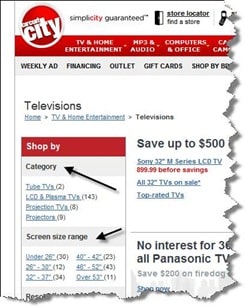
Current best practices dictate that products must be grouped into logical, top-level categories that are then subdivided into at least one or two additional levels. For example, a broad category like "Electronics" is often too expansive to be useful. Industry standards now recommend breaking such categories down into subcategories like "Television & Home Theater," which can be further refined into "OLED TVs" or "Soundbars." However, data-driven design suggests a limit to this hierarchy; exceeding three levels of sub-categories can lead to "navigation fatigue," where the user feels lost within the site’s architecture. To mitigate this, modern interfaces utilize "child" category highlights, allowing users to see snippets of deeper levels without having to click through multiple pages.
Analytics as a Diagnostic Tool for Design
The efficacy of a category page is rarely a matter of subjective aesthetics; it is measured through rigorous data analysis. Analytics professionals point to the "exit rate" as the primary KPI for category page health. While every page on a website will have an exit rate, category pages should ideally mirror the site’s average. A spike in exit rates on a specific category page is a red flag, suggesting that the transition from the category level to the product level is failing.
Heatmapping tools and session recordings have become instrumental in identifying these failure points. For instance, if a heatmap reveals that users are clicking on product images but not the "View Details" text, it indicates a flaw in the click-target design. Similarly, if users are spending an inordinate amount of time on a category page without clicking through to a product, it may suggest that the information provided is insufficient to help them make a selection, or conversely, that the page is so cluttered that it has induced "analysis paralysis."
Feature-Based and Need-Based Filtering Systems
To bridge the gap between browsing and buying, top-tier e-commerce platforms have adopted sophisticated filtering systems based on product features and consumer needs. This approach recognizes that different products require different navigational filters.
When consumers shop for technical goods, such as televisions or computer hardware, they often prioritize specific features like resolution, screen size, or processor speed. In contrast, when shopping for apparel or books, the filters might shift toward brand, size, or release date. The integration of these features allows visitors to regroup products dynamically, effectively creating a personalized category page on the fly.
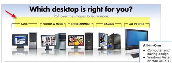
Furthermore, "need-based" categorization has gained traction as a way to assist less-informed shoppers. By categorizing products according to their intended use—such as "Gaming Laptops" versus "Business Laptops"—retailers can guide users based on the problem they are trying to solve rather than the technical specifications they might not fully understand. Best Buy, for example, has successfully utilized this strategy by allowing visitors to filter desktops by use-case categories like "Photo & Music Editing" or "Basic Computing."
The Role of Buying Guides and Decision Support
For complex product categories, the category page often serves as an educational resource. High-performing e-commerce sites frequently integrate buying guides or "wizards" directly into the category interface. These tools are designed to reduce the anxiety associated with making an incorrect purchase.
By providing a structured path—such as a series of questions about the user’s preferences or environment—the site can recommend a specific subcategory or product. This not only improves the user experience but also positions the brand as an authority in its field. Psychological studies on consumer behavior suggest that when a platform helps a user make a difficult decision, the perceived value of the brand increases, leading to higher brand loyalty and repeat business.
Iterative Testing and the Risks of Over-Engineering
Despite the availability of best practices, digital retail experts warn against a "one-size-fits-all" approach. The implementation of new features, such as need-based filters or interactive guides, must be validated through A/B testing.
In one documented case, an e-commerce retailer introduced a complex "need-based" filtration system at the top of their category pages, expecting a significant lift in engagement. However, subsequent analytics and heatmap data revealed that users were almost entirely ignoring the new feature, preferring the traditional sidebar filters they were accustomed to. After two weeks of poor performance, the feature was removed. This serves as a reminder that even logically sound design choices can fail if they do not align with the established habits of the target audience.
Broader Implications for the Future of Digital Commerce
The optimization of category pages carries significant implications for the broader digital economy. As mobile commerce continues to outpace desktop shopping, the limited screen real estate makes the efficiency of category pages even more vital. Mobile users require streamlined navigation, larger touch targets, and highly responsive filtering systems.
Moreover, the rise of Voice Search and Artificial Intelligence is beginning to reshape how category pages are indexed and accessed. Search engines are increasingly prioritizing sites that demonstrate clear hierarchical structures and high user engagement metrics. Consequently, a well-optimized category page is no longer just a tool for user retention; it is a fundamental component of a comprehensive SEO strategy.
As we look toward the next decade of e-commerce, the focus is likely to shift toward even greater personalization. Future category pages may leverage machine learning to reorder product grids in real-time based on a visitor’s past browsing history, demographic data, and even current local weather patterns. However, the core principles remains the same: the page must serve the user’s immediate intent, reduce the friction of choice, and provide a clear, data-backed path to the final purchase. By balancing these elements, retailers can transform their category pages from simple landing spots into powerful engines of conversion.