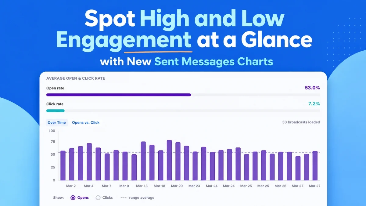
Email marketing platform AWeber has announced the launch of a new suite of advanced visual analytics tools, designed to provide marketers with instant, actionable insights into their campaign performance. Released on August 6, 2026, the update introduces intuitive charts and comparison features that streamline the analysis of open rates, click-through rates, and overall email engagement, enabling users to swiftly identify effective strategies and optimize future broadcasts. This development represents a significant step forward in making sophisticated email analytics accessible and digestible for businesses of all sizes, directly integrating powerful data visualization into the user dashboard.
The digital marketing landscape, particularly email marketing, thrives on data. With billions of emails sent daily, standing out and engaging audiences requires a deep understanding of what resonates. Traditional analytics often present raw numbers, demanding significant effort from marketers to unearth meaningful patterns. AWeber’s new features directly address this challenge by transforming complex data sets into easily interpretable visual formats, allowing users to move beyond mere reporting to proactive strategy adjustments. The goal is to demystify performance metrics, making it simpler for users to discern trends, pinpoint outliers, and ultimately send more effective communications.
Streamlined Engagement Trends: The Opens and Clicks Over Time Chart
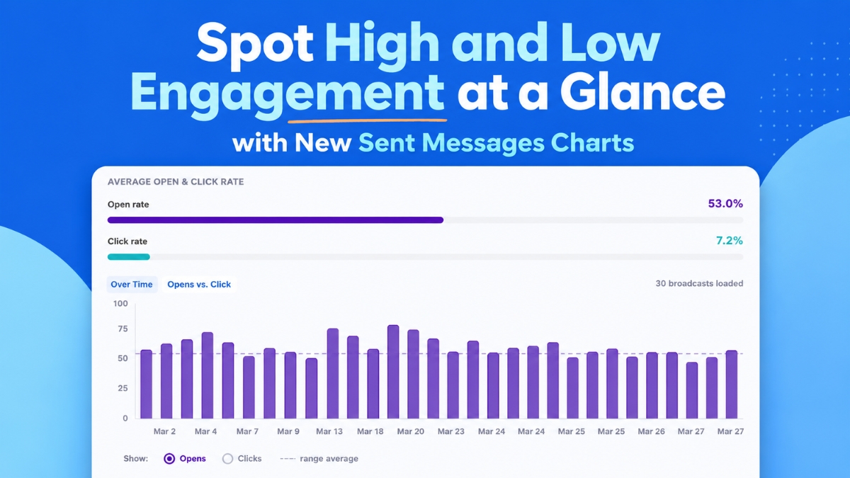
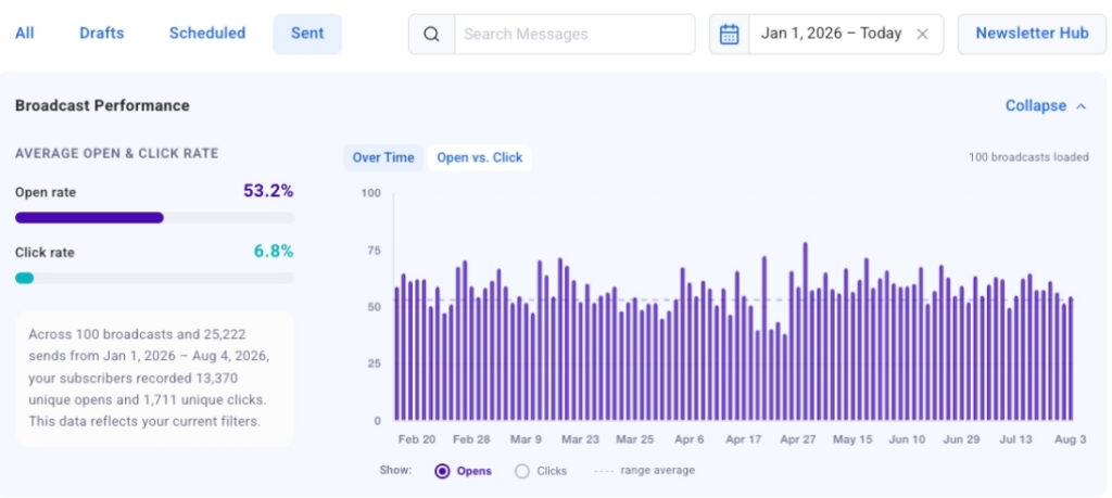
Central to the new analytics suite is the "Opens and Clicks Over Time" chart. This innovative visualization plots up to 100 of a user’s most recent broadcast emails on a dynamic timeline, offering an immediate historical perspective on engagement. Marketers can toggle between views for open rates and click-through rates, facilitating a direct comparison of performance across various sends. This feature is particularly valuable for identifying recurring patterns, such as the impact of specific subject lines on opens, or the correlation between certain send days and higher engagement levels. For instance, a consistent spike in open rates on Tuesdays might indicate optimal audience receptivity on that day, while a particular type of subject line consistently driving high clicks could inform future content strategy.
The ability to visualize these trends at a glance eliminates the need for manual data aggregation and spreadsheet analysis, which can be time-consuming and prone to human error. Instead, marketers can quickly observe the effects of A/B tests, seasonal campaigns, or changes in content strategy over time. A clear, upward trend in engagement metrics could validate a recently implemented strategy, while a sudden dip might signal the need for immediate adjustments. This proactive insight is crucial in an environment where audience preferences and inbox algorithms are constantly evolving. According to recent industry reports, the average email open rate across all industries hovers around 21%, while the average click-through rate is approximately 2.6%. The AWeber chart provides a contextual benchmark against which individual campaign performance can be measured, allowing users to understand if their campaigns are exceeding, meeting, or falling short of industry averages and, more importantly, their own historical performance.
Further enhancing usability, the "Opens and Clicks Over Time" chart incorporates "click-to-jump" links. This functionality allows users to click directly on any bar in the chart, instantly navigating to the corresponding broadcast email within the detailed table below. This seamless integration means that from identifying a performance anomaly on the chart to reviewing the exact message content that caused it takes mere seconds. Whether investigating a highly successful campaign to replicate its elements or analyzing an underperforming one to understand areas for improvement, this direct linkage significantly speeds up the analytical workflow. The chart loads automatically as users scroll, populating with additional broadcast data, ensuring a continuously updated and comprehensive overview of recent email performance without manual intervention.
Comparative Analysis: The Opens vs. Clicks Bubble Chart
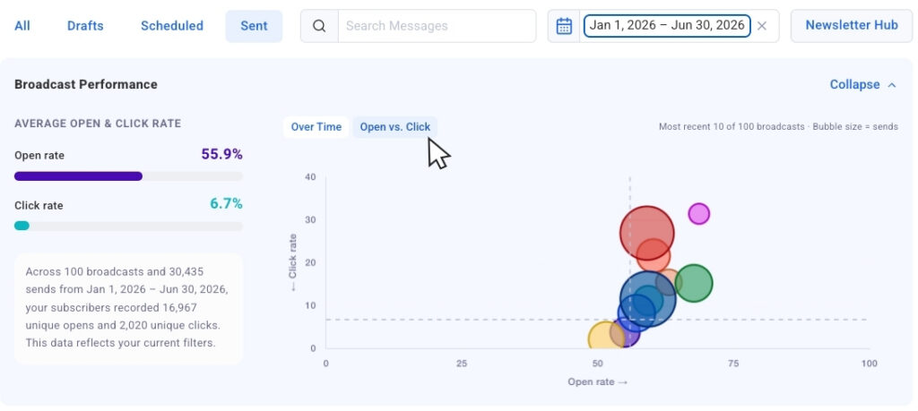
Another pivotal addition is the "Opens vs. Clicks bubble chart," which offers a unique perspective on campaign efficacy by plotting recent sends together on a two-dimensional graph. Each broadcast email is represented as a bubble, with its size dynamically adjusted to reflect the send volume. This visual representation allows for an immediate comparison of results across campaigns targeting different audience sizes, providing critical context that raw percentages alone might miss. A small campaign with exceptional rates might be less impactful overall than a larger campaign with slightly lower but still strong engagement. The bubble size helps contextualize these comparisons.
This chart excels at surfacing outliers with remarkable speed. Marketers can quickly identify broadcasts that achieved strong open rates but saw fewer clicks, indicating a compelling subject line that failed to deliver on its promise with engaging content. Conversely, campaigns that generated moderate opens but high click-through rates could signify a less captivating subject line but highly relevant and persuasive content within the email itself. These distinctions are vital for refining both subject line strategies and in-email content. Understanding these nuances empowers marketers to make informed decisions about what elements to repeat and which aspects require adjustment. For instance, a campaign with high opens and low clicks might prompt a review of the call-to-action (CTA) or the overall value proposition presented in the email body. Conversely, a campaign with lower opens but strong clicks suggests the core message is potent, but the initial hook (subject line, preview text) needs strengthening.
The flexibility of the new interface is further exemplified by the "collapsible chart view." This feature allows users to temporarily hide the visual charts, providing an unobstructed view of the numerical data in the accompanying table. This is particularly useful for marketers who prefer to dive deep into the precise figures after gaining an initial visual understanding. The ability to expand the chart again whenever visual context is needed ensures that users can tailor their analytical experience to their immediate requirements, seamlessly switching between macro trends and granular details.
Granular Filtering for Precision Analysis
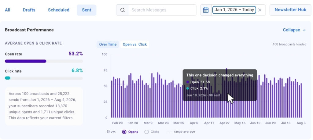
Recognizing that comprehensive analysis often requires narrowing the focus, AWeber has integrated robust filtering capabilities into the new analytics suite. "Date presets" allow users to instantly filter data for the past 30 days, 90 days, or a full year with a single click. The charts and tables update immediately to reflect only the sends within the selected timeframe, enabling quick temporal comparisons and performance reviews. This is invaluable for tracking progress against quarterly goals or analyzing seasonal trends in customer engagement.
Beyond pre-defined date ranges, "dynamic search filtering" offers an even more granular level of control. By typing a keyword or phrase into the search bar, users can narrow the chart and table data to include only broadcasts with that specific word in the subject line. This allows marketers to compare the performance of campaigns around specific themes, product launches, or promotional events. For example, a marketer could search for "sale" to compare all emails related to sales promotions, or "webinar" to assess the effectiveness of their educational content. This capability ensures that comparisons are highly relevant and targeted, fostering deeper insights into content efficacy.
Looking ahead, AWeber has announced that "segment name filtering" is a forthcoming enhancement. This planned feature will allow users to isolate chart and table data by specific audience segments. This is a crucial development, as engagement metrics naturally vary significantly across different audience groups—for instance, new subscribers versus long-term customers, or leads interested in different product categories. The ability to analyze segment-specific performance will enable marketers to tailor their strategies with even greater precision, ensuring that messages are optimized for the unique characteristics and preferences of each audience group. This level of segmentation analysis moves beyond generic performance metrics to provide truly actionable intelligence for hyper-targeted campaigns.
Strategic Implications and Broader Context
The introduction of AWeber’s enhanced visual analytics is not merely a feature update; it represents a strategic shift towards empowering marketers with more intuitive, data-driven tools. In an era where data overload can be a significant challenge, simplifying the interpretation of performance metrics becomes paramount. For small businesses and individual content creators who may not have dedicated data analysts, these tools democratize access to sophisticated insights, allowing them to compete more effectively.
Email marketing consistently delivers one of the highest returns on investment (ROI) in digital marketing, often cited as $36 for every $1 spent. However, achieving this ROI requires continuous optimization. Tools like AWeber’s new charts provide the necessary feedback loop, transforming raw data into a strategic asset. By clearly illustrating what works and what doesn’t, these features enable marketers to iterate on their strategies, refine their messaging, and improve their audience targeting. This continuous improvement cycle is fundamental to maximizing engagement, building customer loyalty, and driving conversions.
The new charts also complement existing resources and integrations, such as the broadcast analytics available in the AWeber MCP app for ChatGPT and Claude.ai, bringing that same level of insight directly into the primary dashboard. This integration ensures a consistent and comprehensive analytical experience across different touchpoints. Furthermore, AWeber continues to provide educational content on best practices, such as how to track and improve email marketing performance and strategies for enhancing email open rates, reinforcing its commitment to supporting marketers beyond just providing tools.
This release underscores a broader industry trend towards more user-friendly and actionable analytics platforms. As marketing technology evolves, the emphasis is increasingly on providing insights that are not only accurate but also easy to interpret and directly applicable to strategic decision-making. By delivering these advanced visual analytics, AWeber is positioning its users to make smarter, faster decisions, ultimately fostering more successful and impactful email marketing campaigns in a competitive digital landscape. The Sent Messages charts are now live and available to all AWeber users, marking a significant enhancement to the platform’s analytical capabilities.