The year 2017 marked a pivotal turning point in the democratization of data visualization, characterized by a transition from static, complex spreadsheets to dynamic, interactive dashboards. At the center of this shift was Google Data Studio, a tool that bridged the gap between professional data scientists and business analysts. By allowing users to connect disparate data sources—ranging from Google Analytics to BigQuery—and transform them into visually compelling narratives, the platform catalyzed a new era of "data storytelling." This evolution was not merely about aesthetic improvements; it represented a fundamental change in how organizations and journalists communicate insights to their audiences.
The Transformation of Business Reporting and Operational Efficiency
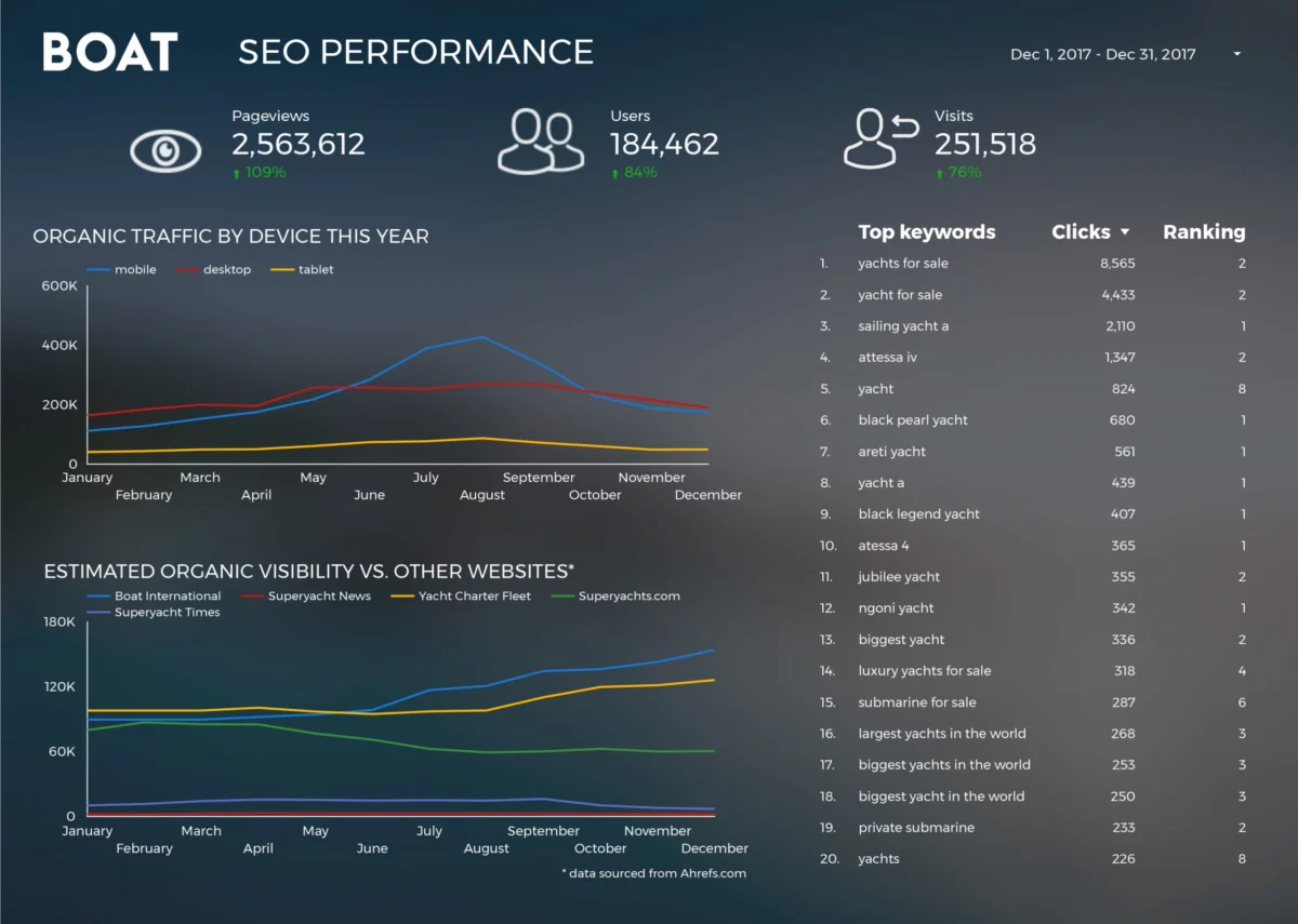
For years, corporate reporting was a labor-intensive process, often involving the manual extraction of data into Excel, followed by hours of formatting and chart creation. The emergence of cloud-based visualization tools significantly reduced this "time-to-insight." A primary example of this operational shift is seen in the case of Boat International Media. Historically, the organization’s SEO performance reporting was a grueling five-day endeavor each month. By implementing Google Data Studio, the team, led by Fanni Takacs and Drew Broomhall, reduced this window to just fifteen minutes.
This 99.8% reduction in reporting time highlights a broader trend in the digital marketing industry: the move toward real-time, "always-on" dashboards. The Boat International model focused on clarity and the elimination of "chart junk," a term coined by Edward Tufte to describe unnecessary or confusing visual elements. By prioritizing clear key insights and maintaining high design standards, the reports became versatile assets—functioning equally well as interactive online portals and as professional PDF exports for executive stakeholders.
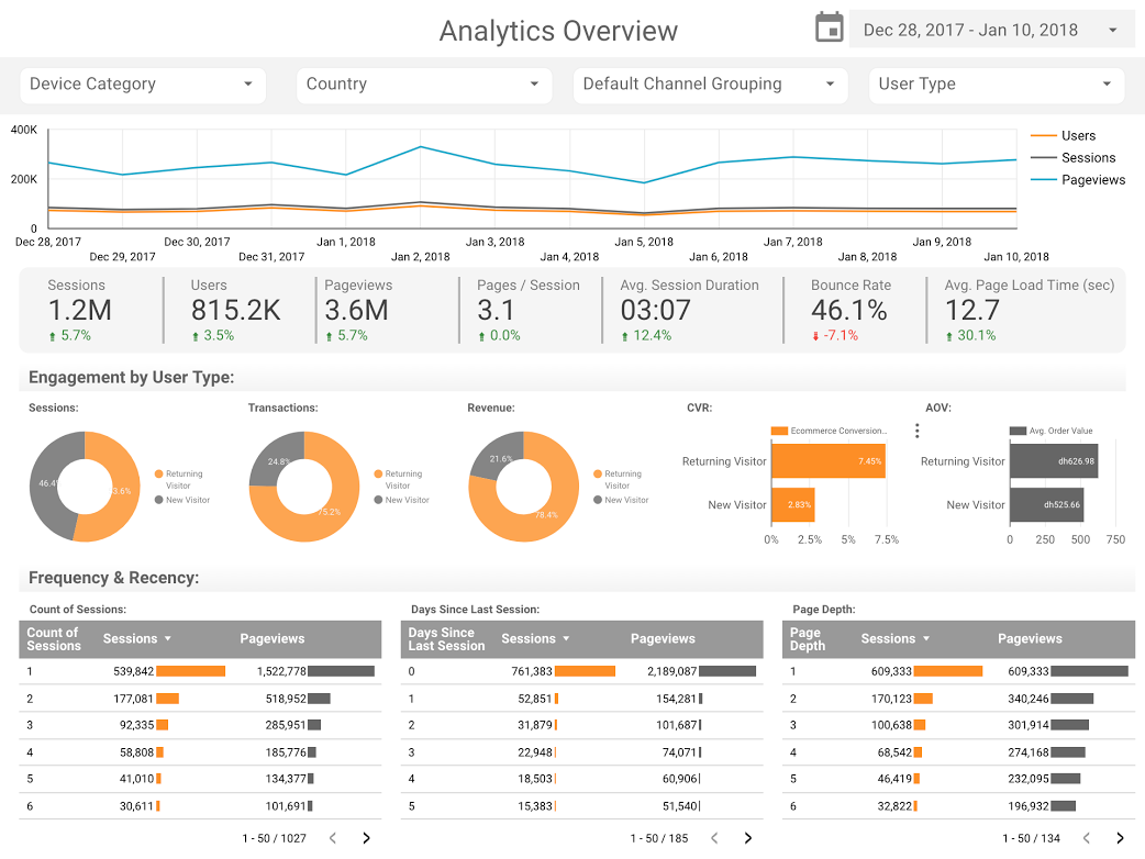
The technical architecture behind these business dashboards often relies on the Google Analytics (GA) connector. Organizations like ClickInsight and E-Nor have utilized these connections to create standardized templates that allow businesses to monitor web activity without starting from scratch. Sunil Attri, a Senior Consultant at E-Nor, demonstrated that by utilizing interactive filters and compact design, a single dashboard could replace dozens of individual GA reports. This consolidation is critical for modern businesses that must navigate "data overload," where the sheer volume of information often obscures actionable intelligence.

Advanced Metrics and the Role of Comparative Visualization
As businesses matured in their use of Data Studio, the focus shifted from simple traffic metrics to deeper engagement analysis. Analytics Pros, a prominent digital analytics firm, pioneered the use of bullet charts within the platform to provide context that standard bar charts often lack. While a standard chart might show that a page received 10,000 views, a bullet chart compares that figure against two critical benchmarks: the previous year’s performance and the current year’s target.
This comparative approach is essential for understanding "performance health." By adding scorecard metrics alongside these charts, analysts can determine not just the quantity of traffic, but the quality of engagement, such as average time on page and scroll depth. This level of detail allows companies to move beyond "vanity metrics" and focus on data points that directly impact the bottom line.
Data Journalism: Bridging the Gap Between Information and Entertainment
Beyond the boardroom, Google Data Studio found a second home in the world of data journalism. The platform’s ability to handle public datasets allowed individuals to tell stories about pop culture and technology with the same rigor applied to financial reports.
One of the most prominent examples from the 2017-2018 period was the comparative analysis of the Marvel and DC Cinematic Universes. With superhero films dominating the global box office—generating over $27 billion in revenue—the "war for the audience" became a subject of intense public interest. Visualizations in Data Studio allowed fans and industry analysts to compare box office returns, critical reception (via Rotten Tomatoes or IMDb), and budget-to-profit ratios across dozens of films. This type of interactive storytelling allows the reader to "explore" the data, clicking through different phases of a franchise to draw their own conclusions.
Similarly, the "Data Behind Star Wars" project by ClickInsight showcased the platform’s ability to handle fictional datasets with the same precision as real-world metrics. By visualizing starship speeds, character demographics, and planet details, the project demonstrated that data visualization is a universal language, capable of engaging audiences regardless of the subject matter.

Big Data and Open Source: The GitHub Analysis
The technical capabilities of Google Data Studio were further validated by its integration with BigQuery, Google’s enterprise data warehouse. This was notably demonstrated by Felipe Hoffa, a Developer Advocate at Google, who analyzed the state of open-source software in 2017.
Hoffa utilized the "PushEvents" published by GitHub—a massive dataset representing millions of code contributions. Processing this volume of data would be impossible in a traditional spreadsheet. However, by using the BigQuery connector, Hoffa was able to visualize which companies and individuals contributed most to the open-source ecosystem. The findings provided a transparent look at the "engine room" of the internet, showing the dominance of certain programming languages and the rising influence of corporate contributors in the open-source space. This project underscored the importance of the "Big Data" pipeline: moving from raw logs to a structured warehouse, and finally to a visual interface that the public can understand.
Longitudinal Studies: 150 Years of UK Social Trends
Perhaps the most profound application of these tools is in the analysis of long-term societal shifts. In a collaborative effort, researchers Lizzie Silvey and others utilized Data Studio to map 150 years of marriage and divorce trends in the United Kingdom. This visualization served as a digital history book, answering complex questions about how external shocks—such as World War I, World War II, and major legislative changes like the Divorce Reform Act of 1969—impacted social structures.
The data revealed clear correlations between legal milestones and statistical spikes. For instance, the visualization allowed users to see exactly how the liberalization of divorce laws led to an immediate increase in filings, followed by a stabilization period. This type of longitudinal analysis is vital for sociologists and policymakers, as it provides a factual foundation for debates on social welfare and family law. It moves the conversation away from anecdotal evidence toward a data-driven understanding of history.
The Broader Impact: The Democratization of Insight
The widespread adoption of Google Data Studio (now evolved into Looker Studio) has had a lasting impact on the professional landscape. It has effectively "democratized" insight, moving the power of data visualization out of the hands of a few specialized "gatekeepers" and into the hands of the broader workforce.
Several key implications have emerged from this shift:
- The Death of the Static Report: The expectation for "live" data has become the industry standard. Stakeholders no longer want to wait for a monthly PDF; they want a link to a dashboard that updates automatically.
- The Rise of the "Analyst-Storyteller": Technical proficiency is no longer enough. The modern analyst must also be a designer and a narrator, capable of choosing the right chart type to convey a specific message.
- Transparency and Accountability: In both business and journalism, providing the underlying data (or an interactive way to view it) builds trust with the audience.
Conclusion: The Path Forward for Data Visualization
The examples from 2017 and 2018 served as a blueprint for the future of business intelligence. They proved that data does not have to be dry or inaccessible; when paired with the right tools and a narrative mindset, it can be one of the most powerful forms of communication available.
As we look back on the evolution of these visualizations, it is clear that the goal remains the same: to turn "noise" into "signal." Whether it is a small business owner tracking their SEO performance or a journalist explaining the complexities of global box office trends, the ability to visualize data is now a fundamental literacy. The tools will continue to evolve—integrating artificial intelligence and more complex predictive modeling—but the core principle of using data to tell a human story remains more relevant than ever. For those looking to make an impact in 2018 and beyond, the message was clear: the data is there, the tools are ready, and the only limit is the storyteller’s imagination.