Color stands as one of the most potent, yet often underestimated, tools in a marketer’s arsenal. Its ability to instantly set a mood, evoke deep-seated emotions, and spark a psychological reaction makes it a cornerstone of effective communication. Indeed, research highlights the immediacy of color’s impact: an astounding 90 percent of a subscriber’s initial impression of an email message or website is predicated solely on color or other visual cues. This swift, subconscious processing underscores why a deep understanding of color psychology is not merely an aesthetic choice but a strategic imperative for any brand aiming to connect with its audience on a profound level.
The Foundational Role of Color in Consumer Behavior
The influence of color extends far beyond superficial appeal; it directly impacts consumer perception and purchasing decisions. Surveys consistently show that 84.7% of consumers deem color important when considering a product, and judicious color use can elevate brand recognition by a remarkable 80%. This critical role transforms color into an indispensable element of brand identity. Consider your favorite brands: what colors immediately spring to mind? These associations are not accidental; they are the result of deliberate strategic choices designed to align with the brand’s values and target audience.
The psychological roots of color perception are complex, blending biological responses with cultural conditioning. For instance, red, a color that historically signaled danger or ripe fruit, triggers physiological responses like increased heart rate and heightened attention. Blue, reminiscent of clear skies and calm waters, tends to induce feelings of serenity and trust. These innate responses are further shaped by learned associations within specific cultures, making the application of color psychology a nuanced art that requires both universal understanding and contextual awareness. Early color theorists like Isaac Newton, who first systematically studied the spectrum, and later thinkers like Johann Wolfgang von Goethe, who explored the psychological effects of color, laid the groundwork for our modern understanding of how hues interact with the human mind. In the digital age, this understanding has evolved, with marketers now leveraging sophisticated analytics to fine-tune color palettes for maximum impact across various platforms.
Decoding the Palette: Individual Color Meanings and Marketing Applications
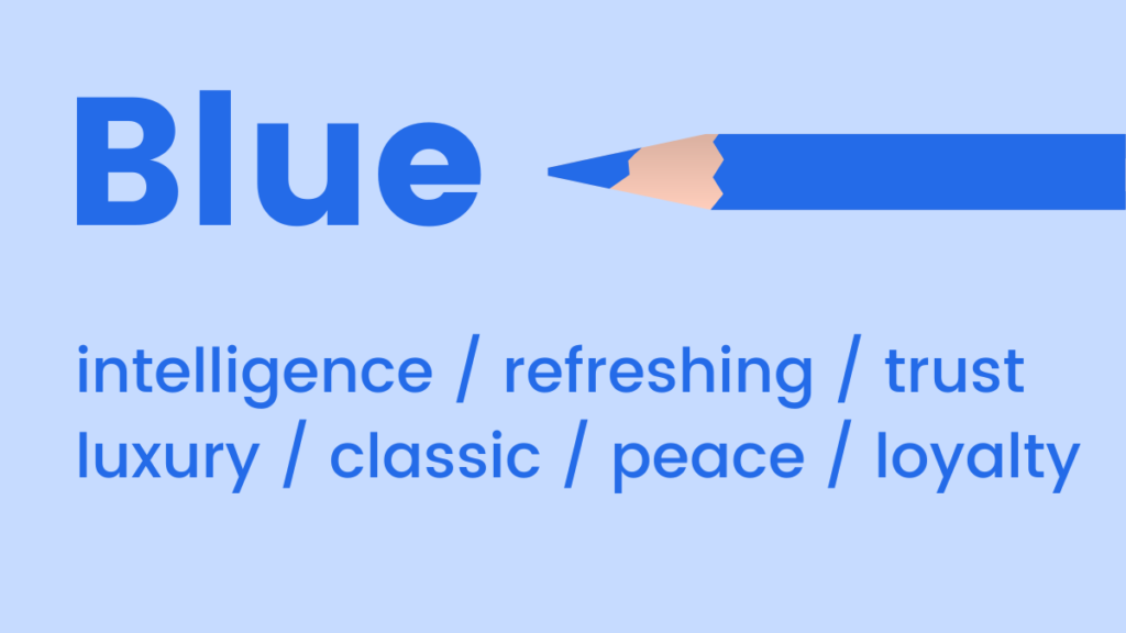
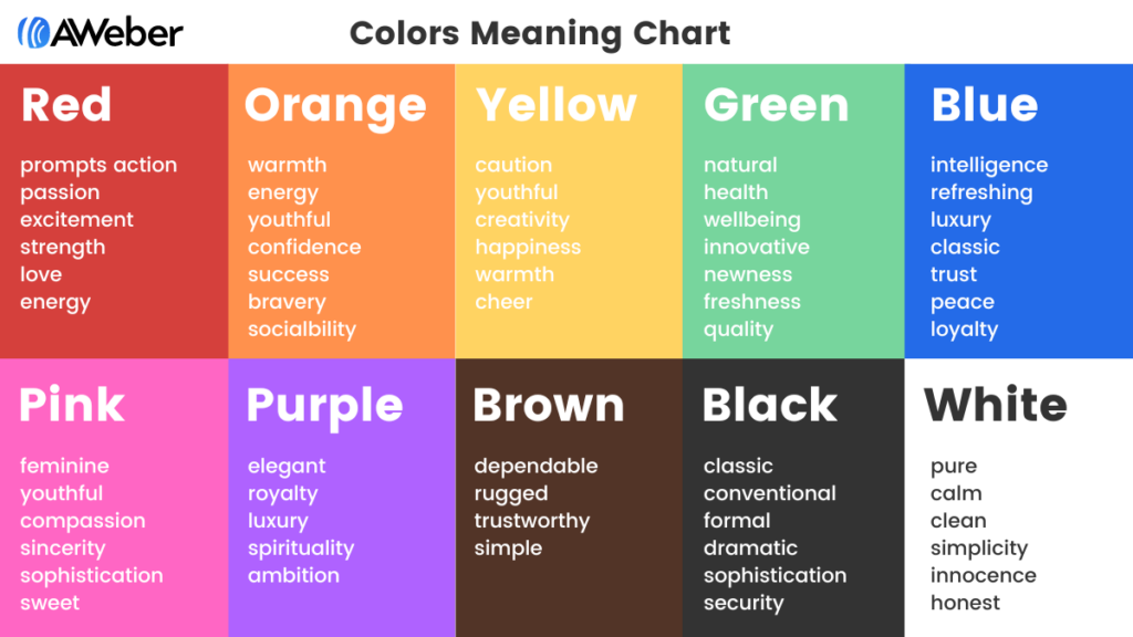
Each color carries a unique set of psychological associations, offering marketers a diverse palette to communicate specific messages and evoke desired responses.
Blue: Trust, Serenity, and Professionalism
Blue is universally associated with feelings of coolness, calmness, and stability. Its mood-boosting properties can signal the body to produce calming chemicals, promoting positivity. Light blue exudes a refreshing and approachable vibe, while darker shades often convey luxury, authority, and reliability without the austerity of black.
- When to use blue in your marketing:
- Financial and Technology Industries: To instill trust, security, and professionalism. Think banking, software, and corporate services.
- Healthcare and Wellness: To promote a sense of calm, cleanliness, and healing.
- Brands emphasizing reliability and clarity: Its association with clear skies and deep oceans makes it ideal for brands wanting to appear dependable and transparent.
- Email Marketing: Pale blue can give a refreshing feel (e.g., Warby Parker), while dark blue evokes sophistication (e.g., Everlane).
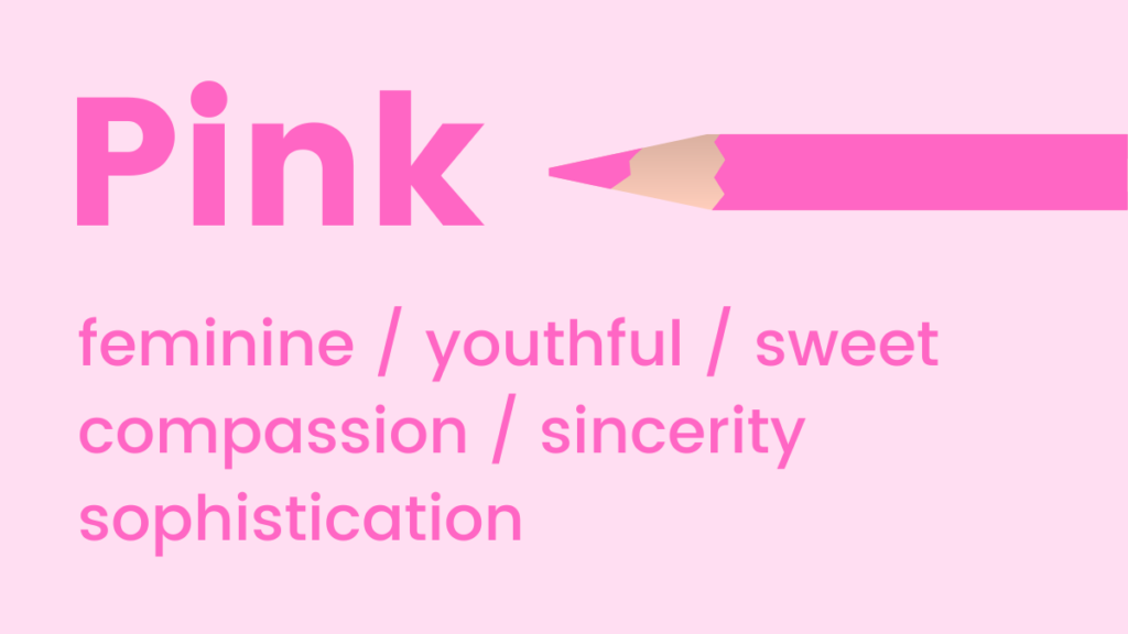
Pink: Youthfulness, Sweetness, and Femininity
Pink tones are vibrant, youthful, and exciting. It’s a prime choice for emphasizing femininity, sweetness, or playfulness. Intriguingly, studies suggest pink can even stimulate cravings for sugar, explaining its prevalence in confectionery branding.
- When to use pink in your marketing:
- Beauty and Fashion (especially for women/girls): To evoke charm, softness, and modern femininity.
- Confectionery and Dessert Brands: To enhance the perception of sweetness and indulgence.
- Welcome Campaigns: Its friendly and inviting nature makes it excellent for initial customer interactions (e.g., Lyft).
- Children’s Products: To communicate innocence and fun.
Green: Nature, Growth, and Prosperity
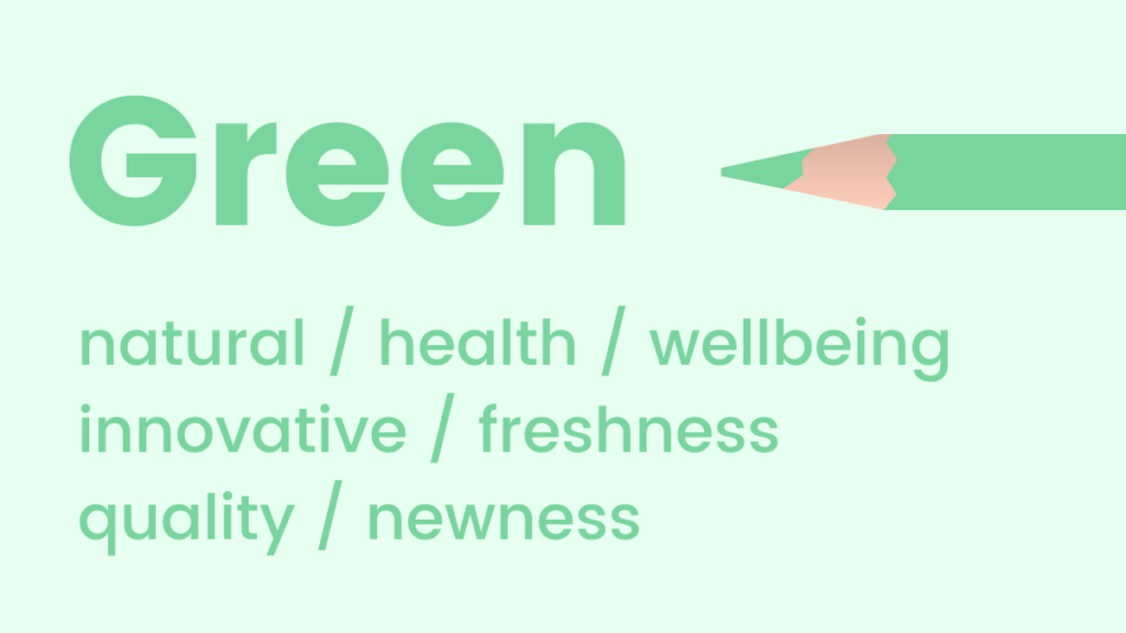
Green is intrinsically linked to natural elements, health, and well-being. It’s a soothing color that promotes relaxation, harmony, and balance. The human eye is most sensitive to green, allowing us to discern a vast array of its shades, which contributes to its calming effect. Its fresh appeal makes it ideal for promoting new products or features.
- When to use green in your marketing:
- Eco-friendly and Organic Brands: To highlight sustainability, natural ingredients, and environmental consciousness.
- Health and Wellness Products: To convey vitality, freshness, and healing.
- Financial Services: Darker greens can symbolize wealth, growth, and stability.
- Promoting New Offerings: Its association with growth and new beginnings is perfect for product launches (e.g., Offscreen).
Orange: Enthusiasm, Warmth, and Affordability
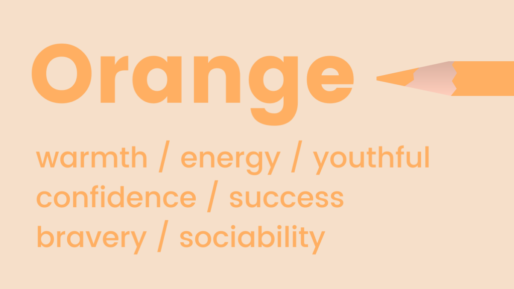
Orange radiates warmth, energy, and enthusiasm. Often perceived as fun and flamboyant, it’s used to represent positivity, optimism, and creativity. Furthermore, orange often carries associations of trust and safety, possibly due to its use in safety equipment and warning signs (though this varies culturally).
- When to use orange in your marketing:
- Call-to-Action (CTA) Buttons: Its high visibility and energetic appeal can draw attention and encourage clicks.
- Creative Industries: To signal innovation, excitement, and approachability.
- Food and Beverage: Can stimulate appetite and evoke feelings of comfort.
- Brands targeting a younger, adventurous demographic: To convey a sense of fun and dynamism.
- Pro Tip: For marketers hesitant about its boldness, integrate orange subtly through images or smaller design elements before committing to larger swaths.
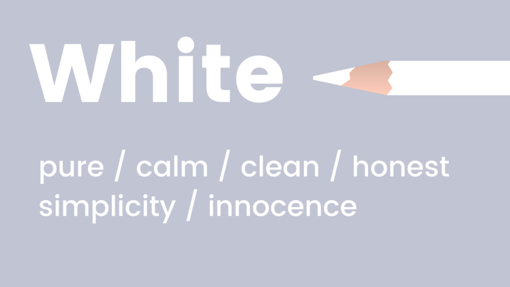
Yellow: Optimism, Joy, and Attention
Similar to orange, yellow symbolizes positivity and optimism, widely recognized as the happiest color in the spectrum. Psychologically, it activates memory, stimulates mental processes, and encourages communication. However, too much bright yellow can also evoke anxiety or caution.
- When to use yellow in your marketing:
- Brands for Children: Its playful and energetic qualities are highly appealing (e.g., Lego).
- Promotional Offers and Sales: To grab attention and convey a sense of excitement or urgency.
- Educational Content: To stimulate engagement and memory retention.
- Highlights and Accents: Use it sparingly to draw the eye to key information without overwhelming the user.
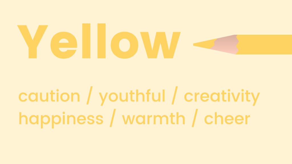
Black: Sophistication, Power, and Formality
Black is a timeless and classic choice, often associated with formality, elegance, and power ("black tie" events). It also implies weight and substance; studies have shown that people perceive black objects as heavier than white ones.
- When to use black in your marketing:
- Luxury Brands: To convey exclusivity, sophistication, and high value.
- Formal and Professional Services: To establish authority and seriousness.
- Modern and Minimalist Designs: As a background or text color for a sleek, impactful look.
- Contrast: Excellent for creating strong contrast with lighter colors, making elements "pop" (e.g., Harry’s email with white CTA).
- Pro Tip: For less intense applications, combine black with white for a fail-safe, elegant contrast.
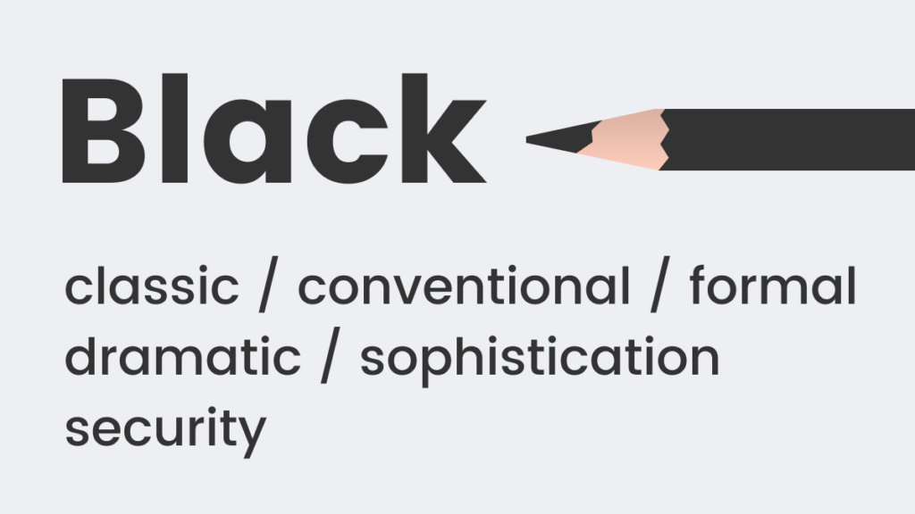
White: Purity, Simplicity, and Modernity
White embodies coolness, calm, and serenity. It’s a favored choice for brands aiming for a modern, fresh, and clean aesthetic. It provides a sense of spaciousness and clarity.
- When to use white in your marketing:
- Minimalist Designs: To create an uncluttered, sophisticated, and contemporary look.
- Healthcare and Hygiene Products: To symbolize purity, cleanliness, and safety.
- High-Tech Brands: To convey innovation, precision, and efficiency.
- Background for Readability: Essential for text-heavy content, as it reduces eye strain and improves focus (e.g., The Little White Company).
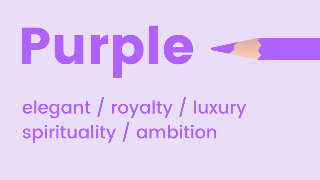
Purple: Luxury, Creativity, and Wisdom
Purple exudes an aura of luxury, elegance, and sophistication. As an intermediary shade, it often uplifts while maintaining a sense of calm. It’s also known to stimulate creativity and imagination, historically associated with royalty and wisdom.
- When to use purple in your marketing:
- High-End Products and Services: To convey exclusivity, quality, and opulence.
- Creative and Artistic Brands: To inspire imagination and uniqueness.
- Wellness and Spirituality: To evoke tranquility, introspection, and enlightenment.
- Distinctive Branding: Can be used to create a unique and memorable brand identity (e.g., Stuart Weitzman).
Red: Passion, Urgency, and Action
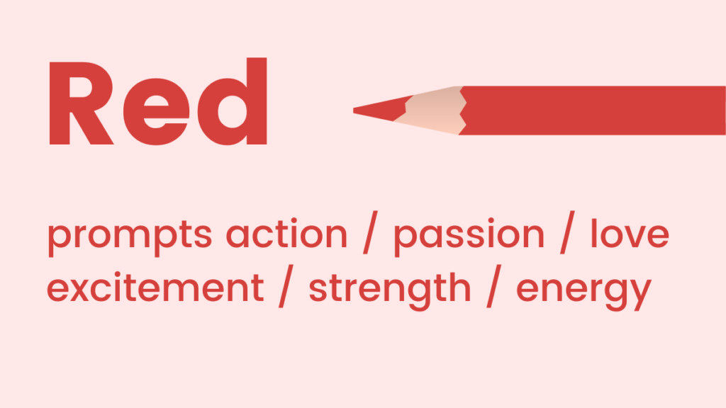
Red tones represent passion, adrenaline, and decisive action. As a high-energy color, it can significantly boost energy levels and quicken the pulse. It is an excellent choice for communicating urgency or importance, often used to capture immediate attention.
- When to use red in your marketing:
- Sales and Promotions: To create a sense of urgency and encourage impulse purchases ("Sale!" banners).
- Call-to-Action (CTA) Buttons: For critical actions where immediate response is desired.
- Food and Beverage Industry: Can stimulate appetite and metabolism.
- Warning or Important Notices: To draw immediate attention to crucial information.
- Brands emphasizing power and excitement: Think sports cars or energetic beverages.
Strategic Color Schemes for Digital Platforms: Websites, Landing Pages, and Sign-up Forms
Implementing multiple colors effectively can be challenging for non-designers. However, understanding basic color theory simplifies the process, enabling the creation of harmonious and attention-grabbing combinations. There are several established color theories, but analogous and complementary schemes are particularly effective for website and landing page design.
Analogous Colors: Harmony and Cohesion
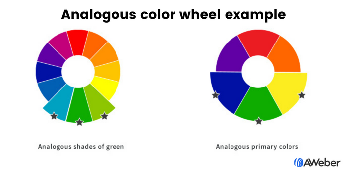
Analogous colors are those that are adjacent to each other on the color wheel (e.g., blue, green, and yellow; or various shades of a single color). This scheme creates a sense of harmony and visual continuity, making it pleasing to the eye. It’s often used to establish a primary brand palette that feels cohesive and sophisticated.
- Application: Ideal for overall website aesthetics, backgrounds, and primary branding elements where a seamless flow is desired. Tools like Adobe Color CC allow users to easily identify analogous combinations by selecting a base color and viewing its neighbors on the color wheel.
Complementary Colors: Contrast and Dynamism
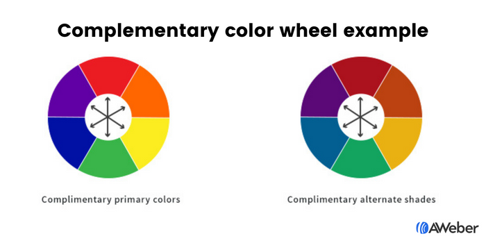
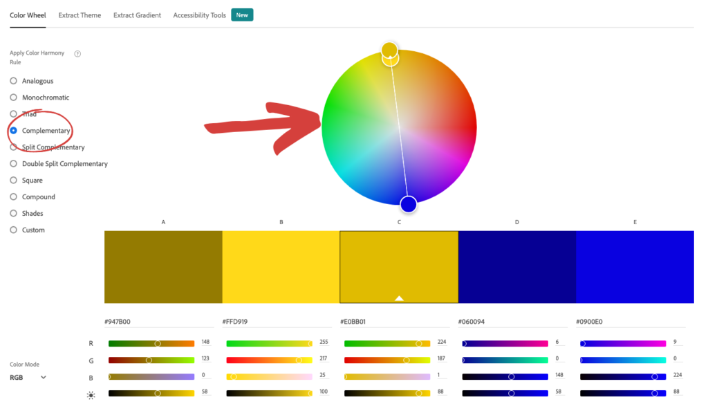
Complementary colors are positioned directly opposite each other on the color wheel (e.g., blue and orange, green and red, purple and yellow). These pairings create strong visual contrast, making elements stand out dynamically. They are excellent for drawing attention to specific areas or actions.
- Application: Highly effective for Call-to-Action (CTA) buttons against a background of its complementary color, or for accentuating key information. For instance, an orange CTA button on a blue website background will instantly command attention due to the high contrast. Adobe Color CC also facilitates finding these impactful pairings.
Contrasting Colors for Sign-up Forms: Maximizing Visibility and Conversion
Sign-up forms are critical conversion points, and their visibility directly correlates with completion rates. Contrast is paramount in making these forms unmissable.
- Contrast between the Form and the Site: The form’s background should distinctly contrast with the surrounding website content. This immediately draws the eye to the form, signaling its importance. Imagine a bright yellow form against a muted grey webpage.
- Contrast within the Form: Once the user’s attention is on the form, internal contrast guides their interaction. Form fields and the submission button should be highly noticeable. Using contrasting shades (e.g., black text, yellow fields, and a white button) ensures clarity and directs the user through the required steps. Complementary colors can also be leveraged here, making the button both complement and contrast with the form’s background, unequivocally prompting a "click here" action.
Optimizing Color in Email Marketing: Purpose-Driven Design
The strategic use of color in email marketing should be dictated by the email’s specific objective, ensuring that visual elements support the message rather than detract from it.
- Email Newsletters: These often prioritize content consumption. Using ample white space with subtle brand color accents ensures readability and prevents visual clutter. If the goal is to drive traffic (e.g., to a blog post or video), a strategically placed, contrasting CTA button becomes crucial.
- Welcome Emails: As a primary brand touchpoint, welcome emails should reinforce visual identity. Incorporating established brand colors prominently helps solidify recognition and convey a consistent brand experience.
- Sales Emails: Color choices here are highly dependent on the offer and product. High-energy colors like red or orange might be used for urgent promotions, while luxurious purples or blues could be chosen for high-end product launches, aligning the emotional response with the product’s value proposition.
Examples in Practice:
- Blue: Warby Parker uses pale blue for a refreshing vibe, while Everlane employs dark blue for a sophisticated, luxurious feel in their emails.
- Pink: Lyft leverages pink in welcome emails to foster a friendly and approachable initial interaction.
- Green: Offscreen uses green palettes to promote new products, creating a fresh, relaxing, and harmonious impression.
- Yellow: Lego’s branding heavily features yellow, appealing to its primary child demographic in product emails.
- Black: Harry’s uses an all-black email to position its products as classic and sophisticated, ensuring the white CTA button stands out sharply.
- White: The Little White Company effectively uses white to portray a calm, pure, and clean brand image across its campaigns.
- Purple: Stuart Weitzman cleverly integrates its signature purple shoebox in abandoned cart emails, subtly reinforcing brand luxury and elegance.
Evolving Brand Aesthetics: Flexibility and Adaptation
A common concern for established brands is how to apply new color psychology insights without disrupting existing brand aesthetics. The key lies in understanding that brand identity, much like a person, can evolve. Rigid adherence to outdated brand standards can hinder progress. Sometimes, introducing a new color or adjusting an existing palette can signify growth, modernity, and responsiveness to market trends, ultimately beginning a "new, better era" for the business.
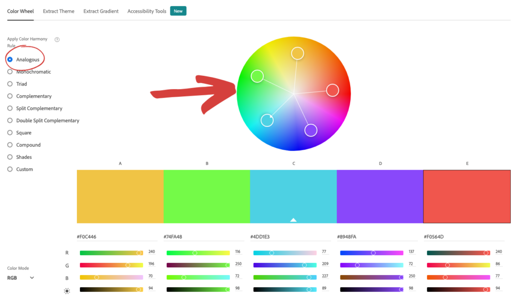
Marketers should not shy away from experimenting with colors that align with specific campaign goals, even if they fall outside the core brand document. Tools like Coolors allow brands to upload their existing color palette and suggest complementary or analogous colors that harmonize with their current identity, facilitating strategic expansion of their visual language. The flexibility to adapt and optimize color usage, backed by data and psychological insights, is a hallmark of successful, forward-thinking branding.
The Future of Color in Marketing: AI-Powered Design
The landscape of color selection and design is rapidly transforming with the advent of artificial intelligence. Marketers no longer need to navigate complex color decisions in isolation. AI-powered design tools are emerging as game-changers, democratizing sophisticated design principles and making them accessible to everyone.
AWeber’s AI Signup Form Builder exemplifies this shift. Instead of grappling with drag-and-drop interfaces or blank canvases, users can simply describe their desired aesthetic—"a dark background with an orange button that pops," or "a clean, white newsletter layout with a red CTA"—and the AI generates a form that aligns with both the described look and underlying color psychology principles. This technology understands color intent, allowing marketers to directly translate their knowledge of what orange signals (trust and action) or what blue builds (credibility) into effective design.
The impending arrival of AI-powered email and landing page builders promises to extend this capability across all digital marketing assets. Imagine instructing an AI to create a "purple, luxury-feel landing page with gold accents" or an email that leverages specific emotional triggers through color. These tools transform the principles of color psychology from abstract knowledge into actionable design input, allowing marketers to focus on strategy and audience connection while the AI handles the intricate design execution. This represents a significant leap, enabling highly customized, psychologically optimized visual content that resonates deeply with target audiences and drives unparalleled engagement.