Email signup forms stand as the singular, pivotal gateway between a casual website visitor and a burgeoning email list, fundamentally dictating the trajectory of potential subscriber acquisition. In an increasingly competitive digital landscape, the efficacy of these forms — encompassing their copy, design, type, and strategic placement — directly influences a visitor’s decision to engage further or disengage entirely. This analysis delves into the proven methodologies, underlying psychological principles, and practical applications that elevate signup forms from mere data collection tools to potent conversion engines.

The Foundational Role of Email Marketing in the Digital Ecosystem
In an era dominated by fluctuating social media algorithms and ever-evolving search engine policies, an owned email list remains arguably the most stable and valuable asset for businesses seeking direct, unfettered communication with their audience. Email marketing consistently delivers a robust return on investment, with industry reports often citing an average ROI of $42 for every dollar spent, far surpassing other digital channels. This makes the initial point of contact – the signup form – a critical component of any comprehensive digital strategy. The goal is not merely to collect addresses but to cultivate an engaged community, making the design and messaging of the signup form paramount to long-term success.
Diverse Avenues for Subscriber Acquisition: Types of Email Signup Forms
The digital marketing toolkit offers a variety of email signup form types, each designed to serve distinct strategic purposes and capture attention at opportune moments in the user journey. The selection of the most appropriate form type is contingent upon the desired placement, timing, and user interaction.
-
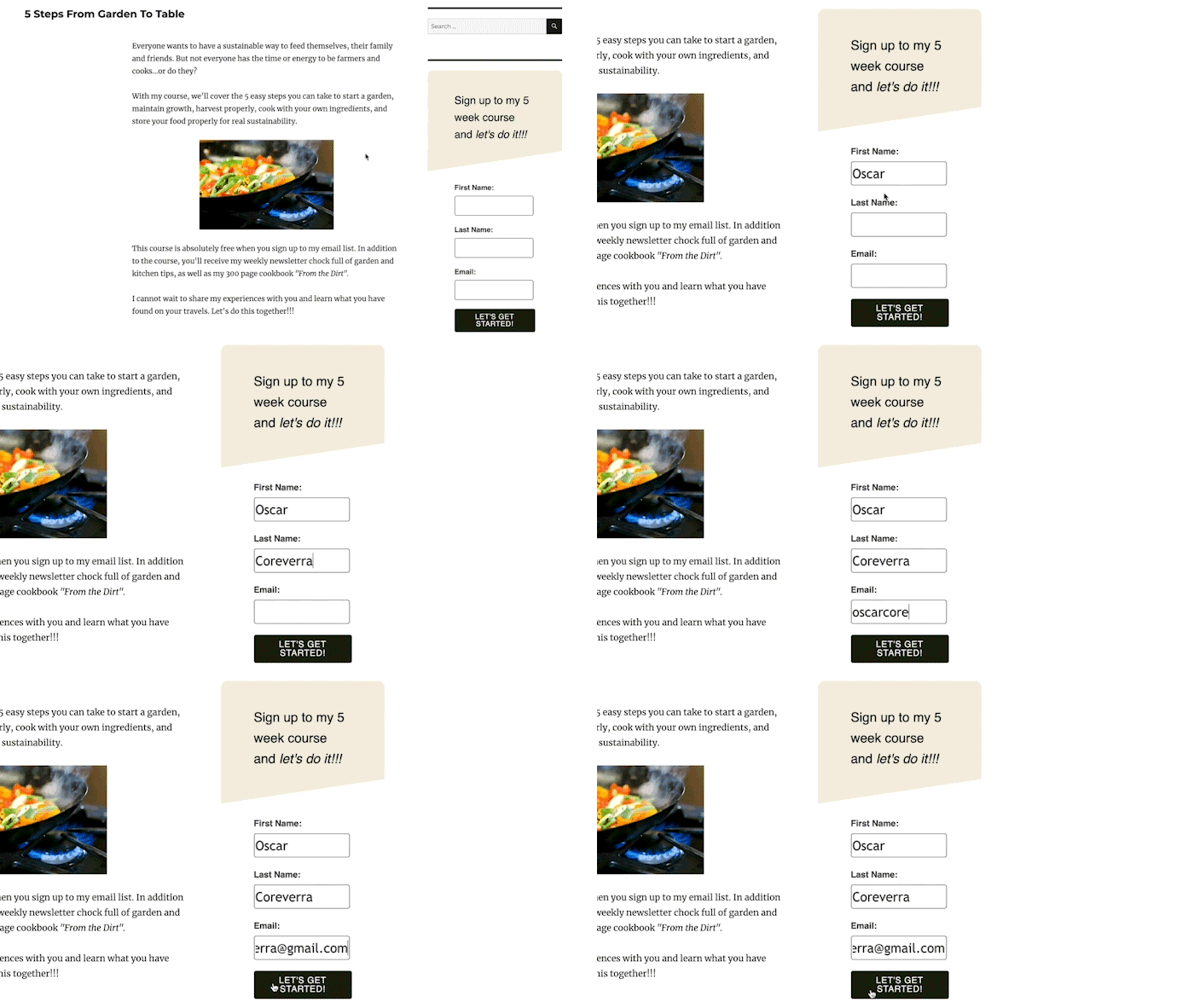
Inline Forms: These forms are seamlessly integrated within the natural flow of a webpage’s content, appearing at the top, bottom, within sidebars, or embedded directly into an article. Their non-intrusive nature makes them suitable for widespread deployment across an entire site or on specific, relevant pages. For instance, a blog discussing a particular topic might feature an inline form offering a related downloadable resource. Tools like the AWeber for WordPress plugin facilitate easy integration and performance tracking, allowing marketers to understand their effectiveness without disrupting the user experience.
-
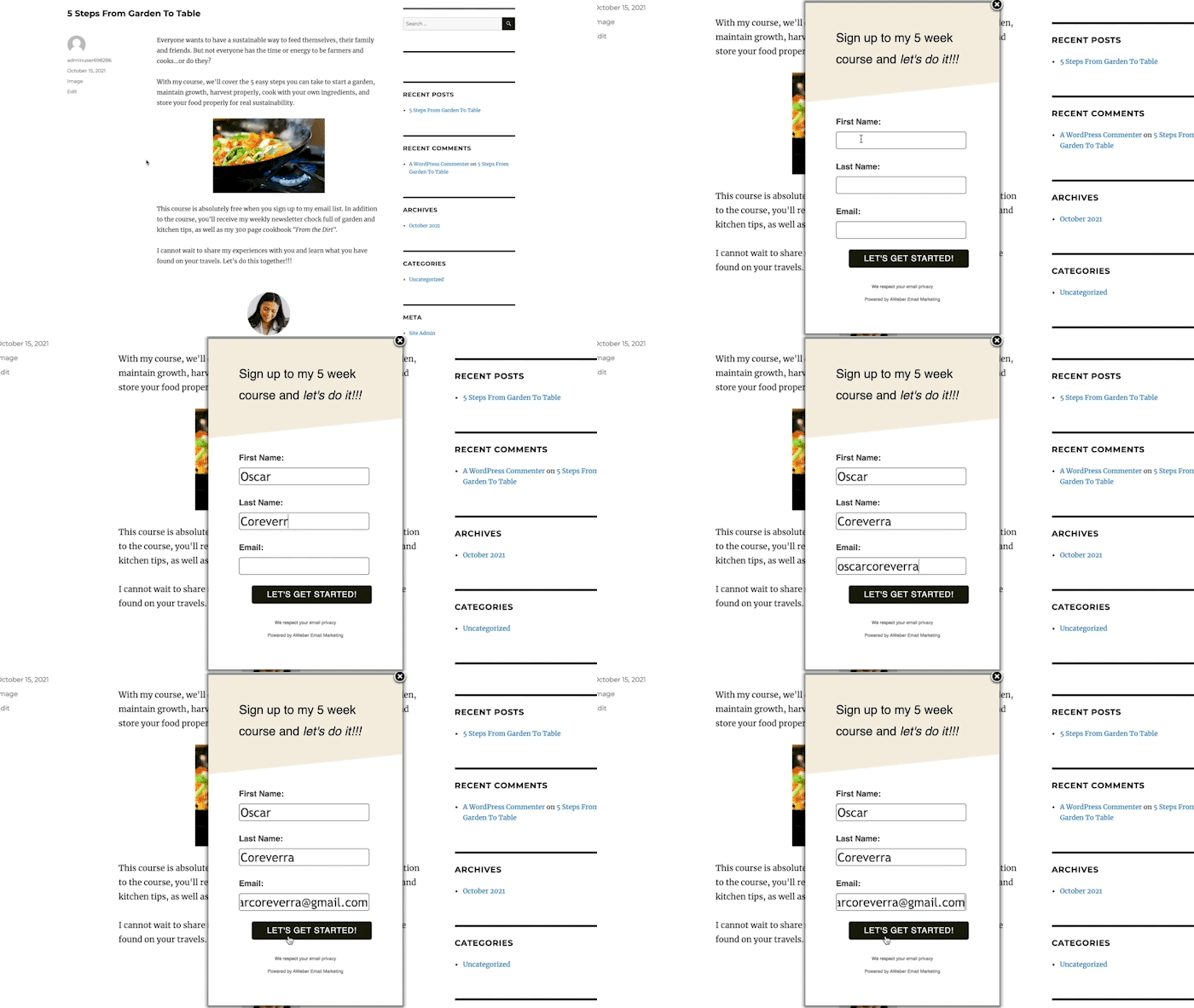
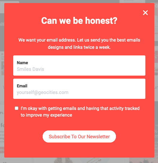
Pop-up Forms: Distinct from inline forms, pop-up forms emerge dynamically during a visitor’s interaction with a website, designed to command immediate attention. These can manifest as overlays that blur the background, slide-ins from various screen edges, or discreet banners. While highly effective at boosting subscriber rates due to their visibility, their implementation requires careful consideration to avoid negatively impacting user experience. Marketers can mitigate potential disruption by adjusting display settings, such as timing and frequency.
Pop-up forms offer several strategic variations:
- Time-Delayed Pop-ups: These forms appear after a predetermined duration, allowing visitors to engage with content before being prompted to subscribe. Optimal delay settings are often informed by web analytics, aligning with average time-on-page metrics. Controls for frequency (e.g., once per visit, every few days) further refine their impact.
- Scroll-Delayed Pop-ups: Triggered when a visitor scrolls to a specific point on a page, these forms capitalize on demonstrated content engagement. Their appearance signifies the visitor’s interest, increasing the likelihood of conversion.
- Exit-Intent Pop-ups: Activated as a user signals intent to leave the website (e.g., moving the mouse cursor towards the browser’s close button), these forms serve as a last-ditch effort to retain a visitor. They are particularly effective for presenting enticing offers to capture otherwise lost opportunities, such as a discount or exclusive content.
- Two-Step Pop-ups: These forms appear only after a user actively clicks a link or button, signifying a higher level of pre-qualified interest. This intentional interaction often translates into significantly higher conversion rates, as the visitor has explicitly opted to receive the offer.
-
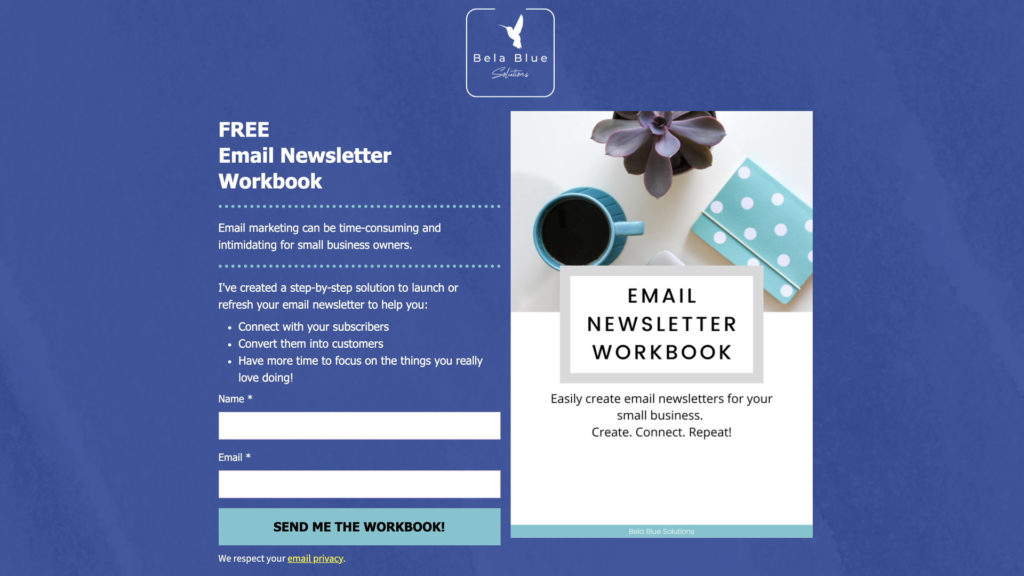
Landing Page Forms: Unlike multi-page websites, dedicated landing pages are hyper-focused on a single objective: capturing subscriber signups. Devoid of navigation bars, menus, or extraneous links, landing pages present visitors with a clear binary choice: subscribe or exit. This singular focus minimizes distractions, allowing for the strategic use of compelling visuals, videos, and persuasive text to amplify the value proposition. Industry benchmarks suggest landing pages with streamlined forms can achieve conversion rates significantly higher than standard website pages due to their focused design.
Strategic Placement: Maximizing Visibility and Relevance
Effective form placement is a nuanced art, balancing visibility with an uninterrupted user experience. The objective is to position forms where they are most noticeable yet feel natural and contextual, aligning with the visitor’s journey and intent.

For inline forms, a ubiquitous presence in the website footer or sidebar ensures that subscription opportunities are always available, regardless of the page a visitor is on. The incentive offered here should possess broad appeal, such as a general discount or a collection of industry best practices. For instance, a study by HubSpot indicated that calls-to-action placed within relevant content can have a 47% higher click-through rate than those in sidebars.
Pop-up forms are strategically deployed on high-traffic areas, most notably the homepage, to maximize initial visitor capture. Web analytics tools, such as Google Analytics, are indispensable for identifying other high-performing pages where tailored pop-ups can offer content-specific incentives. The principle is to present the form at the precise moment a visitor is most receptive to conversion, ensuring the offer is highly relevant to the content being consumed.
Crafting Compelling Copy: The Art of Conversion
Beyond structural considerations, the textual content of a signup form is instrumental in communicating value and persuading visitors to subscribe. Effective copy adheres to several core principles:
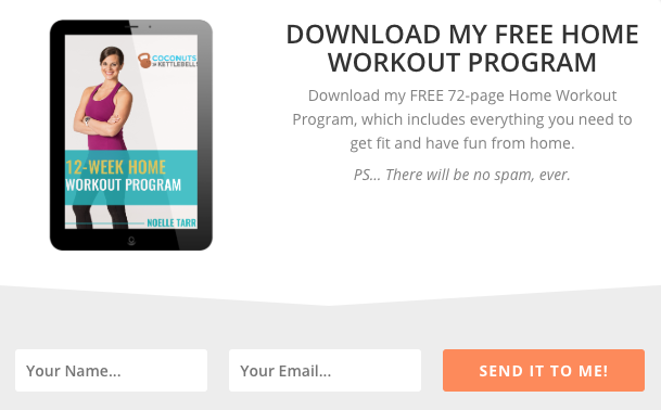
- Clear, Concise Headline: The headline must immediately convey the offer and its benefit to the subscriber. Ambiguity is the enemy of conversion. For example, "Get Your Free 72-Page Home Workout Program" leaves no doubt about what is being offered and how it helps.
- Explicit Value Communication: The space beneath the headline should elaborate on the specific benefits. This means explaining how the offer addresses a pain point, solves a problem, or provides a tangible advantage. Whether through a succinct sentence or a bulleted list, the subscriber needs to understand the transformative outcome of signing up. Stepmom Magazine, for instance, effectively lists the types of content subscribers will gain access to.
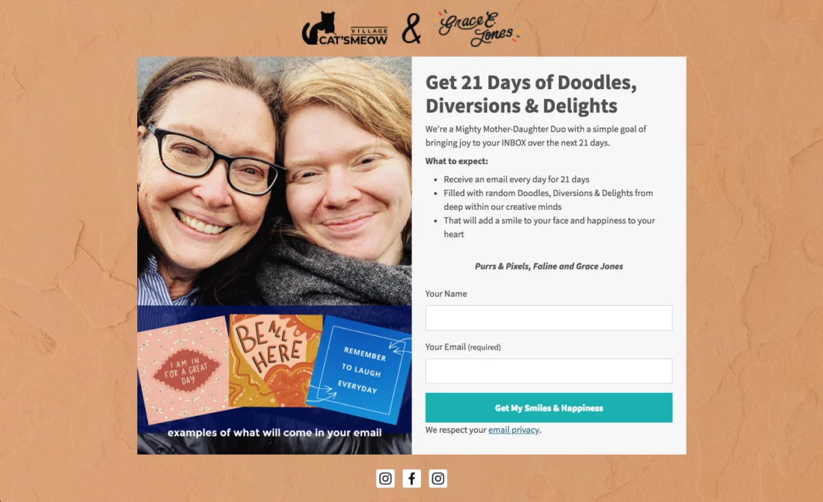
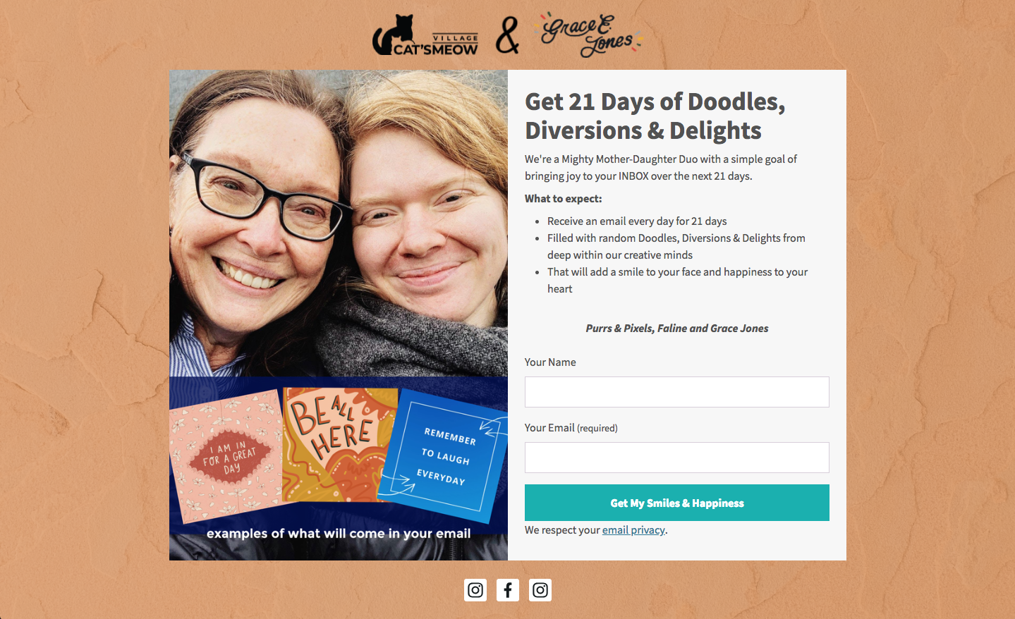
- Setting Clear Expectations: Transparency builds trust. A signup form should clearly outline what subscribers will receive, the frequency of communication, and the nature of the content. This proactive approach not only reduces spam complaints and unsubscribes but also fosters a relationship of trust and helps maintain GDPR compliance. Cat’s Meow Village exemplifies this by specifying "fun, light-hearted emails every day for 21 days."
- Conversational Copy: Employing an informal, engaging tone, such as "Oh hey!" or "Hey you!", can disrupt user expectations and grab attention. This personal touch can draw visitors in, making the value proposition feel more direct and relatable, as seen with Really Good Emails’ approach.
- Creativity, Wit, or Humor: Injecting personality into the copy helps establish rapport and makes the brand more memorable. Humor, in particular, can lower psychological barriers to subscription by making the interaction more enjoyable. How Not to Sail’s use of sailing terminology for its CTA, like "Climb Aboard," cleverly ties into its brand identity, fostering a sense of adventure.
Designing for Impact: Visuals and User Experience
The visual design of an email signup form plays a disproportionately significant role, with research indicating that 90% of a user’s first impression is based solely on visual and color cues. Optimizing design elements is crucial for maximizing conversion potential.
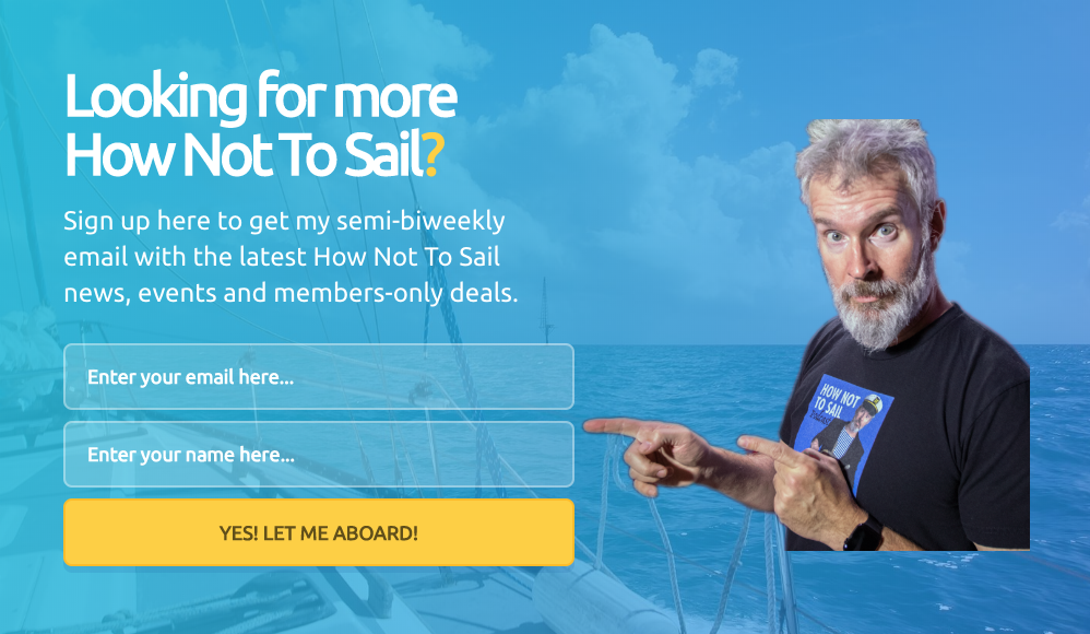
- Minimal Form Fields: Every additional field in a signup form introduces friction, increasing the likelihood of abandonment. For simple list building, collecting only a name and email address is often sufficient. If the goal is lead generation, more data might be necessary, but this decision should be driven by a clear objective. Ann Handley’s form, with just two fields, illustrates this efficiency. Subsequent information can always be gathered through multi-step forms or post-signup surveys.
- Clear Call to Action (CTA): The CTA button should be more than a generic "Sign Up." It should reiterate the offer and compel action. Phrases like "Send me my free guide!" or "Yes, I want in!" leverage urgency and possessive language to increase click-through rates. Paul Kirtley’s "Send me my free training!" exemplifies this personalized, action-oriented approach.
- Typographic Hierarchy: A clear visual hierarchy guides the reader’s eye. Headlines should be the largest text, followed by subheads, and then description text. Limiting font types to one or two, with distinct styles for headlines, enhances readability and professionalism, as demonstrated by FroKnowsPhoto’s use of varied font styles.
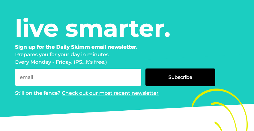
- Controlled Font Colors: Excessive font colors create visual clutter and hinder readability. Sticking to one or two complementary colors ensures clarity and a professional appearance. The Daily Skimm’s minimalist use of white font on a contrasting background is a testament to this principle.
- Strategic Color Contrast: Contrasting colors make the signup form pop against the webpage background, drawing immediate attention. A bright, brand-aligned color can significantly boost form completion rates, as seen in Teach Me To Talk’s vibrant form.
- Visual Incentive Representation: A compelling image or graphic representing the incentive can be the final nudge a visitor needs. Forms featuring relevant visuals tend to receive significantly more engagement. Spoon Graphics effectively uses a fun graphic to represent its offering.
- Subscriber Preference Options: Empowering subscribers to choose their content preferences (e.g., topic, frequency) significantly enhances engagement and personalization. This leads to higher value perception and reduced unsubscribe rates. The Intrepid Guide’s form, allowing topic selection, is a prime example.
- Presenting an Unfavorable Alternative: For dismissible forms like pop-ups, offering an undesirable alternative to subscribing can psychologically nudge visitors towards opting in. Boast’s offer of a discount, contrasted with the option to "pay full price," effectively frames subscription as the advantageous choice.
- Social Proof: Leveraging social proof – showcasing the number of existing subscribers or testimonials – instills confidence and validates the offer. If hundreds of thousands have already subscribed, it signals value and trustworthiness. Nerd Fitness effectively uses this by stating "over 300,000 people" are on their list.
- Large CTA Button: Given that over half of website visits now originate from mobile devices, a large, easily tappable CTA button is crucial for mobile responsiveness and user convenience. Mark Asquith’s prominent "Download Now" button exemplifies this best practice.
- Ample White Space: Strategic use of white space around text, images, and form fields improves readability and creates a clean, professional aesthetic, enhancing trust. 1 Chic Retreat’s form demonstrates how ample spacing allows elements to breathe.
The AI Revolution in Form Creation
Recognizing the complexity and numerous design decisions involved in crafting effective signup forms, advancements in artificial intelligence are now democratizing access to optimized form creation. Platforms like AWeber’s AI signup form builder simplify this process significantly. By providing a brief description of their business, users can leverage AI to generate a complete signup form tailored with brand colors, compelling headlines, relevant descriptions, appropriate input fields, and an optimized layout. A bakery seeking recipe newsletter subscribers will receive a distinct form from a fitness coach promoting a workout plan. This AI-driven approach provides a robust working draft, which users can then refine and personalize, adjusting copy, colors, fields, and button text. Critically, these AI-generated forms seamlessly integrate with existing email lists and automation workflows, ensuring new subscribers are immediately channeled into welcome sequences, streamlining the entire onboarding process. This innovation makes sophisticated marketing tools accessible to businesses without dedicated design or copywriting teams.

Continuous Improvement: Testing and Optimization
The deployment of a signup form is merely the starting point, not the culmination, of an effective list-building strategy. Ongoing testing and optimization are imperative for sustained success. A/B testing (or split testing) allows marketers to compare two versions of a form, isolating variables to determine which elements yield superior performance. This iterative process prevents "form fatigue," where visitors become accustomed to a static design and lose incentive to subscribe. Periodically refreshing forms with new looks, copy, or incentives is crucial.
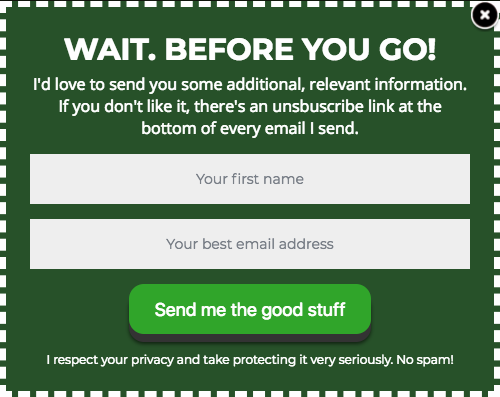
Elements ripe for A/B testing include:
- Headlines and subheadings
- Call-to-action button text and color
- Number of form fields
- Incentive offered (lead magnet)
- Form placement and type (e.g., time-delayed vs. scroll-delayed pop-up)
- Imagery or visual elements
- Overall color scheme and layout
Case Study: Quantifiable Success Through Optimization

A compelling example of the power of optimization comes from AWeber’s own "What to Write in Your Emails" course. Facing feedback indicating divergent preferences for email frequency among subscribers, AWeber implemented a key change: allowing subscribers to choose their preferred email frequency directly on the signup form. This seemingly minor adjustment had profound effects. By enabling personalized delivery through email automation, the initiative led to a remarkable 47% increase in open rates and an astonishing 150% boost in click-through rates. This case study underscores a critical insight, particularly for the 94% of small business owners who craft their own marketing emails: empowering subscribers with control over their experience is one of the highest-impact optimizations achievable for a signup form. It transforms a passive subscription into an active, tailored engagement.
Broader Implications for Digital Business
The meticulous optimization of email signup forms extends far beyond mere subscriber numbers; it profoundly impacts broader digital business health. A robust, engaged email list forms the bedrock of customer relationship management, fostering loyalty, facilitating direct sales, and providing invaluable feedback loops. Conversely, poorly designed or intrusive forms can deter potential customers, damage brand perception, and lead to high bounce rates, representing significant missed opportunities. In an increasingly privacy-conscious world, transparent, value-driven signup forms also build trust and reinforce a brand’s commitment to ethical data practices. Therefore, investing in the strategic design, compelling copy, and continuous optimization of email signup forms is not just a marketing tactic, but a fundamental business imperative for sustainable growth and a thriving digital presence.

 Laily UPN
 Basiran