The strategic application of color in marketing stands as one of the most potent, yet often underestimated, tools available to contemporary marketers. Far from being a mere aesthetic choice, color possesses an inherent power to instantly establish mood, evoke profound emotions, and trigger specific psychological reactions in consumers. Its presence can significantly enhance or diminish the perceived value of an offering, shaping critical first impressions that are often formed in mere milliseconds. Indeed, studies have consistently shown that visual cues, with color being a dominant factor, account for an overwhelming 90 percent of a subscriber’s initial judgment of an email message or website. This immediate, often subconscious, reaction underscores color’s foundational role in digital engagement and brand communication.
This article delves into the intricate mechanisms by which colors impact marketing performance, exploring how to leverage color psychology across various digital touchpoints, including websites, landing pages, sign-up forms, and email campaigns. Understanding these principles is not just a design preference; it is a strategic imperative for brand success.
The Indispensable Role of Color in Consumer Perception
The importance of color psychology in marketing is substantiated by compelling research. A significant 84.7% of surveyed consumers assert that color is a crucial factor in their purchasing decisions. Furthermore, effective color utilization can boost brand recognition by an impressive 80%. Such statistics elevate color from a secondary design element to a primary component of brand identity. Consumers instinctively associate specific colors with their favorite brands, forming a powerful, often emotional, connection. This phenomenon highlights the deep neurological pathways linking visual stimuli to memory and emotion, influencing perception long before conscious thought intervenes.
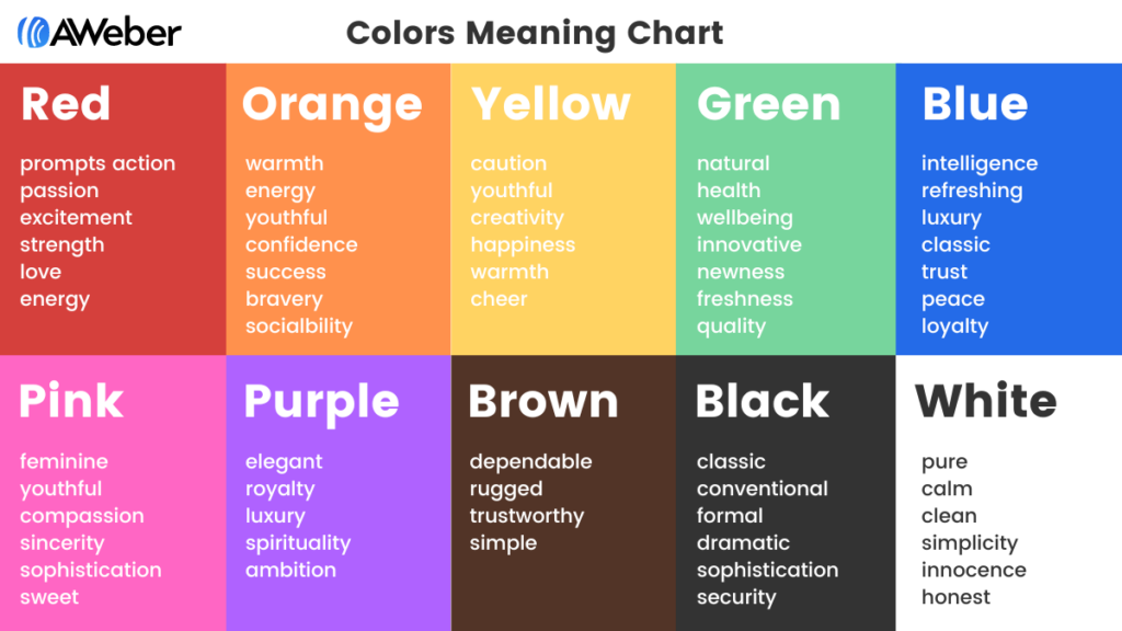
The psychology of color is rooted in a complex interplay of human evolution, cultural conditioning, and individual experience. Certain color associations are nearly universal, such as red signaling danger or passion, possibly due to its association with blood or fire. Green, on the other hand, is often linked to nature, growth, and tranquility. However, cultural nuances can significantly alter these meanings; for instance, white symbolizes purity and new beginnings in Western cultures but can represent mourning in some Eastern traditions. Marketers must therefore navigate these universal and culturally specific meanings to craft resonant messages.
Deconstructing Color Meanings for Marketing Advantage
To effectively harness color psychology, marketers must understand the specific emotional and psychological responses each hue can elicit. This knowledge forms the bedrock of strategic visual communication.
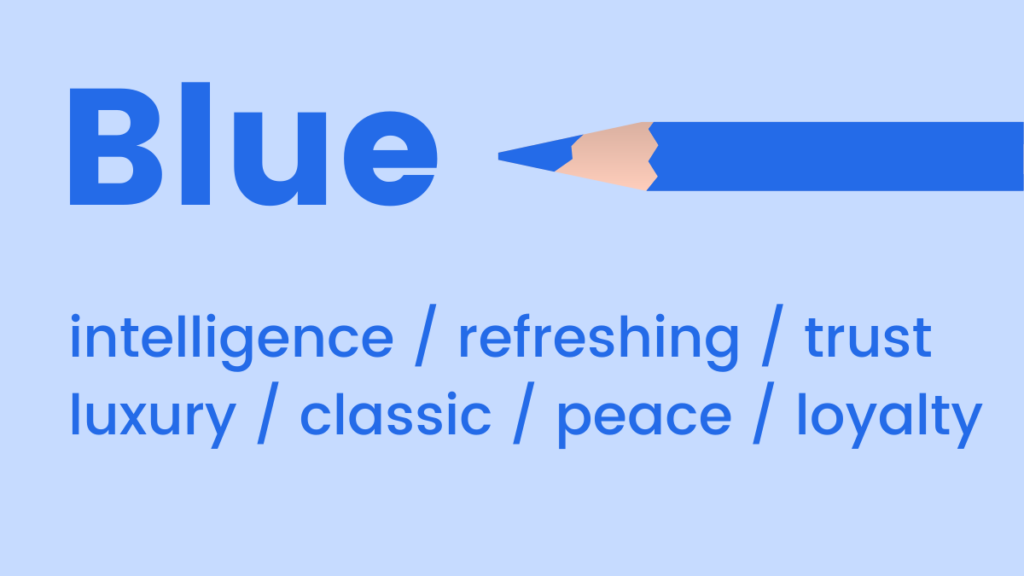
Blue: The Emblem of Trust and Serenity
Blue is widely recognized for its mood-boosting properties, prompting the body to release calming chemicals and fostering a sense of positivity. It evokes feelings of coolness, calmness, and stability. Light blue shades offer a refreshing and approachable feel, often used to signify innovation or cleanliness. Conversely, dark blue conveys a sense of professionalism, authority, and luxury without the stark formality of black. This makes it a popular choice for corporate brands, financial institutions, and tech companies aiming to project reliability and expertise.
When to use blue in marketing:
- Financial Services & Healthcare: To build trust, reliability, and security.
- Technology & Software: To convey innovation, efficiency, and clarity.
- Water-related products/services: To emphasize purity, freshness, and calmness.
- Corporate Branding: For a stable and professional image.
- "Cool" or "Refreshing" products: Such as mints or certain beverages.
Pink: Youthfulness, Sweetness, and Femininity
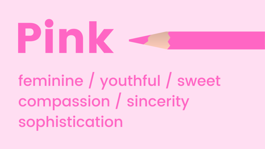
Pink tones are inherently associated with youthfulness, fun, and excitement. It is an excellent choice for emphasizing femininity, sweetness, or nurturing qualities. Interestingly, research suggests pink can even stimulate cravings for sugar, making it highly effective for confectionery or dessert brands. Its versatility ranges from soft, delicate shades that evoke tenderness to vibrant, bold magentas that exude playfulness and modern energy.
When to use pink in marketing:
- Beauty & Fashion (especially feminine products): To convey glamour, gentleness, or trendiness.
- Confectionery & Desserts: To activate sweet cravings and a sense of indulgence.
- Children’s Brands: For a playful and friendly appeal.
- Charities (e.g., breast cancer awareness): To symbolize hope, compassion, and support.
Green: Growth, Health, and Harmony
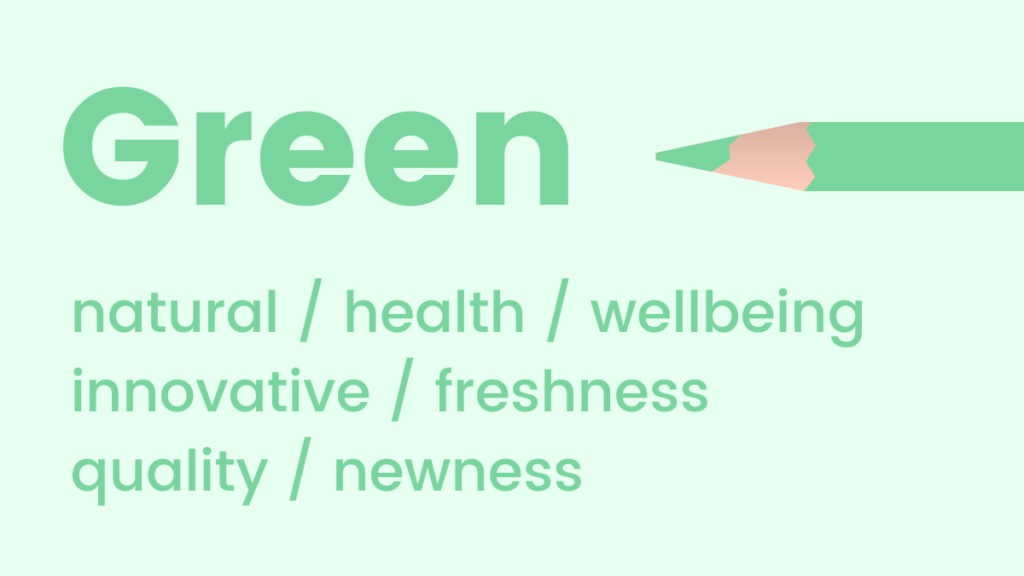
Green tones are deeply reminiscent of natural elements, health, and well-being. It is a soothing choice that promotes feelings of relaxation, harmony, and balance. As the color to which the human eye is most sensitive and can discern the most shades, green is highly versatile and visually comfortable. Its fresh connotations make it ideal for promoting new products, features, or environmentally conscious initiatives. Darker greens can also suggest wealth and tradition, while brighter greens evoke vitality.
When to use green in marketing:
- Environmental & Sustainable Brands: To highlight eco-friendliness and natural ingredients.
- Health & Wellness Products: To suggest vitality, freshness, and organic qualities.
- Financial Institutions: To symbolize growth, prosperity, and stability.
- Outdoor & Adventure Brands: To connect with nature and exploration.
- New Product Launches: To convey freshness and innovation.
Orange: Warmth, Energy, and Optimism
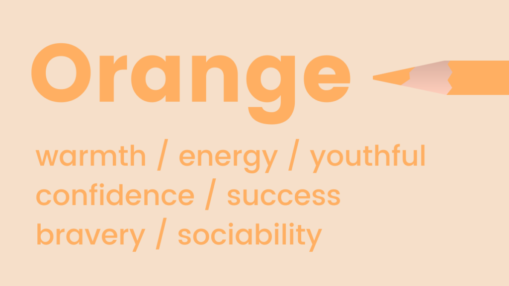
Orange radiates warmth, energy, and enthusiasm. Fun and often flamboyant, it is frequently employed to represent positivity, optimism, and creativity. A compelling psychological aspect of orange is its natural association with trust and safety, perhaps stemming from its visibility in safety equipment or warning signs that are meant to protect. It balances the energy of red with the cheerfulness of yellow, making it approachable yet dynamic.
When to use orange in marketing:
- Creative & Youth-Oriented Brands: To convey excitement, fun, and innovation.
- Call-to-Action Buttons: To draw attention and encourage engagement without being as aggressive as red.
- Food & Beverage Industry: To stimulate appetite and energy.
- Promotional Offers: To create a sense of urgency and value.
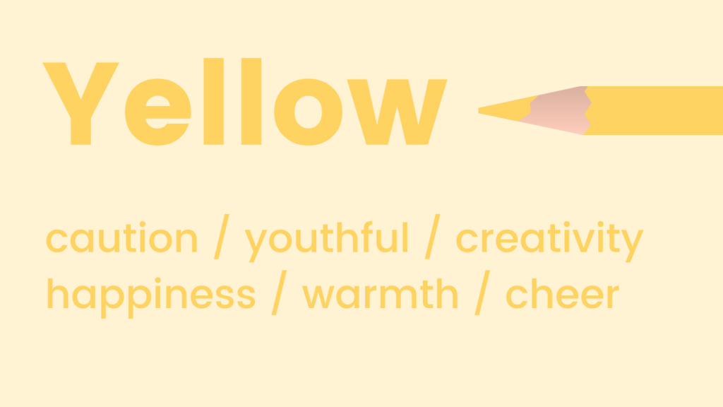
Yellow: Happiness, Optimism, and Mental Stimulation
Like orange, shades of yellow symbolize positivity and optimism; it is widely known as the happiest color in the spectrum. Psychologically, yellow is associated with activating memory, stimulating mental processes, and encouraging communication. While bright yellows can be attention-grabbing and energetic, excessive or overly saturated yellow can sometimes evoke caution or anxiety, making its application require careful balance.
When to use yellow in marketing:
- Children’s Products & Toys: To appeal to joy, playfulness, and imagination.
- Educational Content: To stimulate intellect and curiosity.
- Brands promoting happiness or optimism: Such as travel agencies or leisure services.
- To highlight key information: When used sparingly as an accent color.
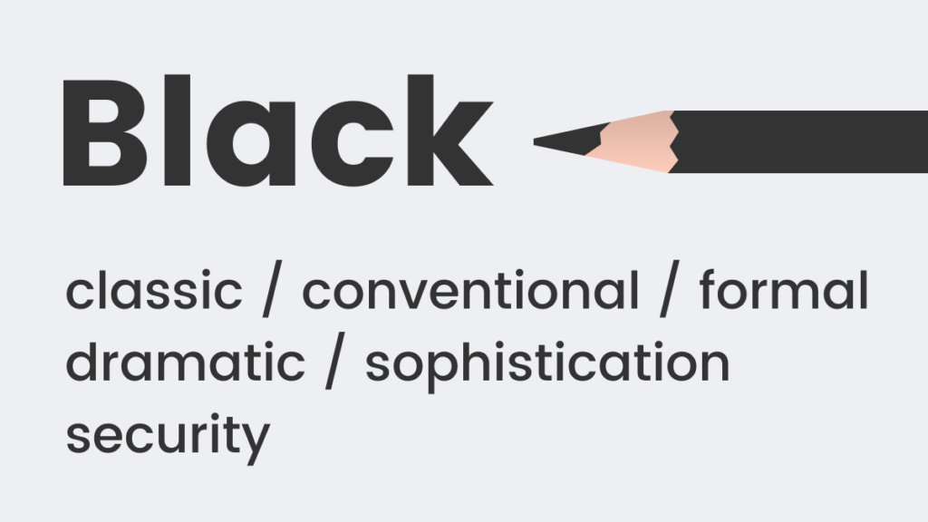
Black: Formality, Luxury, and Power
Black is a timeless and classic color choice that never goes out of style. It is often employed to represent formality, sophistication, and power, as seen in "black-tie" events. Psychologically, black implies weight and substance; for instance, a black box is often perceived as heavier than a white one of the same size. It can convey exclusivity, elegance, and a sense of authority, making it a staple in luxury branding.
When to use black in marketing:
- Luxury Brands: To signify exclusivity, elegance, and high quality.
- Fashion & Automotive: To convey sophistication and power.
- High-End Technology: For a sleek, modern, and premium feel.
- To create strong contrast: In minimalist designs for impact.
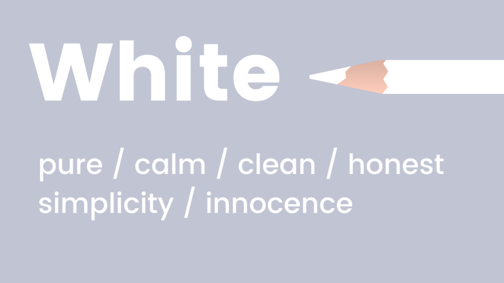
White: Purity, Simplicity, and Modernity
White embodies coolness, calmness, and serenity. It is an excellent choice for brands aiming to project a modern, fresh, and clean image. White space in design is not merely empty; it creates visual breathing room, enhancing readability and emphasizing other elements. It signifies purity, simplicity, and efficiency, making it a foundational color in minimalist aesthetics.
When to use white in marketing:
- Health & Wellness (medical, hygiene products): To convey cleanliness, sterility, and purity.
- Tech Startups & Modern Brands: For a minimalist, sleek, and innovative look.
- Luxury Brands: To highlight product features and create a sense of spaciousness and refinement.
- Backgrounds: To improve readability and focus on content.
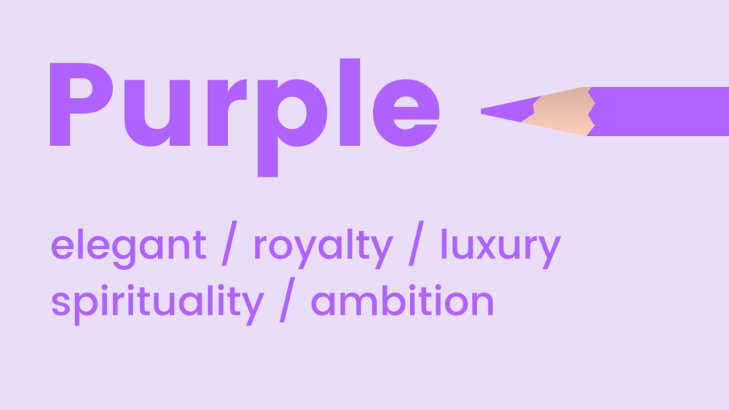
Purple: Royalty, Creativity, and Mysticism
Purple exudes luxury, elegance, and a unique blend of calm and upliftment. Historically associated with royalty due to the rarity and cost of its dyes, it still carries connotations of sophistication and exclusivity. Psychologically, purple is known to encourage creativity, imagination, and introspection. Lighter lavenders can feel whimsical and romantic, while deep purples convey richness and wisdom.
When to use purple in marketing:
- Luxury & High-End Products: To suggest quality, exclusivity, and sophistication.
- Creative Industries: To inspire innovation and imagination.
- Beauty & Wellness (spa services, relaxation products): For a sense of calm and indulgence.
- Youth-oriented brands (lighter shades): To convey fantasy and uniqueness.
Red: Passion, Urgency, and Action
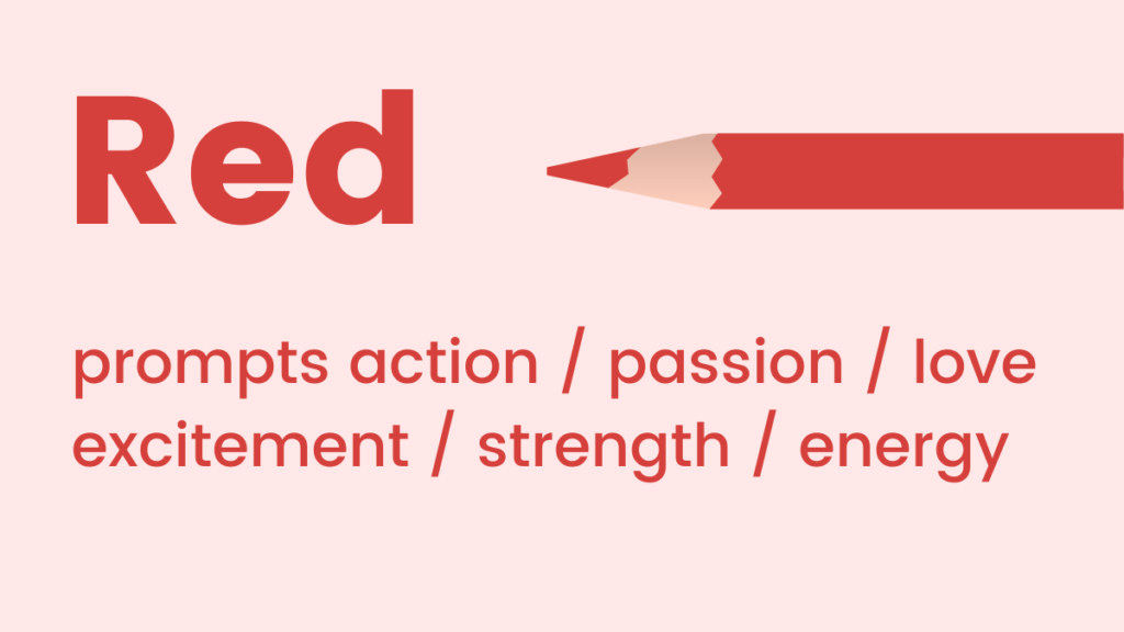
Red tones represent passion, adrenaline, and decisive action. As a high-energy color, it can physiologically boost energy levels and increase heart rate. This makes red an exceptionally effective choice when the objective is to communicate urgency, excitement, or a powerful call to action. However, its intensity means it should be used judiciously to avoid overwhelming the viewer or conveying alarm.
When to use red in marketing:
- Sales & Promotions: To create urgency and highlight discounts.
- Call-to-Action Buttons: To grab immediate attention and drive clicks.
- Food & Beverage (restaurants, fast food): To stimulate appetite and excitement.
- Entertainment & Sports: To convey energy, passion, and dynamism.
- Warning or Alert Messages: To draw critical attention.
Strategic Color Schemes for Websites and Landing Pages
The seamless integration of multiple colors on a website or landing page often poses a challenge for non-designers, leading to confusion and potentially disjointed visual experiences. However, a fundamental understanding of color theory can empower marketers to create harmonious and impactful color combinations that captivate visitors. Among the myriad color theories, analogous and complementary schemes are particularly effective for digital design due to their inherent balance and visual appeal.
Analogous Colors: Harmonious Flow
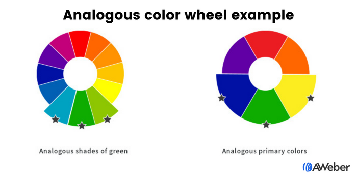
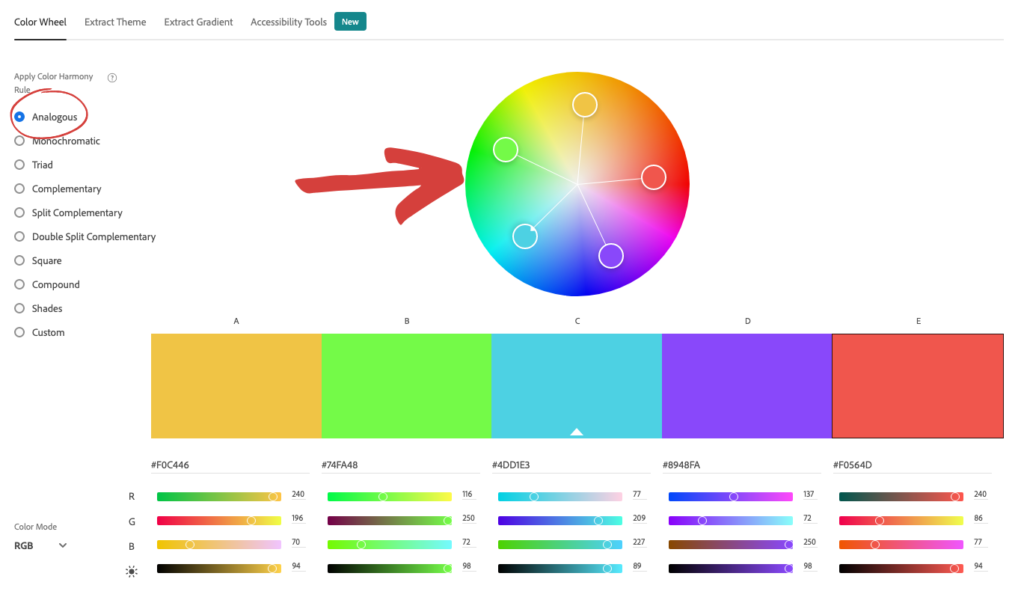
Analogous colors are those situated adjacent to each other on the color wheel. This proximity creates a naturally harmonious and pleasing aesthetic, as these colors typically share a common base hue. For example, a scheme might combine blue, blue-green, and green, or various shades of a single color, such as dark green, medium green, and light green. This approach simplifies the color selection process; once a primary color is chosen, its immediate neighbors on the color wheel provide a ready-made palette that feels cohesive and visually restful. Tools like Adobe Color CC allow designers to easily identify and experiment with analogous color combinations, ensuring a sophisticated and integrated look.
Complementary Colors: Dynamic Contrast
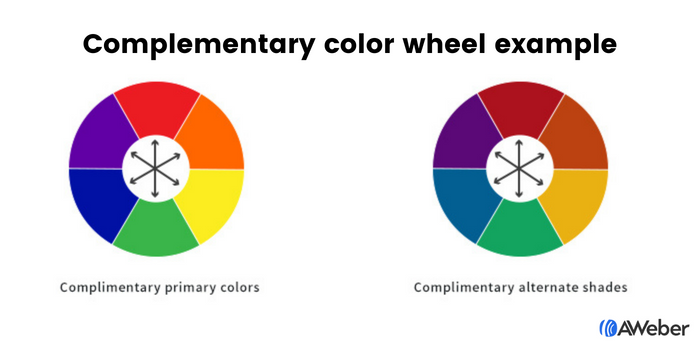
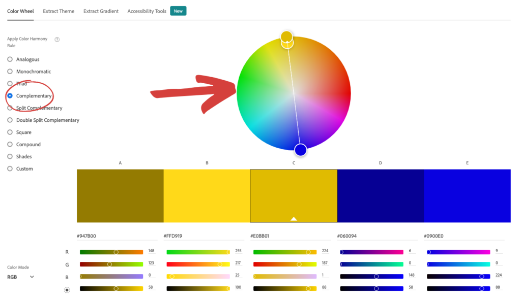
For marketers seeking to inject more vibrancy and visual interest into their digital presence, a complementary color arrangement offers a powerful solution. Complementary colors are positioned directly opposite each other on the color wheel, such as blue and orange, green and red, or purple and yellow. These pairings create high contrast, which can be visually striking and highly effective for drawing attention to specific elements. When balanced correctly, complementary schemes are both visually appealing and dynamic, making elements "pop" and guiding the user’s eye towards key information or calls to action. Adobe Color CC also provides a complementary option, enabling easy exploration of these impactful pairings.
Optimizing Color for Sign-Up Forms
The efficacy of sign-up forms hinges on their visibility and ability to prompt action. Color plays a pivotal role in this, influencing whether a visitor notices and interacts with a form on your site. Applying established color theories, particularly those emphasizing contrast, can significantly enhance form conversion rates.
Analogous Colors in Forms
Using an analogous approach, such as three shades of green or a combination of yellow and green tones, can create a clean, organized, and inviting form. While less forceful than contrasting colors, this harmony can appeal to users seeking a gentle, non-intrusive experience. The subtlety allows the form to blend seamlessly with the overall site aesthetic while still being discernible.
Complementary Colors in Forms
Employing complementary colors, such as purple and yellow, green and red, or blue and orange, can introduce a subtle yet effective visual hierarchy within the form. These pairings create beautiful arrangements that are visually appealing and add a degree of contrast, guiding the user’s focus without overwhelming them.
Contrasting Colors: The Call to Action Amplifier
When the goal is to ensure a sign-up form undeniably captures attention, contrasting colors are paramount. Forms designed with high contrast implicitly communicate, "Look at me!" This principle leverages human visual perception, which is naturally drawn to differences.
- Contrast Between Form and Site: Making the sign-up form’s background a starkly contrasting color to the surrounding website immediately isolates and highlights the form. For example, a bright form against a muted website background will naturally draw the eye, reducing cognitive effort for the user to locate it.
- Contrast Within the Form: Once the form has captured attention, the internal elements—form fields and the call-to-action button—must be equally noticeable. Employing contrasting shades, such as black text on yellow fields with a white button, ensures that each interactive element stands out. This strategic use of contrast within the form itself acts as a direct visual instruction, silently urging visitors to complete the necessary steps. Complementary colors can also be used to create compelling contrast between the button and the form background, making the "click here" message undeniable.
Selecting Colors for Email Campaigns
The choice of colors in marketing emails should be intrinsically linked to the email’s primary objective and the desired emotional response. Different email types warrant distinct color strategies.

- Email Newsletter: Newsletters are primarily designed to deliver information, updates, or educational content. The optimal approach is to use abundant white space with minimal splashes of brand colors. This ensures maximum readability and prevents secondary colors from distracting subscribers from the core content. However, if a key objective is to drive clicks to external content (e.g., blog articles, videos), a strategically placed, high-contrast call-to-action button is essential.
- Welcome Email: As one of the first direct interactions with a new subscriber, welcome emails are crucial for reinforcing brand identity. They should prominently feature brand colors to establish a consistent visual experience and deepen brand recognition.
- Sales Email: Color choices in sales emails should be guided by the specific offer and the desired consumer action. Applying the principles of color psychology discussed earlier, such as using red for urgency or orange for enthusiasm, can significantly influence conversion rates.
Email Color Scheme Examples in Practice:
- Blue: Warby Parker utilizes a pale blue to convey a refreshing, light vibe, while Everlane opts for a dark blue to project a luxurious and sophisticated image, aligning with their brand positioning.
- Pink: Lyft’s welcome emails effectively use shades of pink to foster a friendly and approachable brand image, encouraging new users to engage.
- Green: Offscreen magazine employs a green color palette to promote new products, evoking a sense of relaxation, freshness, and connection to nature.
- Yellow: Lego’s branding heavily features yellow, particularly as a background for product displays in emails, tapping into its association with childhood joy and playfulness.
- Black: Harry’s strategically uses an all-black email design to position their product as classic and sophisticated. The contrasting white call-to-action button ensures that the desired customer action is clearly visible and not lost within the elegant darkness.
- White: The Little White Company’s campaigns exemplify the power of white to portray a calm, pure, and clean brand aesthetic, reflecting their product line.
- Purple: Stuart Weitzman cleverly incorporates its signature purple shoebox in abandoned cart emails, reinforcing its brand as luxe and elegant, even in a recovery message.
Evolving Brand Colors and the Future with AI
The notion that brand colors must remain static is a misconception. Just as individuals evolve, so too should brands. Adapting to market trends, product line expansions, or changing consumer demographics might necessitate the introduction of new colors or subtle shifts in existing palettes. This flexibility is not a deviation but a strategic evolution that can mark a new, more effective era for a business. Online tools like Coolors allow brands to input existing brand colors and intelligently suggest complementary or harmonious new shades, facilitating this evolutionary process.
The advent of Artificial Intelligence is poised to revolutionize how marketers approach color decisions. Platforms like AWeber’s AI Signup Form Builder exemplify this shift, allowing marketers to describe their desired form’s look, feel, and vibe—including specific color requests—and have the AI generate it. This eliminates the need for extensive design knowledge or tedious drag-and-drop processes. By understanding the psychological impact of colors, marketers can provide precise prompts ("a dark background with an orange button that pops" or "blue to build credibility"), enabling AI to translate intent into effective design. Upcoming AI-powered email and landing page builders promise to extend this capability, allowing for the rapid creation of visually compelling content tailored to specific emotional and strategic goals. The principles of color psychology, far from becoming obsolete, will become the intelligent inputs driving the next generation of marketing design.

In conclusion, color is not merely decorative; it is a fundamental element of non-verbal communication that profoundly influences perception, emotion, and behavior. Mastering its psychology and strategic application across digital marketing channels is no longer an optional skill but a critical driver of brand recognition, customer engagement, and ultimately, business success.