

The pricing page represents the most critical juncture in the digital sales funnel for Software-as-a-Service (SaaS) organizations. It serves as the primary gateway where potential customers transition from passive research to active commitment, making it the focal point for feature evaluation, buyer qualification, and final purchase decisions. Recent industry data and expert analysis indicate that the effectiveness of this single page can dictate the revenue trajectory of a firm, yet it remains one of the most misunderstood and poorly optimized components of the modern B2B website.
The Statistical Significance of the Pricing Page
Recent empirical research underscores the disproportionate impact of pricing pages on website performance. According to a comprehensive study by Hockeystack, which analyzed one of the largest datasets in the B2B SaaS sector, pricing pages account for approximately 16.5% of all website traffic. More importantly, these pages exhibit significantly higher engagement levels than general marketing content. While the average sitewide bounce rate for SaaS platforms hovers around 59%, pricing pages maintain a notably lower bounce rate of 39%.
This engagement gap suggests that visitors to the pricing page are deeper in the "intent" phase of the buyer journey. Data from TrustRadius further supports this, revealing that "value for price" is a primary consideration for 66% of all B2B software purchasing decisions. In an era where buyer autonomy is at an all-time high, the pricing page has effectively become a surrogate for the traditional sales representative.

The Evolution of the SaaS Pricing Interface
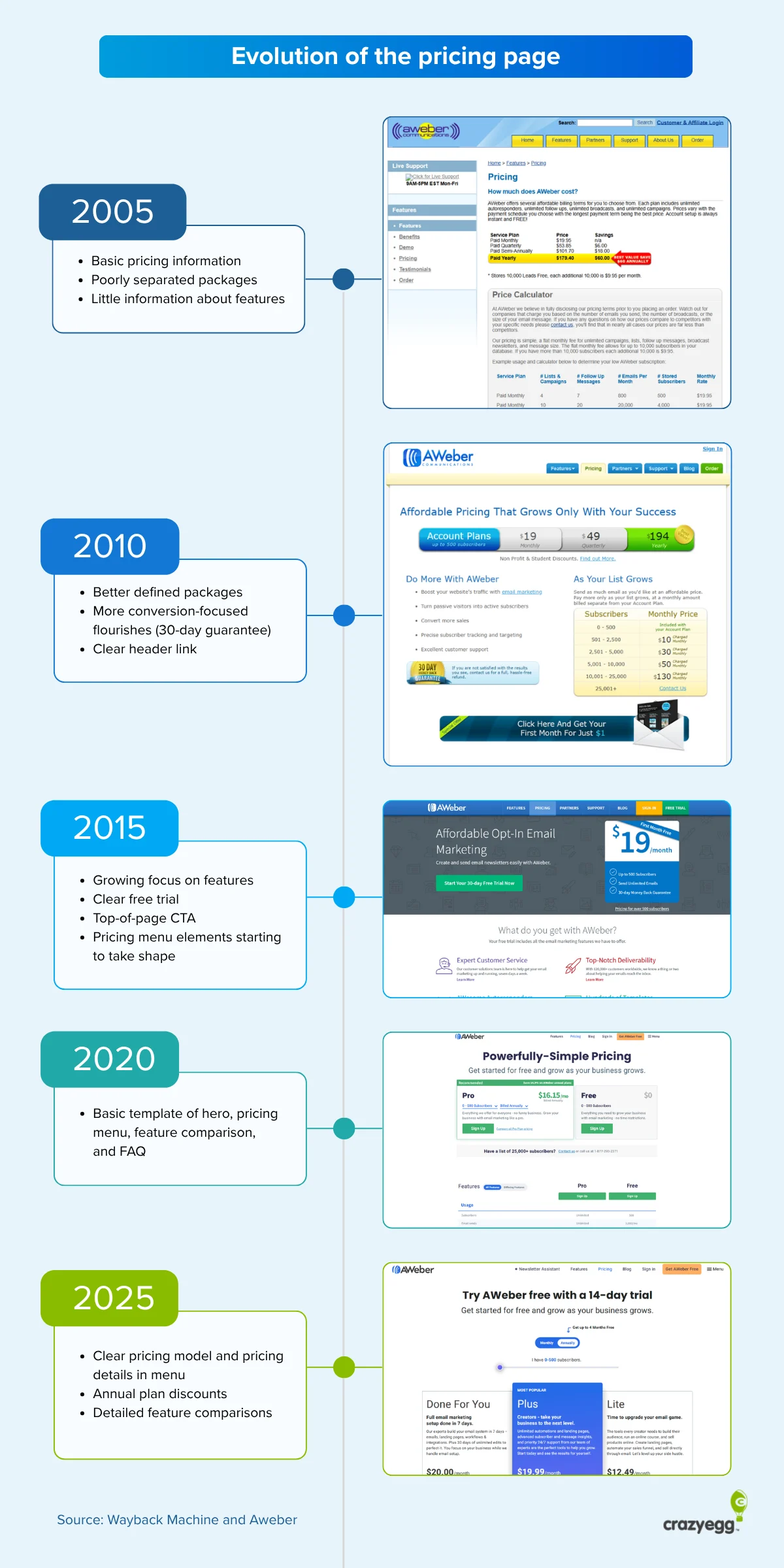
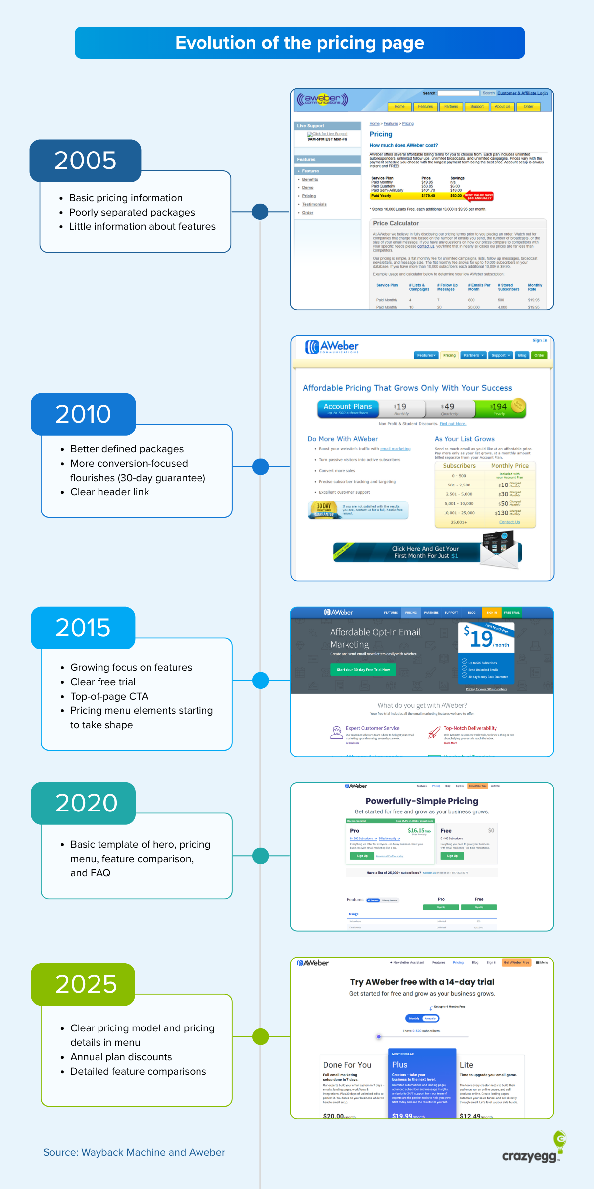
The architecture of the SaaS pricing page has undergone a rigorous evolutionary process over the last two decades. In the early 2010s, many companies experimented with complex, interactive sliders and hidden "Contact Sales" buttons to gate information. However, the modern standard has shifted toward transparency and structured tiering.

Serge Herkül, founder of Potio and former CEO of Toggl, notes that the current industry standard—typically a three-to-four-column layout with a "Good-Better-Best" progression—is the result of millions of A/B tests conducted by industry giants. Deviation from this established visual language often results in cognitive friction for the user. Herkül cites instances where simply changing a navigation link from an innovative phrase like "Go Pro" back to the standard "Pricing" doubled page visits overnight.

A Framework for High-Converting Pricing Architecture
To maximize conversion and ensure clarity, experts suggest a five-pillar framework for pricing page development. This framework prioritizes the "80/20 Rule": 80% of the page should adhere to industry standards to provide familiarity, while 20% should be reserved for brand-specific innovation.
1. The Four-Part Structural Hierarchy
A standard, high-performing pricing page is generally composed of four distinct sections:
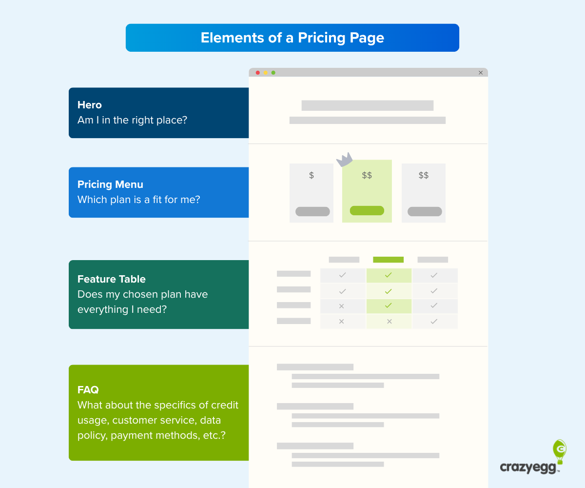
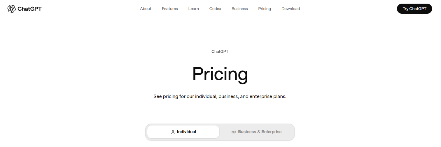
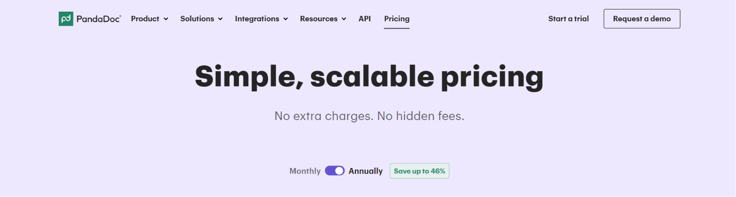
- The Hero Section: This includes the H1 headline and sub-headline. Contrary to popular belief, elaborate marketing copy often performs worse in this section. Analysis suggests that a simple, direct H1 such as "Pricing" or "Plans and Pricing" provides the necessary confirmation that a user has arrived at the correct destination.
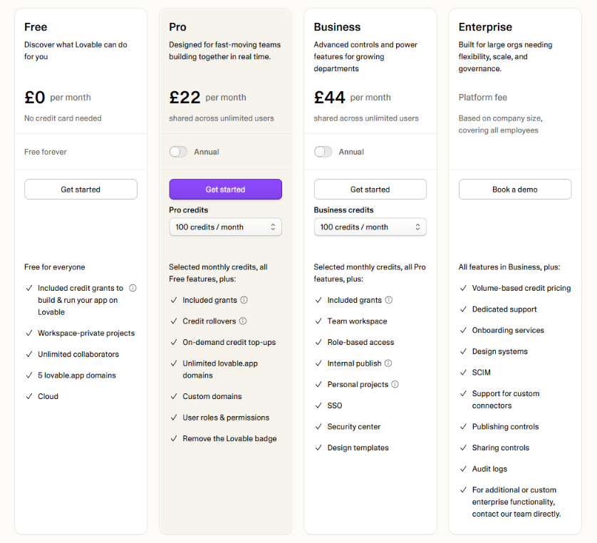
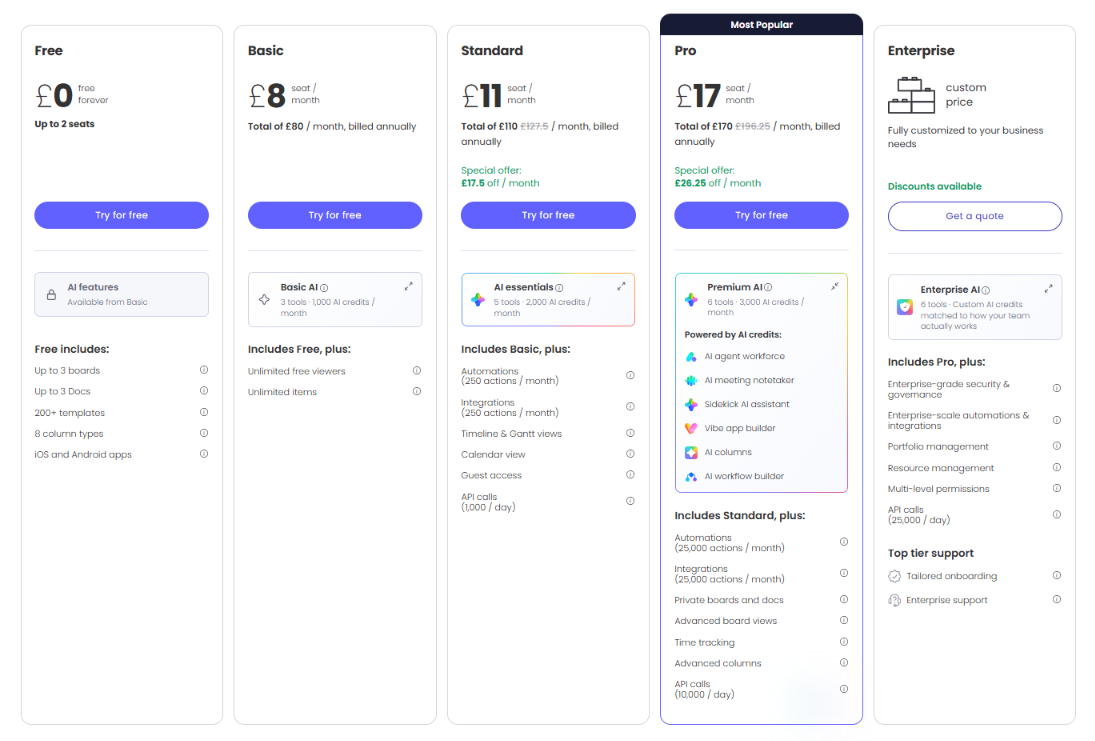
- The Pricing Menu: This is the core area where tiers are defined. Effective menus use descriptive tier names (e.g., Starter, Professional, Enterprise) and include a one-sentence subtitle for each tier to identify the target user (e.g., "For small teams just getting started").
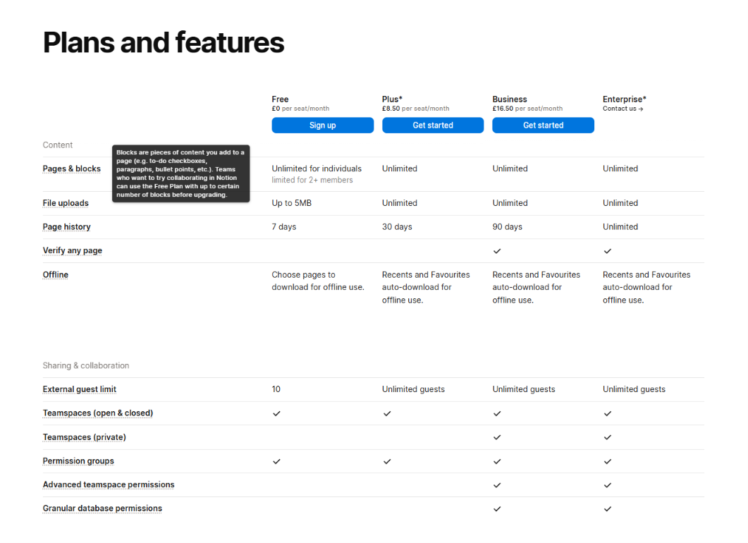
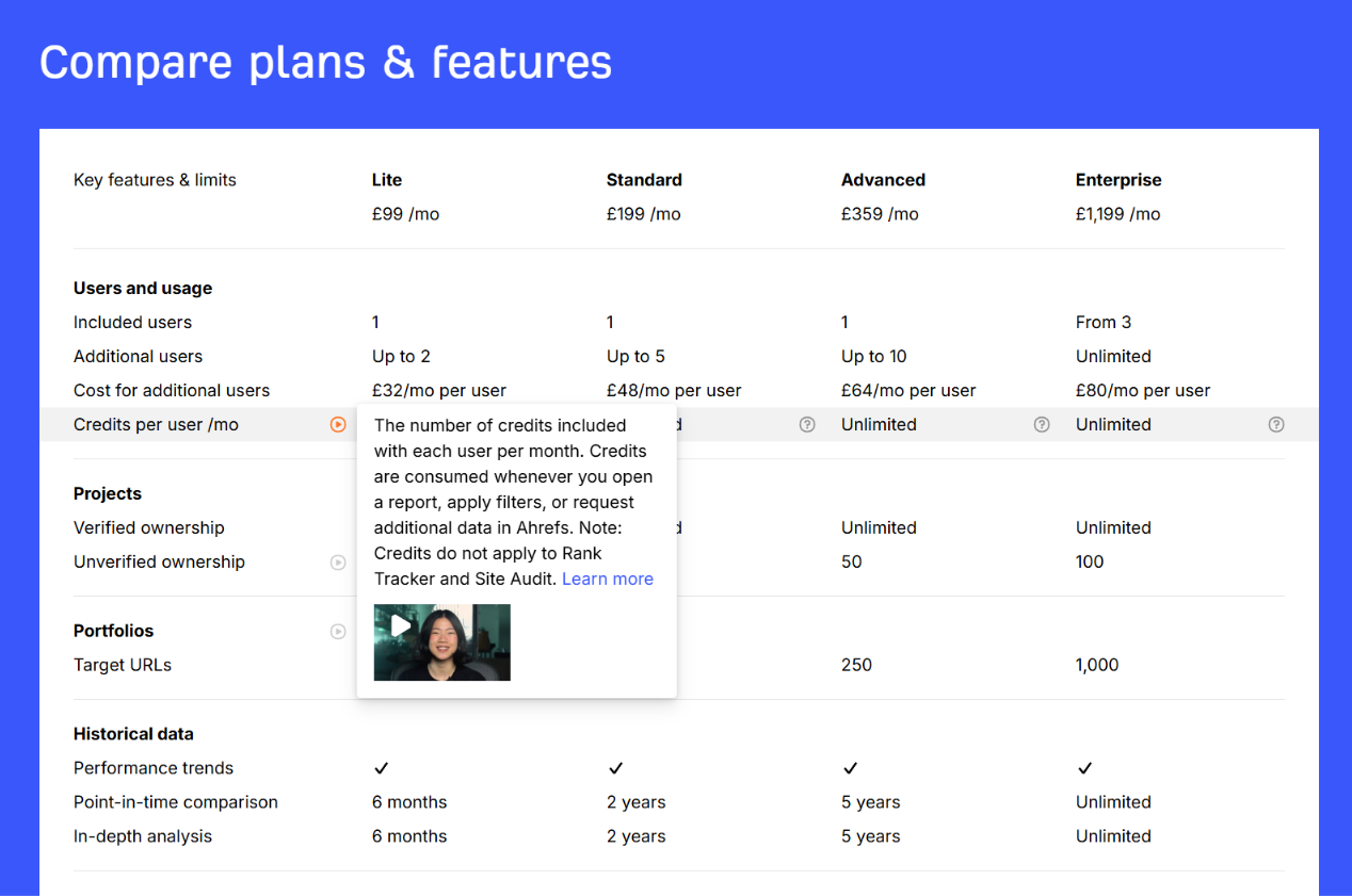
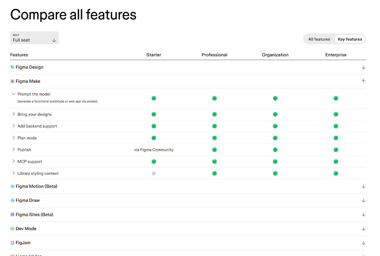
- The Feature Matrix: This comparison table serves as the technical deep-dive. Successful matrices use categories to group features, checkboxes for visual comparison, and tooltips to provide technical context without cluttering the UI.
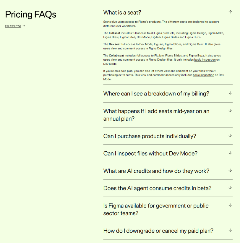
- Frequently Asked Questions (FAQs): This section is designed to mitigate last-minute objections. Rather than using generic questions, high-converting pages use data from support tickets and sales calls to address real friction points regarding billing, seat limits, and refund policies.
2. The 20-Second Rule for Buyer Qualification
A primary metric for pricing page success is the "20-second rule." This principle posits that a qualified buyer should be able to identify which plan is appropriate for their needs within 20 seconds of landing on the page. If the distinction between tiers is unclear, the page is considered to be "doing too much." This clarity is especially vital as companies mature and their pricing models naturally become more complex, incorporating add-ons, credits, and usage-based variables.
3. Strategic Subtraction and Counterintuitive Optimization
Casey Hill, CMO of DoWhatWorks, emphasizes that many of the most successful pricing page optimizations involve removing elements rather than adding them. Having tracked over 14,000 tests, DoWhatWorks found that common "social proof" elements can sometimes backfire.
- Competitor Grids: Including a grid that compares your product to a competitor can unintentionally drive traffic away from your site as users leave to verify the claims.
- Social Proof Overload: While testimonials are generally positive, placing too many logos or badges near the call-to-action (CTA) can create visual noise that distracts from the primary goal: the sign-up.
- CTA Precision: Tests have shown that specific CTAs like "Start Free Trial" or "Buy Now" often outperform softer, ambiguous phrases like "Get Started."
The Rise of AI-Agent Accessibility
One of the most significant shifts in the SaaS landscape is the transition from human-centric navigation to AI-mediated research. Industry reports from Forrester indicate that 94% of B2B buyers now use AI at some point during their evaluation process. Consequently, pricing pages must now be optimized for Large Language Models (LLMs) and autonomous AI agents.
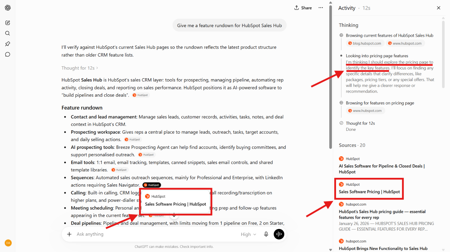
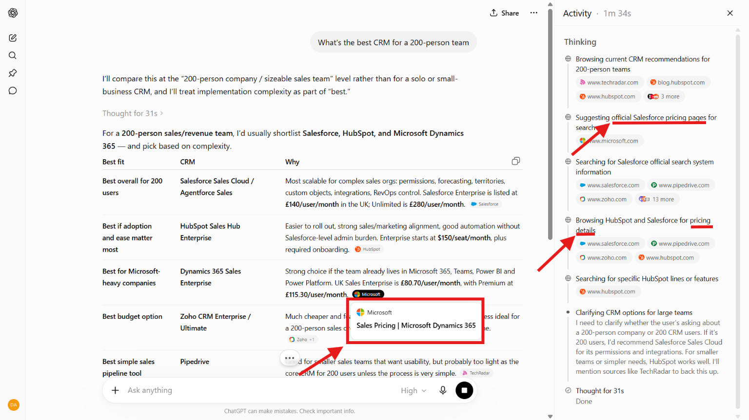
Research from Writesonic and Otterly.ai shows that pricing pages are cited by LLMs more frequently than any other individual page on a SaaS website. Despite making up a tiny fraction of a site’s total content footprint, pricing pages account for approximately 8.8% of GPT-4 and GPT-5 citations for commercial queries. This is because LLMs prioritize structured data and factual tables when answering user prompts about feature sets and budget requirements.
To ensure a pricing page is "agent-friendly," developers are increasingly looking toward protocols like WebMCP. Technical optimization for AI includes using semantic HTML, ensuring clear table headers, and maintaining a consistent pricing "narrative" across the entire site. If the pricing information on a blog post contradicts the pricing page, LLMs may report "hallucinated" or outdated figures to potential buyers.
Broader Implications and Industry Analysis
The implications of pricing page optimization extend beyond simple conversion rates. In the current economic climate, where "Product-Led Growth" (PLG) is becoming the dominant model for SaaS distribution, the pricing page is the primary engine of scale. Krzysztof Szyszkiewicz, a partner at Pricing Engineer and former McKinsey analyst, notes a startling gap in the market: nearly 50% of SaaS companies still do not have a transparent pricing page.
This lack of transparency is increasingly viewed as a competitive disadvantage. Buyers in the 2024 market value "time-to-value" and "ease of purchase" above almost all other factors. By gating pricing behind a "Request a Demo" wall, companies are essentially opting out of the AI-driven research loop and creating a barrier for the modern, autonomous buyer.
Furthermore, the data suggests that companies should decouple pricing model changes from pricing presentation changes. Testing different price points or billing frequencies (revenue testing) is a complex data science task that can lead to churn if handled poorly. Conversely, testing the design, color, and copy of the pricing page (presentation testing) is a low-risk, high-reward strategy that focuses on maximizing sign-ups without altering the underlying business logic.
Chronology of SaaS Pricing Trends
- 2000–2010: The "Subscription 1.0" era. Pricing was largely flat-rate or based on simple user counts. Pages were text-heavy and often required direct sales contact.
- 2011–2018: The "Tiered Growth" era. The three-column "Good-Better-Best" layout became the global standard. Companies began experimenting with "Freemium" models.
- 2019–2023: The "Usage-Based" era. Driven by platforms like Snowflake and AWS, pricing became more granular. Sliders and credit calculators became common on pricing pages.
- 2024–Present: The "AI & Agentic" era. Pricing pages are designed for machine readability. Transparency is mandatory, and the "20-second rule" is the gold standard for UX.
Conclusion
As the SaaS industry continues to mature, the pricing page will remain the most influential piece of digital real estate a company owns. Success in this domain requires a disciplined balance between following established UX standards and preparing for a future where the primary "visitor" to the page may be an AI agent rather than a human. By prioritizing structural clarity, strategic subtraction, and technical accessibility, SaaS organizations can turn their pricing page into a powerful, autonomous revenue generator.







