The email signup form stands as a critical gateway between a casual website visitor and a loyal subscriber, fundamentally influencing the growth and engagement of an email list. In the dynamic landscape of digital marketing, where attention spans are fleeting and competition is fierce, the efficacy of this seemingly simple digital interface can significantly impact a business’s ability to cultivate direct relationships with its audience. The strategic design, compelling copy, and thoughtful placement of these forms are not mere aesthetic choices but pivotal conversion drivers, dictating whether a potential lead takes the crucial step toward subscription or simply moves on. This article delves into the proven methodologies and emerging trends that underpin successful email signup forms, offering a comprehensive guide to their types, optimal placement, persuasive copywriting, effective design principles, and the indispensable role of continuous optimization.

The Evolution of Email List Building: A Strategic Imperative
Email marketing has consistently delivered one of the highest returns on investment (ROI) among digital marketing channels, with industry reports often citing figures of $36-$42 for every $1 spent. This enduring power of email underscores the paramount importance of list building. Historically, signup forms were often rudimentary, consisting of a simple "Enter your email" field at the bottom of a webpage. However, as digital marketing matured, and user experience (UX) became a central focus, the sophistication of these forms evolved dramatically.
In the early 2000s, with the rise of content marketing, businesses recognized the value of offering incentives, or "lead magnets," in exchange for an email address. This shift transformed the signup form from a passive request into an active value exchange. The mid-2010s saw the proliferation of various form types, particularly pop-ups, driven by data demonstrating their higher conversion rates despite initial user resistance. Today, with increased data privacy regulations like GDPR and CCPA, and a heightened consumer awareness of their digital footprint, signup forms must not only be effective but also transparent, compliant, and genuinely value-driven. The journey of a signup form reflects the broader evolution of digital marketing itself: from simple broadcast to personalized engagement, always with the goal of fostering a direct, owned audience channel.
Categorizing Signup Forms: A Strategic Overview
The selection of an appropriate signup form type is a foundational strategic decision, dictated by the specific context of a visitor’s interaction with a website and the desired point of engagement. Each form type serves a distinct purpose, designed to capture attention at different stages of the user journey.
Inline Forms: Seamless Integration
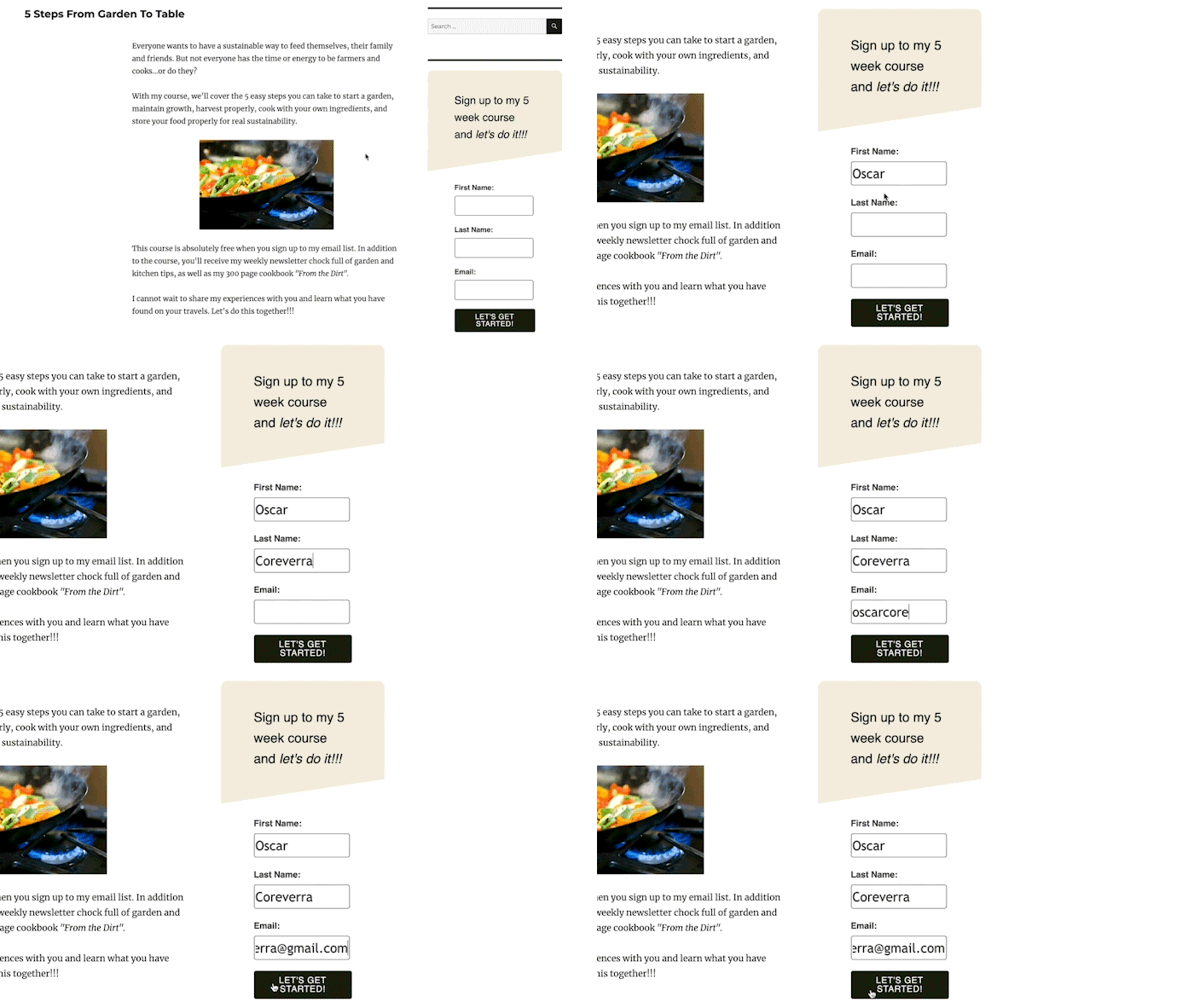
Inline signup forms are intrinsically woven into the fabric of a webpage, appearing as a natural component of the content or layout. They can be strategically positioned at the top of an article, nestled within the sidebar, embedded at the conclusion of a blog post, or integrated into the footer across all pages. Their strength lies in their non-intrusive nature, allowing visitors to discover them organically as they consume content. For instance, an inline form placed within a relevant blog post about "digital marketing tips" could offer a "free digital marketing toolkit," directly aligning with the reader’s immediate interest. Tools like the AWeber for WordPress plugin facilitate easy integration and performance tracking for these forms, making them a staple for consistent, low-friction list growth.
Pop-up Forms: Capturing Attention Dynamically
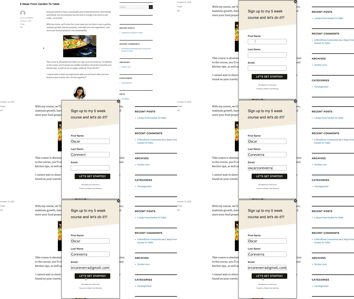
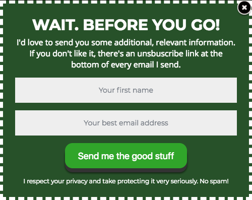
Unlike their embedded counterparts, pop-up forms emerge dynamically, overlaying or sliding into the user’s view at pre-defined junctures during a website visit. Their primary advantage is their ability to command immediate attention, leading to higher subscriber acquisition rates compared to inline forms. However, this attention-grabbing nature necessitates careful deployment to avoid disrupting the user experience. Industry data suggests that pop-ups can increase conversion rates by as much as 10-15% when implemented thoughtfully, but aggressive use can lead to higher bounce rates. Modern pop-up solutions offer granular control over display settings, allowing marketers to mitigate potential disruption.
Pop-up forms come in several strategic variations:
- Time-delayed pop-ups: These forms appear after a visitor has spent a pre-determined amount of time on a page. By waiting, they allow visitors to engage with the content, signaling a level of interest before presenting the subscription offer. Optimal delay times are often informed by average time-on-page analytics.
- Scroll-delayed pop-ups: Triggered when a user scrolls to a specific percentage of a page, these forms capitalize on active content consumption. A user who has scrolled 50% or more of an article is likely invested in the content, making them more receptive to a related offer.
- Exit-intent pop-ups: Perhaps one of the most effective pop-up types, exit-intent forms activate when a visitor’s mouse movement suggests they are about to leave the website. This provides a crucial last opportunity to re-engage, often by presenting an irresistible offer such as a discount, a free resource, or a special subscription bonus, effectively "saving" a potentially lost conversion.
- Two-step pop-ups: These forms are triggered by a user’s intentional action, such as clicking a link or button. Because the visitor actively initiates the pop-up, these forms typically boast very high conversion rates, as they target an already engaged and interested audience.
Landing Page Forms: Singular Focus for Maximum Conversion
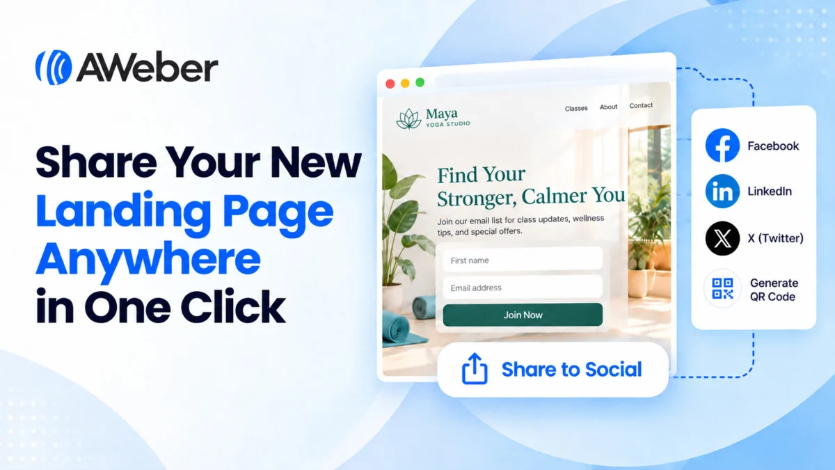
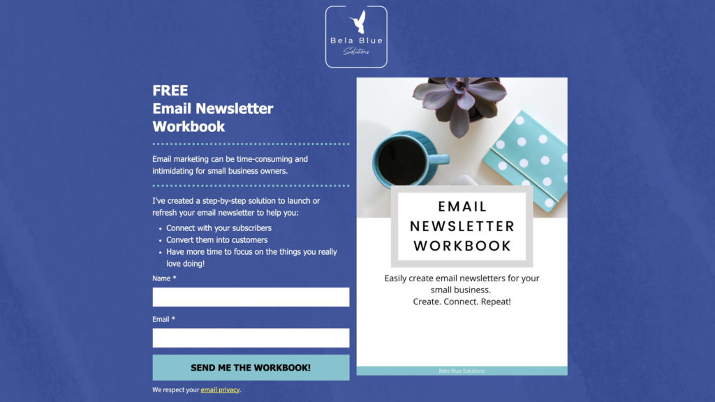
A landing page is a standalone web page designed with a singular, unambiguous objective: to convert visitors into subscribers or leads. Devoid of typical website navigation, menus, or extraneous links, a landing page funnels the visitor’s focus exclusively towards the signup form. This singular focus minimizes distractions, compelling visitors to either subscribe or exit. The effectiveness of landing pages stems from their dedicated persuasive power, leveraging images, videos, testimonials, and compelling text to amplify the value proposition of subscribing. Studies consistently show that dedicated landing pages convert significantly higher than standard website pages for specific campaigns, often exceeding 20-30% conversion rates for well-optimized pages. They are particularly effective for promoting specific lead magnets or campaign-specific offers.
Strategic Placement: Maximizing Visibility Without Intrusiveness
The strategic placement of email signup forms is as crucial as their design and copy. The goal is to identify locations that are highly visible yet feel organic and non-disruptive to the user’s journey. A well-placed form appears at the precise moment a visitor is most receptive to the offer, thereby maximizing conversion potential.
For inline forms, a ubiquitous presence is often beneficial. Placing a general inline form in the footer or sidebar across all website pages ensures that no matter where a visitor navigates, the option to subscribe is readily available. The incentive for such a broad form should be universally appealing, such as a general discount, a newsletter with "latest tips," or updates. For more targeted engagement, inline forms can be placed within specific content that directly relates to the offer, such as a form offering a "checklist for SEO optimization" embedded in an article about SEO.
Pop-up forms, due to their interruptive nature, require more nuanced placement. The homepage, often the first point of contact for many visitors, is a prime location for a general pop-up promoting the main subscription incentive. Beyond the homepage, leveraging website analytics (e.g., Google Analytics) to identify high-traffic pages can pinpoint other optimal locations. A pop-up on a product category page, for instance, could offer a discount on items within that category, making the offer highly relevant and timely. Contextual relevance is key: a pop-up offering a recipe book would be highly effective on a food blog, but out of place on a tech review site. The timing and frequency of pop-up displays should also be carefully managed to prevent "pop-up fatigue" and maintain a positive user experience.

The Art of Persuasion: Crafting High-Converting Copy
The words used on a signup form are powerful conversion tools, tasked with articulating value and compelling action. Effective form copy is clear, concise, and resonant with the target audience.
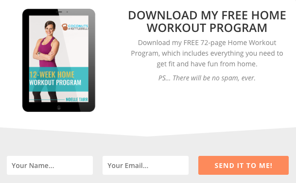
- Use a Clear, Concise Headline: The headline is the first point of contact. It must immediately communicate the core offer and its benefit. Ambiguity is the enemy of conversion. For example, "Unlock Your Free Home Workout Program" immediately informs the visitor what they will receive and how it will benefit them, as seen in examples like Coconuts & Kettlebells. This directness eliminates guesswork and instills confidence.
- Clearly Communicate the Value: Beyond the headline, expand on the tangible benefits. How does this offer solve a problem, fulfill a need, or answer a question? Use brief, impactful sentences or a bulleted list to highlight key takeaways. Stepmom Magazine’s landing page, for instance, uses bullet points to detail the types of content subscribers will receive, painting a clear picture of the value proposition. Research shows that clearly articulated benefits can increase conversion rates by up to 20%.
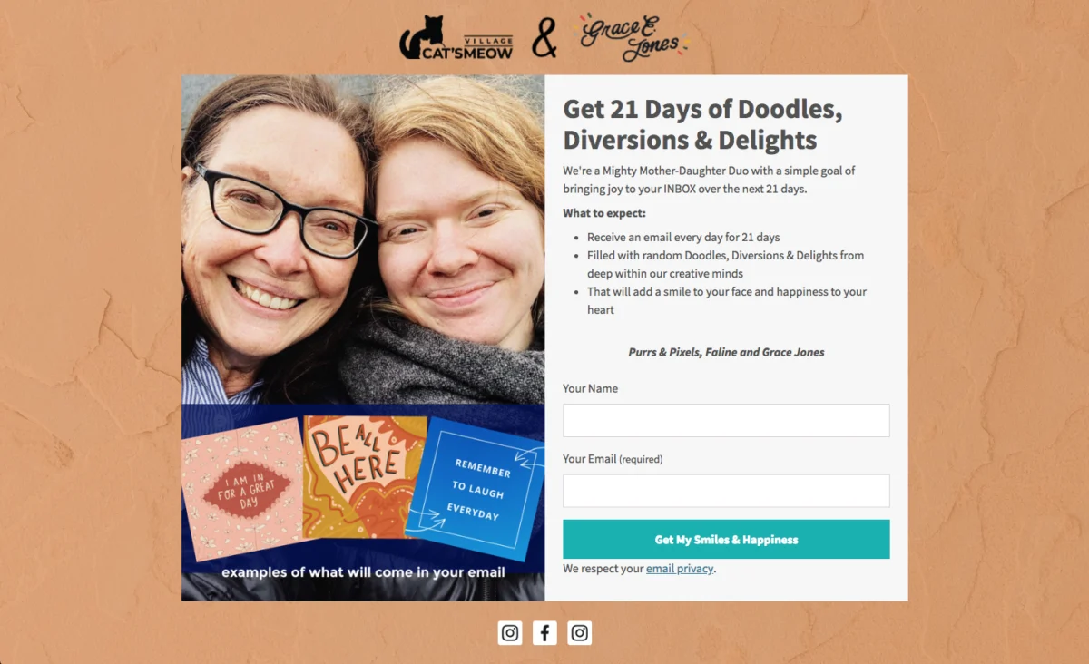
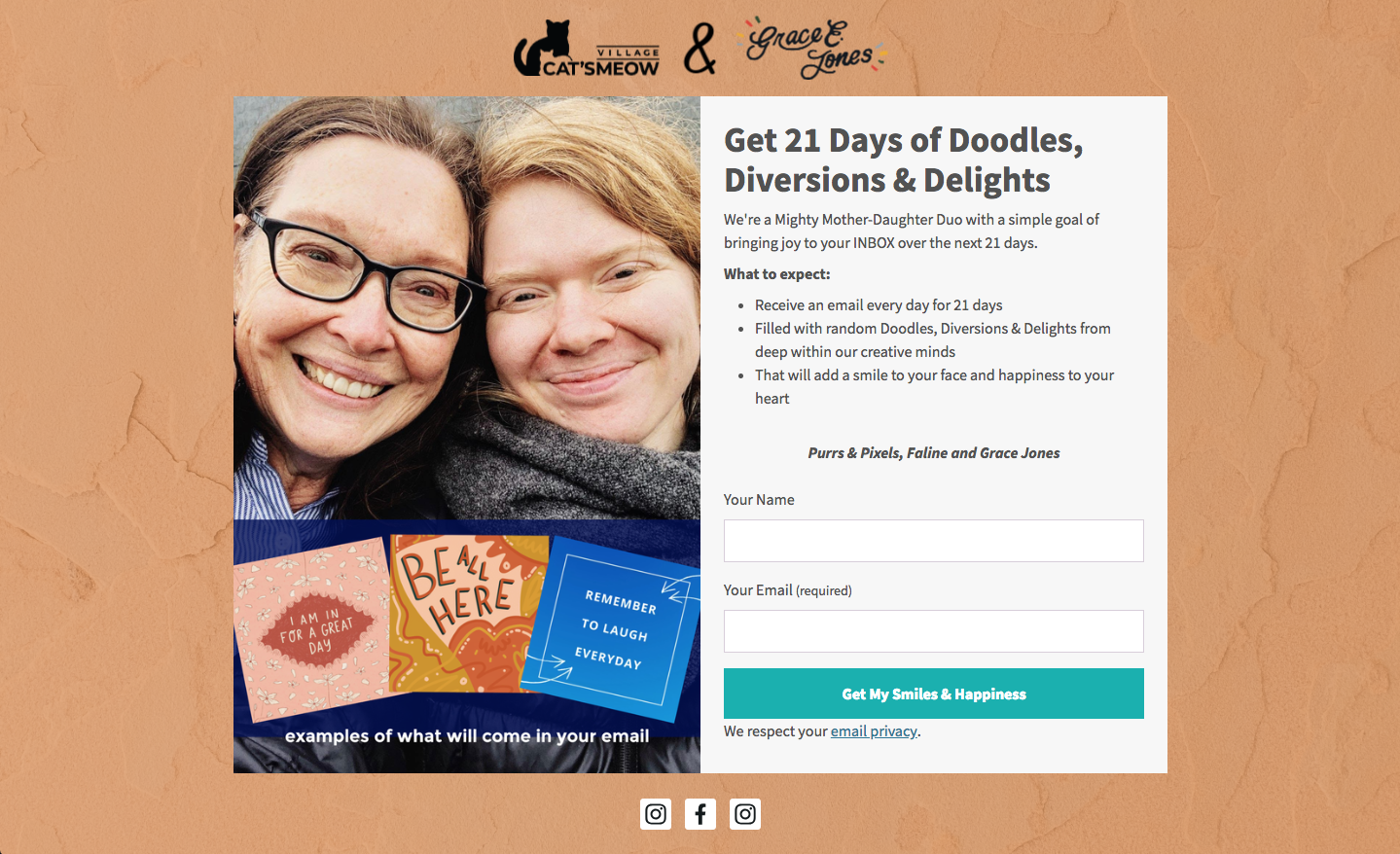
- Set Clear Expectations: Transparency builds trust and reduces unsubscribes. Inform subscribers about the frequency of emails and the type of content they can expect. This also ensures GDPR compliance by obtaining informed consent. Cat’s Meow Village, by explicitly stating "expect fun, light-hearted emails every day for 21 days," manages expectations effectively and sets the stage for a positive subscriber journey.
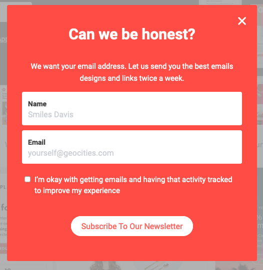
- Write Conversational Copy: Breaking away from formal, sterile language can create a more personal and engaging experience. Phrases like "Oh hey!" or "Hey there!" grab attention by being unexpected and humanizing the interaction. Really Good Emails successfully employs this technique, making the signup feel less like a transaction and more like an invitation.
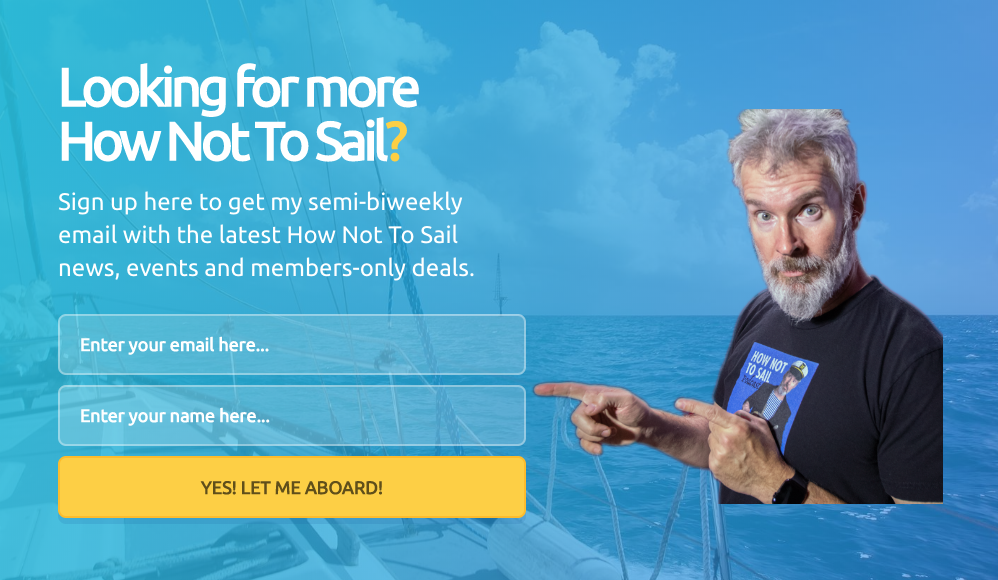
- Be Creative, Witty, or Humorous: Injecting personality into your copy helps build rapport and makes your brand more relatable. Humorous or witty language can make the signup process memorable and enjoyable. How Not to Sail, by using sailing-themed terminology for its CTA, not only ties into its brand identity but also creates a unique and engaging experience for potential subscribers. This approach can foster a stronger emotional connection, leading to higher engagement.
Design for Conversion: Principles of Effective Form Aesthetics
Beyond persuasive words, the visual design of a signup form profoundly influences user perception and conversion rates. The aesthetics of a form communicate professionalism, trustworthiness, and ease of use, all critical factors in a visitor’s decision to subscribe. Studies in cognitive psychology highlight that 90% of first impressions are indeed based on visual cues, underscoring the importance of thoughtful design.
- Keep Form Fields to a Minimum: Every additional field in a form introduces friction, increasing the perceived effort required to complete it. For a basic newsletter subscription, simply asking for an email address (and perhaps a first name for personalization) is often sufficient. Research by HubSpot indicates that reducing the number of form fields from 11 to 4 can increase conversion rates by over 120%. Ann Handley’s minimalist form, with just two fields, exemplifies this principle, streamlining the subscription process. If more data is needed, consider gathering it post-signup through surveys or multi-step forms.
- Use a Clear Call to Action (CTA): The CTA button is the ultimate prompt for action. Generic buttons like "Sign Up" are often less effective than those that reiterate the specific benefit or action. Instead of "Subscribe," a button could say "Send me my free guide!" or "Yes, I want exclusive tips!" Personal and possessive language ("My," "Me") often increases click-through rates, as it connects the action directly to the subscriber’s benefit. Paul Kirtley’s form uses possessive language, making the CTA more engaging and relevant.
- Follow a Hierarchy for Font Sizes and Types: A clear typographic hierarchy guides the eye, emphasizing the most important information first. The headline should be the largest, followed by subheadings, and then descriptive text. Stick to one or two complementary font types to maintain visual consistency and professionalism. FroKnowsPhoto demonstrates effective hierarchy, using varying font sizes and styles (bold, italicized) to create visual interest and readability.
- Stick to 1-2 Font Colors: Overuse of colors can be distracting and make a form appear cluttered or unprofessional. A limited palette enhances readability and reinforces brand identity. The Daily Skimm’s form, using a single font color, illustrates how simplicity can be highly effective.
- Create Color Contrast: Strategic use of contrasting colors helps the signup form stand out from the rest of the webpage, drawing immediate attention. A bright, brand-aligned color for the form or its CTA button against a neutral background can significantly increase visibility and completion rates. Teach Me To Talk effectively uses contrasting colors to highlight its offer and form.
- Visually Represent Your Incentive: A compelling visual can be the extra nudge a visitor needs to subscribe. Images or graphics that represent the lead magnet (e.g., an e-book cover, a preview of a template) make the offer more tangible and appealing. Forms with relevant visuals often receive more engagement. Spoon Graphics, for example, uses a creative graphic to represent its incentive, making the offer more attractive.
- Let Subscribers Choose Their Preferences: Offering personalization options, such as topic preferences or email frequency, empowers subscribers and increases engagement. When users feel they have control over the content they receive, they are more likely to find value and remain subscribed. The Intrepid Guide’s form allows subscribers to select their interests, leading to a more tailored and engaging email experience. This approach aligns with the growing demand for personalized digital interactions.
- Try Presenting an Unfavorable Alternative: This psychological tactic is particularly effective for pop-up forms. By framing the option to decline as an undesirable outcome, it subtly encourages subscription. Boast’s form, offering a discount upon signup, presents the alternative as "No thanks, I prefer paying full price." This makes the act of subscribing the clear, logical choice.
- Use Social Proof: Humans are inherently influenced by the actions of others. Displaying social proof, such as the number of existing subscribers, testimonials, or trust badges, builds confidence and validates the value of your offer. Nerd Fitness effectively uses social proof by stating "Join over 300,000 people," reassuring potential subscribers of the content’s perceived value and popularity.
- Use a Big CTA Button: With over half of global website traffic originating from mobile devices, a large, easily tappable CTA button is a necessity for optimal mobile user experience. Mark Asquith’s form features a prominent "Download Now" button, ensuring accessibility and ease of use across all devices.
- Use Plenty of White Space: White space, or negative space, around text, images, and form fields enhances readability, reduces cognitive load, and gives the form a clean, professional appearance. A cluttered form can feel overwhelming and deter completion. 1 Chic Retreat’s form demonstrates how ample white space improves visual flow and user comfort.
The Dawn of AI in Form Creation
The complexity of balancing compelling copy, strategic placement, and effective design can be daunting for many businesses, particularly those without dedicated marketing teams. This challenge has paved the way for artificial intelligence (AI) to revolutionize signup form creation. Platforms like AWeber’s AI signup form builder are now capable of generating complete, brand-aligned forms based on a simple textual description of a business.
This AI-driven approach streamlines the entire design process, automatically selecting brand colors, crafting headlines and description copy, suggesting relevant input fields, and designing an optimal layout. For instance, an AI might generate a vibrant, image-rich form with a "Get Weekly Recipes" CTA for a bakery, while designing a more minimalist, benefit-driven form with "Download Your Free Workout Plan" for a fitness coach. This significantly reduces the time and expertise required to create high-converting forms. While AI provides a robust working draft, it also maintains full editability, allowing users to fine-tune every element to match their precise needs and brand voice. Furthermore, these AI-generated forms seamlessly integrate with email marketing automation workflows, ensuring that new subscribers are immediately channeled into welcome sequences, further enhancing efficiency. The rise of AI in form building marks a significant step towards democratizing sophisticated marketing tools, making advanced conversion strategies accessible to a broader range of businesses.
Continuous Improvement: The Imperative of Testing and Optimization
Launching a signup form is merely the initial step; its true potential is realized through continuous testing and optimization. The digital landscape is fluid, and audience preferences evolve, necessitating a dynamic approach to form performance. A/B testing, or split testing, is an indispensable tool in this process, allowing marketers to compare two versions of a form to determine which elements yield superior results.
Virtually every aspect of a signup form can be tested:
- Headlines and Body Copy: Different value propositions or emotional appeals.
- Call to Action (CTA) Text: Variations like "Get My Free Guide" vs. "Download Now."
- Form Field Count: Testing two fields vs. three, or optional vs. mandatory fields.
- Visuals: Different images or the absence of visuals.
- Color Schemes: Background, text, and button colors.
- Placement: Top of page vs. bottom, sidebar vs. content middle.
- Pop-up Triggers: Time delay, scroll depth, or exit intent.
- Incentives: Comparing the effectiveness of different lead magnets or discounts.
Periodic updates, even if minor, are crucial to prevent "form fatigue," where repeat visitors become desensitized to a static form. Fresh designs and updated copy can re-capture attention and drive new conversions. Regular analysis of form analytics, including conversion rates, bounce rates, and completion times, provides valuable insights for iterative improvements.
Real-World Impact: A Case Study in Engagement
The power of thoughtful optimization is vividly illustrated by AWeber’s experience with their "What to Write in Your Emails" course. Initially, feedback from subscribers revealed a dichotomy: some desired more frequent content, while others preferred a less intense delivery schedule. Recognizing this diverse preference, AWeber implemented a crucial change: allowing subscribers to choose their preferred email frequency directly on the signup form.

This simple yet profound modification, empowering subscribers with control over their experience, yielded remarkable results. The open rates for the course emails increased by an impressive 47%, while click-through rates surged by 150%. This case study underscores a vital principle: personalization and subscriber empowerment are potent drivers of engagement. For the 94% of small business owners who craft their own marketing emails, as identified by AWeber’s research, offering frequency choice represents a high-impact, actionable strategy to significantly boost email marketing performance. It demonstrates that meeting subscribers on their terms, even in seemingly minor ways, can lead to substantial improvements in how they interact with content.
Ethical Considerations and Future Trends
As email marketing continues to evolve, ethical considerations and user trust are becoming increasingly paramount. Compliance with data privacy regulations like GDPR in Europe and CCPA in California mandates transparent data collection practices and explicit consent. Signup forms must clearly state what data is being collected, how it will be used, and allow users to easily understand and manage their preferences. This often means including links to privacy policies and making consent checkboxes clear and opt-in by default. The era of deceptive or overly aggressive tactics is giving way to one of transparency and respect for user autonomy.
Looking ahead, the future of email signup forms will likely be characterized by even greater personalization, AI-driven optimization, and seamless integration with broader customer relationship management (CRM) systems. Predictive analytics could enable forms to dynamically adjust their offers or design based on individual visitor behavior and demographics, further enhancing conversion rates. Voice search and conversational interfaces may also influence how users interact with signup prompts, potentially leading to voice-activated subscription processes. The trend towards hyper-personalization, driven by advanced AI and machine learning, will ensure that signup forms are not just data collection tools, but intelligent gateways designed to initiate long-term, valuable customer relationships.
In conclusion, the email signup form, far from being a static element, is a sophisticated instrument central to digital marketing success. By meticulously considering its type, placement, copy, and design, and by embracing continuous testing and emerging AI technologies, businesses can transform a simple form into a powerful engine for subscriber growth and sustained engagement. In an increasingly competitive digital landscape, mastering the art and science of the signup form is not merely advantageous; it is essential for building a resilient and thriving online presence.