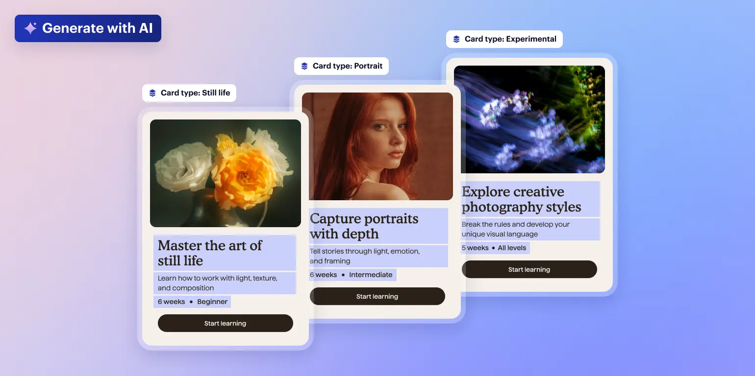

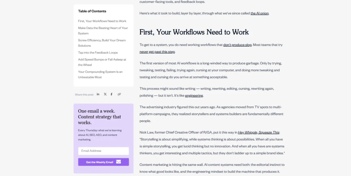
In the contemporary digital landscape, the architectural layout of a website serves as the primary conduit for user engagement and information retention. Among the most enduring yet debated elements of this architecture is the website sidebar—a vertical column situated to the left or right of the primary content area. Historically utilized as a repository for secondary information, the modern sidebar has evolved into a sophisticated tool for navigation, conversion, and brand storytelling. As digital consumption patterns shift toward mobile-first experiences, the strategic implementation of sidebars requires a nuanced understanding of user psychology, data-driven design, and technical optimization.

The Evolution of the Sidebar: A Chronological Overview
The history of the website sidebar is intrinsically linked to the broader evolution of web design and display technology. In the late 1990s and early 2000s, the era of "framesets" dominated the internet. Sidebars were often hard-coded frames that remained static while the main content refreshed, a practice that eventually fell out of favor due to search engine optimization (SEO) limitations and accessibility issues.

By the mid-2000s, the rise of Content Management Systems (CMS) like WordPress introduced the "widgetized" sidebar. This era marked a shift toward user-friendly customization, allowing non-developers to drag and drop elements such as archives, categories, and blogrolls. However, this often led to "sidebar clutter," where excessive widgets distracted users from the primary content.
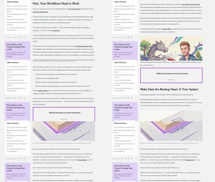
The 2010s brought the "Responsive Design Revolution." As mobile traffic surpassed desktop, designers were forced to reconsider the sidebar’s utility. This led to the development of the "hamburger menu" and the practice of stacking sidebar content beneath the main article on smaller screens. Today, in the 2020s, the sidebar has been refined into a minimalist, often "sticky" element that prioritizes high-value actions and essential navigation, guided by sophisticated tracking tools like heatmaps and session recordings.
Categorization and Functional Utility
Modern web architecture recognizes four primary iterations of the sidebar, each serving a specific psychological and functional purpose:

- Static Sidebars: These remain fixed at the top of the page. As the user scrolls down the main content, the sidebar eventually disappears from view. These are most effective for short-form content where the primary goal is to provide an initial set of options before the user dives into the text.
- Sticky Sidebars: Utilizing CSS "sticky" positioning, these elements remain pinned within the viewport as the user scrolls. Industry data suggests that sticky elements, particularly Call-to-Action (CTA) buttons, can significantly increase conversion rates. For instance, e-commerce testing has shown that sticky "Add to Cart" or "Compare" buttons can boost completed orders by nearly 8%.
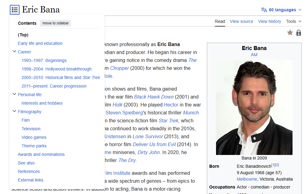
- Left-Rail Sidebars: In Western cultures, where reading patterns follow an "F-shape" from left to right, the left rail is the highest-value real estate. It is typically reserved for primary navigation or critical documentation indices.
- Right-Rail Sidebars: These are generally perceived as secondary. They are ideal for supplementary content such as author biographies, related articles, or social proof, as they do not interrupt the natural flow of reading the primary text.
The Three Pillars of Sidebar Content
To maximize the efficacy of a sidebar, designers must categorize elements into three functional pillars: navigation, conversion, and support.

Navigational Elements
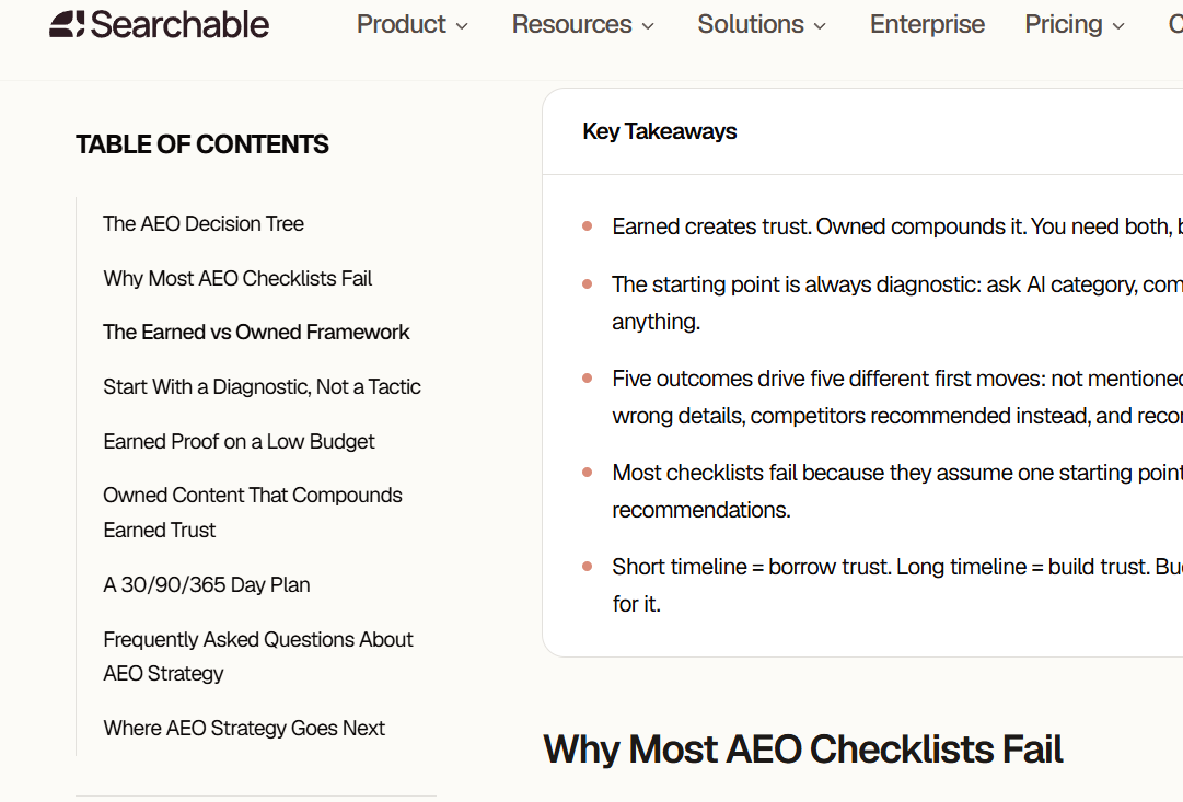
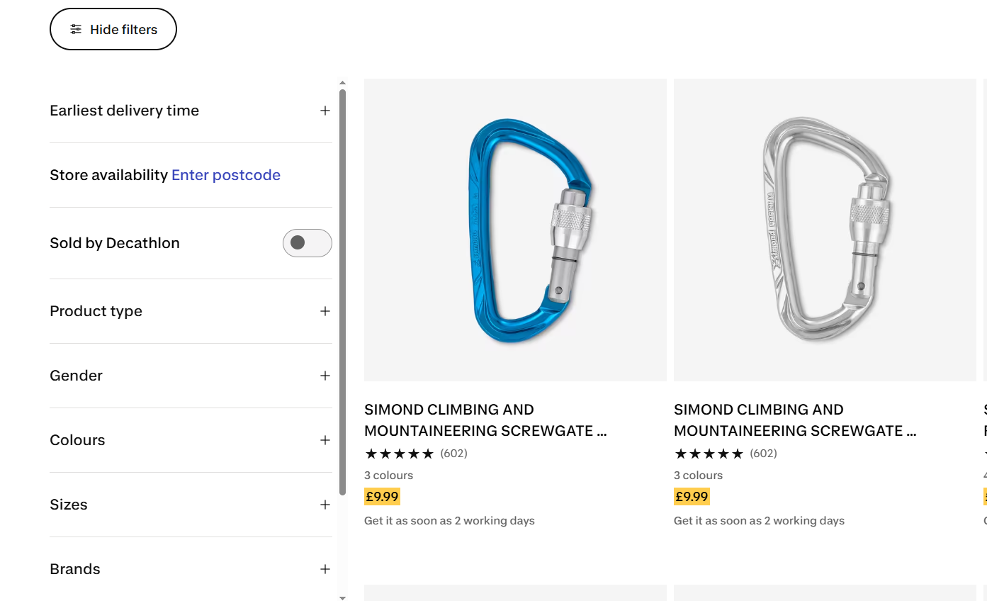
The primary role of the sidebar in content-heavy environments—such as documentation hubs, large e-commerce catalogs, and educational blogs—is to prevent user disorientation. Common navigational tools include the Table of Contents (TOC), which allows users to jump to specific sections of long-form articles, and hierarchical category menus. Search boxes are also frequently placed here to provide an immediate escape hatch for users who cannot find what they need through browsing.
Conversion Elements
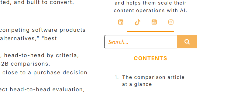
For commercial enterprises, the sidebar is a silent salesperson. Conversion-focused widgets include newsletter signup forms, gated resource downloads (lead magnets), and direct product advertisements. Strategic placement of these elements is vital; data from the Nielsen Norman Group indicates that users often ignore areas that look too much like traditional advertisements—a phenomenon known as "banner blindness." To counter this, successful sidebars integrate conversion elements using the site’s native typography and color palette to make them feel like integral parts of the user experience rather than external intrusions.
Supplementary and Trust-Building Content
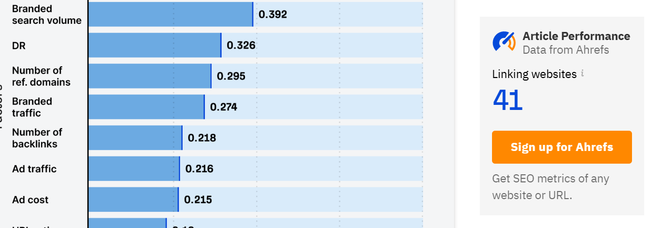
Trust is the currency of the internet. Sidebars provide a space to build this currency without cluttering the main narrative. Author bios with professional photography, "Most Popular Posts" lists, and social sharing icons provide context and social proof. Furthermore, real-time performance data—such as the number of times an article has been shared or the number of active community members—can enhance the perceived authority of the content.
Strategic Design and Best Practices
The difference between a high-performing sidebar and a distracting one lies in the details of its execution. Professional journalistic standards and UX research suggest several non-negotiable best practices.

The Width-to-Content Ratio:
A sidebar should ideally occupy a width of 240 to 320 pixels on a standard desktop display. This technical constraint ensures that the main content area remains between 600 and 700 pixels wide. According to 2022 research by the Baymard Institute, this width is the "readable sweet spot," allowing for 55 to 75 characters per line. Deviating from this ratio can lead to eye fatigue and decreased reading comprehension.

Visual Integration and Branding:
To avoid the aforementioned "right-rail blindness," the sidebar must mirror the main page’s aesthetic. This includes using consistent font weights, line heights, and spacing. When a sidebar uses a contrasting background or unfamiliar fonts, the user’s brain may subconsciously flag it as an advertisement and filter it out entirely.

Active State Indicators:
In navigational sidebars, it is crucial to show the user their current location. This is achieved through "active states"—such as bolding the text of the current section or adding a colored indicator line. Without these visual cues, users in complex documentation sites often feel "lost in the woods," leading to higher bounce rates.

The Mobile Dilemma: When to Skip the Sidebar
One of the most critical decisions a web architect must make is when to omit the sidebar entirely. On mobile devices, the limited horizontal space makes a traditional sidebar impossible. Attempting to force a sidebar layout on mobile results in microscopic text or obscured content.

Current industry standards dictate that sidebar content on mobile should be redistributed. Primary navigation should be moved to a "hamburger" or "kebab" menu at the top of the screen. Conversion elements, like newsletter signups, should be repositioned as "inline" elements that appear between paragraphs of the main content or as a "sticky" footer. For landing pages with a single objective, such as a webinar registration or a product sales page, sidebars should be removed altogether to eliminate any potential friction or distraction from the primary CTA.
Data-Driven Optimization: The Role of Analytics
A sidebar’s design should never be based on aesthetic preference alone; it must be validated by empirical data. UX researchers utilize three primary tools to audit sidebar performance:

- Heatmaps: These visual representations show where users are clicking. A "Click Map" might reveal that a specific sidebar link is getting zero engagement, suggesting it should be removed or moved higher.
- Scroll Maps: These indicate how far down a page users are scrolling. If a high-value CTA is located in a sidebar area that only 10% of users reach, it is effectively invisible.
- A/B Testing: This involves serving two different versions of a sidebar to different segments of the audience. For example, a site might test whether a newsletter signup performs better at the top of the right sidebar or at the bottom of a sticky left sidebar.
Official Responses and Expert Perspectives
Leading design systems, such as the GOV.UK Design System and Google’s Material Design, emphasize the importance of "information architecture" over visual flair. Experts from the Nielsen Norman Group have frequently stated that while the sidebar is a powerful tool, it is often misused as a "junk drawer" for links that don’t fit elsewhere. Their recommendation is a "less is more" approach, where only the most relevant links to the current page’s context are displayed.

From an SEO perspective, search engines like Google prioritize the "main content" of a page. While sidebar links help with internal site crawling and "link equity" distribution, they are generally weighted less heavily than links within the body text. However, a poorly designed sidebar that slows down page load times can negatively impact "Core Web Vitals," which are a confirmed ranking factor in Google’s algorithm.
Broader Implications for the Future of Web Design
As we move toward an era of AI-driven content and voice-activated interfaces, the traditional website sidebar may undergo further transformation. We are already seeing the rise of "contextual sidebars" that change their content dynamically based on the user’s past behavior or the specific paragraph they are currently reading.

The broader implication is clear: the sidebar is no longer just a design choice; it is a strategic component of the digital ecosystem. Whether it is helping a citizen navigate government regulations on a site like GOV.UK or assisting a developer in integrating an API on Stripe’s documentation, the sidebar remains a vital bridge between the user and the information they seek. By adhering to data-driven best practices and prioritizing the user’s cognitive load, organizations can ensure their sidebars serve as a catalyst for engagement rather than a barrier to it.