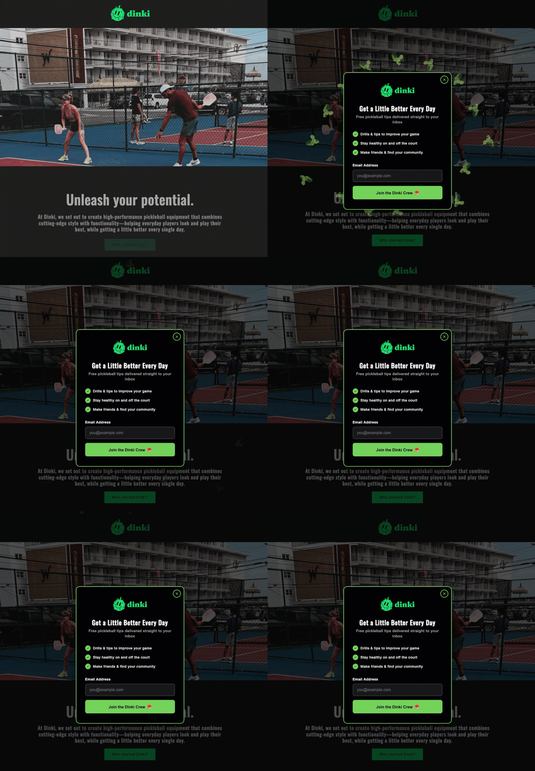
Popup forms, those small overlay windows designed to capture email addresses on websites, represent a powerful yet frequently misused tool in digital marketing. When implemented judiciously, they are unequivocally the fastest method for expanding an email subscriber list. Conversely, when executed poorly, they can become the quickest route to alienating visitors and increasing bounce rates. The critical distinction between success and failure in popup strategy lies not in the mere existence of the popup itself, but profoundly in the nuanced considerations of when, where, and how often it makes an appearance.
The Evolution of Email List Building and the Rise of Popups
Email marketing has long been recognized as one of the most effective channels for nurturing leads, building customer relationships, and driving conversions. Its enduring power lies in its directness and the permission-based nature of communication. As digital landscapes evolved, marketers sought increasingly efficient ways to grow their subscriber bases. This quest led to the widespread adoption of popup forms in the early 2010s, initially seen as a breakthrough for their immediate visibility and high conversion potential compared to static inline forms.
However, this initial enthusiasm often led to aggressive and untargeted deployment. Websites commonly featured popups appearing within seconds of a visitor landing, often obscuring content entirely and demanding an email address before any value had been offered or consumed. This "spray and pray" approach, while sometimes yielding short-term gains, quickly fostered user frustration, leading to negative brand perception and diminishing returns. Industry analysis from the mid-2010s highlighted a growing sentiment among users that popups were intrusive, disruptive, and indicative of a website prioritizing data collection over user experience. This era underscored the imperative for a more sophisticated, user-centric approach to popup implementation, moving away from mere interruption towards strategic engagement.
Designing for Conversion: Crafting the Irresistible Offer
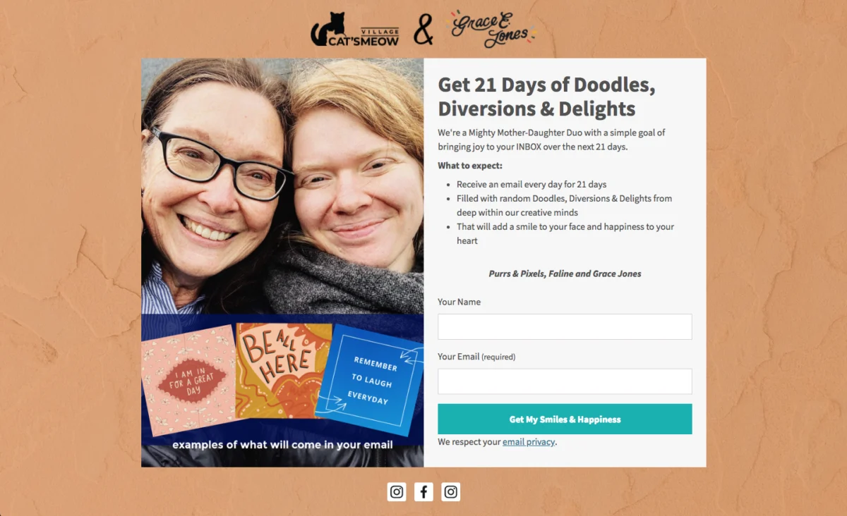
The effectiveness of a popup form begins with its fundamental design and the clarity of its value proposition. A popup must instantly communicate what the visitor stands to gain in exchange for their email address.
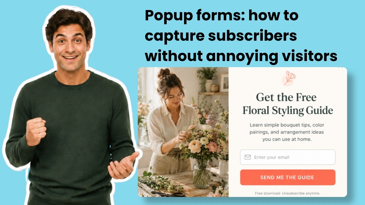
Headline First, Offer Foremost: The headline of a popup is its most critical element, serving as the immediate hook. It must be specific, concise, and articulate the benefit clearly, ideally in under ten words. Generic calls to action like "Subscribe to our newsletter" or "Join our list" are consistently outperformed by headlines that name a tangible deliverable. For instance, "Get the Weekly Marketing Checklist" or "Download Your Free E-commerce Guide" immediately informs the visitor of the specific value they will receive. Research consistently indicates that specific offers can increase conversion rates by as much as 30-50% compared to vague invitations, as they reduce cognitive load and clearly set expectations. The visitor should grasp the essence of the offer before they read anything else on the popup.
The Power of a Value Statement (Context and Credibility): While optional, a brief value statement placed directly below the headline can significantly enhance the popup’s appeal. This one-sentence addition provides crucial context, builds urgency, or offers social proof. Examples include "Sent to your inbox in 60 seconds" to emphasize immediacy, or "Trusted by 5,000+ small business owners" to leverage social validation. Such statements reassure potential subscribers and can tip the scales towards conversion, especially when the primary headline is compelling but could benefit from an extra layer of persuasion. If the headline alone is sufficiently clear and persuasive, however, maintaining a minimalist design by omitting this statement can also be effective.
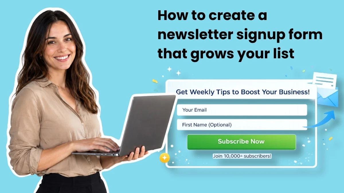
Minimalist Forms: The Less-Is-More Approach: A fundamental principle of high-converting forms is simplicity. For a popup, email is often the only field truly necessary to initiate a relationship. While adding a field for a first name can enable personalization in future communications, this should generally be considered the absolute maximum for a popup form. Every additional field introduces friction and has a demonstrable negative impact on completion rates. Industry studies suggest that each extra field can reduce conversion rates by 5-10%. More extensive data, such as company size or specific interests, can be gathered strategically later through welcome email sequences, progressive profiling, or dedicated preference centers, ensuring that the initial interaction remains as frictionless as possible.
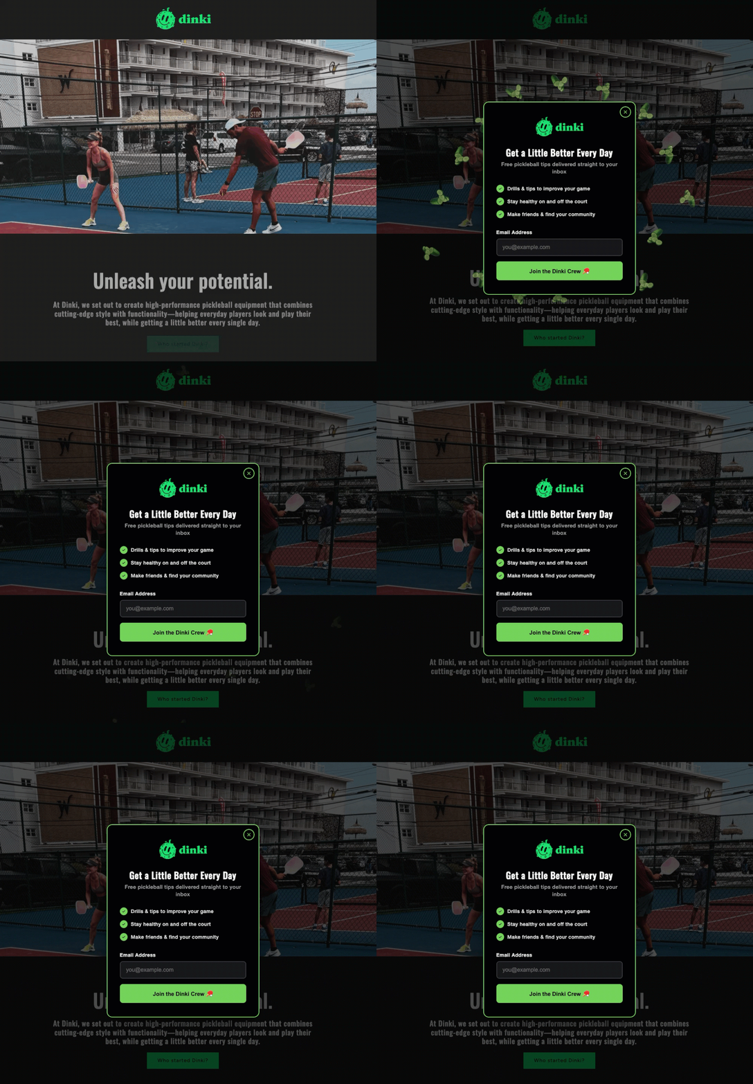
Action-Oriented Calls to Action (CTAs): The button text on a popup is the final prompt for action, and its language profoundly influences conversion. Buttons that use active, benefit-oriented language consistently outperform generic terms like "Submit" or "Sign Up." Phrases such as "Send me the checklist," "Get my free guide," or "Claim my discount" clearly articulate the immediate outcome of clicking. Furthermore, adopting first-person language ("Get my free guide") has shown to be more effective in many A/B tests than second-person ("Get your free guide"), as it creates a stronger sense of ownership and personal benefit for the user.
Respecting User Choice: The Obvious Close Button: A critical, yet often overlooked, aspect of popup design is the ease with which a visitor can dismiss it. A clear, visible close option—such as a prominently placed "X" or a polite "No, thank you" link—is paramount. Employing tiny, barely visible close buttons or guilt-tripping dismiss links ("No, I don’t want more customers") constitutes "dark patterns" in UX design. These tactics, while attempting to force conversions, invariably erode user trust and create a negative brand experience. Allowing visitors to easily dismiss a popup if they are not ready to subscribe demonstrates respect for their autonomy and contributes to a positive perception of the website, fostering long-term engagement rather than short-term, forced conversions.
Strategic Deployment: Timing is Everything
The moment a popup appears is arguably as crucial as its design and offer. A poorly timed popup can transform a helpful resource into a hostile interruption, instantly driving visitors away. Effective timing aligns the popup’s appearance with the visitor’s engagement level, ensuring the offer is presented when they are most receptive.
Moving Beyond Early Interruptions: The practice of displaying a popup within the first few seconds of a page load is a relic of outdated marketing strategies. Such immediate interruptions signal to the visitor that the website prioritizes lead generation over content consumption, leading to high bounce rates and user dissatisfaction. Modern best practices advocate for waiting until a visitor has demonstrated some level of engagement, indicating genuine interest in the site’s content.
Scroll-Based Triggers: One of the most effective timing mechanisms is the scroll-based trigger, which deploys the popup after a visitor has scrolled a predetermined percentage down the page. For content-heavy pages like blog posts, a scroll depth of 40% to 60% is often optimal. This ensures that the visitor has consumed enough content to form an opinion about the site’s value and is therefore more likely to consider an offer. Data from various platforms indicates that scroll-triggered popups typically achieve conversion rates 1.5 to 2 times higher than immediately displayed or very early timed popups, reflecting a more qualified audience.
Time-Based Triggers: An alternative is the time-based trigger, which activates the popup after a set number of seconds on a page. A duration of fifteen to thirty seconds provides ample time for most visitors to engage with the content before being presented with an offer. Anything under ten seconds can still feel aggressive and premature, as visitors may still be orienting themselves to the page.
Exit-Intent Technology: The Last-Chance Offer: Perhaps the least intrusive and often most effective trigger is exit-intent technology. This sophisticated mechanism detects when a visitor’s cursor moves towards the browser’s close button, back button, or address bar, signaling an imminent departure. The popup then appears just before they leave, offering a last-chance incentive. Exit-intent popups consistently boast higher conversion rates than both timed and scroll-based popups, sometimes by a margin of 5-10%. Their success lies in their ability to engage users who were already planning to leave, presenting a compelling reason to reconsider or stay connected without interrupting their primary browsing experience. Digital marketing strategists often recommend combining triggers, for instance, showing a scroll-based popup to highly engaged readers and reserving an exit-intent popup for those who decide to leave without converting through the initial offer. This layered approach maximizes capture opportunities while minimizing annoyance.
Controlling Frequency: The Art of Not Annoying
Beyond timing, the frequency with which a popup appears to a returning visitor is crucial for maintaining a positive user experience. Showing the same popup repeatedly, especially immediately after a visitor has dismissed it, is a surefire way to frustrate users and erode trust.
Once a visitor closes a popup, their decision should be respected for a reasonable period. Implementing a frequency cap, such as displaying the popup only once per browsing session or once every seven to thirty days, is a standard best practice. This prevents "popup fatigue" and avoids training visitors to immediately close any overlay they encounter. Repeated, untargeted popups do not magically convert resistant visitors; instead, they reinforce the decision to leave and can actively damage brand perception. Respecting a visitor’s initial decision to decline an offer is vital for fostering a respectful online environment and encouraging future visits.
Targeted Placement: Contextual Relevance for Maximum Impact
The principle of relevance extends not only to the offer itself but also to the specific pages on which a popup appears. A blanket approach, showing the same form on every page of a website, dilutes its impact and can lead to visitor frustration due to repetitive or irrelevant offers.
Page-Specific Targeting: Effective popup strategies involve matching the offer to the content being consumed. For example, a popup offering a "blog writing checklist" is highly relevant and valuable on a blog post discussing content marketing strategies. Conversely, the same offer would be entirely out of place on a pricing page or a customer support article. Generic "join our newsletter" popups, while broadly applicable, rarely perform as well as highly targeted offers directly related to the page’s content. If a visitor is actively reading about email automation, presenting a resource specifically about email automation significantly increases the likelihood of conversion, as it directly addresses their immediate interest.
Device-Specific Targeting: Navigating the Mobile Landscape: The rise of mobile browsing necessitates a nuanced approach to popup deployment. A popup designed for desktop viewing, which might appear as a contained overlay, can often consume the entire screen on a mobile device, rendering the underlying content inaccessible. This is not merely an aesthetic issue but a significant user experience and SEO concern. Since January 2017, Google has explicitly identified "intrusive mobile interstitials" (full-screen popups that cover content immediately on mobile page load) as a negative ranking signal. This means websites employing such aggressive mobile popups can experience a detrimental impact on their search engine visibility.
To mitigate this, digital marketers should implement device-specific targeting. On mobile devices, it is advisable to use less intrusive formats such as smaller banner popups, slide-in forms that appear from the side, or sticky bars fixed to the top or bottom of the screen. These options remain visible without completely obstructing content. Full-screen popups should generally be reserved for desktop users, and even then, should only be triggered by time delays, scroll depth, or exit intent, as these are not penalized by Google. Crucially, regardless of device, the close button must be prominent, easily discoverable, and tap-friendly on any screen size.
Advanced Strategies and Formats (Leveraging AI Builders)
Beyond the fundamental principles, modern tools, particularly those leveraging Artificial Intelligence, are expanding the possibilities for creative and highly effective popup forms. AI Signup Form Builders, such as AWeber’s, allow marketers to quickly design and deploy sophisticated forms based on simple text descriptions. This significantly lowers the barrier to entry for implementing advanced strategies:
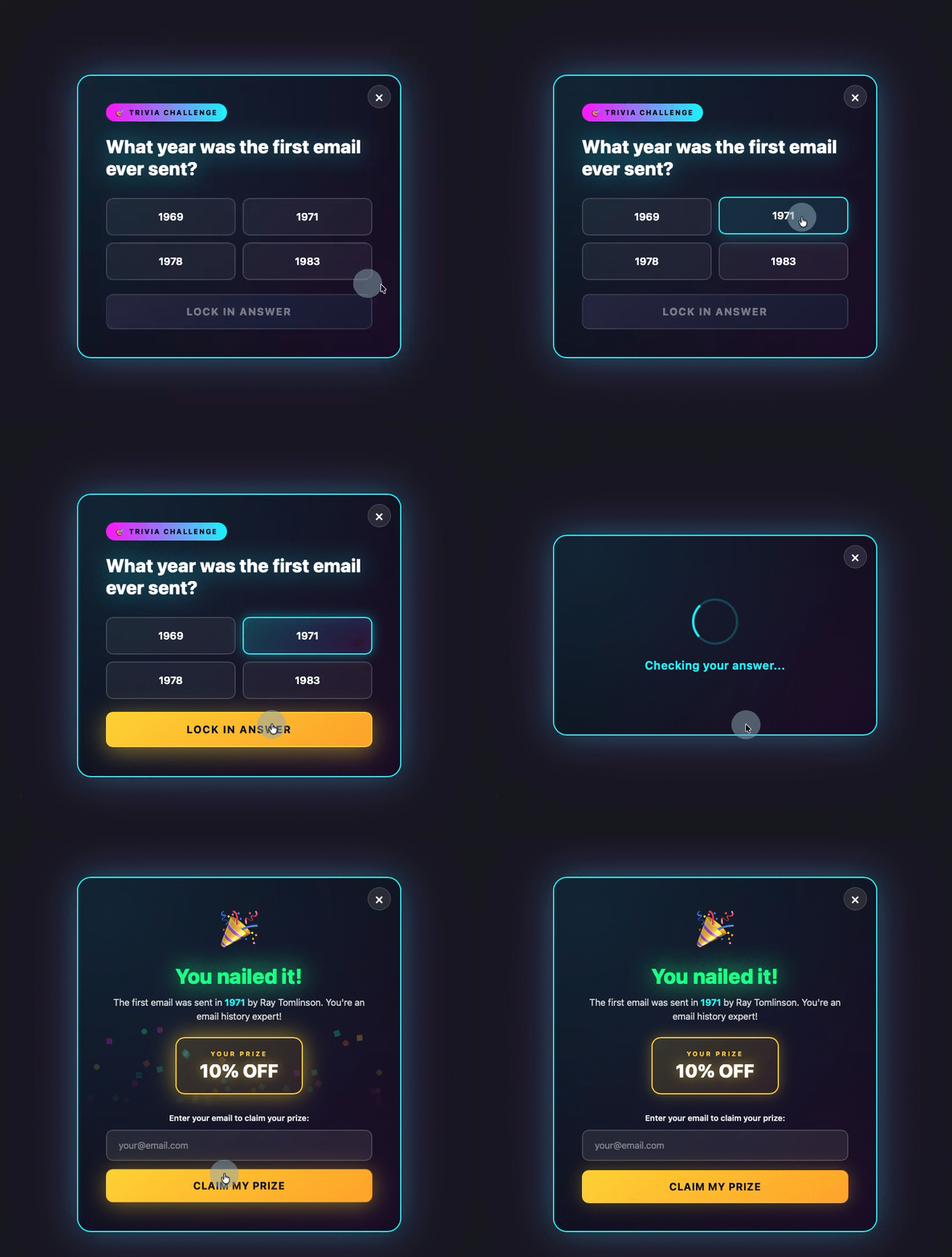
- Gamification: Transforming a simple signup form into an engaging experience, such as a quiz, trivia question, or a "spin-to-win" wheel, can dramatically increase interaction. Visitors engage with the game first, making a low-commitment decision, before being prompted for their email address. This primes them for conversion by making the process fun and rewarding.
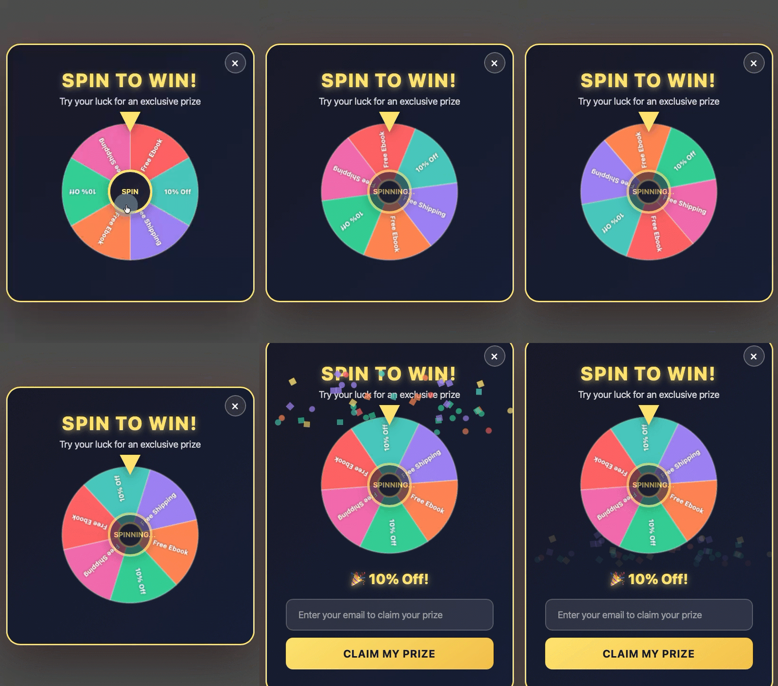
- Discount Offers: For e-commerce sites, a discount offer popup, often presented as a spin-to-win wheel or a direct coupon, can be incredibly effective, especially when triggered by exit intent. This provides a compelling last-minute incentive for visitors who might otherwise abandon their carts or leave the site. The visitor enters their email to claim the prize, providing a direct value exchange.
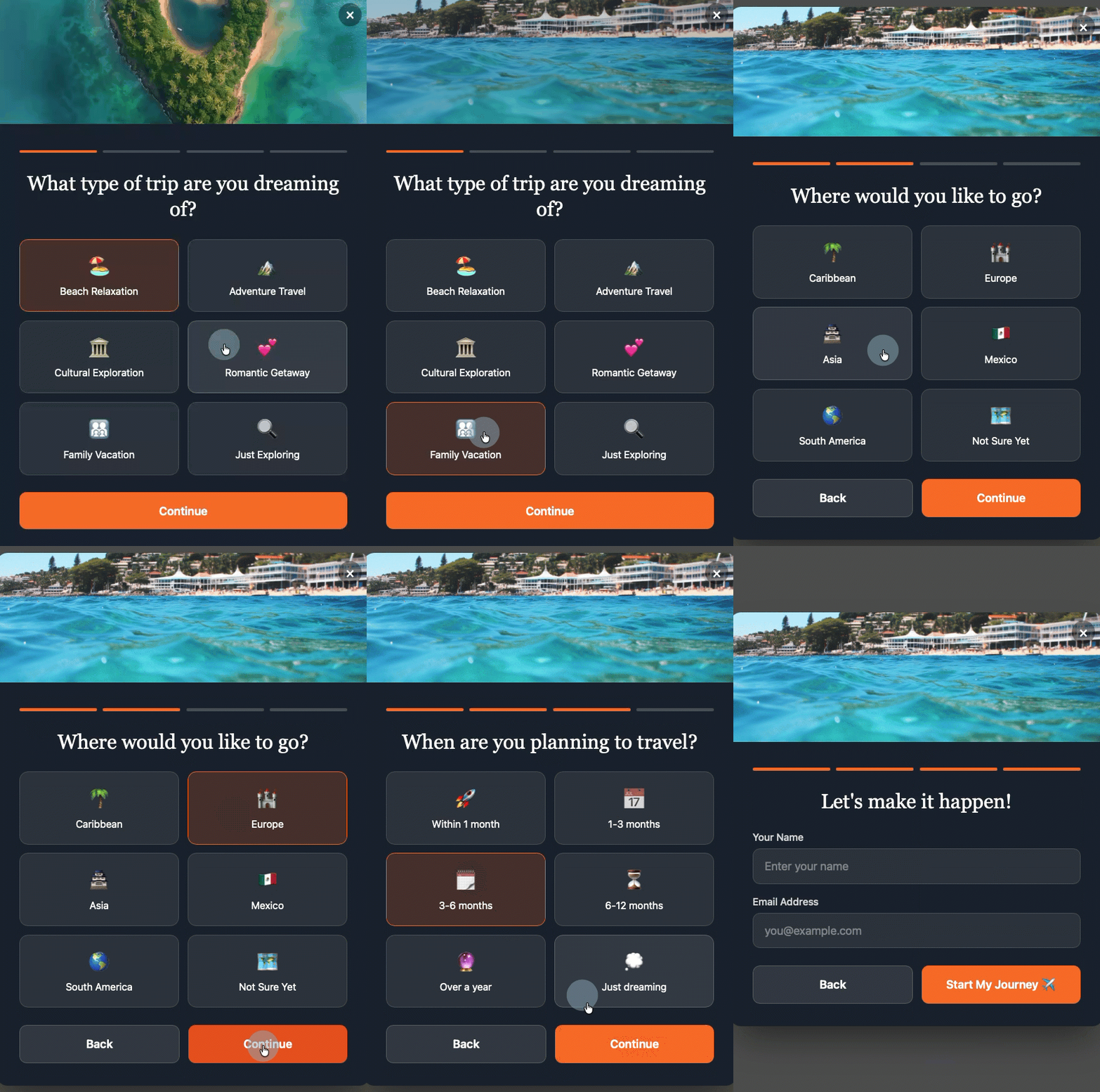
- Multi-Step Forms: Breaking down the signup process into multiple, smaller steps can reduce perceived effort and increase completion rates. In a multi-step form, the visitor makes a low-commitment decision (e.g., selecting a category of interest) before ever seeing the email field. By the time they reach the email input, they have already invested some effort and are more likely to complete the final step.
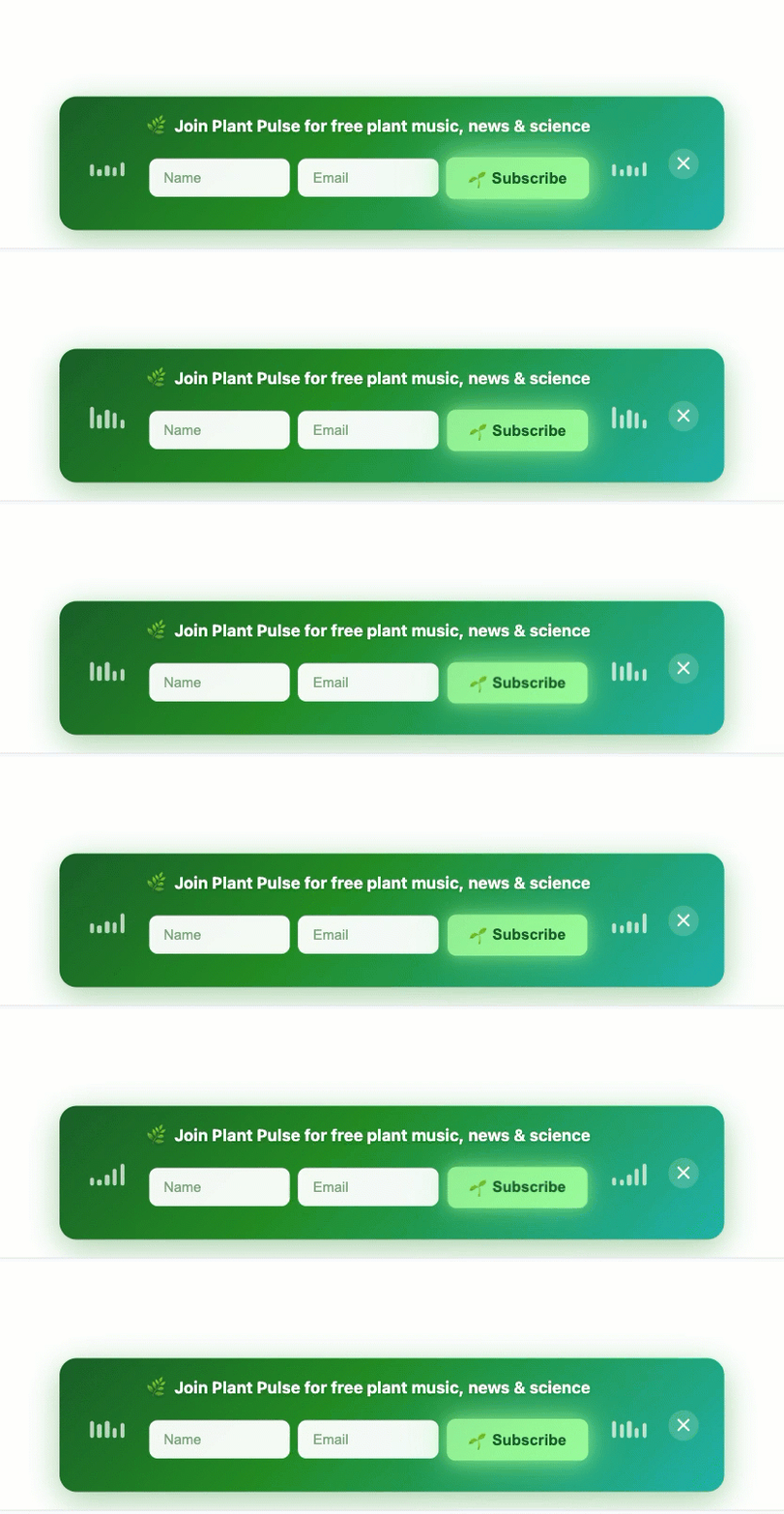
- Sticky Bars: These non-intrusive elements are thin bars that remain fixed at the top or bottom of a webpage. They contain a concise call to action and often a single email field. Sticky bars are always visible without blocking content, offering a persistent, gentle prompt for subscription without interrupting the user’s browsing flow.
These advanced formats, whether built manually or with the assistance of AI tools, adhere to the core principles of user-centric design, intelligent timing, and contextual relevance. By simply describing the desired format, timing, and offer, AI builders can generate the copy, design, layout, and fields, which can then be edited or deployed directly, integrating seamlessly with email lists and automation sequences.
Conclusion
The era of aggressive, untargeted popup forms is fading, replaced by a sophisticated understanding of user experience and conversion psychology. Mastering the art of popup forms in today’s digital landscape hinges on a strategic blend of user-centric design, intelligent timing, judicious frequency control, and contextual relevance. By crafting specific, value-driven offers, employing minimalist form designs, utilizing action-oriented CTAs, and always providing an obvious close option, websites can create popups that invite rather than interrupt.
Furthermore, leveraging smart timing triggers like scroll depth, time on page, and especially exit intent, ensures that offers are presented when visitors are most engaged or about to depart. Adhering to frequency caps and targeting popups to specific pages and devices (with a particular emphasis on non-intrusive mobile solutions) transforms these tools from potential annoyances into powerful engines for list growth and customer engagement. The ongoing evolution of AI-powered design tools further empowers marketers to implement these best practices efficiently, fostering a positive brand perception while steadily expanding their valuable email subscriber base. The ultimate goal remains consistent: to build a robust email list that drives business objectives, all while ensuring a respectful and rewarding experience for every visitor.