The website sidebar remains one of the most enduring and debated components of user interface (UI) design, serving as a critical secondary column that houses navigation, conversion tools, and supplementary information. In the contemporary digital landscape, where user attention is a finite and highly contested resource, the strategic deployment of sidebars has transitioned from a standard default to a data-driven decision. Far from being a mere aesthetic choice, the sidebar functions as a bridge between the primary content and the broader site architecture, directly influencing user retention, bounce rates, and conversion metrics.

The Architectural Role of the Modern Sidebar
A website sidebar is defined as a vertical column positioned to the left or right of the primary content area. Historically, sidebars became the hallmark of the “blogging era” in the early 2000s, providing a space for archives, categories, and “blogrolls.” Today, however, their role is more specialized. On content-heavy platforms, such as technical documentation sites, expansive blogs, and e-commerce stores with vast catalogs, sidebars are indispensable for orienting the user. They provide a persistent “map” that allows visitors to jump between sections or find related products without retreating to the main menu.

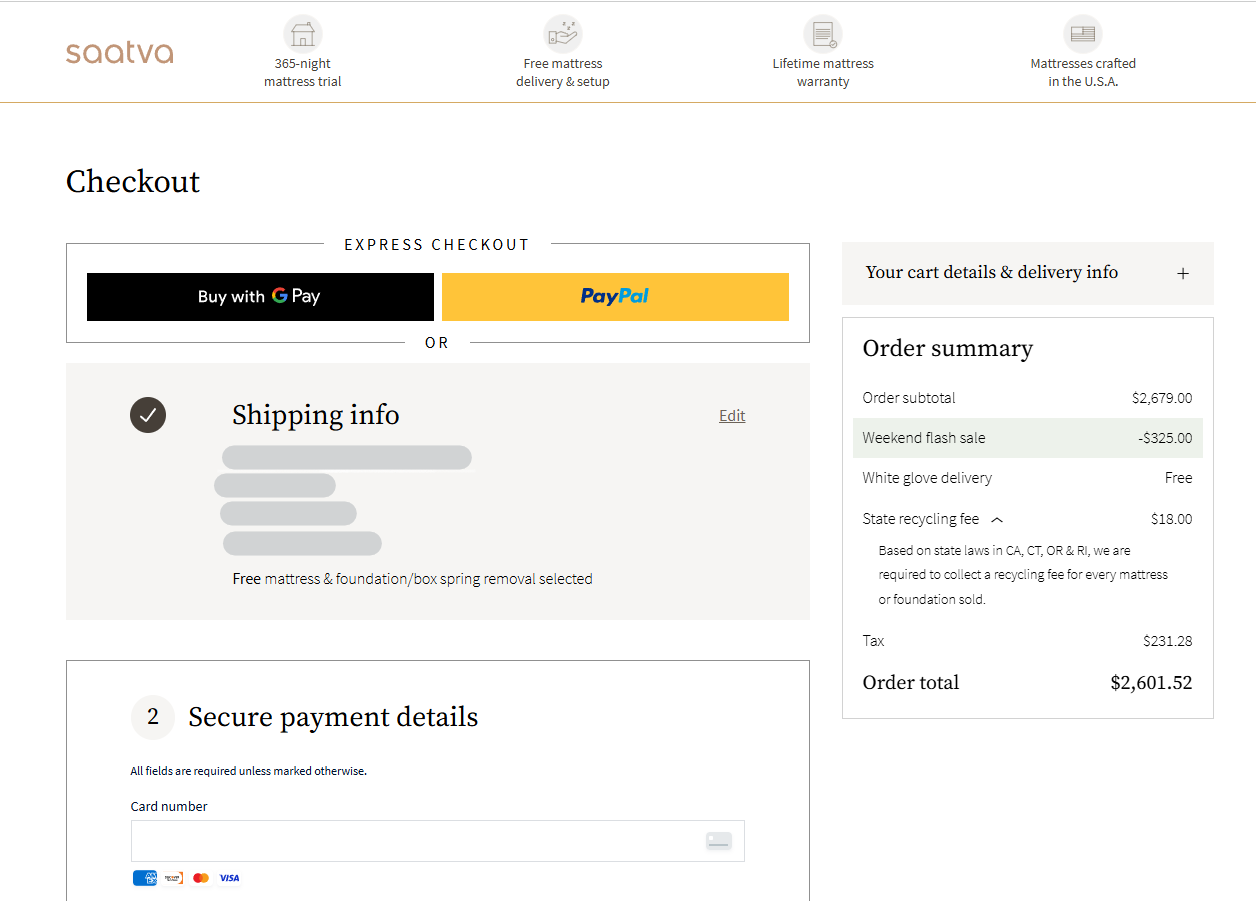
Conversely, the rise of “distraction-free” design has led to the removal of sidebars from landing pages and minimalist portfolios. On pages with a singular objective—such as a newsletter sign-up or a product checkout—the sidebar is often viewed as “interface noise” that can dilute the primary call to action (CTA). Industry consensus suggests that the decision to include a sidebar must be predicated on the complexity of the information architecture and the specific goals of the webpage.
Distinguishing Sidebars from Side Panels
A frequent point of confusion in UI terminology is the distinction between a sidebar and a side panel. While the terms are often used interchangeably in casual discourse, professional designers maintain a clear boundary. A sidebar is a fixed, integral part of the page layout that is typically loaded with the initial HTML and remains visible as part of the frame.
In contrast, a side panel is a transient interface element, often used in web applications or site builders. These panels are frequently “toggled” open or closed by the user to perform specific tasks, such as adjusting settings or viewing a shopping cart. Understanding this difference is vital for developers using platforms like WordPress or Wix, where “side panels” are often used for administrative editing, while “sidebars” are reserved for the end-user’s viewing experience.

A Taxonomy of Sidebar Variations
The functionality of a sidebar is often determined by its behavior during the user’s scroll. There are four primary types currently utilized by major digital platforms:

- Static Sidebars: These remain in a fixed position at the top of the page. As the user scrolls down through the main content, the sidebar eventually disappears from view. These are best suited for short-form content where the visitor is unlikely to need the sidebar elements once they have begun reading.
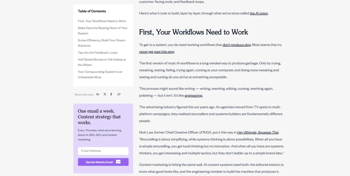
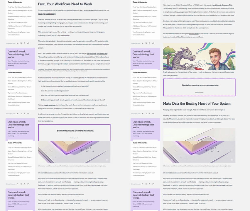
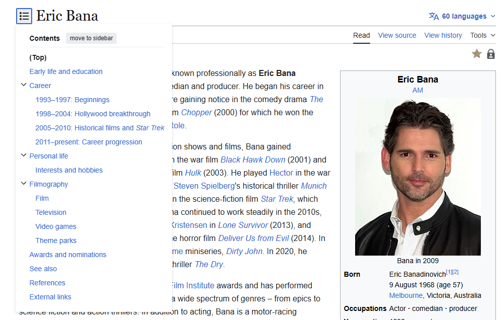
- Sticky Sidebars: These are programmed to “stick” to the viewport. Regardless of how far a user scrolls, the sidebar (or specific elements within it) remains visible. This is increasingly the standard for long-form articles, where a Table of Contents (TOC) allows the reader to track their progress.
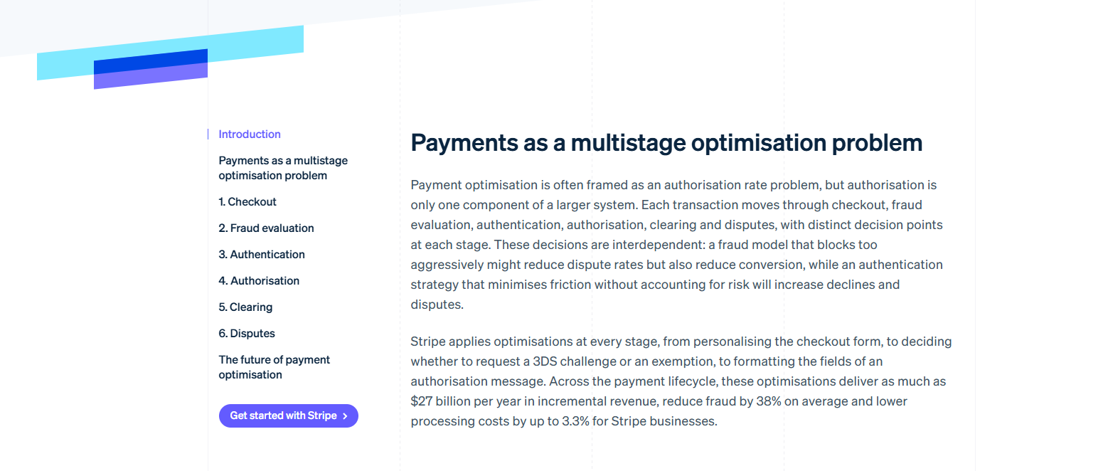
- Content-Specific Sidebars: Common on platforms like Wikipedia, these sidebars change based on the page topic. For instance, a biography page might feature a “fact box” sidebar with dates, locations, and a portrait, providing a quick summary that complements the long-form text.
- Community or Contextual Sidebars: Platforms like Reddit utilize sidebars to display subreddit rules, related communities, and moderator lists. This serves a dual purpose of information and community governance.
Strategic Content Integration: Navigation, Conversion, and Trust
To maximize the utility of a sidebar, designers must categorize elements into three functional buckets: navigation, conversion, and supplementary content.

Navigational Elements
The most common use of the sidebar is to facilitate movement. This includes vertical navigation menus, search boxes, and category filters. For e-commerce sites, a sidebar often houses “faceted search” options, allowing users to filter by size, color, or price. Research from the Baymard Institute indicates that users often rely on sidebar filters to narrow down large datasets, and the absence of these tools can lead to “search fatigue.”
Conversion Elements
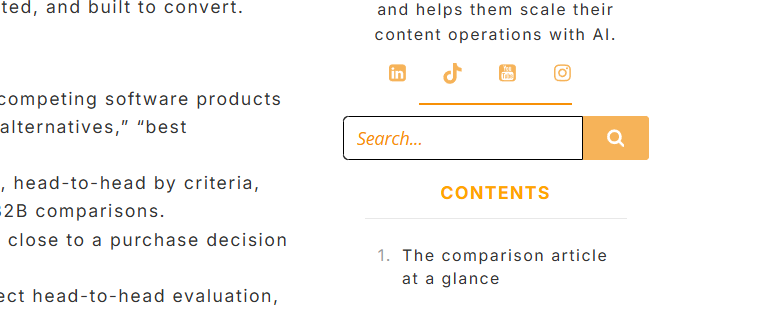
Sidebars are prime real estate for “secondary conversions.” While the main content might be educational, the sidebar can house newsletter sign-up forms, “start a free trial” buttons, or links to downloadable resources like whitepapers. Data from growth marketing agencies shows that placing a CTA in a sidebar can capture users who are engaged with the brand but not yet ready to commit to the primary page offer.

Supplementary Content and Social Proof
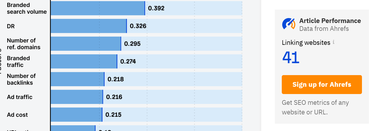
Building trust is essential in the digital economy. Sidebars often feature author biographies, social media sharing icons, and “most popular posts” widgets. By showing that an article has been shared thousands of times or written by a recognized expert, the sidebar provides “ambient social proof” that enhances the credibility of the primary content.

Chronology of Design Evolution: From Desktop to Mobile-First
The history of the sidebar is a timeline of adaptation to screen real estate.

- The Desktop Era (1995–2010): Sidebars were ubiquitous. With large desktop monitors, the “three-column layout” (left nav, center content, right ads/widgets) became the standard for the internet.
- The Responsive Revolution (2010–2015): The explosion of smartphone usage forced a reckoning. Sidebars, which consumed 25-30% of horizontal space, were unreadable on mobile. This led to the development of “stacking” rules, where the sidebar was pushed to the bottom of the page.
- The Modern Hybrid Era (2015–Present): Designers now treat sidebars as “context-aware.” On mobile devices, sidebar content is often hidden behind “hamburger menus” or converted into “floating action buttons” (FABs). This evolution ensures that the functionality of the sidebar is preserved without compromising the mobile reading experience.
Empirical Evidence: The Psychology of the “Right Rail”
The placement of a sidebar—left versus right—is deeply rooted in cognitive psychology and reading patterns. The Nielsen Norman Group has conducted extensive eye-tracking research that confirms the “F-Pattern” of reading on the web. Users typically start at the top-left, move horizontally, and then scan down the left side of the screen.

Consequently, placing navigation on the left is considered a best practice for usability because it aligns with where the eye naturally looks for structure. However, this creates a challenge for “conversion” elements. Because users scan the left, they often develop “right-rail blindness,” a phenomenon where they subconsciously ignore the right side of the screen, associating it with advertisements.

To combat this, modern design standards suggest using the left sidebar for critical navigation and the right sidebar for supplementary information that doesn’t require immediate attention. Furthermore, matching the typography and color palette of the sidebar to the main content can reduce “ad-like” appearances, helping to bypass the user’s mental filters.

Data Analysis: The Impact of “Sticky” Elements
Quantitative data suggests that “stickiness” is one of the most effective ways to boost sidebar performance. An A/B test conducted by GrowthRock on an e-commerce platform revealed that making the “Add to Cart” area sticky on the right side of the screen resulted in a 7.9% increase in completed orders. Similarly, the financial site MoneyGeek reported a 20% lift in desktop conversions after implementing a sticky CTA for insurance quotes.
These figures underscore a fundamental truth in UX: reducing friction leads to higher conversions. When a user decides to take action after reading a long article, having the CTA immediately available in the sidebar—rather than requiring them to scroll back to the top—removes a significant psychological and physical barrier.

Technical Implementation and SEO Considerations
From a technical standpoint, adding a sidebar in modern Content Management Systems (CMS) like WordPress has evolved. “Classic themes” relied on widgets, while newer “Block themes” utilize Full Site Editing (FSE). This allows for more granular control, enabling designers to create different sidebars for different categories of content.

Regarding Search Engine Optimization (SEO), the impact of sidebars is largely indirect. While search engines primarily focus on the “Main Content” (MC) of a page, the sidebar contributes to the site’s internal linking structure. A well-organized sidebar with relevant links helps search engine crawlers discover and index deeper pages on the site. However, designers must be cautious; a “spammy” sidebar filled with irrelevant links or excessive ads can lead to a poor User Experience (UX), resulting in high bounce rates—a signal that search engines interpret as a lack of page quality.
Broader Impact and the Future of Data-Driven Design
As we move toward a more personalized web, the future of the sidebar likely lies in dynamic customization. Using heatmaps, scroll maps, and session recordings, companies can now see exactly how users interact with their sidebars. If a “Recent Posts” widget is never clicked, it can be replaced with a “Most Viewed” widget or a targeted offer based on the user’s browsing history.

Tools like Crazy Egg allow for sophisticated A/B testing of sidebar layouts. Designers can test whether a left-side Table of Contents outperforms a right-side version, or whether a newsletter sign-up performs better at the top or bottom of the column. This shift from “best practice” to “empirical testing” ensures that the sidebar remains a high-value asset rather than a legacy design relic.
In conclusion, the website sidebar is a versatile and powerful tool when deployed with intentionality. By balancing the needs of navigation, conversion, and credibility—and by backing design choices with eye-tracking data and conversion metrics—webmasters can ensure that this vertical column continues to serve both the user’s needs and the business’s bottom line. The key is to view the sidebar not as an afterthought, but as a dynamic component of a holistic digital strategy.