The digital retail landscape is currently undergoing a transformative shift as brands move away from static product listings toward dynamic, intent-driven category pages that act as critical junctions in the consumer journey. In the contemporary e-commerce ecosystem, the category page—often referred to as the Product Listing Page (PLP)—serves as more than a mere directory; it is a sophisticated navigational tool designed to bridge the gap between initial discovery and final acquisition. Industry data suggests that category pages often receive more organic traffic than individual product pages, making their optimization a strategic imperative for global retailers. As the e-commerce sector continues its rapid expansion, projected to reach over $6.3 trillion in global sales by the end of 2024, the ability to refine these "middle-of-the-funnel" experiences has become a primary differentiator between market leaders and struggling enterprises.
The Strategic Framework: Defining Navigational Purpose
The architectural foundation of a high-performing category page begins with a clear definition of its functional role. Expert analysts in conversion rate optimization (CRO) categorize the user intent on these pages into three distinct phases: browsing, deciding, and buying. Each phase necessitates a unique design language and functional set to prevent "decision conflict," a psychological state where a user is presented with too many high-commitment options before they are ready to act.
For browsing-focused pages, the primary objective is to answer the user’s internal question: "What options are available to me?" At this stage, introducing aggressive conversion elements, such as "Add to Cart" buttons, can paradoxically increase friction. When an interface demands a higher-commitment decision than the user is prepared to make, cognitive load increases, often leading to site abandonment. Instead of pushing for an immediate sale, browsing-focused designs prioritize discovery, utilizing high-quality imagery and clear sub-navigational cues to guide the user deeper into the product silo.
Conversely, for users in the "buying" phase—often returning visitors or those searching for specific replenishment items—the presence of an immediate "Add to Cart" or "Quick Buy" feature is essential. The intersection of what a brand wants a visitor to do and what the visitor expects to find creates the optimal feature set for the page.
The Chronology of E-commerce Navigation Evolution
To understand the current standards of category page design, one must examine the chronological evolution of online retail interfaces:
- The Directory Era (1995–2005): Early e-commerce sites utilized simple, text-heavy directory structures. Category pages were essentially digital versions of mail-order catalogs with limited filtering capabilities.
- The Faceted Search Revolution (2006–2015): The introduction of faceted navigation allowed users to filter products by attributes like price, size, and color. This period saw the rise of the "Amazon-style" sidebar, which remains a standard today.
- The Mobile-First and AI Integration Era (2016–Present): With over 50% of web traffic shifting to mobile devices, category pages have become more streamlined. The integration of Artificial Intelligence (AI) now allows for dynamic sorting, where product orders change in real-time based on the individual user’s browsing history and purchase intent.
Statistical Benchmarks and Performance Analytics
Evaluating the efficacy of a category page requires a deep dive into specific analytical metrics. A primary indicator of health is the exit rate. While a home page may have a higher bounce rate, category pages are expected to have an exit rate that aligns closely with the site average. A significant spike in exit rates on a specific category page typically indicates a disconnect between user expectation and the page’s content.
According to data from the Baymard Institute, approximately 42% of e-commerce sites do not offer category-specific filters for their top-level categories, leading to a degraded user experience. Furthermore, industry benchmarks indicate that sites with well-structured subcategories and intuitive filtering see a 26% higher conversion rate compared to those with flat architectures. These statistics underscore the necessity of examining heatmaps and click-through rates (CTR) to determine if users are navigating toward product detail pages (PDPs) or simply leaving the ecosystem out of frustration.
Architectural Standards: Hierarchy and Sub-categorization
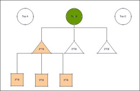
A common pitfall in digital retail is the creation of overly broad top-level categories. A category labeled "Electronics," for instance, is too expansive to be useful for a targeted search. Professional guidelines suggest that products should be grouped into a hierarchy that goes at least one level deeper than the top-level category. However, there is a "three-level rule" generally accepted by UX designers: navigating more than three levels deep into sub-categories can lead to "navigation fatigue," where the user loses their sense of place within the site’s architecture.
As a visitor navigates through these levels, the interface should dynamically highlight "child" categories. This visual reinforcement helps the user understand the relationship between products. For example, if a user is in the "Laptops" sub-category under "Computers," the page should easily allow them to pivot to "Accessories" or "Software" without returning to the home page.
Feature-Based and Intent-Based Filtering Systems
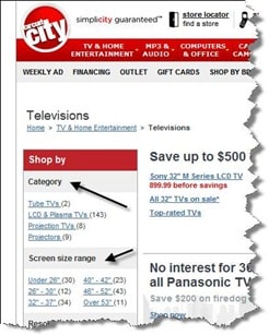
Modern consumers do not just shop by product type; they shop by specific features and underlying needs. Successful retailers like Best Buy and the now-defunct Circuit City pioneered the use of attribute-based filtering. If a consumer is shopping for a television, the technical specifications—such as resolution (4K, 8K), screen size, and refresh rate—are the primary drivers of the decision-making process.
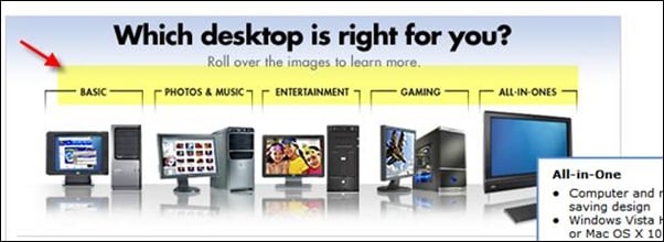
Beyond technical features, "need-based" filtering has emerged as a powerful tool for conversion. This approach categorizes products based on the user’s end goal. For example, a desktop computer category might be broken down into "Gaming," "Home Office," or "Professional Video Editing." This method reduces the technical knowledge required by the consumer, allowing the website to act as a digital sales assistant. By identifying the "why" behind a purchase, brands can align their category pages with the psychological motivations of their audience.
Mitigating Decision Fatigue through Buying Guides and Wizards
For complex product categories, such as high-end photography equipment or home appliances, the sheer volume of choices can lead to "analysis paralysis." In these instances, the category page should serve an educational function. The integration of buying guides, comparison tools, and interactive wizards can assist the user in determining which subcategory or specific model fits their requirements.
Industry analysts note that providing educational content on category pages not only improves the user experience but also enhances Search Engine Optimization (SEO). Search engines favor pages that provide comprehensive value to users, and long-form content or guides within category structures can help a site rank for "long-tail" informational queries.
The Testing Paradigm: CRO and User Behavior
The final pillar of category page optimization is the commitment to iterative testing. What works for a luxury fashion brand may fail for a B2B industrial supplier. A/B testing is essential for determining the placement of filters, the density of product grids, and the necessity of "Add to Cart" buttons.
One notable case study involves a major retailer that implemented a complex "needs-based" filter at the top of their category pages. Despite the internal team’s confidence in the feature, analytics and heatmaps revealed that less than 5% of visitors were interacting with it. Most users preferred the traditional sidebar filters they were accustomed to. Within two weeks, the brand reverted the change, highlighting the importance of letting data—rather than internal assumptions—drive design decisions.
Broader Implications for the Global Retail Industry
The optimization of category pages has broader implications for the future of digital commerce. As voice search and visual search technologies become more prevalent, the way categories are named and structured will need to adapt to natural language processing. Furthermore, the rise of "headless commerce"—where the front-end delivery is decoupled from the back-end logic—allows brands to deliver highly personalized category experiences across multiple devices, from smart mirrors to mobile apps.
In conclusion, the category page is the engine room of the e-commerce site. By defining clear purposes, adhering to logical hierarchies, utilizing data-driven filtering, and maintaining a culture of rigorous testing, retailers can significantly reduce friction in the user journey. As competition for consumer attention intensifies, those who master the art and science of the category page will be best positioned to capture market share in an increasingly crowded digital marketplace. The transition from a simple list of products to a sophisticated, guided shopping experience is no longer optional; it is the standard for modern excellence in retail.