The landscape of digital analytics and business intelligence underwent a significant transformation throughout 2017 and 2018, driven largely by the democratization of data visualization tools. At the forefront of this shift was Google Data Studio, a platform that transitioned from a niche beta product within the Google Analytics 360 suite to a powerhouse for both corporate reporting and narrative data journalism. By allowing users to connect disparate data sources into a single, cohesive visual interface, the platform addressed a long-standing gap in the market: the need for real-time, interactive, and aesthetically professional reporting that did not require a degree in data science to operate. The following analysis explores the specific applications of this technology across business and journalistic sectors, highlighting the methodologies that defined the era of modern data communication.
The Technological Shift in Business Intelligence Reporting
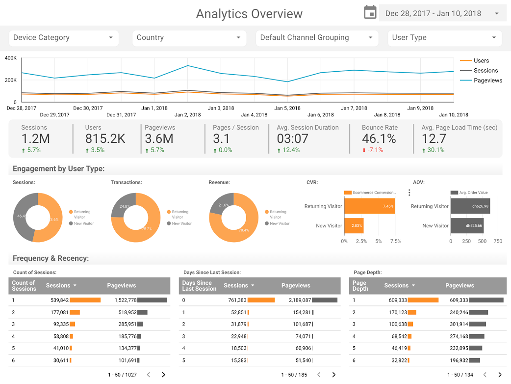
Before the widespread adoption of cloud-based visualization tools, business reporting was often a labor-intensive process characterized by static spreadsheets and manual data entry. In the early 2010s, analysts typically spent the majority of their time on data collection and cleaning, leaving little room for actual insight generation. The emergence of Google Data Studio changed this calculus by introducing native connectors for Google Analytics, BigQuery, and Google Sheets, effectively automating the "plumbing" of data management.
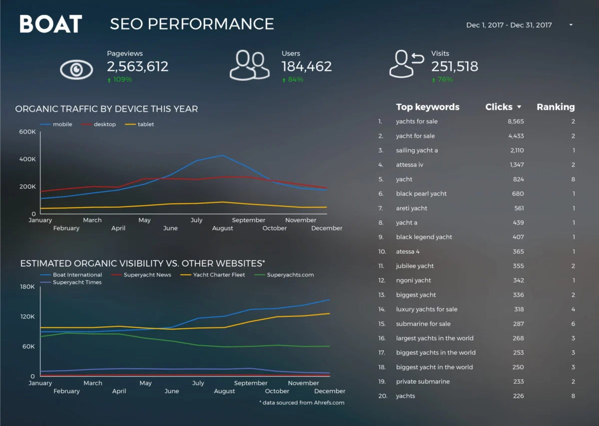
A primary example of this efficiency gain is observed in the case of Boat International Media. Prior to implementing automated dashboards, the organization’s SEO performance reporting was a grueling monthly task that required five full days of manual labor to compile. By migrating to a centralized visualization framework, the team reduced this turnaround time to just fifteen minutes. This 99% reduction in reporting overhead allowed the organization to shift its focus from historical data compilation to proactive strategy. The design of their SEO dashboard emphasized clarity, utilizing a "less is more" philosophy to ensure that key performance indicators (KPIs) were immediately visible to stakeholders, whether viewed on a live screen or exported as a PDF for executive review.
Advanced Visualization Techniques for Corporate Strategy
As the platform matured, organizations began moving beyond simple bar and line charts to more sophisticated comparative visualizations. Analytics Pros, a prominent digital consultancy, demonstrated the power of bullet charts to provide context to engagement metrics. Unlike standard gauges, bullet charts allow for a multi-layered view of performance, showing current figures against both previous year’s data and specific benchmark targets.

In a business context, this level of granularity is vital. For instance, knowing that a webpage has 10,000 views is a "vanity metric" in isolation. However, when viewed through a Data Studio dashboard that incorporates bullet charts and scorecard metrics, an analyst can see that those 10,000 views represent a 20% increase over the previous year but fall 5% short of the quarterly goal. Furthermore, by integrating time-on-page and engagement rates, these dashboards provide a holistic view of user behavior, enabling businesses to identify not just which pages are popular, but which ones are successfully converting or retaining audience interest.
The Rise of Data Journalism and Public Storytelling
Parallel to the business world’s adoption of these tools was the rise of data-driven storytelling in the public sphere. Data journalism, once the exclusive domain of major outlets like The New York Times or The Guardian, became accessible to independent researchers and hobbyists. This shift allowed for the exploration of complex cultural and social phenomena through a quantitative lens.
One of the most engaging applications of this technology was the comparative analysis of the Marvel and DC cinematic universes. By aggregating global box office data, critics and fans were able to visualize a $27 billion industry. These visualizations did more than just list numbers; they mapped the "war for hearts and minds" by showing the trajectory of franchise success over time. Such reports utilized the interactive nature of Data Studio to allow users to filter by year, character, or region, turning a static article into an exploratory experience.
Similarly, the "Star Wars" universe was subjected to rigorous data analysis. Through reports created by teams like ClickInsight, fans could compare technical specifications such as starship speeds and character demographics. While seemingly whimsical, these projects demonstrated the platform’s ability to handle complex, multi-tabbed reporting structures that could guide a user through a narrative arc—from high-level overviews to granular details.
Large-Scale Data Processing with BigQuery Integration
The true power of modern visualization often lies in the backend infrastructure. The integration between Data Studio and BigQuery, Google’s enterprise data warehouse, enabled the processing of massive datasets that were previously unmanageable for standard reporting tools.

Felipe Hoffa, a Developer Advocate at Google, showcased this capability by analyzing the entirety of GitHub’s "PushEvents" from 2017. By pulling millions of data points regarding open-source contributions, Hoffa was able to identify which companies and individuals were the most active contributors to the global coding community. This type of analysis has profound implications for the tech industry, as it provides an objective measure of corporate influence in the open-source ecosystem. The ability to visualize petabytes of data through a browser-based interface marked a significant milestone in the democratization of "Big Data."
Analyzing Social Trends: The UK Marriage and Divorce Study
Beyond entertainment and technology, data visualization has proven essential in understanding long-term social trends. A comprehensive study of 150 years of marriage and divorce data in the United Kingdom provides a prime example of how data can provide historical context to modern social issues.
By mapping these trends against historical events, such as the world wars and major legislative changes like the Divorce Reform Act of 1969, researchers were able to visualize the direct impact of policy on human behavior. The data revealed sharp spikes in divorce rates following legal relaxations and significant dips during periods of economic or global instability. This journalistic use of Data Studio transformed a dry government dataset into a compelling narrative about the evolution of the British family unit, answering critical questions about who seeks divorce and how societal shifts influence personal milestones.
Chronology of Development and Industry Impact
The journey of Google Data Studio is a reflection of the broader trend toward cloud-native business intelligence.
- 2016: Google introduces Data Studio as part of the Google Analytics 360 suite, initially limiting the free version to five reports per user.
- 2017: Recognizing the demand for accessible data tools, Google removes the report limit for the free version, leading to an explosion of user-generated content and templates.
- 2018: The platform introduces advanced features such as calculated fields, data blending (allowing users to join different data sources on a common key), and improved embedding capabilities.
- Post-2018: The platform would eventually be integrated into the Looker family, becoming Looker Studio, as Google sought to unify its business intelligence offerings.
The impact of this chronology cannot be overstated. By providing a free, powerful alternative to expensive legacy BI software, Google forced the industry to prioritize user experience and accessibility. Competitors were pushed to innovate, leading to a "gold rush" of data visualization features across the software-as-a-service (SaaS) landscape.
Implications for the Future of Data Communication
The examples highlighted—ranging from SEO dashboards for luxury media brands to deep dives into the GitHub developer community—underscore a fundamental truth: data is only as valuable as the story it tells. The transition from 2017 to 2018 represented a turning point where the "how" of data visualization became as important as the "what."
For businesses, the implication is clear: those who can translate raw data into actionable visual insights will possess a significant competitive advantage. The reduction in reporting time directly correlates to an increase in organizational agility. For the public, the rise of data journalism means a more informed citizenry, capable of looking past anecdotes to see the underlying trends in economics, politics, and culture.
As we look back at the visualizations that inspired the industry in 2018, it is evident that the tools of that era laid the groundwork for the AI-driven insights we see today. The core principles remain the same: choose the right chart for the data type, maintain a clean and purposeful design, and always prioritize the narrative that the data is trying to convey. Whether it is tracking the performance of a global SEO campaign or analyzing a century of social change, the power of visualization lies in its ability to make the complex understandable and the invisible visible.