The modern retail landscape has transformed traditional store aisles into a fiercely competitive arena, where products vie for precious consumer attention. In this dynamic environment, a brand’s packaging is no longer a passive container but a critical, active participant in the purchasing decision. Success hinges on a multifaceted strategy that can capture attention from afar, communicate value instantly, and ultimately outperform rivals at the point of purchase. This requires a deliberate blend of bold visual contrast, clear benefit articulation, and tactile, memorable design elements.
The average consumer spends mere seconds scanning store shelves, making the initial impression of a product’s packaging paramount. Estimates suggest that shoppers dedicate as little as three seconds to evaluate a product before moving on. This compressed timeframe elevates the importance of packaging from mere aesthetic appeal to a sophisticated psychological tool designed to halt a consumer’s stride, encourage interaction, and drive selection. Beyond the intrinsic qualities of the product itself, its packaging must act as a silent salesperson, compelling buyers to engage and ultimately choose it over competing options.
The Psychology of the Initial Encounter: Capturing the Eye
The adage that first impressions are lasting holds profound truth in the realm of retail. Long before a consumer can process detailed product features or compare pricing, their subconscious mind has already conducted an initial, rapid assessment of the entire shelf. This subconscious evaluation is heavily influenced by visual cues that naturally draw the human eye. Research in visual perception indicates that certain elements are inherently more attention-grabbing.
Key Visual Drawcards on Retail Shelves:
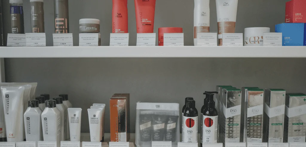
- High Contrast: Visually striking differences in color, tone, or texture immediately break through visual clutter. A minimalist, monochromatic package amidst a sea of vibrant competitors, or conversely, a brightly colored, dynamic design in a predominantly muted section, will naturally stand out.
- Unfamiliarity/Novelty: The human brain is wired to notice that which deviates from the norm. Unique shapes, unexpected color palettes, or unconventional design elements can pique curiosity and draw attention.
- Prominent Branding/Key Information: Clear, easily legible brand logos and concise benefit statements act as immediate anchors for recognition and understanding.
This principle underscores the critical need for thorough market research. Understanding the prevailing design trends and common visual strategies employed by competitors is not about imitation, but about informed disruption. A brand’s packaging design process should commence with a strategic analysis of the competitive landscape, aiming to create a distinct presence that resonates with consumers, rather than simply aiming for aesthetic perfection in isolation. The goal is to engineer a visual proposition that elicits a reaction, prompting consumers to pause and consider the offering.
Color and Form: Silent Architects of Emotion and Identity
Color and structural form are not merely decorative; they are powerful, silent communicators that tap directly into human emotions and pre-existing expectations. These elements initiate immediate subconscious emotional responses, shaping brand perception before a single word of text is read.
The Nuances of Color Psychology in Packaging
Color serves as a potent tool for influencing purchasing decisions, leveraging contrast and unexpected applications to differentiate products in crowded markets. Different colors are associated with distinct psychological responses and consumer expectations, making informed color choices crucial for establishing brand identity and evoking desired sentiments.
- Red: Often associated with urgency, passion, and excitement. It can stimulate appetite and is frequently used in food and beverage packaging, as well as for clearance or sale items to create a sense of immediate action.
- Blue: Conveys trust, reliability, and calmness. It is commonly found in products related to technology, finance, and healthcare, aiming to instill confidence and a sense of security.
- Green: Evokes nature, health, and sustainability. Its use is prevalent in organic foods, eco-friendly products, and wellness brands, signaling natural origins and environmental consciousness.
- Yellow: Represents optimism, happiness, and warmth. It can be used to grab attention and convey a sense of affordability or playfulness.
- Orange: Combines the energy of red with the cheerfulness of yellow, often signaling creativity, enthusiasm, and value.
- Purple: Historically linked to royalty, luxury, and sophistication. It is frequently employed for premium products or those aiming to convey a sense of exclusivity.
- Black: Suggests elegance, power, and sophistication. It is a common choice for luxury goods, high-end electronics, and premium food items.
- White: Represents purity, simplicity, and cleanliness. It is often used to convey a sense of clarity, minimalism, and freshness.
Beyond the inherent meaning of a color, its application is equally critical. The intensity and saturation of colors play a significant role. High-intensity colors can signal high energy and potentially lower cost, while carefully managed contrast ratios enhance visual readability, particularly from a distance. For example, a stark contrast between text and background ensures legibility, allowing a shopper to quickly grasp essential information.
Structural Form and Silhouette: The Three-Dimensional Brand Statement
The physical shape and structural design of a product contribute significantly to its visual identity by creating a distinct three-dimensional silhouette that occupies and defines shelf space. This form interacts with psychological mechanisms that influence perception and memory.
Psychological Mechanisms Leveraged by Product Structure:
- Recognition and Memorability: A unique and consistent form makes a product instantly recognizable, even from across a store. Think of the distinctive shape of Coca-Cola bottles or the iconic silhouette of the original Apple iPod.
- Perceived Value and Quality: Certain shapes can subconsciously convey premium quality or specific product attributes. For instance, heavier, more robust packaging might suggest higher quality ingredients or durability.
- Usability and Experience: The physical interaction with packaging can influence a consumer’s perception of the product. Ergonomic designs or packaging that facilitates easy opening and use can enhance the overall customer experience and foster positive brand association.
- Differentiation: Unconventional geometries or structural innovations can immediately set a product apart from its competitors, breaking the monotony of standard packaging shapes.
A subtle but distinct curve in a bottle, an unusually proportioned box, or an innovative dispensing mechanism can all contribute to a brand’s instant recognizability and create a memorable tactile and visual experience.
The One-Second Rule of Typography: Clarity in a Flash
From the moment a consumer’s gaze alights upon a product, a rapid cognitive process begins. Packaging that attempts to convey too much information simultaneously or relies on overly complex designs risks immediate failure. The effectiveness of packaging design is fundamentally dependent on the implementation of a strict visual hierarchy.
The primary message – typically the brand name or the core benefit of the product – must be immediately legible, ideally from several feet away. Any secondary information, such as detailed ingredients, nutritional facts, or secondary features, should only become discernible upon closer inspection. If a shopper cannot comprehend the essence of what the product is and why it matters within that critical first second, they are highly likely to move on to a more easily understood alternative. This necessitates a design philosophy that prioritizes clarity and conciseness, ensuring that the most vital information is presented in an instantly digestible format.
Authenticity: The Enduring Value Over Hype
In today’s discerning consumer market, there is a growing skepticism towards overt marketing ploys and exaggerated claims. Consumers are increasingly aware that not all information presented at face value is entirely accurate, leading to a potential backlash against packaging that is saturated with bold, unsubstantiated assertions or overly elaborate graphics. Such designs can inadvertently appear disingenuous and become off-putting.
Instead, brands are finding greater success by embracing transparency and authenticity in their packaging design and marketing. This can be effectively communicated through various means:
- Product Visibility: Incorporating clear windows that allow consumers to see the actual product inside builds trust and manages expectations.
- Minimalist Typography: Using straightforward, clear typography to state facts plainly conveys honesty and directness.
- Sustainable Materials: The use of eco-friendly, recycled, or responsibly sourced materials can serve as tangible proof of a brand’s commitment to its stated values, particularly environmental responsibility.
When a product’s packaging feels honest and straightforward, it fosters an immediate sense of rapport and credibility with the consumer. This connection, built on trust, is far more enduring than fleeting hype.
The Evolving Retail Arena: Digital and Physical Convergence
Whether it exists on a physical store shelf or a digital product listing, the "shelf" remains the ultimate testing ground for brand strategy. In the digital realm, packaging design translates into product imagery and descriptions that must still capture attention and convey value quickly within the scrollable, information-rich online environment. The principles of visual hierarchy, clear benefit communication, and brand authenticity remain equally critical.
By implementing a carefully considered amalgamation of visual disruption, clear and concise communication, and genuine authenticity, a product can effectively rise above the pervasive noise of the marketplace. This strategic approach to packaging design ensures that a product not only catches the eye but also earns its place in the consumer’s shopping cart, fostering loyalty and driving sustained sales in both physical and digital retail environments. The ongoing evolution of retail further emphasizes the need for adaptable, compelling packaging that can bridge the gap between offline and online experiences, ensuring a cohesive and impactful brand presence across all consumer touchpoints.