The landscape of digital analytics and business intelligence underwent a significant paradigm shift throughout 2017, as the democratization of data visualization tools allowed for a more seamless transition from raw numbers to actionable narratives. At the forefront of this movement was Google Data Studio, which emerged from its early beta stages to become a cornerstone for both corporate reporting and data journalism. By bridging the gap between complex data warehouses and user-friendly visual interfaces, the platform enabled organizations to condense weeks of manual labor into minutes of automated insight. This evolution was not merely a matter of aesthetic improvement but represented a fundamental change in how information is consumed, shared, and utilized across various sectors, from high-end media publishing to social science research.
The Evolution of Business Reporting: From Manual Labor to Real-Time Insights
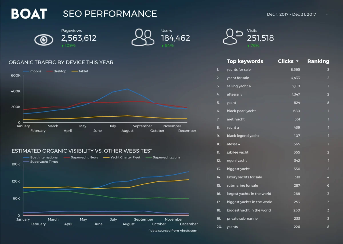
In the years leading up to 2018, business reporting was often characterized by static spreadsheets and labor-intensive manual data entry. Analysts frequently spent more time compiling reports than actually analyzing the data within them. The introduction of dynamic visualization tools like Google Data Studio provided a solution to this "reporting fatigue." A primary example of this transformation is seen in the operations of Boat International Media. Before adopting a modernized visualization workflow, the organization’s SEO performance reporting was a grueling five-day process. By leveraging automated data connectors, the team—led by analysts Fanni Takacs and Drew Broomhall—reduced this turnaround time to just fifteen minutes.
This dramatic increase in operational efficiency allowed the firm to focus on "clear key insights" rather than the mechanical aspects of data collection. The shift toward "clutter-free" design became a hallmark of professional reporting during this era. High-quality business dashboards began to prioritize white space, consistent color palettes, and intuitive hierarchies, ensuring that reports were as effective when printed as PDFs for stakeholders as they were when viewed as interactive web modules. This emphasis on design was not just about optics; it was a strategic move to ensure that critical SEO metrics—such as organic growth, keyword rankings, and backlink profiles—could be understood at a glance by executive decision-makers.
Standardizing the Google Analytics Ecosystem
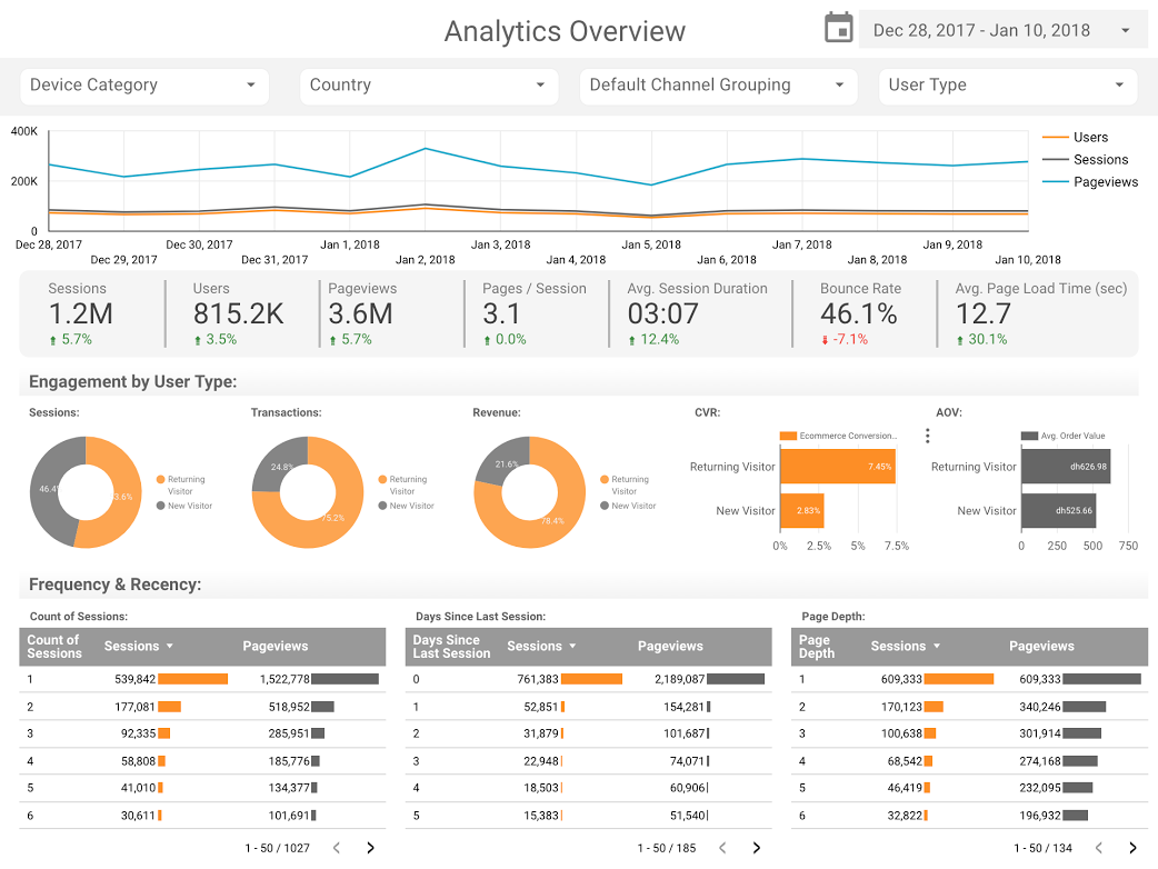
As Google Analytics became the industry standard for web measurement, the need for a more flexible way to present its findings became urgent. While the native Google Analytics interface offered robust data, it often proved overwhelming for non-technical users. The emergence of standardized templates, such as those developed by the ClickInsight team, provided a foundational bridge. These templates allowed companies to visualize web activity—ranging from user demographics to conversion funnels—without needing to build a dashboard from scratch.

Further advancements were made by industry consultants like Sunil Attri of E-Nor, who championed the use of compact, interactive reports. By utilizing the native data connectors within the Google ecosystem, these dashboards could pull live data directly from the source, eliminating the risk of human error associated with manual exports. The integration of "Bullet Charts," popularized by organizations like Analytics Pros, introduced a new level of sophistication to page-level engagement tracking. Unlike traditional gauges or bar charts, bullet charts allowed analysts to compare current performance against both historical data from the previous year and specific benchmark targets simultaneously. This three-dimensional view of performance—current status, historical context, and goal alignment—provided a more nuanced understanding of user behavior and content efficacy.
Data Journalism: Bringing Public Records to Life
Beyond the boardroom, 2017 and 2018 saw a surge in "journalistic storytelling" through data. This movement was driven by the availability of public datasets and the ease with which they could be visualized for a general audience. Data journalism shifted the focus from anecdotal evidence to empirical narratives, making complex global trends accessible to the public.
One of the most prominent examples of this was the analysis of the "Cinematic Universe" wars. As the Marvel Cinematic Universe (MCU) and the DC Extended Universe (DCEU) competed for box office dominance, data enthusiasts used visualization tools to track the financial and critical trajectory of these franchises. With the MCU alone amassing over $27 billion in global box office revenue, the data told a story of unprecedented brand loyalty and scaling. Visualizations comparing these two giants allowed audiences to see not just which films made the most money, but how audience sentiment and box office returns fluctuated over a decade of storytelling.
Similarly, the cultural phenomenon of Star Wars provided a rich dataset for analysis. ClickInsight’s "Star Wars Data Report" served as a prime example of how technical tools could be applied to entertainment. By quantifying ship speeds, character demographics, and planet details, the report demonstrated that data visualization could be used to engage fans in a way that traditional articles could not. These interactive reports allowed users to "browse" the data, turning a static consumption of facts into an exploratory experience.
Technical Integration: The Power of BigQuery and Open Source
The technical backbone of these visualizations often relied on the synergy between Google Data Studio and BigQuery, Google’s enterprise data warehouse. This was particularly evident in the work of Google Developer Advocate Felipe Hoffa, who tackled the massive task of analyzing open-source contributions. By processing every "PushEvent" published by GitHub throughout 2017, Hoffa was able to identify the top contributors to the open-source community.

This analysis was significant because it moved beyond surface-level statistics to reveal the underlying health of the web’s infrastructure. Open-source software is the foundation of the modern internet, and understanding who is building and maintaining it is crucial for technological transparency. By importing GitHub’s massive datasets into BigQuery and visualizing the results in Data Studio, Hoffa showcased the platform’s ability to handle "Big Data" with the same ease as a simple spreadsheet. This signaled a new era where complex data processing was no longer restricted to data scientists but was accessible to anyone with a basic understanding of SQL and visualization principles.
Social Trends and Historical Analysis: 150 Years of UK Data
Perhaps the most profound application of these tools was in the realm of social science and historical trends. A notable study conducted by analysts including Lizzie Silvey examined 150 years of marriage and divorce trends in the United Kingdom. This was not a mere collection of charts but a deep-dive analysis of how external factors—such as world wars, economic depressions, and legislative changes—impacted the fabric of society.
The data revealed the long-term effects of the Divorce Reform Act of 1969, showing a sharp spike in divorce rates as the law made it easier for couples to separate. It also illustrated how the aftermath of World War I and World War II led to significant fluctuations in marriage rates. By using Data Studio to answer questions such as "Who wants a divorce and why?" the researchers provided a factual basis for discussions that are often dominated by opinion and anecdote. This type of longitudinal analysis highlights the power of visualization to provide context to the present by accurately mapping the past.
The Broader Impact on Decision-Making and Communication
The widespread adoption of these visualization tools has had a lasting impact on how information is communicated across all levels of society. For businesses, it has meant a shift from "hindsight" reporting to "insight" and "foresight." When data is available in real-time and presented clearly, organizations can pivot more quickly in response to market changes. The reduction in reporting time from days to minutes represents a massive gain in productivity, allowing teams to spend their energy on strategy and execution.
In the public sphere, the rise of data-driven storytelling has contributed to a more informed citizenry. As journalists and researchers use these tools to explain everything from climate change to election results, the "data literacy" of the general public continues to grow. The ability to interact with a chart, filter the results, and see the underlying numbers builds trust and transparency in a way that static reporting cannot.
Conclusion: The Path Forward in 2018 and Beyond
As 2018 progressed, the trend toward interactive, automated, and beautifully designed data stories only accelerated. The examples set by Boat International, ClickInsight, and independent researchers proved that data is most powerful when it is accessible. The transition from the "Beta" phase of tools like Google Data Studio to their status as essential business assets marked the end of the era of the "siloed analyst."
Today, the expectation for data is higher than ever. It is no longer enough to have the numbers; one must also have the narrative. Whether it is tracking the performance of a multi-million dollar SEO campaign, analyzing the global box office, or mapping 150 years of social history, the goal remains the same: to turn data into knowledge. As the tools continue to evolve, the barrier to entry for high-level data visualization continues to fall, inviting more voices to participate in the data-driven conversation. The legacy of the 2017-2018 period remains a testament to the fact that when data is visualized effectively, it doesn’t just inform—it inspires.


 Ali Ikhwan
 Dwi Wanna