The architecture of a digital storefront is centered significantly on the category page, often referred to in the industry as the Product Listing Page (PLP). As the primary bridge between a website’s homepage and its individual Product Detail Pages (PDPs), the category page serves as a critical junction in the customer journey. Recent industry data indicates that for many large-scale retailers, category pages account for 60% to 70% of total organic search traffic, making them more influential for SEO and user discovery than even the homepage. Despite this importance, many e-commerce platforms struggle with high exit rates on these pages, often due to a misalignment between the page design and the visitor’s specific stage in the purchasing funnel.
The Strategic Alignment of Purpose and User Intent
Before a retailer initiates any design changes, layout adjustments, or A/B testing, it is imperative to define the specific objective of the category page. Industry analysts categorize the intent of a visitor into three primary roles: browsing, deciding, or buying. Misidentifying this intent can lead to significant friction. For instance, a browsing-focused category page is designed for users who are still in the exploratory phase, asking themselves what options are available and where they should navigate next.
Introducing high-commitment conversion actions, such as an "Add to Cart" button, at this stage can create what psychologists call decision conflict. When an interface demands a higher level of commitment than the user is prepared to make, it often results in cognitive overload. Instead of proceeding through the funnel, the user may feel pressured to evaluate specific product details prematurely, leading to a deceleration in the browsing process or total site abandonment. For browsing-centric pages, the design priority must remain on clear navigation, visual hierarchy, and the ease of moving into more specific sub-sectors of the catalog.
Conversely, for transactional-focused pages—often seen in grocery or office supply e-commerce—the user intent is frequently replenishment. In these scenarios, the absence of an "Add to Cart" button is actually the source of friction. The intersection of what the brand wants the visitor to do and what the visitor expects to do constitutes the "functional sweet spot" of e-commerce design.
Analytical Evaluation and Performance Benchmarks
The optimization of category pages must be rooted in rigorous data analysis. Digital marketing professionals typically monitor the "Exit Rate" of category pages as a primary KPI. Under ideal circumstances, a category page should have an exit rate that aligns closely with the overall site average. A spike in this metric suggests that the page is failing to facilitate the transition to a product page, indicating a breakdown in the user experience.
Historical data from e-commerce audits suggests that high exit rates on PLPs are often linked to poor load times or irrelevant product sorting. According to Google’s Core Web Vitals benchmarks, a delay of just one second in mobile load times can impact conversion rates by up to 20%. Therefore, the technical performance of these pages is as vital as their visual layout. Furthermore, heatmapping tools and session recordings often reveal that users ignore large banners or promotional carousels at the top of category pages, preferring to dive straight into the product grid, suggesting that "above the fold" real estate is frequently mismanaged by marketing teams.
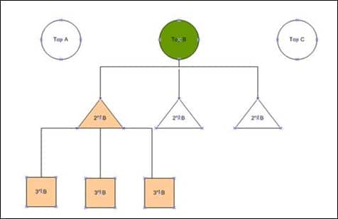
Structural Hierarchy and the Rule of Sub-Categorization
A common pitfall in e-commerce site architecture is the "flat" category structure. While grouping products into top-level categories like "Electronics" or "Apparel" is a necessary starting point, it is rarely sufficient for a modern consumer. Industry best practices recommend a hierarchical depth of at least two to three levels. For example, "Electronics" should lead to "Computers," which then leads to "Laptops" or "Desktops."
However, experts caution against excessive nesting. A hierarchy that exceeds three or four levels can lead to "navigation fatigue," where the user feels lost in a labyrinth of clicks. To mitigate this, successful retailers implement "child category" highlights. When a user is on a high-level category page, the interface should visually surface the most popular sub-categories or "child" items to provide a shortcut to the user’s likely destination. This approach balances the need for organization with the demand for speed.
Faceted Navigation and Feature-Based Filtering
As the volume of products in a category grows, the importance of faceted navigation—filters that allow users to narrow down results based on specific attributes—becomes paramount. The effectiveness of these filters depends entirely on the retailer’s understanding of the product’s "key buying factors."
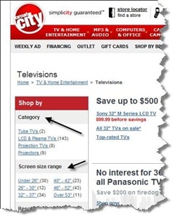
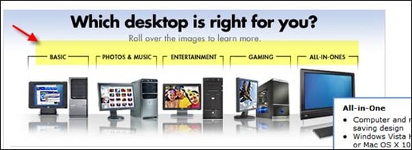
In the consumer electronics sector, for example, technical specifications such as screen resolution, processor speed, and battery life are the primary drivers of choice. In contrast, in the publishing or media sector, filters might focus on format (audiobook vs. hardcover) or release date. Case studies of major retailers like Best Buy show that categorizing products by "need" or "use case"—such as "Gaming," "Photo Editing," or "Basic Home Office"—can significantly improve the relevance of the search results for non-technical users. This "needs-based" filtering helps bridge the gap between technical specifications and real-world utility, making the selection process more intuitive.
The Role of Buying Guides and Decision Support
For complex or high-ticket items, a category page must do more than just list products; it must act as a consultant. When consumers are faced with a wide array of sophisticated options, "analysis paralysis" can set in. To counter this, leading e-commerce platforms have begun integrating buying guides, comparison tools, and interactive "wizards" directly into their category pages.
These tools serve to educate the consumer and build brand authority. For instance, a category page for professional camera equipment might include a brief guide on the differences between mirrorless and DSLR sensors. By providing this educational layer, the retailer reduces the perceived risk of the purchase, effectively moving the visitor from the "browsing" phase to the "deciding" phase without requiring them to leave the site to conduct external research.
Evolutionary Design through Iterative Testing
The final stage of category page optimization is the implementation of a continuous testing cycle. Digital landscapes are not static; consumer preferences and technological capabilities evolve rapidly. What was considered a best practice two years ago—such as the heavy use of sidebars for navigation—is being replaced by "mobile-first" designs that utilize slide-out menus and simplified grids.
A/B testing allows brands to validate their assumptions. For example, a retailer might test whether a "Quick View" modal improves conversion or if it simply adds an unnecessary step in the journey. Similarly, the placement of filters—whether on the left sidebar or as a horizontal bar at the top—can have a measurable impact on user engagement. Real-world examples have shown that even highly anticipated features, such as "need-based" filtration, can sometimes fail to resonate with specific audiences. In one documented case, a client implemented a sophisticated filtration system that the internal team was confident would succeed, only for analytics to reveal that fewer than 1% of visitors were utilizing it. The feature was removed within weeks, underscoring the importance of data over intuition.
Broader Implications for the Future of E-commerce
The optimization of category pages carries significant implications for the broader e-commerce ecosystem. As Artificial Intelligence (AI) and Machine Learning (ML) become more integrated into retail platforms, we are seeing the rise of "Dynamic Category Pages." These are pages that reorder themselves in real-time based on the individual user’s past behavior, search history, and demographic data.
Furthermore, the shift toward "Headless Commerce"—where the front-end user interface is decoupled from the back-end commerce engine—allows for much faster experimentation and more personalized category experiences across different devices, from smartphones to smart mirrors. As the digital marketplace becomes increasingly crowded, the ability to provide a seamless, intuitive, and highly relevant category page experience will be the deciding factor in which brands retain customer loyalty and which ones see their bounce rates climb.
In conclusion, the category page is far more than a simple list of inventory. It is a sophisticated psychological and technical tool that, when executed correctly, guides the user through the complex landscape of choice. By aligning page design with user intent, leveraging deep analytics, maintaining a logical hierarchy, and embracing a culture of testing, e-commerce brands can transform these high-traffic pages into powerful engines for growth and conversion. The future of digital retail lies in the ability to turn a vast catalog into a curated, navigable, and persuasive experience that respects the user’s time and simplifies their decision-making process.