Your email signup form is the single most critical point of entry between a website visitor and your invaluable email list. Far from being a mere technicality, it represents a pivotal juncture that can decisively influence a visitor’s decision to subscribe, or to move on, potentially forever. The strategic confluence of compelling copy, intuitive design, appropriate typography, and optimal placement collectively dictates the efficacy of this digital handshake. This article delves into the proven strategies, underlying psychological principles, and practical applications that transform passive visitors into engaged subscribers, thereby fueling sustainable business growth.

The digital landscape has long recognized email as a cornerstone of direct marketing, consistently delivering high returns on investment. As of 2024, global email users are projected to exceed 4.5 billion, underscoring its enduring relevance. A well-constructed email list is more than just a collection of contacts; it’s a direct communication channel, a powerful tool for nurturing leads, building brand loyalty, and driving sales. At the heart of this ecosystem lies the signup form, acting as the initial bridge in what often becomes a long-term customer relationship. Understanding its nuances, therefore, is not just beneficial, but imperative for any entity operating in the digital sphere.
The Foundational Pillars: Understanding Email Signup Form Types
Not all signup forms are created equal. Each type serves a distinct strategic purpose, designed to capture attention and encourage subscription at varying points in a user’s journey. The judicious selection of a form type is paramount, aligning with where and when you aim to engage your audience most effectively.
1. Inline Forms: Seamless Integration and Contextual Relevance
Inline signup forms are those seamlessly embedded within the natural flow of a webpage’s content. They can be strategically positioned at the top, bottom, within the sidebar, or interspersed directly within an article. Their strength lies in their unobtrusive nature; they do not interrupt the user experience but rather offer an opt-in opportunity as the visitor engages with the content.
- Strategic Placement: Inline forms are ideal for blog posts, “About Us” pages, or product descriptions. Placing them at the end of a valuable article, for instance, allows visitors to consume content first, building trust and demonstrating expertise before presenting the subscription option. A study by OptinMonster indicated that inline forms, when contextually relevant, can achieve conversion rates of over 1%.
- Best Practices: These forms are particularly effective when the incentive offered is directly related to the surrounding content. For example, an inline form within a recipe blog post could offer a free cookbook. Using a plugin like AWeber for WordPress can streamline the placement and performance tracking across various pages, providing valuable data for optimization.
2. Pop-Up Forms: Maximizing Attention and Timed Engagement
Pop-up forms, by their very design, are not embedded. Instead, they “pop up” or “slide in” at specific, pre-determined junctures during a visitor’s website interaction. These forms are engineered to command immediate attention, often leading to higher conversion rates due to their visibility. However, their intrusive nature necessitates careful implementation to avoid negatively impacting user experience.
- Mitigating Disruption: Modern pop-up forms offer sophisticated display settings to minimize annoyance. Options include fading the background, appearing as a slide-in from a corner, or setting frequency caps to prevent repeated displays to the same user. Research from Sumo suggests that the average conversion rate for all pop-ups is around 3.09%, with top performers reaching over 9%.
- Variations for Precision Targeting:
- Time-Delayed Pop-ups: These forms appear after a specified duration, allowing visitors to engage with content before the prompt. Analyzing web analytics for average time on page is crucial to set an optimal delay, ensuring the pop-up appears when interest is piqued but before the visitor might leave.
- Scroll-Delayed Pop-ups: Triggered when a visitor scrolls to a particular percentage of the page, these forms leverage active engagement. Their appearance signals that the user has found the content sufficiently interesting to explore further, making them more receptive to an offer.
- Exit-Intent Pop-ups: Arguably one of the most effective pop-up types, these forms activate when a user’s mouse movement suggests an imminent departure from the site. They act as a last-ditch effort to “save” a potentially lost visitor, presenting an enticing offer (e.g., a discount, exclusive content) to encourage subscription before they navigate away. Data consistently shows exit-intent pop-ups can recover 10-15% of abandoning visitors.
- Two-Step Pop-ups: Unlike others, these forms appear only after a visitor actively clicks a link or button. This intentional interaction signifies a higher level of interest, resulting in significantly higher conversion rates, often exceeding 15-20%, because the user has self-qualified their interest in the offer.
3. Landing Page Forms: Dedicated Focus for High-Value Offers
In stark contrast to a multi-page website, a landing page is a standalone web page with a singular, unambiguous objective: to convert visitors into subscribers or leads. Devoid of navigation bars, menus, or external links, landing pages present visitors with a clear binary choice: subscribe to the offer or leave.
- Unparalleled Focus: This minimalist design philosophy eliminates distractions, channeling the visitor’s attention entirely towards the value proposition and the signup form. This dedicated focus often leads to superior conversion rates for specific campaigns, especially when paired with paid advertising traffic.
- Emphasizing Value: Landing pages provide ample space to elaborate on the benefits of subscribing, using rich media like images, videos, and detailed testimonials to underscore the value proposition. Whether offering a webinar, an ebook, or a free consultation, the landing page format ensures maximum clarity and persuasive power. Industry benchmarks suggest well-optimized landing pages can achieve conversion rates between 5-10%, with exceptional ones reaching 20% or more.
Strategic Placement: Maximizing Visibility and Conversion Potential
The effectiveness of any signup form is intrinsically linked to its placement. While different form types lend themselves to different locations, the overarching principle is to find placements that are both highly noticeable and naturally integrated into the user experience, avoiding undue interruption. The goal is to present the form precisely when a visitor is most receptive to converting.
Optimal Placement for Inline Forms
Inline forms should ideally be present on every page of your website, typically in the footer or sidebar, ensuring a consistent opportunity for subscription regardless of the visitor’s navigation path. The incentive here should be broadly appealing, such as a general newsletter, a 10% discount, or essential industry tips. For more targeted engagement, inline forms can be embedded within specific content, for example, offering a related checklist within a “how-to” guide. Analytics tools like Google Analytics are indispensable for identifying high-traffic pages and sections where users spend the most time, providing data-driven insights for optimal inline form placement.
Optimal Placement for Pop-Up Forms
Given that the homepage often serves as the primary entry point for most website traffic, a pop-up form here is crucial for capturing a significant number of initial visitors, promoting your main value proposition. Beyond the homepage, identifying other high-traffic pages through web analytics allows for strategic deployment of pop-ups tailored to the specific content of those pages. For instance, a pop-up on a product category page could offer a discount specific to that category, enhancing contextual relevance and conversion likelihood.
Crafting Compelling Copy: The Art of Turning Visitors into Subscribers
Beyond placement and type, the linguistic artistry of your signup form’s copy plays an instrumental role in highlighting the intrinsic value you are offering. It is the persuasive voice that convinces a visitor to commit their contact information.
1. Clear, Concise Headlines: The Immediate Value Proposition
The headline of your signup form must eliminate any ambiguity regarding the benefits of subscribing. It should be a pithy statement that instantly conveys what subscribers will gain and how it will address their needs or desires.

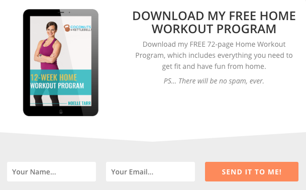
- Example Analysis (Coconuts & Kettlebells): The headline “Free 72-page Home Workout Program” is a masterclass in clarity. It immediately communicates a tangible, high-value offer. The subsequent description reinforces this by detailing the program’s utility (“designed to help you get fit from home”), leaving no room for doubt about the subscriber’s gain. This directness, according to conversion rate optimization best practices, can boost signups by up to 20%.
2. Clearly Communicate the Value: Expanding on the Benefit
Following the headline, the body copy must elaborate on the promised value. This section should articulate how your offer solves a problem, answers a pertinent question, or otherwise improves the subscriber’s situation. This can be achieved through a succinct sentence or two, or a more detailed bulleted list for complex offers.
- Example Analysis (Stepmom Magazine): This landing page effectively uses bullet points to enumerate the types of content subscribers will receive. This approach breaks down the value into easily digestible points, demonstrating the breadth and relevance of the content, which reassures potential subscribers of a consistent flow of valuable information tailored to their interests.
3. Set Clear Expectations: Building Trust and Reducing Churn
Transparency is paramount. Your signup form should explicitly state what subscribers will receive, the frequency of communication, and the nature of the content. This proactive approach not only builds trust and fosters a positive subscriber relationship but also significantly reduces spam complaints and unsubscribe rates. It also ensures compliance with data protection regulations like GDPR.
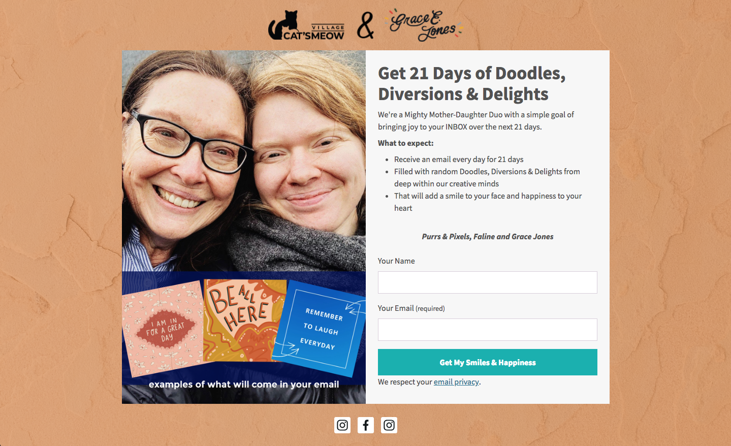
- Example Analysis (Cat’s Meow Village): By stating subscribers can expect “fun, light-hearted emails every day for 21 days,” Cat’s Meow Village exemplifies clear expectation setting. This specificity allows subscribers to know precisely what they are signing up for, mitigating surprises and fostering a sense of reliability. Studies show that explicit expectation setting can reduce unsubscribe rates by 15-20%.
4. Write Conversational Copy: Fostering Connection
Engaging, conversational language can significantly increase reader engagement. Phrases like “Oh hey!” or “Hey you!” act as pattern interrupts, grabbing attention because they deviate from typical marketing jargon. This personal touch hooks visitors, making them more receptive to your value proposition.
- Example Analysis (Really Good Emails): The use of conversational copy creates an immediate, personal connection, making the form feel less like a transactional request and more like an invitation. This informal tone helps in establishing brand personality and relatability.
5. Be Creative, Witty, or Humorous: Enhancing Brand Personality
Injecting creativity, wit, or humor into your copy helps build rapport and allows subscribers to connect with your brand on a deeper, more human level. It differentiates your brand and makes the subscription process more memorable.
- Example Analysis (How Not to Sail): This example ingeniously integrates sailing terminology into its call to action, replacing a generic “Sign Up” with phrases that evoke the brand’s theme. This witty approach not only entertains but also immerses the visitor in the brand’s narrative, making the act of subscribing feel like “climbing aboard” a unique journey.
Designing for Impact: Visuals and User Experience
The visual presentation of your signup form profoundly influences initial perceptions. Given that 90% of first impressions are based on visual and color cues alone, strategic design is not merely aesthetic but a critical component of conversion optimization.
1. Keep Form Fields to a Minimum: Reducing Friction
Every additional field in a signup form introduces friction, creating a barrier to completion. Forms with fewer input fields consistently convert better because they demand less time and effort from visitors.

- Strategic Field Selection: In most cases, collecting just a name and email address suffices for initial subscription. If the primary goal is list growth, adhere to this minimum. For lead generation, where qualifying leads is crucial, more fields might be justified. However, consider progressive profiling (collecting additional data over time) or post-signup surveys to gather more information without overwhelming the initial subscriber. Behavioral economics suggests that reducing perceived effort can increase conversions by up to 30%.
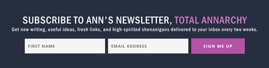
- Example Analysis (Ann Handley): This form exemplifies minimalism with just two fields, optimizing for speed and ease of subscription.
2. Use a Clear Call to Action (CTA): Guiding the Subscriber
The CTA button is the final prompt for action. Generic phrases like “Sign Up” are often missed opportunities. The text on your CTA should be specific, benefit-oriented, and directly relate to the action the subscriber is taking.
- Action-Oriented Language: Instead of “Sign Up,” consider “Send me my free guide!” if you’re offering one. Incorporating urgency (“Join now!”) or personal, possessive language (“Yes, I want in!”, “Download my free templates”) significantly boosts clicks by fostering a sense of ownership and immediate benefit.
- Example Analysis (Paul Kirtley): Paul Kirtley’s CTA uses possessive language directly tied to the subscriber’s action, creating a personalized and compelling prompt. Research indicates personalized CTAs convert 202% better than basic ones.
3. Follow a Typographic Hierarchy: Enhancing Readability
A clear typographic hierarchy guides the reader’s eye, emphasizing key information. Headlines should be the largest text, followed by subheads, and then descriptive body text.
- Font Selection: Limit your form to one or two complementary font types. If using multiple, ensure the headline font is distinct to draw immediate attention. This visual organization aids readability and professional perception.
- Example Analysis (FroKnowsPhoto): This form demonstrates effective typographic hierarchy, using varying font sizes and styles (bold, italicized, all caps) to create visual interest and direct the reader’s focus.
4. Stick to 1-2 Font Colors: Maintaining Clarity
Excessive font colors can be distracting and impair readability. Adhering to one or two carefully chosen font colors ensures clarity and maintains a professional aesthetic.
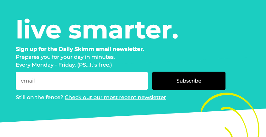
- Example Analysis (The Daily Skimm): This form’s exclusive use of white font color against a contrasting background proves that simplicity, when executed well, is highly effective and visually clean.
5. Create Color Contrast: Making Your Form Stand Out
Strategic use of contrasting colors ensures your signup form visually pops against the background of your website. A bright, attention-grabbing color on a neutral page can dramatically increase form visibility and completion rates.
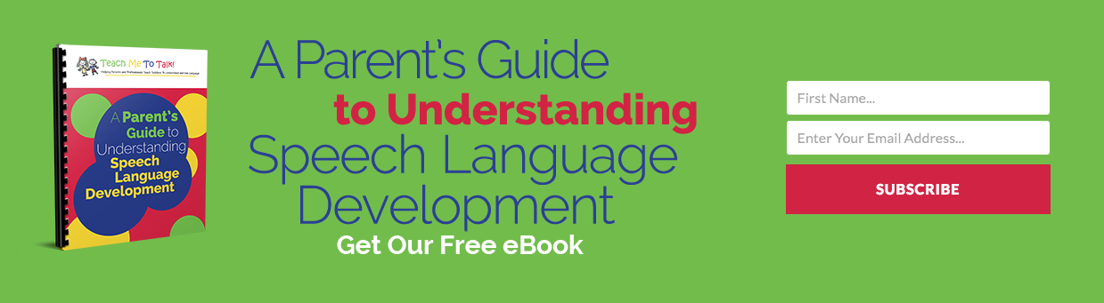
- Example Analysis (Teach Me To Talk): The form uses a distinct color scheme that immediately draws the eye, while clearly articulating the incentive. This high contrast makes the form undeniable.
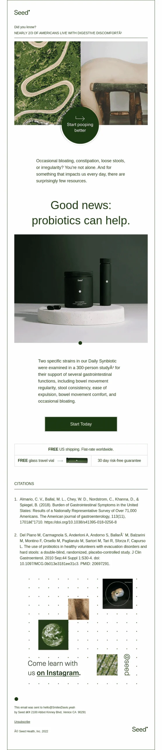
6. Visually Represent Your Incentive: The Power of Imagery
A compelling visual representation of your incentive can provide the crucial extra nudge for subscription. Forms incorporating relevant images generally receive significantly more views and conversions than text-only forms.
- Example Analysis (Spoon Graphics): This form effectively uses a fun, graphical representation of its incentive, making the offer more tangible and appealing. Visuals can convey complex information quickly and evoke emotional responses, boosting engagement.
7. Let Subscribers Choose Their Preferences: Personalization and Engagement
Empowering subscribers to select their email preferences significantly enhances engagement rates. By allowing customization of content and frequency, you ensure they receive information most relevant to them, leading to higher perceived value and sustained interaction.

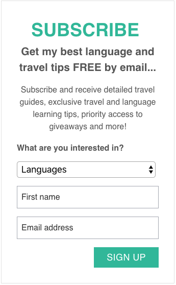
- Example Analysis (The Intrepid Guide): This signup form allows subscribers to choose topic preferences, leading to a more personalized email experience. This strategy can reduce unsubscribe rates and increase open/click-through rates by up to 50%, as subscribers feel more in control and receive content they genuinely desire.
8. Try Presenting an Unfavorable Alternative: Leveraging Loss Aversion
This psychological tactic, primarily effective for pop-up forms that can be dismissed, positions opting out as an undesirable choice. It prompts visitors to consider the negative consequences of not subscribing, making the subscription option the clearly superior choice.
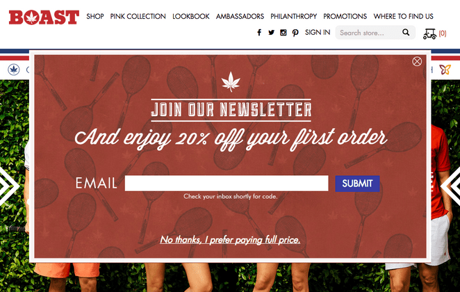
- Example Analysis (Boast): By offering a discount for signing up and presenting the alternative as “No thanks, I prefer paying full price,” Boast cleverly leverages loss aversion. Few people would willingly choose to pay more, making the subscription option highly compelling. This technique can increase opt-in rates by 10-25%.
9. Use Social Proof: Building Trust and Credibility
Social proof operates on the fundamental psychological principle that if many others have done something, it must be worthwhile. Displaying subscriber numbers, testimonials, or endorsements instills confidence in visitors, assuring them that subscribing is a sound decision and that your brand is credible.
- Example Analysis (Nerd Fitness): Highlighting “over 300,000 people” subscribed immediately builds trust and validates the value of their content. This “bandwagon effect” is a powerful conversion driver, often boosting signups by 10-18%.
10. Use a Big CTA Button: Mobile Responsiveness and Usability
With over half of all website visits originating from mobile devices, ensuring your signup form is mobile-friendly is non-negotiable. A large, easily tappable CTA button and adequately spaced input fields are crucial for a seamless mobile user experience.
- Example Analysis (Mark Asquith): Mark Asquith’s form features a large, bold “Download Now” button, making it highly visible and easy to interact with on any device, especially touchscreens. This attention to mobile usability can improve conversion rates by up to 30% on mobile.
11. Use Plenty of White Space: Enhancing Clarity and Professionalism
Ample white space around text, images, and form fields is vital for readability. It prevents visual clutter, making the form appear less daunting and more professional, which in turn enhances trust and encourages completion.
- Example Analysis (1 Chic Retreat): This form effectively utilizes white space, giving its copy room to breathe and contributing to a clean, professional, and inviting appearance.
The Future is AI: Streamlining Form Creation
The myriad design decisions involved in creating an effective signup form—typography, color contrast, white space, CTA copy, field count—can be daunting. Recognizing this complexity, platforms like AWeber have introduced AI-powered signup form builders.
- Automated Design: By simply describing your business in a single sentence, AWeber’s AI can generate a complete signup form, incorporating brand colors, a compelling headline, descriptive copy, appropriate input fields, and an optimized layout. A bakery seeking emails for a weekly recipe newsletter will receive a distinctly different form than a fitness coach promoting a free workout plan, tailored to their specific needs and audience.
- Customization and Integration: While AI provides a robust working draft, every element remains editable, allowing users to fine-tune copy, swap colors, add or remove fields, and adjust button text to perfectly align with their brand. Critically, these AI-generated forms seamlessly connect to your AWeber email list and automation workflows, ensuring new subscribers flow directly into your welcome sequence, streamlining the entire lead nurturing process. This innovation democratizes high-quality form design, making sophisticated tools accessible to businesses without dedicated design or development teams, significantly reducing the time and effort required for effective list building.
Continuous Improvement: Testing and Optimizing Your Signup Form
Publishing your signup form is merely the initial step; its true potential is unlocked through continuous improvement and optimization. The digital landscape is dynamic, and what works today may not be as effective tomorrow.

A/B Testing: The Scientific Approach to Optimization
A/B testing, or split testing, is a fundamental practice for data-driven optimization. It involves comparing two versions of your signup form (Version A and Version B) to determine which performs better against a specific metric, such as conversion rate.
- Methodology: To conduct an effective A/B test, you typically change only one element between the two versions (e.g., headline, CTA button color, number of fields) to isolate its impact. Visitors are then randomly shown either Version A or Version B, and their interactions are tracked. Over time, statistical analysis reveals which version yielded superior results.
- Elements to Test: Virtually any element of your signup form can be A/B tested: headlines, body copy, CTA text, button colors, field count, image vs. no image, form placement, pop-up delay times, and even the overall layout. Consistent A/B testing can lead to incremental gains that accumulate into substantial improvements in subscriber growth.
Refreshing Forms: Combating “Banner Blindness”
Over time, even the most effective signup forms can experience diminishing returns. Visitors who have encountered your form multiple times without subscribing may develop “banner blindness” – a tendency to ignore familiar elements. Periodically refreshing your form with a new look, updated copy, or a different incentive can re-capture attention and entice previously unresponsive visitors. This proactive approach ensures your form remains fresh, relevant, and compelling.
Case Study: AWeber’s 150% Lift in Engagement Through Preference Options
A compelling example of optimization comes from AWeber itself. When updating their popular “What to Write in Your Emails” course, they observed varied subscriber feedback: some desired more frequent emails, while others preferred less.
- The Solution: AWeber implemented a preference choice on the signup form, allowing subscribers to select their desired email frequency for the course. This simple but profound change empowered subscribers, granting them control over their experience.
- The Impact: The results were remarkable: open rates increased by 47%, and click-through rates soared by 150%. This demonstrates the immense power of personalization and subscriber empowerment. For the 94% of small business owners who write their own marketing emails, giving subscribers control over frequency is one of the highest-impact changes they can implement, directly leading to greater engagement and satisfaction.
Broader Impact and Implications: The Long-Term View
The humble email signup form, when strategically conceived, meticulously crafted, and continuously optimized, transcends its basic function to become a powerful engine for business growth. Its implications extend far beyond mere list building:
- Enhanced Lead Generation: A highly converting form translates directly into a robust pipeline of potential customers.
- Improved Customer Relationships: By setting clear expectations and offering personalized content, businesses can cultivate deeper trust and loyalty from the outset.
- Data-Driven Insights: The process of optimizing forms generates invaluable data on audience preferences, messaging effectiveness, and design impact, informing broader marketing strategies.
- Competitive Advantage: Businesses that prioritize the user experience of their signup forms stand out in a crowded digital marketplace, projecting professionalism and customer-centricity.
- Sustainable Growth: An ever-growing, engaged email list provides a direct, low-cost channel for promotions, announcements, and content distribution, contributing to long-term business resilience and profitability.
In conclusion, mastering the art and science of email signup forms is not an option but a strategic imperative. It demands a holistic approach, integrating psychological understanding, design principles, compelling copywriting, and continuous analytical refinement. By investing in this critical digital gateway, businesses unlock the full potential of email marketing, transforming fleeting website visits into enduring and profitable customer relationships.