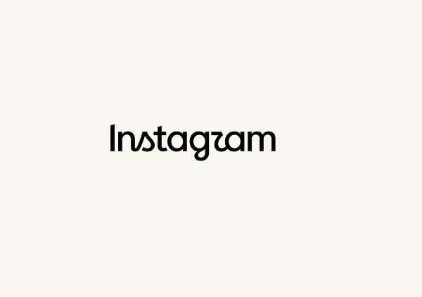
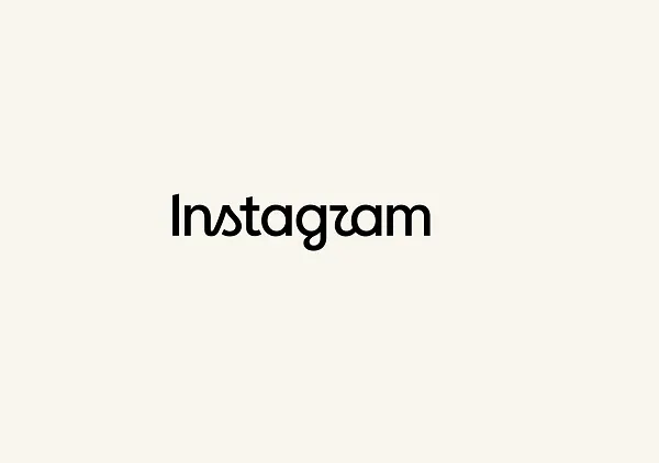
Instagram, the globally dominant photo and video sharing platform, has initiated a significant update to its visual identity, introducing a refreshed wordmark that marks the first substantial branding alteration for the application in more than ten years. The unveiling, spearheaded by Instagram Chief Adam Mosseri, has sparked a wide spectrum of reactions from its vast global user base, ranging from appreciation for a more modern aesthetic to criticisms concerning specific design elements and the perceived priorities of the platform.
Details of the Brand Refresh
The core of Instagram’s latest brand evolution centers around a redesigned wordmark, the textual representation of the company’s name. Adam Mosseri, in his announcement shared across both Instagram and Threads, articulated the rationale behind the change, stating, "We updated the Instagram wordmark today, which is more than a decade old and felt dated. We feel the refresh is sharper and more modern, but references the original and has the simplicity and craft that’s always made it Instagram." This statement underscores a dual objective: to modernize the brand’s appearance while simultaneously preserving a connection to its established visual heritage.
Beyond the wordmark itself, the update encompasses a broader "brand system," as detailed in a comprehensive overview shared on Meta’s design blog. This system includes new fonts, icons, and formats that are intended to create a cohesive and contemporary visual experience across the platform. The objective is to ensure that every visual element, from the smallest icon to the most prominent text display, aligns with the refreshed aesthetic, projecting a unified and forward-looking image. The updated text display, in particular, aims to provide a fresher feel that could subtly reinvigorate the app’s overall perception without necessitating radical changes to its core functionality or user interface.
A Decade of Visual Evolution: Instagram’s Brand History
To fully appreciate the significance of this rebrand, it is crucial to examine Instagram’s visual history. Launched in October 2010, Instagram quickly distinguished itself with its distinctive square photos and a vintage-inspired aesthetic, encapsulated by its original logo: a detailed, brown-and-beige camera icon. This initial logo, designed by co-founder Kevin Systrom, paid homage to retro Polaroid cameras and perfectly matched the app’s then-novel photo filters that mimicked classic film photography. It was a tangible representation of the app’s core function and nostalgic appeal.
In 2016, Instagram undertook its most dramatic rebrand prior to the current update. This change saw the iconic skeuomorphic camera logo replaced with a flat, abstract gradient icon, accompanied by a simplified black-and-white wordmark. This shift was largely driven by a desire to move away from the skeuomorphic design trend, which was increasingly perceived as outdated, and embrace a more modern, minimalist, and scalable aesthetic suitable for a rapidly evolving digital landscape. The gradient icon, while initially met with some resistance, eventually became synonymous with Instagram’s global presence and expansion beyond simple photo sharing into videos, Stories, and direct messaging. The 2016 update reflected Instagram’s growth from a niche photography app to a mainstream social media powerhouse, appealing to a broader, more diverse user base.
The wordmark itself, accompanying the gradient icon since 2016, remained largely unchanged until the present announcement. Its longevity, spanning more than a decade, speaks to its initial robustness but also highlights the natural lifecycle of brand identities in the fast-paced tech sector. As digital aesthetics evolve, and platforms mature, periodic refreshes become necessary to maintain relevance, signal innovation, and ensure the brand doesn’t appear stagnant or antiquated.
The Rationale Behind the Refresh: Modernization and Strategic Alignment
The decision to update a long-standing brand element like a wordmark is rarely arbitrary. For a platform with over 2 billion monthly active users, every design choice carries immense weight and potential impact. The rationale articulated by Adam Mosseri—that the previous wordmark "felt dated"—is a common driver for rebrands in the tech industry. In a sector characterized by rapid technological advancement and shifting user expectations, brands must continuously evolve their visual identity to project contemporaneity and innovation.
A "dated" appearance can subtly convey a lack of innovation or responsiveness, even if the underlying product is continually being updated. By making the wordmark "sharper and more modern," Instagram aims to align its visual identity with its ongoing efforts to introduce new features, improve user experience, and compete effectively in a crowded social media landscape. This refresh can be interpreted as a strategic move to future-proof the brand, ensuring it resonates with younger generations while retaining its established user base.
Furthermore, the emphasis on "simplicity and craft" suggests an underlying design philosophy that values clarity and refined execution. In an increasingly visually saturated digital environment, simplicity can often cut through the noise, making a brand more memorable and accessible. The intention to reference "the original" also speaks to a desire for continuity and brand recognition, acknowledging the platform’s heritage while propelling it forward. This delicate balance between innovation and tradition is crucial for established brands seeking to refresh without alienating loyal users.
User Reception: A Spectrum of Reactions
As anticipated with any significant change to a widely used platform, the new Instagram wordmark has elicited a diverse array of reactions from its global community. Mosseri’s announcement posts on both Instagram and Threads quickly garnered thousands of comments, reflecting the strong emotional connection users have with the platform’s brand identity.
A primary point of contention, frequently highlighted in user feedback, revolves around the stylistic choices within the new wordmark, particularly the rendering of the letter "r." Numerous users have observed that the stylized presentation causes the "r" to resemble a "z," leading to confusion and, for some, an aesthetic discomfort. This specific critique underscores the sensitivity of typographic design, where subtle alterations can significantly impact legibility and perception. When a brand name is misread or perceived incorrectly due to stylistic choices, it can undermine the clarity and professionalism the rebrand aims to achieve.

Beyond specific design elements, a significant portion of the user feedback reflects broader frustrations with the platform’s direction. Many commenters utilized the opportunity to voice long-standing grievances, asserting that they prioritize functional improvements and a return to core features over cosmetic branding updates. Common refrains included desires to "just want to see posts from the profiles they follow" rather than algorithmically suggested content, and a general plea for Instagram to prioritize user experience and content discovery from close connections. This sentiment highlights a disconnect between the company’s focus on brand aesthetics and a segment of its user base that feels alienated by perceived shifts in content presentation and algorithmic prioritization. Such reactions are not uncommon in the tech industry; users often view rebrands as superficial changes that do not address deeper functional or ethical concerns.
Conversely, some users have welcomed the refresh, viewing it as a necessary and timely update. They appreciate the modern feel and the move away from what they perceived as an outdated look. These users often see branding as a reflection of a company’s dynamism and willingness to evolve, and for them, the new wordmark signals Instagram’s continued relevance in the digital sphere. This split in opinion illustrates the inherent challenge in rebranding a global platform: appealing to a diverse audience with varying aesthetic preferences and priorities.
Expert and Industry Commentary
While the original article does not provide direct quotes from design experts, industry observers and branding professionals typically offer nuanced perspectives on such rebrands. Design commentators would likely analyze the new wordmark through several lenses. They might commend the effort to simplify and modernize, acknowledging that the previous wordmark, while familiar, had indeed reached an age where a refresh was warranted to maintain contemporary relevance. The choice of a custom typeface, or a heavily modified existing one, would be scrutinized for its uniqueness, scalability, and integration with the broader Meta design ecosystem.
The specific criticism regarding the "r" resembling a "z" would be a key point of discussion among typographers and brand strategists. While stylistic flourishes are common in custom logotypes, legibility remains paramount, especially for a brand name as ubiquitous as Instagram. Designers might debate whether the pursuit of a unique aesthetic inadvertently compromised clarity, a critical component of effective brand communication.
Furthermore, industry experts would likely place this rebrand within the broader context of Meta’s overarching brand strategy. Following the rebrand of Facebook to Meta, there has been a clear emphasis on creating a cohesive yet distinct family of brands under the Meta umbrella. The Instagram wordmark refresh could be seen as an effort to align more closely with this larger corporate identity, possibly signaling future integrations or a more unified design language across Meta’s various platforms (Facebook, WhatsApp, Messenger, Threads). This strategic alignment is vital for Meta as it continues to build its metaverse vision, requiring its core social platforms to present a modern and integrated front.
Implications for the Instagram Ecosystem
The implications of this brand refresh extend beyond mere aesthetics, impacting various stakeholders within the Instagram ecosystem.
For Regular Users: While the immediate functional impact is minimal—the app’s core features remain unchanged—the psychological effect can be subtle yet significant. A refreshed visual identity can make an app feel newer, more responsive, and more aligned with current trends, potentially enhancing user engagement and perception of the platform’s vitality. For users who appreciate modern design, this could foster a renewed sense of connection to the brand. Conversely, for those resistant to change or primarily concerned with functional issues, the rebrand might be perceived as a superficial distraction.
For Content Creators and Businesses: The new wordmark necessitates updates to brand assets for millions of businesses, influencers, and content creators who utilize Instagram’s logo and wordmark in their marketing materials, websites, and merchandise. As the article notes, "Time for brands to refresh those website links and icons." This requires an immediate operational adjustment, albeit a minor one, to maintain brand consistency and alignment with Instagram’s updated identity. For brands that deeply integrate Instagram into their marketing, this update signals a need to stay agile and responsive to platform-level changes. It also presents an opportunity for them to refresh their own brand assets and align with a more modern aesthetic.
For Instagram’s Future Development: A brand refresh often precedes or accompanies more substantial product updates. The article speculates on this, questioning "whether Instagram may be on the brink of pushing some new update to align with this new display." While currently, the update appears confined to the title at the top of the app and other brand assets, it is plausible that this visual overhaul is a precursor to more significant feature rollouts or UI enhancements. Companies often use rebrands to signal a new chapter or strategic direction. This could mean upcoming changes to content algorithms, new monetization tools for creators, or expanded functionalities that build upon the platform’s existing offerings. A modernized brand identity provides a suitable visual framework for introducing such innovations, making them feel more cohesive and intentional.
The Broader Context of Digital Branding
In the digital age, brand identity is more fluid and dynamic than ever. Companies like Instagram operate in a constant state of evolution, driven by technological advancements, competitive pressures, and shifting user behaviors. Rebrands are not just about aesthetics; they are strategic maneuvers to maintain relevance, differentiate from competitors, and communicate a company’s evolving vision.
The mixed reactions to Instagram’s wordmark update are typical of the social media landscape. Users often develop strong attachments to familiar interfaces and branding, and any deviation can trigger a sense of loss or discomfort. This phenomenon, often dubbed "brand fatigue" or "update aversion," is well-documented, particularly in platforms with massive user bases. Companies must navigate this delicate balance between innovation and user familiarity, ensuring that changes enhance the user experience rather than disrupt it.
Ultimately, the success of this rebrand will not solely depend on immediate public reception but on its long-term ability to reinforce Instagram’s position as a leading social media platform. By projecting a "sharper and more modern" image, Instagram aims to signal its continued commitment to innovation and its ongoing relevance in a rapidly changing digital world. While the "r" controversy might linger for a while, the broader impact will be measured by how well this refreshed identity supports Instagram’s strategic objectives and resonates with its diverse global audience in the years to come.