
For many small businesses, the signup form is often an afterthought—a static element placed on a website and largely forgotten. This oversight, however, represents a significant missed opportunity. Industry analysis consistently reveals that poorly designed forms—those that demand excessive information, fail to articulate clear value, or are strategically misplaced—can drastically impede subscriber acquisition, leading to a substantial loss of potential engagement before the first email is even dispatched. Addressing these critical deficiencies is not merely an improvement; it is an essential strategic imperative for sustainable digital growth.
The Evolution and Enduring Power of Email Marketing
Email marketing, often perceived as an older digital medium, has consistently demonstrated its resilience and effectiveness, particularly in an environment increasingly dominated by concerns over data privacy and the deprecation of third-party cookies. Unlike social media platforms, which control access to audiences through ever-changing algorithms, an email list provides businesses with an owned asset—a direct line of communication that is immune to external platform policies. This fundamental shift has propelled email marketing to the forefront of digital strategy, making the acquisition of subscribers through a well-optimized form more critical than ever.
Historically, email signup forms were rudimentary, often just a simple input field. However, as digital marketing matured, so did the understanding of user psychology and conversion optimization. The modern newsletter signup form is now recognized as a sophisticated conversion tool, requiring careful consideration of its fields, placement, and persuasive copy to convert casual visitors into engaged subscribers.
Optimizing Form Fields: The Science of Friction and Personalization
The design of a newsletter signup form must strike a delicate balance between data collection and user friction. Every additional field introduced on a form increases the cognitive load on a visitor, thereby raising the potential for abandonment. This principle, often referred to as "friction reduction" in conversion rate optimization (CRO), dictates that simplicity is paramount for initial engagement.
Minimum Required Information:
The foundational components of any effective newsletter signup form are an email address field and a clear subscribe button. This minimalist approach is rooted in extensive A/B testing data, which frequently shows that forms with only one or two fields outperform those with more. According to a study by HubSpot, reducing the number of form fields from four to three can increase conversion rates by as much as 50%. For the vast majority of small business newsletters, an email address is the only piece of information truly necessary to commence delivering value.
Strategic Use of the First Name Field:
While minimalism is key, the inclusion of a first name field can be justified under specific conditions. Its primary utility lies in enabling personalization within email communications. Addressing a subscriber by their first name, such as "Hey Sean," rather than a generic "Hey there," has been statistically shown to improve open rates by up to 26% and click-through rates by as much as 14%, according to various email marketing benchmarks. However, this benefit only materializes if the email content actively utilizes this merge tag. If a business does not intend to personalize emails, the first name field should be omitted to maintain the lowest possible friction point. Each unnecessary field introduces another opportunity for a visitor to hesitate and ultimately abandon the signup process.
Fields to Resolutely Exclude:
Certain data fields are almost universally detrimental to newsletter signup conversion rates. These include requests for phone numbers, company names, job titles, or physical addresses. Such fields are typically associated with lead capture forms for high-value gated content, sales inquiries, or business-to-business (B2B) interactions where a clear reciprocal value exchange is immediately apparent. On a newsletter form, these intrusive requests signal to the potential subscriber that the business is seeking something substantial before offering anything in return. This perception of imbalance often deters signups. The guiding principle should be: if the collected data cannot be directly and immediately utilized to enhance the subscriber’s experience or deliver value, it should not be requested.

Strategic Placement: Maximizing Visibility and Conversion Potential
The visibility and accessibility of a newsletter signup form are as critical as its design. Even the most perfectly crafted form will fail to grow a list if it remains unseen. Strategic placement, therefore, is paramount, influencing both the volume and quality of subscribers.
Above the Fold on Your Homepage:
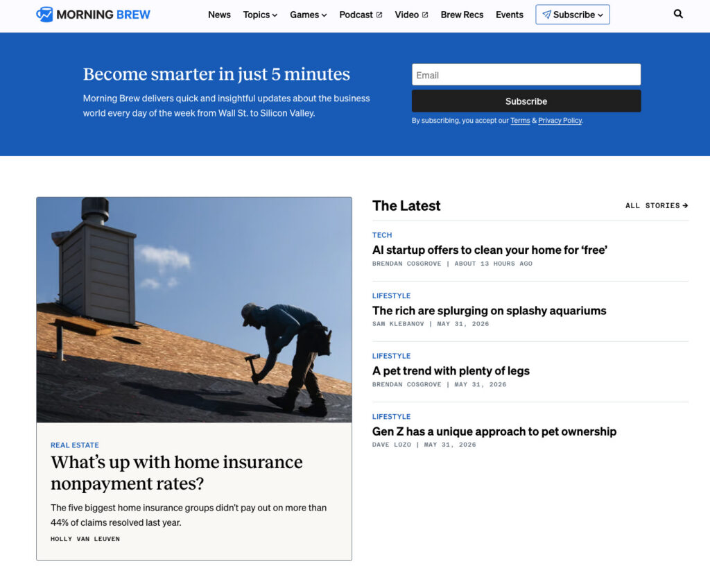
For businesses where the newsletter itself is the primary product (e.g., Morning Brew, The Hustle), placing the signup form prominently "above the fold" on the homepage is a non-negotiable strategy. Visitors to such sites arrive with the explicit intention of subscribing, making the form the central element of the page. For businesses where the newsletter supports a core product or service, a homepage form remains effective but must be positioned to complement, rather than overshadow, the primary calls to action. It should be easily discoverable but not necessarily the dominant feature, allowing other business objectives to coexist.
Sidebar Signup Forms:
Sidebar forms offer persistent visibility as visitors navigate through content-rich pages, such as blog posts. They are particularly effective on desktop interfaces, where they can run alongside the main content, keeping the subscription option in constant view without interrupting the reading flow. This passive yet persistent presence allows readers to subscribe at their convenience, especially if the newsletter content aligns with their current reading interests. However, it is crucial to note that on mobile devices, most website themes relegate sidebars to below the main content, reducing their immediate visibility. Consequently, sidebar forms should be complemented by other mobile-optimized placements.
Dedicated Signup Page:
A standalone page exclusively dedicated to the newsletter offers an unparalleled opportunity to articulate the full value proposition of subscribing. Free from the distractions of other website elements, this page provides ample space for compelling copy, testimonials, and detailed descriptions of what subscribers can expect. This strategy is highly effective for promoting the newsletter across external channels, such as social media bios, podcast show notes, guest post bylines, and email signatures. Alexandra Franzen, a renowned business strategist who built a substantial audience through email, famously described her newsletter as "an art project," emphasizing the need to "make it so good that every reader goes and tells ten friends about it." A dedicated signup page should embody this philosophy, selling a unique experience rather than just a subscription.
Header or Top Navigation Bar Forms:
Integrating a compact signup form into the website’s header or top navigation bar ensures ubiquitous visibility across every page. This placement is particularly potent for content-heavy sites where users frequently browse multiple pages. The form here should be minimalist—typically just an email field and a button—to avoid cluttering the navigation. Its constant presence acts as a subtle reminder and convenient entry point for visitors who become convinced of the newsletter’s value after exploring various sections of the site.
Footer Signup Forms:
The footer serves as a natural endpoint for visitors who have explored a page to its conclusion and are seeking further engagement. A newsletter signup form in this location acts as a safety net, capturing individuals who may not have been ready to subscribe upon initial arrival but whose interest has grown after consuming the page’s content. It caters to those who actively seek more from the brand.
Exit-Intent Popups:
Exit-intent popups are triggered when a visitor’s cursor indicates an intention to leave the page (e.g., moving towards the browser’s close or back button). These "last-chance" interventions can be highly effective, often boasting higher conversion rates than static forms, with some reports suggesting rates between 2-10%. The key to their success lies in careful implementation: they should be displayed once per session, feature a clearly visible close button, and offer a specific, compelling benefit. For example, "Don’t miss out! Get weekly email tips for your small business" is significantly more persuasive than a generic "Subscribe to our newsletter." Excessive or poorly timed popups, however, can detract from the user experience, so strategic deployment is critical.
Crafting Compelling Copy: The Art of Persuasion
The language used on a newsletter signup form is a primary driver of conversion. Effective copy must clearly articulate the value proposition, manage expectations, and provide a frictionless path to subscription. Three elements are paramount: leading with benefits, setting frequency expectations, and employing specific calls to action.
Lead with the Benefit, Not the Action:
Many forms default to generic calls like "Subscribe to our newsletter." This phrasing, however, focuses on the mechanical action rather than answering the visitor’s fundamental question: "What’s in it for me?" A benefit-driven headline immediately addresses this. For example, "Get one email per week with strategies to grow your small business" succinctly answers three critical questions: What will I receive? How often? Is it relevant to my needs? This clarity allows visitors to make an informed decision rapidly, removing the burden of imagination and increasing the likelihood of conversion. The contrast between "Subscribe to our newsletter" and "Get our Tuesday email: one tactic to grow your list this week" highlights the power of specificity—the latter provides a day, a clear promise, and a relevant topic, leaving no room for ambiguity.
Set Frequency Expectations at Signup:
This is perhaps one of the most frequently overlooked yet critical elements of effective signup form copy. Explicitly stating the newsletter’s sending frequency—e.g., "every Tuesday," "twice a month," or "weekly"—significantly reduces post-subscription unsubscribes. When subscribers know what to expect, they are less likely to feel surprised or overwhelmed by incoming emails. This transparency builds trust from the outset, establishing a clear contract between the sender and the recipient. A subscriber who willingly opts in knowing they will receive a weekly email is far more likely to remain engaged than one who is caught off guard by an unexpected message.
Use a Specific Call-to-Action Button:
The button text is the final piece of persuasive copy a visitor encounters before committing. Generic terms like "Submit" offer no value or context. "Subscribe" is an improvement but remains vague. The most effective button text directly mirrors the benefit promised in the form’s headline. If the headline states, "Weekly email marketing strategies for small businesses," the button could reinforce this with "Get weekly strategies" or "Send me the tips." This alignment transforms the button from a mere mechanical prompt into a confirmation of the promised value. Incorporating social proof, such as "Join 1,200 readers," can further enhance conversion by leveraging the psychological principle of conformity, indicating that others have already found value in subscribing. Conversely, ambiguous button text like "Learn more" or "Get started" should be avoided, as it creates uncertainty about the immediate outcome of clicking.
The Rise of Intelligent Tools: AI in Form Creation
For years, the standard approach to creating newsletter signup forms involved selecting a generic template, customizing colors and logos, and then publishing. The inherent limitation of this method is that templates are, by design, generalized solutions built for a hypothetical business, often failing to capture the unique essence, voice, and specific offerings of an individual brand. This often leads to a disconnect where businesses are forced to adapt their message to a pre-existing design, rather than having a design tailored to their message.
The emergence of AI-powered tools is revolutionizing this process. Platforms like AWeber’s AI Signup Form Builder represent a significant leap forward. Instead of starting from a blank template, users describe their newsletter’s purpose and content. The AI then leverages advanced natural language processing to understand the business’s website, content, and brand voice, generating a complete, customized form that seamlessly integrates with the existing online presence. This intelligent approach ensures that the form’s design, copy, and field structure are uniquely aligned with the newsletter’s actual offering, target audience, and brand aesthetics.
These AI-generated forms can be embedded directly onto any webpage, deployed as standalone landing pages, or configured as exit-intent popups. The AI’s ability to interpret specific instructions, such as "display this form on blog posts about digital marketing," streamlines deployment. Crucially, each AI-generated form is directly linked to the business’s subscriber list, ensuring that new signups are immediately ready to receive the next newsletter, thus maintaining the momentum of engagement. This advancement democratizes sophisticated form optimization, making it accessible even to small businesses without dedicated design or development teams.
Measuring Performance and Iteration: The Continuous Improvement Loop
Creating an optimized signup form is merely the first step; continuously tracking its performance is essential for ensuring sustained list growth and refining strategy. Data-driven insights provide the intelligence needed to make informed adjustments.
Conversion Rate by Placement:
Monitoring the conversion rate for each form placement (e.g., homepage, sidebar, popup) is critical. This data reveals which locations are most effective at converting visitors into subscribers. For instance, a form embedded within a high-traffic, top-performing blog post might yield a 3% conversion rate, while a footer form might convert at 0.5%. Such discrepancies highlight where marketing efforts should be concentrated and where optimizations are most needed. Advanced tools, such as AWeber’s AI Signup Form Builder, often include integrated analytics to track these metrics automatically, providing a clear overview of form efficacy across different placements.

Unsubscribe Rate in the First 30 Days:
A high unsubscribe rate within the first month post-subscription is a strong indicator of a mismatch between subscriber expectations and actual delivery. This often points to inconsistencies between the promises made on the signup form (e.g., content type, frequency) and the content or sending schedule of the emails received. A thorough review of the form copy against the actual email content and frequency is necessary to identify and rectify these discrepancies. Building trust from the first interaction through accurate expectation setting is paramount to long-term subscriber retention.
Broader Impact and Future Outlook
The strategic optimization of newsletter signup forms extends beyond mere subscriber numbers; it profoundly impacts the overall health and future viability of a business’s digital presence. An engaged email list serves as a resilient asset, providing a direct, unfiltered channel for communication, promotion, and relationship-building, independent of external platform algorithms. This direct ownership of audience data is increasingly valuable in a privacy-conscious world moving towards a cookieless future.
As digital marketing continues to evolve, the sophistication of signup forms will likely increase further, with greater emphasis on zero-party data collection (data voluntarily shared by customers) and hyper-personalization. AI tools will play an even more prominent role, not just in generating forms but also in dynamically optimizing them based on real-time user behavior and predictive analytics. For businesses, mastering the art and science of the newsletter signup form is not just about growing a list; it is about building a sustainable, direct connection with their most valuable asset: their audience.
Frequently Asked Questions
What is a newsletter signup form?
A newsletter signup form is a dedicated web form, either embedded within a website or hosted as a standalone page, designed specifically to capture visitor information (primarily an email address) for the purpose of adding them to a recurring email newsletter list. Its singular focus distinguishes it from broader email signup forms that might collect data for automated sequences, product updates, or transactional communications. The form’s design, copy, and field choices are meticulously crafted to reflect precisely what the subscriber is opting into, establishing clear expectations from the outset. A mismatch between the form’s promise (e.g., "Get our weekly tips") and the actual email content (e.g., daily promotional offers) can quickly erode trust and lead to unsubscribes.
How do I add a newsletter signup form to my website?
The process of adding a newsletter signup form typically involves using an email marketing platform. In platforms like AWeber, you would generally utilize an AI-powered builder or a traditional form editor to design your form. After describing your newsletter and customizing the design to match your brand, the platform generates an embed code. This code is then copied and pasted into your website’s HTML where you wish the form to appear. Most popular website builders, such as WordPress, Squarespace, and Wix, provide a "Custom HTML" or "Code Block" feature where this embed code can be seamlessly inserted. This method ensures that the form’s functionality is fully integrated with your email list management system.
How do I add a newsletter signup to Facebook?
To add a newsletter signup option to your Facebook presence, the most straightforward method involves leveraging a hosted signup form URL from your email marketing service provider. First, create your signup form within a platform like AWeber. Once published, the platform provides a unique, shareable URL for this form. You can then add this link to your Facebook page’s primary call-to-action button (e.g., "Sign Up"), embed it in your page’s "About" section or bio, or pin it prominently in a post. When visitors click this link, they are directed to your secure, hosted signup form, allowing them to subscribe without needing to leave their browser, thus minimizing friction.
How do I create a newsletter signup form in HTML?
While it is possible to code a newsletter signup form entirely from scratch using HTML, CSS, and JavaScript, the most efficient and reliable method for most businesses is to generate the form using an email marketing platform. Services like AWeber provide tools that build the form’s frontend (HTML/CSS) and, crucially, automatically wire the backend logic to your email list, handling data submission and subscriber management. After designing your form within the platform, you can typically access and copy the generated HTML code. This provides a clean, functional code base that can then be customized further if specific styling or layout adjustments are required beyond the platform’s native options. This approach ensures that the form is both aesthetically pleasing and fully integrated with your email marketing infrastructure without requiring extensive coding expertise.