The landscape of B2B Software-as-a-Service (SaaS) marketing is undergoing a fundamental shift as buyers move away from vendor-driven narratives toward self-directed research. In an era defined by extreme skepticism and budget scrutiny, the traditional “competitor comparison” page—long a staple of the SaaS marketing playbook—is being forced to evolve. Modern buyers are no longer swayed by biased feature tables that present a lopsided victory for the host company; instead, they are seeking objective, helpful resources that facilitate confident decision-making.
Industry analysts and landing page experts, including Tas Bober, suggest that the efficacy of these pages now hinges on integrity rather than persuasion. With research from the Harvard Business Review indicating that 40% to 60% of B2B deals are lost to customer indecision rather than a competitor, the primary goal of a comparison page is no longer just to “beat” a rival, but to help the buyer navigate the complexity of their own internal evaluation process.
The Evolution of the SaaS Buyer Journey
The modern B2B buyer is more informed and less patient than ever before. Historically, comparison pages were designed as “bottom-of-the-funnel” assets intended to capture high-intent traffic from users searching for terms like “[Brand A] vs. [Brand B].” While these keywords remain valuable, the context of the search has changed. Buyers are often looking for reasons not to buy, or seeking to understand the specific trade-offs inherent in different technological architectures.
This shift has created a “trust deficit.” When a buyer lands on a page where every feature of a competitor is marked with a red “X” and every feature of the host product is marked with a green checkmark, the credibility of the vendor is immediately called into question. To combat this, leading SaaS organizations are adopting “buyer enablement” strategies—providing the tools and information necessary for a buyer to complete a purchase, rather than simply trying to sell to them.
Strategic Categorization: The Three Pillars of Comparison
To effectively serve the buyer journey, marketers must recognize that “comparison” is not a monolith. Expert frameworks, such as those championed by Bober, categorize these pages into three distinct types based on the buyer’s current state of awareness.
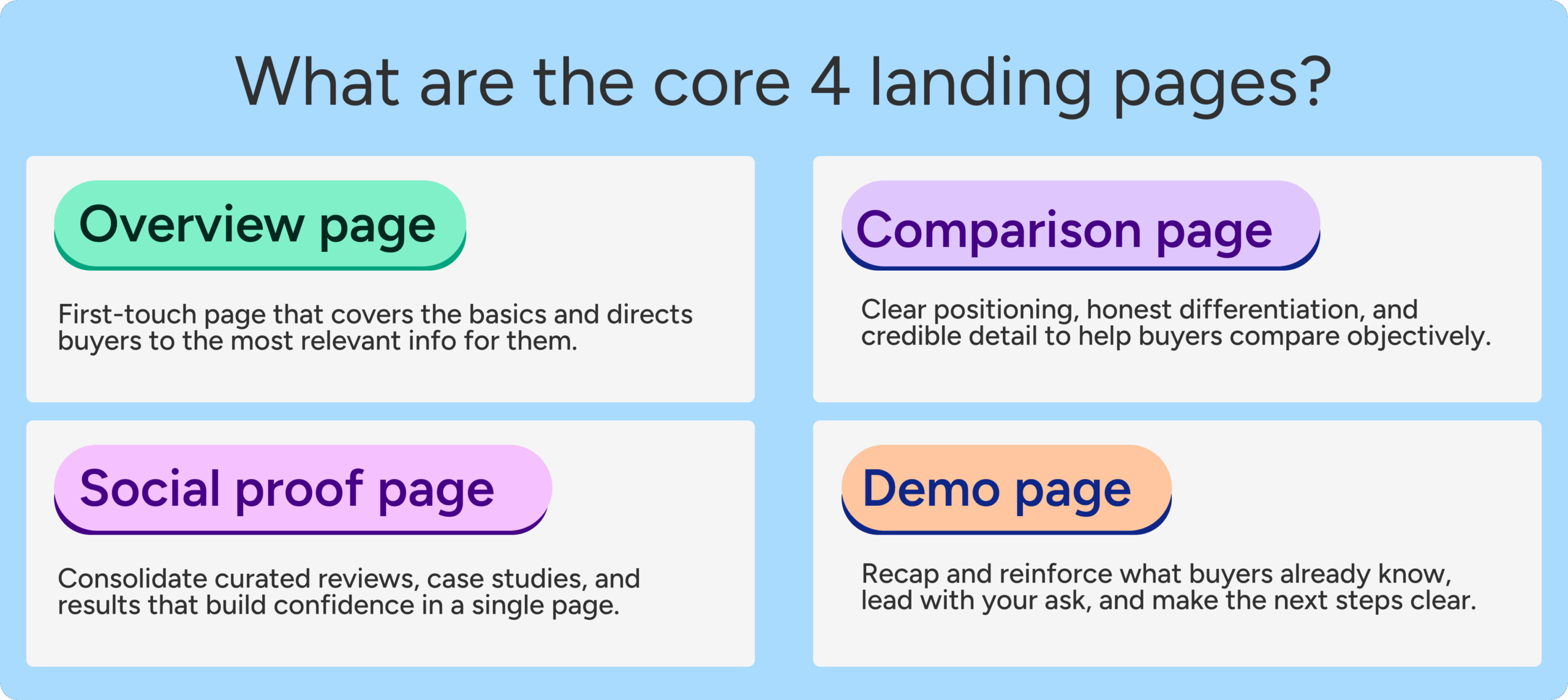
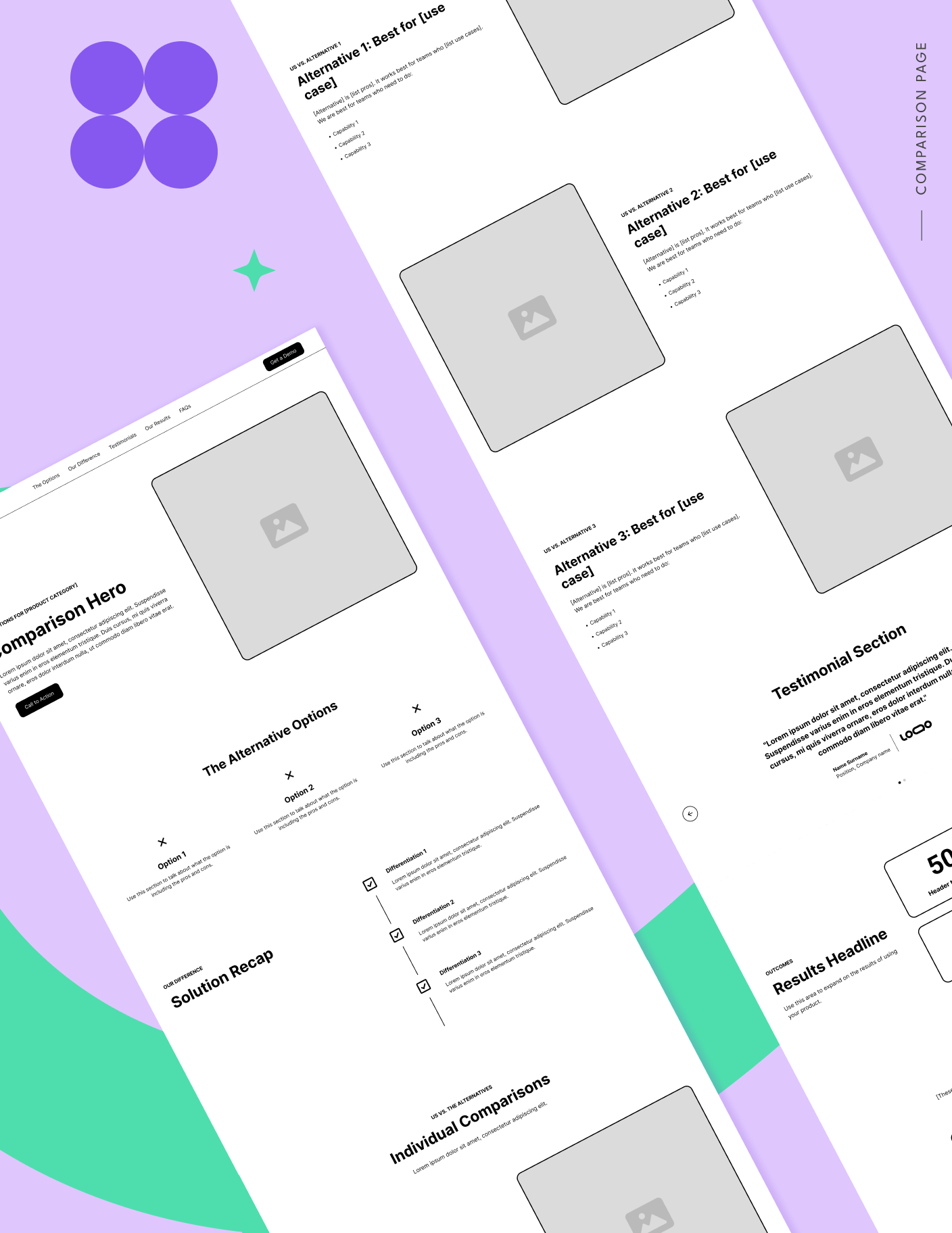
1. The Comparison Overview Page
Often the most overlooked but arguably the most critical, the overview page answers the question: “What are all my options for solving this problem?” This page targets buyers who are category-aware but may not have a shortlist. It includes direct competitors, manual workarounds (such as Excel or legacy processes), and outsourced services. By acknowledging that a manual process is a valid—albeit often flawed—alternative, a vendor positions themselves as a helpful consultant rather than a biased salesperson.
2. One-to-One Competitor Matchups
This is the traditional direct comparison. It serves buyers who have narrowed their choices to two specific vendors. The most effective versions of these pages today are those that acknowledge the competitor’s strengths. For instance, a page might state that a competitor is better suited for enterprise-level security while the host product is superior for mid-market agility. This honesty builds the rapport necessary to win over a skeptical procurement team.
3. Competitor Alternatives Pages
These pages specifically target “switcher” traffic—users who are currently using a specific tool and are looking for a replacement. The intent here is high, and the messaging must focus on the “pain points of the legacy experience.” It is less about a general feature list and more about the specific friction points (e.g., price hikes, poor support, or lack of flexibility) that drive a user to seek an alternative.
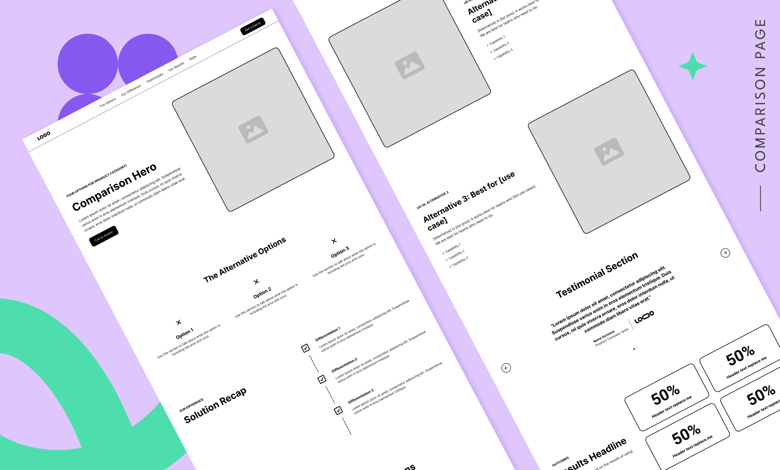
The Anatomy of a High-Trust Comparison Page
Building a page that buyers trust requires a departure from standard landing page templates. A high-integrity SaaS comparison page should be structured as a guided evaluation tool. Key components of this architecture include:

Objective Navigation and Anchors
Standard landing pages often remove navigation to prevent “leaks.” However, on a comparison page, the goal is to provide answers. Including a clear table of contents or anchor links allows buyers to jump directly to the sections that matter most to them, such as pricing, integrations, or security. This transparency signals that the vendor has nothing to hide.
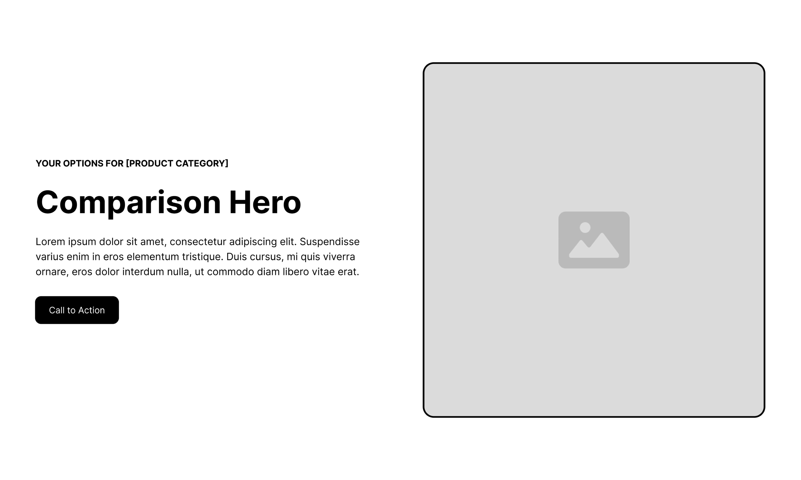
The Guided Hero Section
The hero section must immediately validate the user’s search intent. If a user searches for a specific comparison, the headline should reflect that query while framing the page as a guide. Phrases like “Which video tool is right for your business?” are more effective than “Why our tool is better than Loom.”
Contextual Solution Differentiation
Instead of a simple list of features, successful pages group differences into themes that impact the buyer’s day-to-day workflow. This might include “Speed of Implementation,” “Ease of Maintenance,” or “Scalability.” By focusing on outcomes rather than buttons, the vendor helps the buyer build an internal business case.
Targeted Social Proof
Generic testimonials are often ignored on comparison pages. The most impactful social proof comes from customers who have specifically switched from the competitor mentioned on the page. Detailing the results of that switch—such as a 20% reduction in costs or a 30% increase in team efficiency—provides the measurable data that stakeholders need for approval.
Analyzing Industry Leaders: Four Models of Success
Several B2B SaaS companies have successfully implemented high-integrity comparison pages, providing a blueprint for the rest of the industry.
Vidyard vs. Loom: The Helpful Guide
Vidyard’s approach to its Loom comparison is notable for its tone. The page asks, “Which video tool is right for you?” and provides a feature table that describes the core focus of each platform. It acknowledges that both tools have value but prioritizes the different use cases (e.g., sales vs. internal communication) to help the user self-qualify.
Asana vs. ClickUp: Addressing the Migration Barrier
Asana recognizes that the biggest hurdle in switching project management tools is the pain of migration. Their comparison page includes an extensive FAQ section dedicated to the technicalities of moving data. By addressing this friction point directly, they move the conversation from “Which is better?” to “How easy is it to switch?”
Mailchimp vs. Klaviyo: The Honesty Model
Mailchimp’s comparison content is a rare example of a vendor calling out its own gaps. By explaining where Klaviyo might be stronger—such as in reporting for specific lower-tier plans—Mailchimp earns massive credibility. When they then highlight their own strengths, the buyer is far more likely to believe the claims.
Zendesk vs. Freshdesk: The Research-Backed Approach
Zendesk elevates its comparison by citing independent research firms. By bringing in a third party to interview customers who have used both products, they remove the “he-said, she-said” nature of marketing and replace it with objective data.
The Impact of Search Engine and AI Evolution
The push for more helpful comparison content is not just driven by buyer psychology; it is also a technical necessity. Search engines and Large Language Models (LLMs) are becoming increasingly sophisticated at identifying “thin” or overly biased content. Google’s recent “Helpful Content” updates prioritize pages that provide genuine value and original insight.
For SaaS companies, this means that a page consisting of a simple, biased table is less likely to rank in organic search or be cited by AI search tools like Perplexity or ChatGPT. Conversely, a comprehensive, objective guide that discusses the pros and cons of an entire category is viewed as a high-authority resource. This creates a dual benefit: better conversion rates through trust and better visibility through technical relevance.
Conclusion: The Future of SaaS Transparency
As the SaaS market continues to saturate, the ability to build trust will become the primary differentiator between brands. The comparison page is the front line of this battle. Organizations that continue to rely on the outdated playbook of biased matchups and hidden weaknesses will likely see their customer acquisition costs rise as savvy buyers look elsewhere.
In contrast, companies that embrace the “Tas Bober model” of transparency and buyer enablement will find themselves in a stronger position. By helping the right buyers find the right solutions—even if that means acknowledging where a competitor might be a better fit—SaaS brands can foster long-term loyalty and reduce churn. The goal is no longer just to win the click, but to win the confidence of the person behind it.