

The digital retail landscape has reached a point of saturation where the difference between a successful conversion and a lost lead often hinges on the structural integrity of a website’s category pages. Recent industry analysis indicates that while product detail pages (PDPs) are the final destination for a purchase, the category page serves as the critical connective tissue of the user journey. For major e-commerce platforms, optimizing these intermediary hubs is no longer a matter of aesthetic preference but a strategic necessity to mitigate high exit rates and reduce decision friction.
The Foundational Purpose of Category Page Design
The primary challenge in e-commerce architecture is the failure to define the specific intent of a category page. Marketing experts and user experience (UX) designers categorize these pages into three distinct roles: facilitating browsing, assisting in the decision-making process, or driving an immediate purchase. A common error among mid-market retailers is the implementation of a "one-size-fits-all" layout that attempts to serve all three functions simultaneously, often resulting in what psychologists term "choice overload" or "decision paralysis."
In a browsing-focused environment, the visitor is typically in the early stages of the sales funnel. They are seeking to understand the breadth of a brand’s offerings rather than commit to a specific SKU. When designers introduce high-commitment calls to action (CTAs), such as "Add to Cart" buttons, on these high-level pages, they inadvertently create cognitive friction. The user, who was merely exploring, is suddenly forced to evaluate their readiness to buy, which can lead to a premature exit from the site. Industry data suggests that interfaces demanding a higher level of commitment than the user is prepared for result in a 20% to 30% increase in bounce rates.
Chronology of Optimization: A Systematic Approach to Implementation
The process of refining a category page typically follows a structured timeline that begins with data auditing and concludes with iterative testing.
- Phase One: The Analytical Audit (Weeks 1-2): Retailers must first examine their existing analytics to establish a baseline. Key metrics include the exit rate—the percentage of visitors who leave the site from the category page—and the click-through rate (CTR) to product pages. A high exit rate on a category page is a primary indicator that the design is failing to bridge the gap between the homepage and the specific product.
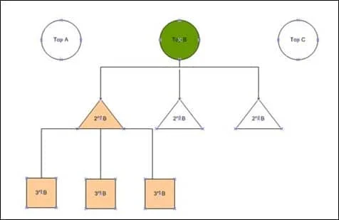
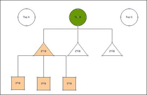
- Phase Two: Structural Re-categorization (Weeks 3-4): Once the data identifies pain points, the focus shifts to information architecture. This involves breaking down broad "top-level" categories (e.g., Electronics) into logical sub-categories (e.g., Home Audio, Wearables, Computing). The industry standard suggests a hierarchy no deeper than three levels to ensure that products remain accessible within a few clicks.
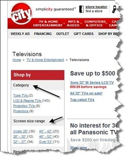
- Phase Three: Feature and Filter Integration (Weeks 5-6): This phase involves identifying the specific attributes that drive consumer choice. For technical products, this may include specifications like resolution or battery life. For lifestyle products, it may focus on brand, price point, or "new arrivals."
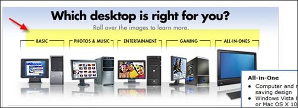
- Phase Four: Need-Based Mapping (Weeks 7-8): More sophisticated retailers implement "needs-based" navigation. This allows users to filter products based on their intended use case—such as "gaming" versus "office work"—rather than just technical specifications.
- Phase Five: Deployment and A/B Testing (Ongoing): The final stage is never truly complete. It involves using heatmaps and session recordings to observe how real users interact with the new elements, followed by A/B testing to refine button placements, filter visibility, and image sizes.
Data-Driven Insights and Market Benchmarks
To understand the impact of category page optimization, one must look at the broader e-commerce conversion benchmarks. According to recent reports from the Baymard Institute, nearly 40% of e-commerce sites have "poor" or "mediocre" category navigation. Sites that successfully implement faceted navigation—allowing users to filter by multiple attributes simultaneously—see a significant lift in user retention.
Furthermore, the "minimum requirements" for a modern category page have evolved. For example, in the consumer electronics sector, providing a "compare" feature directly on the category page can reduce the time-to-purchase by up to 15%. This is because the feature addresses the "decide" phase of the user journey without requiring the user to navigate back and forth between multiple product pages.
Another critical data point involves the use of sub-category "child" highlights. When a user hovers over a top-level category, the inclusion of visual cues or top-performing items from sub-categories can improve the click-through rate by approximately 12%. This provides a "shortcut" for the user, catering to the segment of the audience that knows exactly what they want while still supporting the casual browser.
Responses from Industry Leaders and Retail Giants
The shift toward more intuitive category pages is reflected in the strategies of retail giants like Best Buy and the now-defunct but historically significant Circuit City. Best Buy’s digital strategy has long prioritized the "reason for purchase" over the "product type." By allowing visitors to identify their needs—such as "photo and music" or "entertainment"—the retailer effectively acts as a digital sales consultant, guiding the user to the appropriate sub-section of the site.
UX consultants often argue that the "Add to Cart" button on a category page is a polarizing feature. "For high-intent returning customers, the button is a convenience that streamlines the path to purchase," says one senior e-commerce strategist. "However, for new users, it can be a source of distraction. The most successful brands use ‘Quick View’ modals or dynamic buttons that only appear once a user has demonstrated a certain level of engagement."
Recent case studies have shown that even minor changes in how categories are grouped can have outsized effects. One client in the niche hobbyist market reported that after adding a "need-based" filtration system, they initially saw no change in conversion. However, after analyzing heatmaps, they realized the filter was placed below the fold on mobile devices. Moving the filter to a sticky header resulted in a 7% increase in mobile conversions within two weeks.
Broader Impact and Implications for the Future of E-commerce
The optimization of category pages carries significant implications for Search Engine Optimization (SEO) and long-term brand loyalty. From an SEO perspective, category pages are often the strongest "authority" pages on a site. They tend to rank for broad, high-volume search terms (e.g., "men’s running shoes"). If these pages are poorly structured or have high bounce rates, search engines like Google may de-prioritize them in search results, leading to a loss of organic traffic.
Moreover, as Artificial Intelligence (AI) and machine learning become more integrated into e-commerce, the category page is expected to become hyper-personalized. Future iterations of these pages will likely rearrange sub-categories and filters in real-time based on the user’s past browsing history and predicted intent. A user who frequently buys "budget-friendly" items may see price filters prioritized, while a "brand-loyal" customer may see their favorite labels at the top of the grid.
The move toward "buying guides" and "wizards" on category pages also signals a shift toward content-led commerce. By providing educational resources—such as a guide on "how to choose the right laptop"—retailers are building trust and reducing the perceived risk of a purchase. This is particularly vital for complex or high-ticket items where the consumer may feel overwhelmed by technical jargon.
In conclusion, the category page is the "department floor" of the digital world. Just as a physical store must be organized to lead a customer from the entrance to the checkout, a website must utilize clear hierarchy, relevant filtering, and data-driven design to facilitate a seamless transition from browsing to buying. Retailers who ignore the psychological and analytical nuances of these pages risk not only immediate sales but also the long-term health of their digital ecosystem. Through constant testing and a deep understanding of user intent, brands can transform these often-overlooked pages into powerful engines for growth and customer satisfaction.







