The digital landscape of 2017 marked a significant turning point in how organizations and independent analysts interpreted complex datasets. At the center of this transformation was Google Data Studio, a tool that transitioned from a niche beta product into a powerhouse for both corporate reporting and data journalism. By providing a bridge between raw data and visual narrative, the platform enabled a shift from static, retrospective reporting to dynamic, real-time insights. As the industry moved into 2018, the adoption of such tools highlighted a broader trend: the democratization of data, where sophisticated visualization was no longer the exclusive domain of specialized data scientists but became accessible to marketers, journalists, and business consultants.
The Shift in Corporate Reporting Efficiency
One of the most profound impacts of Google Data Studio in the 2017–2018 period was the drastic reduction in time-to-insight for businesses. Traditionally, monthly reporting for agencies and internal marketing departments was a labor-intensive process, often involving the manual export of data from multiple sources into spreadsheets, followed by the creation of static slide decks.
A primary example of this efficiency gain was documented by Boat International Media. The organization, which manages high-end luxury yachting content and client services, faced a significant bottleneck in their Search Engine Optimization (SEO) reporting. Prior to implementing Data Studio, the process of compiling monthly client reports consumed approximately five business days. By leveraging automated data connectors, the team, led by analysts Fanni Takacs and Drew Broomhall, reduced this window to just fifteen minutes.
This case study illustrates more than just time savings; it represents a shift in the quality of client communication. By utilizing a tool that focuses on clear key insights and avoids the "data clutter" typical of manual spreadsheets, the reports became professional-grade documents suitable for both digital viewing and high-quality PDF distribution. This professionalization of data delivery allowed the firm to focus on strategic advice rather than administrative compilation.
Enhancing Analytical Depth Through Advanced Visualization
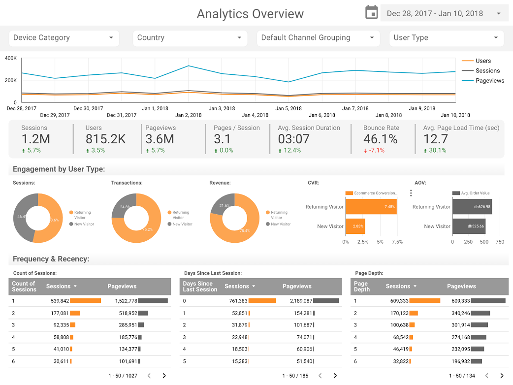
While efficiency was a primary driver for adoption, the sophistication of the visualizations themselves allowed for deeper analytical rigor. Analytics Pros, a prominent digital analytics consultancy, demonstrated this through the use of bullet charts for page-level engagement. Unlike standard bar charts, bullet charts allow for a multi-layered comparison of performance.

In the context of 2017 web performance, this meant that teams could simultaneously view current page performance, the previous year’s metrics, and predefined benchmark targets. This three-dimensional view of data enabled businesses to identify not just which pages were popular, but which were underperforming relative to historical trends or organizational goals. Furthermore, the integration of scorecard metrics allowed for a more nuanced understanding of user behavior, shifting the focus from simple "page views" to "engagement duration," a metric far more critical for content-driven business models.
Similarly, firms like E-Nor and ClickInsight began releasing standardized templates for Google Analytics. These templates acted as a catalyst for the industry, providing small to medium-sized enterprises (SMEs) with the same level of analytical oversight previously reserved for large corporations with significant BI (Business Intelligence) budgets. Sunil Attri of E-Nor highlighted how compact, interactive presentations could distill the vast amounts of data within Google Analytics into actionable "Activity Overviews," making data-driven decision-making a daily reality rather than a monthly chore.
Data Journalism and the Rise of the Visual Narrative
Beyond the boardroom, 2017 saw a surge in "data storytelling," a practice that sits at the intersection of journalism and data science. As public datasets became more available through government transparency initiatives and technological APIs, individuals began using Data Studio to explore cultural and social trends.
The cinematic industry provided a fertile ground for this type of analysis. In the "Marvel vs. DC" cinematic universe debate, data visualizations were used to quantify the commercial and critical success of rival franchises. With over $27 billion in combined worldwide box office revenue at stake, analysts used Data Studio to compare audience reception against financial ROI, providing a factual basis for what had previously been a matter of fan opinion.
The "Star Wars" franchise received similar treatment. ClickInsight developed reports that moved beyond the films’ narratives to analyze the "meta-data" of the universe, such as starship speeds and character demographics. These projects served a dual purpose: they entertained the public while demonstrating the technical capabilities of the platform to handle diverse, non-traditional datasets.
Technical Integration: The Role of BigQuery and Open Source Data
The technical backbone of many high-level visualizations in 2017 was the integration between Data Studio and Google BigQuery. This was most notably demonstrated by Felipe Hoffa, a Developer Advocate at Google. Hoffa utilized the BigQuery connector to analyze the massive volume of "PushEvents" published by GitHub throughout 2017.

The open-source world is the foundation of modern web infrastructure, yet understanding who contributes to it requires processing millions of rows of data. By importing GitHub’s data into BigQuery and visualizing it in Data Studio, Hoffa was able to identify the top contributors and companies driving technological innovation. This use case was pivotal because it showed that Data Studio was not just for "small data" like website traffic, but could scale to visualize "big data" insights from massive cloud-based warehouses.
Historical and Social Analysis: Long-term Data Trends
One of the most complex applications of data visualization in the 2017–2018 period was the analysis of long-term social trends. A study conducted by Lizzie Silvey and her colleagues examined 150 years of marriage and divorce trends in the United Kingdom.
This project moved away from real-time business metrics and into the realm of historical sociology. By visualizing data spanning over a century, the report was able to correlate spikes and dips in marriage rates with major historical events, such as World Wars and changes in matrimonial legislation. This type of longitudinal analysis provided answers to complex social questions: Who initiates divorce and why? How does the law impact the fabric of society? The ability to present 150 years of data in an interactive, digestible format allowed the general public to engage with sociological research that would otherwise remain buried in academic journals or government archives.
Chronology of Development: From Beta to Industry Standard
To understand the impact of these visualizations in 2018, it is necessary to look at the timeline of the platform’s development:
- May 2016: Google introduces Data Studio as part of the Google Analytics 360 Suite, initially restricted to a limited number of reports for free users.
- February 2017: In a major move toward democratization, Google removes the five-report limit for the free version of Data Studio, allowing users to create and share an unlimited number of dashboards.
- Throughout 2017: Google expands the "Connectors" ecosystem, allowing direct links to AdWords, YouTube, BigQuery, and eventually third-party connectors for Facebook Ads and Twitter.
- Late 2017: The introduction of "Embedding" allows journalists and bloggers to place interactive charts directly into news articles, similar to how one would embed a YouTube video.
- 2018: The platform begins to see widespread adoption in the enterprise sector, moving out of its "experimental" phase and becoming a staple of the modern marketing tech stack.
Analysis of Implications: The Future of Data Literacy
The rise of tools like Google Data Studio has profound implications for data literacy in the professional world. In the past, the "gatekeepers" of data were those who could write SQL queries or navigate complex BI software. By 2018, the gatekeepers had become the "storytellers."
The shift toward visual-first reporting means that the value of an analyst is no longer measured by their ability to compile data, but by their ability to interpret it. When a report that used to take five days now takes fifteen minutes, the remaining four days and seven hours are freed up for strategic thinking. This has forced a shift in the labor market, where "data visualization" has become a required skill for marketers, PR professionals, and journalists alike.
Furthermore, the transparency offered by interactive dashboards has changed the relationship between agencies and clients. When a client can log in to a live dashboard at any time, the traditional "smoke and mirrors" of monthly reporting vanishes. This fosters a more honest, data-driven partnership where both parties are looking at the same source of truth in real-time.
Conclusion: A New Era of Communication
As we look back at the visualizations that defined 2017 and 2018, it is clear that we entered a new era of communication. Whether it was a business optimizing its SEO performance or a journalist explaining the intricacies of the Marvel Cinematic Universe, the goal remained the same: to make the invisible visible.
The examples provided by Boat International, Analytics Pros, and independent researchers demonstrate that data is most powerful when it is accessible, visual, and narrative-driven. As tools continue to evolve, the ability to transform raw numbers into compelling stories remains one of the most vital skills in the modern information economy. The "happy visualizing" encouraged by early adopters in 2018 has now become a fundamental requirement for any organization seeking to navigate the complexities of the 21st-century digital world.