The digital marketplace has evolved into a highly sophisticated ecosystem where the transition from casual browsing to a completed transaction depends heavily on the structural integrity of a website’s architecture. At the heart of this architecture lies the category page, a critical junction in the user journey that serves as a bridge between high-level discovery and specific product engagement. Industry analysts note that while many brands focus their optimization efforts on the homepage or the final checkout process, the category page often remains an underutilized asset. Effective category page design is not merely an aesthetic choice but a strategic imperative that requires a deep understanding of consumer psychology, data analytics, and hierarchical logic. To maximize the efficacy of these pages, digital retailers must adhere to a rigorous set of best practices designed to reduce friction and facilitate informed decision-making.
The Strategic Definition of Page Purpose
Before implementing technical changes or altering visual layouts, e-commerce stakeholders must define the primary objective of a category page. Market research indicates that visitors typically interact with these pages in one of three capacities: browsing, deciding, or purchasing. A failure to align the page design with the visitor’s intent often results in "decision conflict," a psychological state where the user is presented with too many options or premature calls to action.
On browsing-focused pages, users are generally seeking to understand the breadth of a brand’s offerings. They are asking fundamental questions about the variety and range of products available. Introducing high-commitment actions, such as "Add to Cart" buttons, at this stage can be counterproductive. UX researchers have observed that when an interface demands a higher level of commitment than the user is prepared to make, the result is often a "backtrack" or total abandonment of the site. In these instances, the page should prioritize navigation clarity, visual cues, and educational content over immediate conversion metrics.
Conversely, for returning customers or those with high-intent search queries, the category page serves as a tool for efficiency. For these users, streamlined features like quick-view options and direct purchase buttons are essential. The challenge for modern retailers is to create a dynamic interface that accommodates both the exploratory browser and the time-sensitive buyer.

Chronology of E-commerce Navigation Evolution
The approach to category page design has undergone significant transformations over the last three decades, reflecting changes in consumer technology and bandwidth.
- The Early Era (1995–2005): Category pages were largely static HTML lists. Navigation was rudimentary, often relying on "blue link" directories. The primary goal was simply to index products for search engines and basic user findability.
- The Web 2.0 Shift (2005–2012): This period saw the introduction of faceted navigation and sidebar filtering. Retailers began to understand that users needed to narrow down choices based on attributes like size, price, and color.
- The Mobile-First Revolution (2012–2018): As mobile traffic surpassed desktop, category pages were redesigned for vertical scrolling and "hamburger" menus. Large imagery became a priority to facilitate touch-screen interaction.
- The Era of Personalization and AI (2018–Present): Modern category pages now utilize machine learning to dynamically reorder products based on an individual’s browsing history and predictive analytics. The focus has shifted from static organization to hyper-relevant, real-time curation.
Analytical Frameworks for Performance Evaluation
To determine the success of a category page, retailers must look beyond simple traffic numbers and delve into granular behavioral data. A primary metric of concern is the exit rate. In a healthy e-commerce funnel, the exit rate of a category page should ideally mirror the site-wide average. A disproportionately high exit rate suggests a disconnect between what the user expected to find and what the page delivered.
Data from conversion rate optimization (CRO) firms suggests that a "pogo-sticking" effect—where a user clicks into a product and immediately returns to the category page—often indicates that the category page did not provide enough information to set accurate expectations. By analyzing heatmaps and click-through rates (CTR) on specific filters, brands can identify which product attributes are most influential in the decision-making process. If analytics show that 70% of users are filtering by "Price: Low to High," but the default view is "Featured," the retailer is creating unnecessary friction.
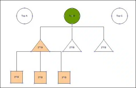
Hierarchical Logic and the Rule of Three
A fundamental principle of information architecture is the logical grouping of products. While top-level categories like "Electronics" or "Apparel" are necessary for broad organization, they are often too expansive to be useful for the average shopper. Industry experts recommend a "drill-down" approach that takes the user at least one level deeper into subcategories.
However, there is a delicate balance to maintain. A common pitfall in e-commerce design is over-categorization. General consensus among UX designers suggests a limit of three levels of sub-categories. Beyond this point, the "Paradox of Choice" takes hold, and the user may feel overwhelmed by the complexity of the navigation. To mitigate this, successful retailers often use "child" category highlights—visual representations of sub-categories within the main category page—to guide the user toward a more specific destination without requiring multiple clicks.
Feature-Driven and Intent-Based Filtering
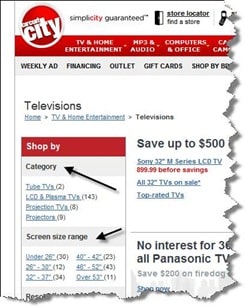
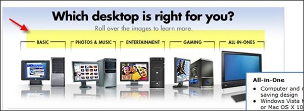
The most effective category pages are those that reflect the specific needs and language of the consumer. This requires a shift from "attribute-based" filtering to "need-based" filtering. For example, while a technical specification like "resolution" is vital for someone shopping for a television, a need-based filter like "Best for Gaming" or "Home Theater Experience" speaks directly to the user’s end goal.
Case studies from major retailers such as Best Buy and the now-defunct Circuit City illustrate the power of feature-rich navigation. By allowing users to filter by screen size, brand, and resolution simultaneously, these platforms reduced the cognitive load on the consumer. Similarly, in the publishing industry, filtering by media type—such as "Audiobook," "Hardcover," or "E-book"—is essential because the format is often as important as the content itself.
The Role of Educational Content and Buying Guides
For complex or high-ticket items, a category page should act as a consultant. Visitors often find themselves in a state of uncertainty, unsure of which subcategory or specific model meets their requirements. In these scenarios, the integration of buying guides, comparison wizards, and "frequently asked questions" can provide the necessary reassurance to move the user forward.
By providing educational resources directly on the category page, retailers can reduce the likelihood of the user leaving the site to conduct research elsewhere. This strategy not only improves the user experience but also enhances the site’s authority and search engine optimization (SEO) performance. When a category page provides value beyond a simple list of products, it becomes a destination in its own right.
Industry Implications and Future Outlook
The broader implications of category page optimization extend to the very bottom line of global commerce. According to the Baymard Institute, the average documented online shopping cart abandonment rate is nearly 70%. A significant portion of this abandonment can be traced back to frustrations encountered early in the navigation process.
As we look toward the future, the integration of Augmented Reality (AR) and Voice Search is expected to further complicate category page design. Retailers will need to ensure that their category structures are compatible with voice-activated queries and that product data is robust enough to support AR previews.
Furthermore, the impact of site speed cannot be overstated. Research from Google indicates that a one-second delay in mobile load times can impact conversion rates by up to 20%. Therefore, the technical optimization of category pages—ensuring that high-resolution images and complex filter scripts do not impede performance—is as critical as the layout itself.
In conclusion, the optimization of e-commerce category pages is a continuous process of hypothesis, testing, and refinement. By defining a clear purpose, leveraging analytical data, maintaining a logical hierarchy, and addressing the specific needs of the consumer, brands can transform these navigational waypoints into powerful engines of conversion. In an increasingly competitive digital landscape, the retailers who succeed will be those who view their category pages not as static shelves, but as dynamic, user-centric environments.