The psychology of color in marketing stands as one of the most potent, yet frequently underestimated, tools available to contemporary marketers. Far from being a mere aesthetic choice, color possesses an inherent capacity to instantly establish mood, evoke profound emotions, and trigger specific psychological responses in consumers. Its influence is so pervasive that it can significantly bolster or diminish the perceived value of an offering. Empirical evidence underscores this impact: a staggering 90 percent of a subscriber’s initial impression of an email message, or indeed a website, is predicated solely on color and other visual cues. This profound influence extends across all digital touchpoints, from website design and landing pages to sign-up forms and email campaigns, making a nuanced understanding of color psychology indispensable for optimizing marketing performance.
The Science Behind the Shades: A Brief History of Color Psychology
The recognition of color’s psychological power is not a modern phenomenon. Philosophers and scientists have long pondered its effects. Johann Wolfgang von Goethe, in his 1810 work "Theory of Colours," explored the emotional and symbolic associations of various hues, laying some early groundwork. Later, figures like Wassily Kandinsky delved into the spiritual and expressive qualities of color in art. In the 20th century, as advertising and marketing matured, the deliberate application of color psychology gained traction. Researchers began to quantify color’s impact on consumer behavior, moving beyond anecdotal observations to scientific studies. Early studies, for instance, investigated how color influenced purchasing decisions and brand recall. This historical progression highlights a gradual but continuous accumulation of knowledge, culminating in today’s data-driven approach where color selection is a strategic decision rooted in psychological principles. The goal remains consistent: to leverage color to create desired emotional states and drive specific actions from the target audience.
Modern research continues to validate these long-held beliefs. Surveys consistently show that a significant majority of consumers—around 84.7% in one notable study—consider color an important factor when evaluating products. Furthermore, strategic color application has been demonstrated to increase brand recognition by up to 80%. This remarkable statistic solidifies color’s role as a cornerstone of brand identity. Brands worldwide meticulously select their signature colors, understanding that these hues become deeply intertwined with public perception. Consider iconic brands and the colors immediately associated with them; this instant recall is a testament to the enduring psychological link between color and brand identity. The efficacy of color psychology, therefore, is not merely theoretical but is demonstrably linked to tangible business outcomes, from initial impressions to long-term brand loyalty.
Decoding the Palette: Individual Color Meanings and Strategic Applications
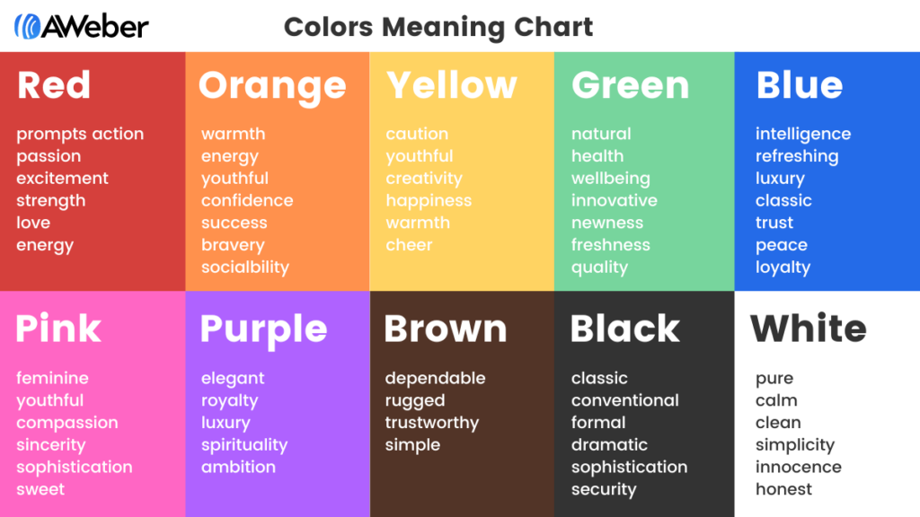
To effectively harness color psychology, marketers must understand the specific emotional and psychological associations each primary and secondary color evokes. This understanding allows for deliberate choices that resonate with marketing objectives and target audience demographics.
-
Blue: Trust and Tranquility
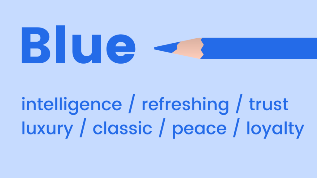
Blue is widely perceived as a cool, calm, and collected color. Its mood-boosting properties are attributed to its ability to signal the body to produce calming chemicals, fostering feelings of positivity, serenity, and security. Light blue offers a refreshing, airy quality, often associated with innovation, clarity, and open spaces, making it popular in tech and healthcare. Conversely, dark blue conveys sophistication, authority, and reliability, serving as a classic choice for brands aiming to project luxury, formality, and corporate trustworthiness. Industries such as finance, technology, and professional services frequently employ blue to establish credibility and foster consumer trust. For instance, many banks and social media platforms heavily feature blue in their branding to symbolize stability and dependability.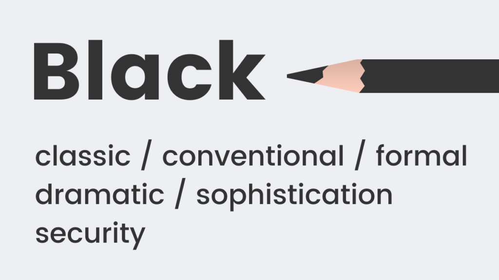
-
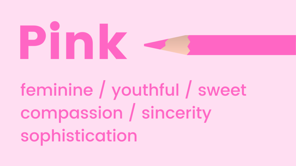
Pink: Youthful Charm and Sweetness
Pink tones universally evoke youthfulness, fun, and excitement. It is a powerful choice for emphasizing femininity, sweetness, and romance. Intriguingly, research suggests pink can even stimulate cravings for sugar, explaining its prevalent use in confectionery and dessert branding. While traditionally associated with feminine products, contemporary marketing has seen pink adopted by brands seeking to convey playfulness, approachability, or a modern, trendy aesthetic, such as the "millennial pink" trend that transcended gendered associations. Its softer shades can communicate tenderness and care, while brighter fuchsias convey energy and vibrancy.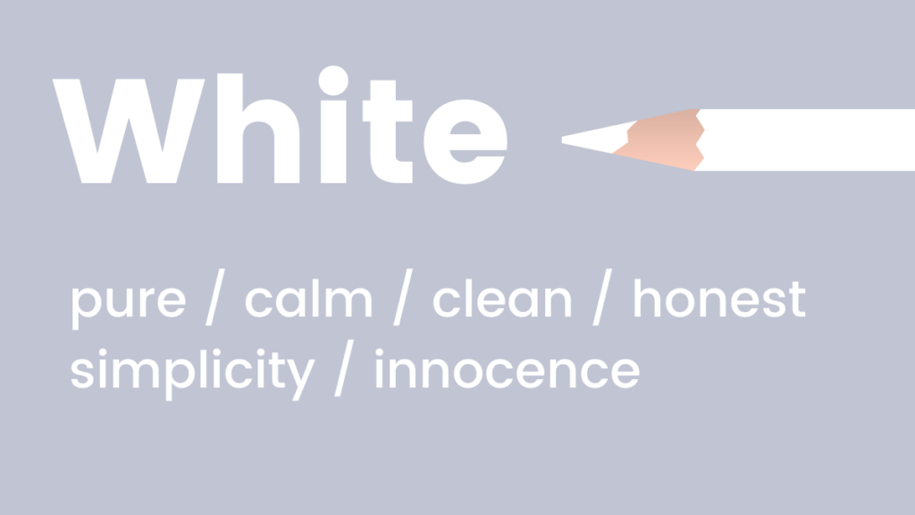
-
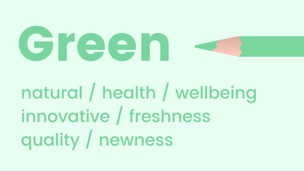
Green: Nature, Growth, and Prosperity
Green is intrinsically linked to natural elements, health, and well-being. It is a soothing hue, promoting feelings of relaxation, harmony, and renewal. Unique among colors, the human eye is most sensitive to green and can discern the widest array of its shades, contributing to its comforting presence. Given its fresh and organic connotations, green is an excellent choice for promoting new products, sustainable initiatives, or wellness brands. It also carries strong associations with wealth, prosperity, and financial stability, making it a common choice for financial institutions and environmental organizations.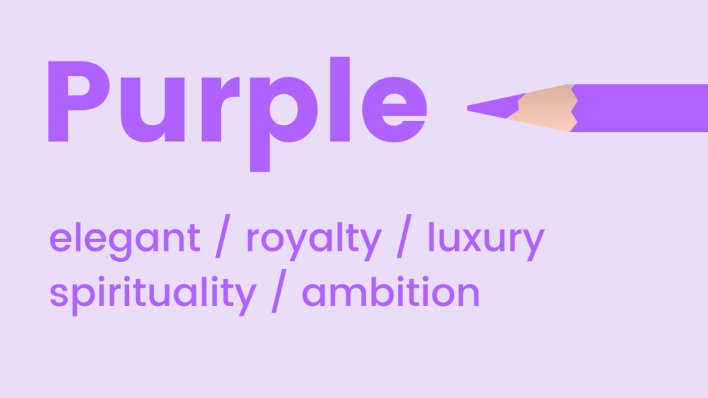
-
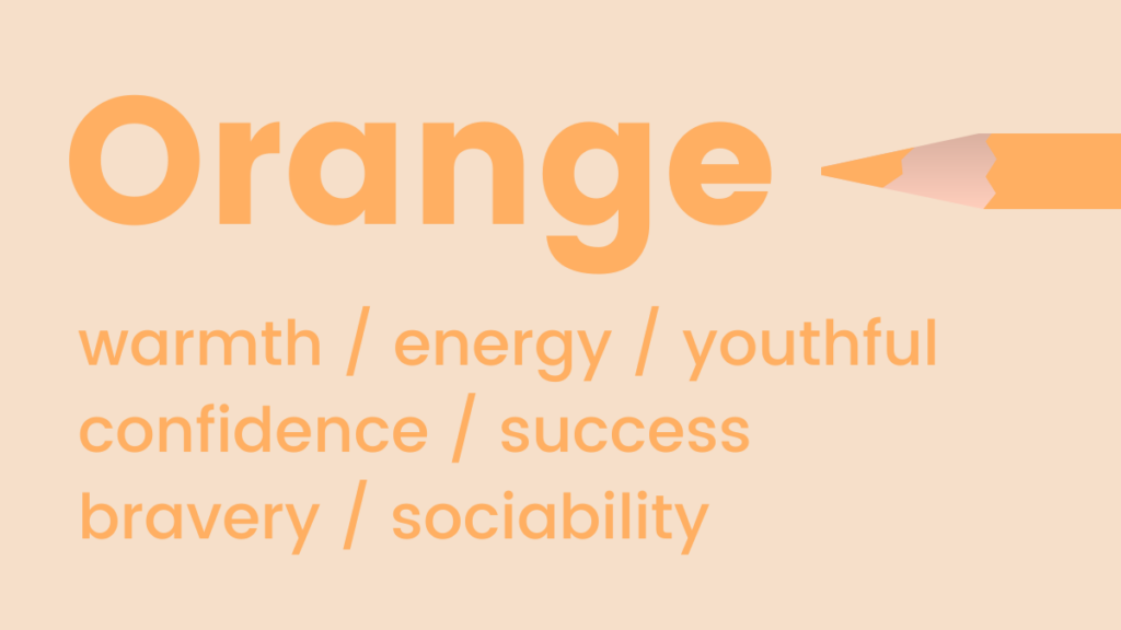
Orange: Energy, Enthusiasm, and Approachability
Orange radiates warmth, energy, and vibrancy. As a fun and flamboyant color, it is often employed to represent positivity, optimism, and creativity. Beyond its energetic appeal, orange also holds a surprising association with trust and safety, perhaps due to its use in safety equipment and warning signs that command attention without inducing alarm. Its bold nature makes it effective for calls to action, drawing the eye without the aggressive urgency of red. It is frequently seen in brands targeting younger audiences or those wanting to project an image of innovation and approachability, such as in the food and beverage industry or children’s products.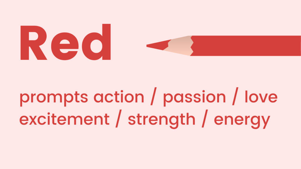
-
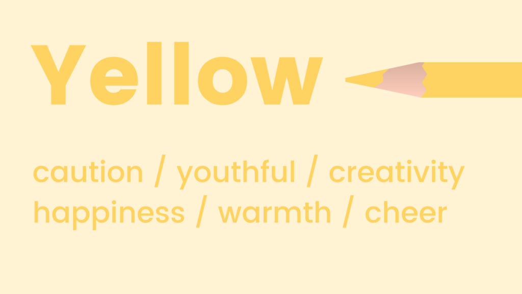
Yellow: Optimism, Clarity, and Attention
Similar to orange, shades of yellow are potent symbols of positivity, optimism, and joy, widely recognized as the happiest color in the spectrum. Yellow is also celebrated for its cognitive benefits, known to activate memory, stimulate mental processes, and encourage communication. Its high visibility makes it an excellent choice for drawing immediate attention, often used in warnings or highlights. However, excessive use can lead to feelings of anxiety or overwhelm. Strategically, yellow is effective for brands that want to convey cheerfulness, innovation, or a sense of youthful energy, such as toy companies or creative services.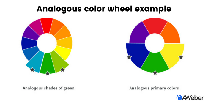
-
Black: Luxury, Power, and Sophistication
Black is a timeless and classic color, perpetually in style. It is frequently employed to denote formality, elegance, and exclusivity, as seen in "black tie" events. Psychologically, black implies weight and substance; studies have shown that people perceive a black object as heavier than a white one of the same size. This perception translates into branding, where black conveys strength, authority, and high quality. It is a staple for luxury brands, high-end fashion, and technology companies seeking to project a sophisticated, powerful image.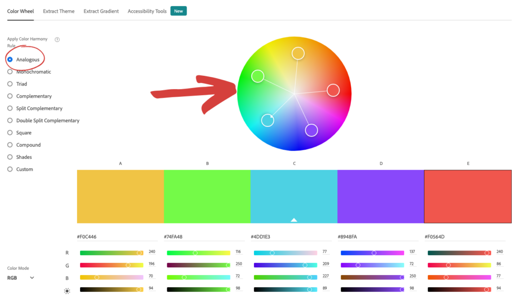
-
White: Purity, Simplicity, and Modernity
White embodies coolness, calm, and serenity. It is an ideal choice for brands aiming to convey modernity, freshness, cleanliness, and minimalism. White space in design is crucial for readability and visual breathing room, enhancing the perception of simplicity and sophistication. Brands in healthcare, bridal, and high-tech sectors often leverage white to project purity, efficiency, and a forward-thinking aesthetic. It also signifies new beginnings and clarity, making it suitable for launching new initiatives or services.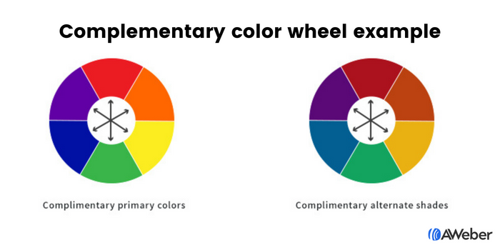
-
Purple: Royalty, Creativity, and Mystique
Purple is a color of luxury, elegance, and mystique. Historically associated with royalty and nobility due to the rarity and cost of its dyes, it continues to convey a sense of prestige and opulence. Psychologically, purple uplifts while maintaining a sense of calm, bridging the energy of red with the serenity of blue. It is also known to encourage creativity, imagination, and spiritual reflection. Brands seeking to align with high-end products, creative industries, or those offering unique, transformative experiences often adopt purple.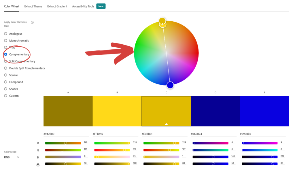
-
Red: Passion, Urgency, and Action
Red tones are synonymous with passion, adrenaline, and decisive action. As a high-energy color, it can elevate heart rates and boost energy levels, making it highly effective for capturing immediate attention and conveying urgency. Its strong emotional resonance means it can signify love and desire, but also warning and danger. In marketing, red is frequently used for calls to action, sales promotions, and food branding, as it can stimulate appetite. Retailers often use red during clearance sales to evoke a sense of immediate opportunity.
Crafting Cohesion: Mastering Color Schemes for Digital Assets

While understanding individual color meanings is crucial, combining them effectively is where true design artistry and strategic marketing intersect. For digital assets like websites and landing pages, two fundamental color schemes are particularly effective in creating visually appealing and psychologically resonant experiences.

-
Harmonious Analogous Combinations
Analogous colors are those situated adjacent to each other on the color wheel. This proximity creates a naturally harmonious and pleasing aesthetic, as these colors often appear together in nature. An analogous scheme might consist of blue, green, and yellow, or even three distinct shades of a single color. The beauty of this approach lies in its inherent visual flow and comfort, preventing jarring contrasts while offering enough variety to maintain interest. For marketers, selecting an analogous palette simplifies the design process: choose a dominant brand color, then easily identify its neighbors on the color wheel to build a cohesive and sophisticated scheme. Tools like Adobe Color CC allow designers to effortlessly generate analogous palettes, ensuring consistency and aesthetic appeal.
-
Dynamic Complementary Contrasts
For marketers aiming to inject more vibrancy and visual interest, a complementary color scheme is an excellent choice. Complementary colors are located directly opposite each other on the color wheel, such as blue and orange, green and red, or purple and yellow. These pairings create a high degree of contrast, making elements "pop" and drawing the eye effectively. While analogous schemes offer harmony, complementary schemes provide dynamic tension and visual excitement. They are particularly effective for highlighting calls to action or emphasizing key information. However, due to their strong contrast, complementary colors must be used judiciously, often with one color dominating and the other used as an accent to avoid visual overload. Adobe Color CC also facilitates the identification of complementary colors, helping marketers achieve balanced yet impactful designs.
Optimizing User Engagement: Color in Websites, Landing Pages, and Sign-Up Forms
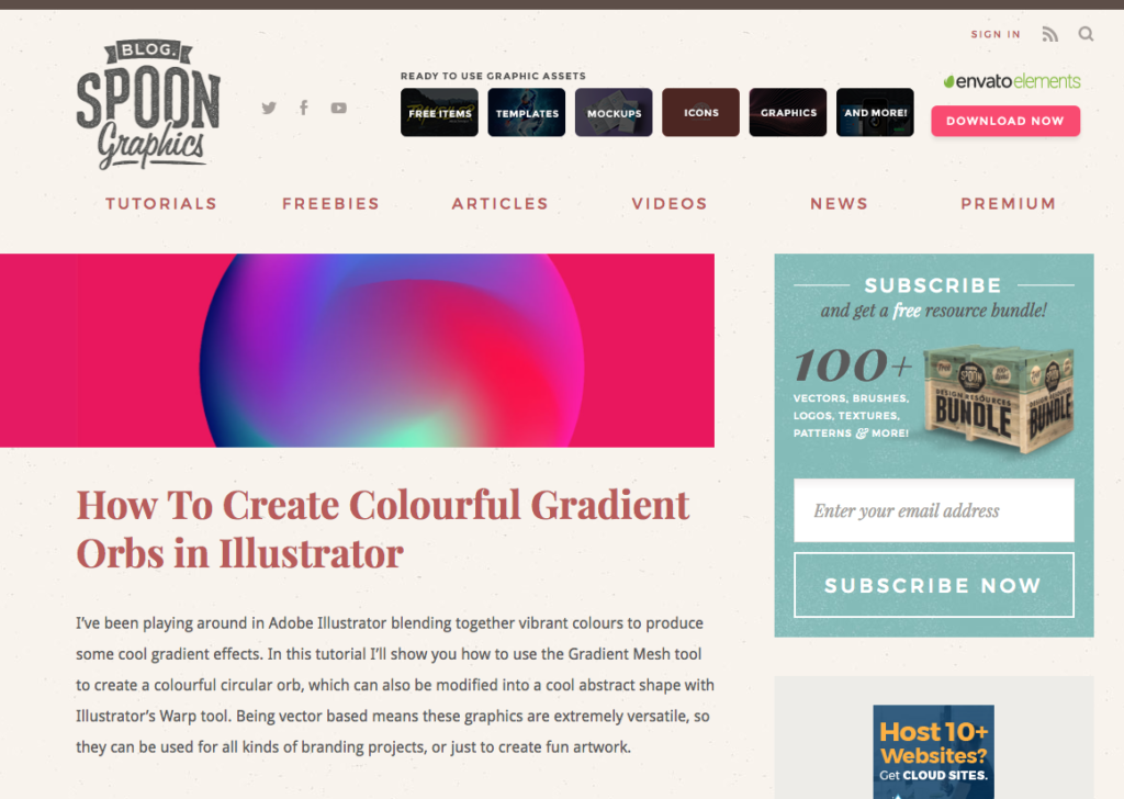
Beyond overall aesthetic, the strategic application of color is paramount for optimizing user experience (UX) and conversion rate optimization (CRO) on critical digital assets.

- Driving Conversions with Strategic Form Colors
Sign-up forms are pivotal conversion points, and their visibility and appeal are heavily influenced by color. Marketers can employ color theory to ensure forms capture attention and guide users toward completion.- Contrast with the Site Background: Making a sign-up form’s background a contrasting color to the main website automatically draws the eye. If a website is predominantly cool-toned, a warm-toned form will stand out, signaling an important interactive element. This subtle visual cue directs visitors’ attention to where an action is expected.
- Internal Form Contrast: Once the form has captured attention, the internal elements—form fields and submission buttons—must be equally prominent. Using contrasting shades within the form itself ensures that the call to action is unmistakable. For example, a dark form background with bright, contrasting input fields and an even brighter button ensures a clear visual hierarchy. Imagine a black form with yellow fields and a white "Submit" button; each element guides the eye to the next step, making the conversion path intuitive and engaging. Complementary colors can be particularly effective here, with a button’s color directly contrasting the form’s background to create an undeniable "click here" invitation.
The Art of Email Aesthetics: Tailoring Color for Communication Impact
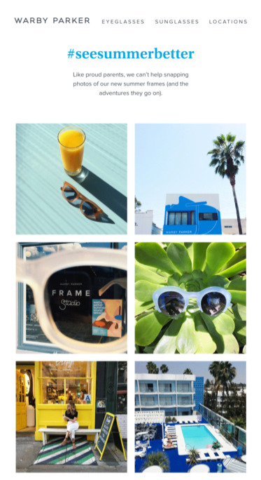
The strategic use of color extends significantly into email marketing, where each email type demands a tailored color approach to align with its specific purpose and reinforce brand messaging.
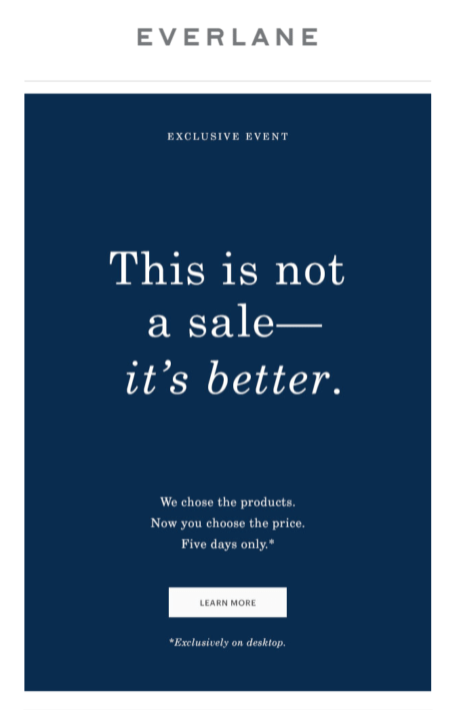
- Email Newsletter: Newsletters typically serve to provide regular updates, information, or educational content. For these, a minimalist approach, dominated by white space with subtle splashes of brand colors, is often most effective. The primary goal is content consumption, so secondary colors should not distract. The exception is when a specific call-to-action (CTA) is crucial, such as prompting readers to click through to a blog post or video. In such cases, a vividly contrasting CTA button becomes essential to draw attention and drive clicks.
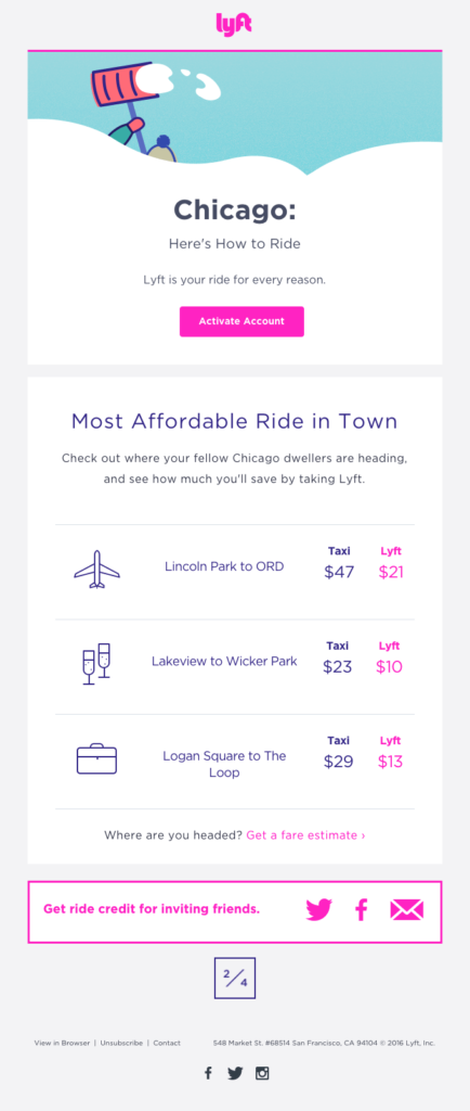
- Welcome Email: This is often a subscriber’s first direct interaction with a brand post-signup. It’s an opportune moment to reinforce brand identity. Utilizing the brand’s core color palette extensively in welcome emails helps solidify visual recognition and create a consistent brand experience. For instance, Lyft’s use of vibrant pink in its welcome emails immediately conveys its youthful and friendly brand persona.
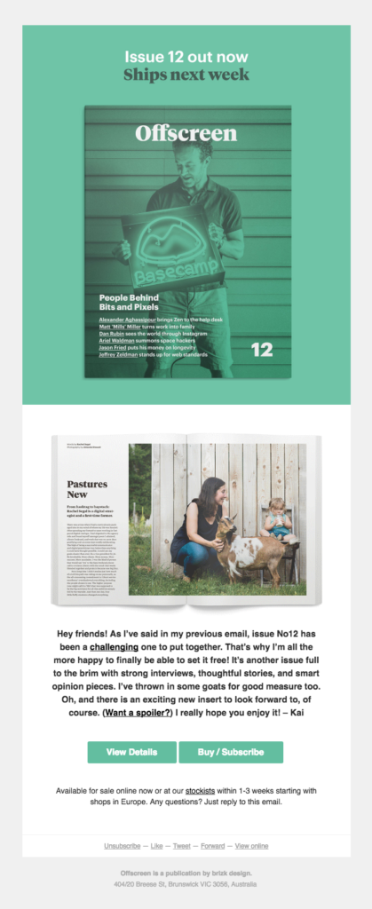
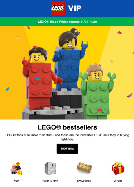
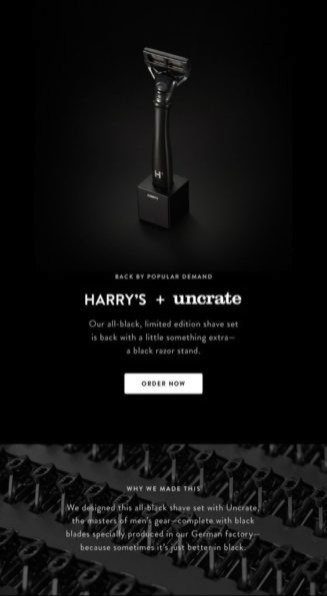
- Sales Email: The color choices for sales emails are highly dependent on the nature of the offer and the desired emotional response. Leveraging the psychological associations of colors discussed earlier is key. A flash sale might utilize red to convey urgency and excitement, while a luxury product promotion might lean into dark blues or purples to emphasize exclusivity and sophistication. Brands like Warby Parker effectively use pale blues for a refreshing, accessible feel, while Everlane opts for dark blues to project a luxurious image. Lego strategically uses yellow backgrounds in product emails to appeal to its child audience, a color known for optimism and happiness. Harry’s, with an all-black email and a white CTA, exemplifies classic sophistication, ensuring the action remains prominent. Conversely, The Little White Company employs white to project purity and cleanliness. Stuart Weitzman’s abandoned cart email ingeniously incorporates its signature purple shoebox, reinforcing luxury even in a transactional context.
Evolving Brand Identity: Adapting Color Strategies
A common apprehension among marketers involves applying these dynamic color principles to an already established brand aesthetic. The concern is often whether introducing new colors or deviating from a strict brand guide might dilute identity. However, just as people evolve, so too must brands. Rigidity can stifle growth. The most robust brands understand that flexibility is key. This might mean realizing that a new color needs to be integrated into the brand palette to adapt to market changes or new product lines. Tools like Coolors allow marketers to input existing brand colors and then generate harmonious or complementary palettes, facilitating a thoughtful expansion of the brand’s visual language without abandoning its core identity. This iterative approach ensures the brand remains relevant, engaging, and psychologically effective in an ever-changing landscape.
The Future of Color in Marketing: AI-Powered Design
The landscape of marketing design is on the cusp of a revolutionary transformation with the advent of artificial intelligence. Marketers no longer need to navigate every color decision in isolation; AI is becoming an indispensable partner. AWeber’s innovative AI Signup Form Builder exemplifies this shift. Users can simply describe their desired aesthetic—"I want a dark background with an orange button that pops"—and the AI generates the form. This intuitive approach allows marketers to directly translate their knowledge of color psychology into design prompts. For instance, if a marketer knows orange signals trust and action, or blue builds credibility, they can articulate this intent, and the AI will execute the design with that psychological understanding embedded.
This "describe-it-and-build-it" experience is rapidly expanding to other marketing assets, including email and landing page builders. Soon, marketers will be able to request a "clean, white newsletter layout with a red CTA" or a "purple, luxury-feel landing page with gold accents," and the AI will handle the intricate design work. The color principles, theories, and psychological associations that marketers meticulously learn become the intelligent input for these AI systems. This technological advancement democratizes sophisticated design, making powerful, conversion-optimized visuals accessible to marketers of all skill levels, ensuring that the strategic power of color is leveraged to its fullest potential across all digital marketing endeavors.

In conclusion, the strategic use of color remains a cornerstone of effective marketing. From shaping initial impressions and bolstering brand recognition to guiding user behavior and driving conversions, color’s influence is undeniable. By understanding its psychological impact, applying established color theories, and embracing emerging AI-powered design tools, marketers can unlock a new era of visually compelling and highly effective campaigns, ensuring their messages not only resonate but also inspire action.