A newsletter signup form is the singular, critical point of entry between a website visitor and an organization’s invaluable email list. It serves as the digital gatekeeper, designed to efficiently collect a prospective subscriber’s information and seamlessly integrate them into an email platform, thereby initiating a direct communication channel for ongoing engagement and value delivery. While often treated as a secondary element in website design, its strategic importance cannot be overstated; it is the foundation upon which robust email marketing campaigns are built.
Historically, many small businesses and content creators have approached newsletter forms with a "set it and forget it" mentality. This prevalent oversight often leads to suboptimal performance, as forms frequently suffer from common deficiencies: demanding excessive information, failing to articulate clear value propositions, and being relegated to obscure, singular locations on a website. These three missteps collectively represent significant opportunities to deter potential subscribers before they ever receive their inaugural email, severely hindering list growth and engagement potential. Addressing these fundamental flaws is paramount for any entity serious about cultivating a thriving email audience.
Optimizing Form Fields: The Foundation of Conversion
The first principle of an effective newsletter signup form is minimalism. The baseline requirement should always be an email address field coupled with a prominent subscribe button. This minimalist approach is not arbitrary; every additional field introduced into a form creates friction, and friction is a well-documented deterrent to conversion. Research from companies like HubSpot and MarketingExperiments consistently demonstrates that reducing the number of form fields can lead to substantial increases in conversion rates, sometimes by as much as 120% when fields are drastically cut. For the vast majority of small business newsletters, an email address is the only piece of information genuinely required to begin delivering value and nurturing a relationship.
When to Add a First Name Field
The inclusion of a first name field on a newsletter signup form is justifiable only when a deliberate strategy for personalization is in place. Addressing a subscriber by their first name, such as "Hey Sean," rather than a generic "Hey there," has been shown to modestly increase email open rates and foster a stronger sense of connection. However, this benefit is contingent upon the actual utilization of merge tags within the email content. If there are no plans to leverage the subscriber’s name in subsequent email communications, omitting this field is advisable. Eliminating even one unnecessary field can significantly reduce perceived effort, making the signup process less daunting and mitigating the risk of abandonment.
Fields to Exclude from Newsletter Forms
Certain data fields are almost universally detrimental to newsletter signup conversion rates. These include, but are not limited to, phone number, company name, job title, and physical address. Such fields are more appropriate for lead capture forms associated with gated content, sales inquiries, or more substantial commitments. Their presence on a newsletter form sends an unintended signal to the visitor: that the organization is seeking significant personal data or a higher level of commitment before offering any demonstrable value in return. Collecting data that will not be directly used to enhance the subscriber’s newsletter experience is not only inefficient but can also erode trust and privacy perceptions. A core tenet of effective form design is data utility: if the data collected is not immediately actionable for the stated purpose of the newsletter, it should not be requested.
Strategic Placement: Maximizing Visibility and Engagement
The placement of a newsletter signup form on a website is as crucial as its design and content. A meticulously crafted form that remains unseen will invariably fail to expand an email list. Strategic placement ensures optimal visibility and maximizes conversion potential, with different locations yielding varying levels of effectiveness depending on the website’s primary function and visitor behavior.
Above the Fold on Your Homepage
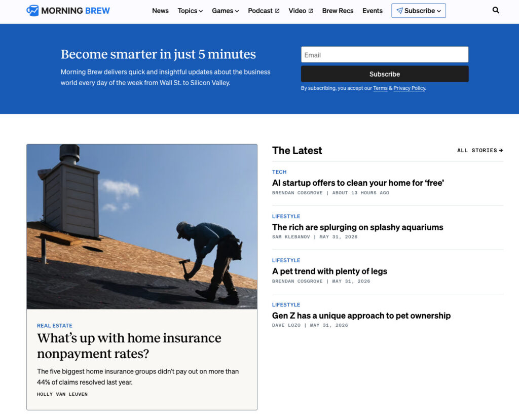
For businesses where the newsletter itself is the primary product – exemplified by publications like Morning Brew or The Hustle – an above-the-fold placement on the homepage is not merely recommended, but essential. In these cases, visitors typically arrive with the express intent of subscribing, making the form the central focus of the page. For businesses where the newsletter serves as a supportive element to a core product or service, a homepage form remains effective but must be carefully positioned to complement the site’s primary calls to action rather than competing with or overshadowing them. The goal is integration, not domination.

Sidebar Signup Form
A sidebar signup form offers persistent visibility as visitors navigate through content-rich pages. For readers who have arrived seeking specific information, a sidebar form provides a non-intrusive option to subscribe to a newsletter covering similar topics. On desktop interfaces, sidebar forms are highly effective due to their continuous presence alongside the main content. However, on mobile devices, most website themes relegate sidebars to a position below the main content, rendering them less effective. Therefore, a sidebar placement should be complemented by at least one other mobile-optimized location to ensure broad reach.
Dedicated Signup Page
A standalone page exclusively dedicated to the newsletter offers unparalleled space to articulate the value proposition of subscribing without the distraction of competing calls to action. This format allows for a comprehensive "sales pitch" for the newsletter, detailing its benefits, frequency, and unique content. Such pages are ideal for linking from external platforms like social media bios, podcast show notes, guest post bylines, and any other mention of the newsletter. As business strategist Alexandra Franzen, who famously built her audience entirely through email, shared in an AWeber webinar, her newsletter is an "art project." She emphasized, "The goal here, if you’re going to create a newsletter, is to make it so good that every reader goes and tells ten friends about it." A dedicated signup page should embody this mindset, selling the experience and intrinsic value of the content, not merely the act of subscription.
Persistent Header or Top Navigation Bar Form
Embedding a compact signup form within the website’s header or top navigation bar ensures constant visibility across every page. This placement is particularly effective for content-heavy websites where visitors typically browse multiple pages per session. The key to success here is conciseness: an email field and a button are usually sufficient to maintain a clean aesthetic while offering an ever-present subscription option.
Footer Signup Form
The website footer serves as a common destination for visitors who have consumed content and are seeking further information or engagement. Placing a newsletter signup form in the footer acts as a crucial safety net, capturing individuals who may not have been ready to subscribe upon their initial arrival but have since been sufficiently engaged by the site’s content. It caters to the "explorers" who scroll to the very end, indicating a deeper level of interest.
Exit-Intent Popup
An exit-intent popup is a dynamic form that triggers when a visitor’s cursor indicates an intention to leave the page (e.g., moving towards the browser’s close or back button). This offers a final opportunity to present the newsletter before the visitor departs. For optimal effectiveness and to avoid user annoyance, exit-intent popups should adhere to specific guidelines: display only once per session, feature a clearly visible close button, and offer a highly specific and compelling incentive. For instance, "Get weekly email tips for your small business" will consistently outperform a generic "Subscribe to our newsletter." Studies indicate that well-implemented exit-intent popups can convert between 2-8% of abandoning visitors.
Crafting Compelling Copy: The Art of Persuasion
Beyond form fields and placement, the efficacy of a newsletter signup form is profoundly influenced by its accompanying copy. Three elements are critical for driving conversions: the explicit benefit promised, the clarity of frequency expectations, and the minimal effort requested from the subscriber.
Lead with the Benefit, Not the Action
A common pitfall in form design is the default use of generic calls to action such as "Subscribe to our newsletter." While this instructs the reader on the desired action, it fails to provide any compelling reason for them to comply. The word "subscribe" denotes a mechanical action, leaving the critical question unanswered in the visitor’s mind: "What’s in it for me?"
Conversely, benefit-driven copy directly addresses this fundamental query. A phrase like "Get one email per week with strategies to grow your small business" is highly effective because it simultaneously answers three crucial questions: What will I receive? How often will I receive it? Is it relevant to my needs? This clarity enables visitors to make an informed decision within seconds, as the value proposition is immediately evident. The contrast between "Subscribe to our newsletter" (which places the burden of imagination on the reader) and "Get our Tuesday email: one tactic to grow your list this week" is stark. The latter provides specific details—a day, a clear promise, and a relevant topic—removing all ambiguity and encouraging immediate action.
Set Frequency Expectations at Signup
One of the most frequently overlooked yet critical elements of newsletter signup forms is the explicit statement of email frequency. Transparently informing subscribers upfront—whether emails are sent every Tuesday, twice a month, or weekly—significantly reduces post-signup unsubscribes. When new subscribers receive an email whose frequency or timing they did not anticipate, the immediate instinct is often to unsubscribe. By setting clear expectations, this reactive behavior is mitigated. A subscriber who willingly opted in knowing they would receive weekly emails is far less likely to feel caught off guard when an email arrives on a Wednesday morning. This proactive communication establishes a clear contract between the sender and receiver, fostering trust from the very first interaction.
Use a Specific Call-to-Action Button
The call-to-action (CTA) button is the final prompt a visitor encounters before committing to subscribe. Generic text like "Submit" provides no information or incentive. While "Subscribe" is an improvement, it remains vague. The most powerful button text directly mirrors the benefit promised elsewhere on the form. For example, if the headline states "Weekly email marketing strategies for small businesses," the button could compellingly read "Get weekly strategies" or "Send me the tips." This transforms the button into a confirmation of value, rather than merely a mechanical instruction.
Incorporating social proof can further enhance CTA effectiveness. Phrases like "Join 1,200 readers" leverage the psychological principle of conformity, signaling to potential subscribers that a significant number of others have already found value in the newsletter. If an organization boasts a respectable subscriber count, featuring it on the button can be a powerful motivator. Conversely, ambiguous button text such as "Learn more" or "Get started" should be avoided, as it creates uncertainty about the immediate outcome of clicking. The button’s purpose must be unmistakably clear.
Leveraging Technology: The Role of AI in Form Creation
For many years, the standard advice for creating newsletter signup forms involved selecting a template, customizing its colors and logo, and then publishing it. However, this approach carries a significant drawback: templates are inherently generic, designed for a broad audience rather than a specific business. They impose a predefined layout, copy structure, and field arrangement, often forcing businesses to adapt their unique offering to a generic design rather than building a form that authentically reflects their brand and audience.
A generic template cannot intuitively grasp that a newsletter is dispatched every Tuesday, or that its target audience comprises freelance designers, or that its tone is distinctly witty and informal. It lacks understanding of specific brand colors, voice, or content niche. Businesses are left to fill in pre-drawn blanks, often leading to a disconnect between the form and the actual newsletter experience.
This inherent limitation is precisely why innovative solutions like the AI Signup Form Builder in AWeber are transforming the landscape. This advanced tool adopts a fundamentally different approach. Instead of starting from a blank template, users describe the essence of their newsletter, and the AI generates a complete form meticulously matched to their brand. By analyzing the user’s website, understanding its content, and discerning its voice, the AI can produce a contextually relevant and aesthetically aligned form that integrates seamlessly with the existing site, eliminating the need for arduous manual customization. This shift from template-driven design to intelligent, context-aware generation marks a significant leap forward in form optimization.
As demonstrated by AWeber’s Chief Product Officer, Chris Vasquez, in a featured video, the AI can dramatically transform a standard signup form into a branded, high-converting asset. The forms generated by such AI tools can be flexibly deployed—embedded on any webpage, utilized as a standalone landing page, or configured as an exit-intent popup. The AI can even manage placement across a site based on user instructions. Crucially, each form is directly linked to the subscriber list, ensuring that new signups are immediately ready to receive the next newsletter, streamlining the entire subscriber acquisition process.
Measuring Success: Analytics for Continuous Improvement
The creation and deployment of a newsletter signup form represent only the initial step. Continuous tracking and analysis of its performance are indispensable for determining whether the chosen placement, copy, and field configurations are yielding optimal results. Without robust measurement, optimization efforts are merely guesswork.
Conversion Rate by Placement
Monitoring the conversion rate for each specific form placement is vital for identifying which locations are most effective in driving new subscribers. For instance, a form embedded within a high-performing blog post might achieve a 3% conversion rate, whereas a footer form might convert at 0.5%. Such data provides actionable insights, directing where to allocate more attention and resources for further optimization. Advanced tools, such as the AI Signup Form Builder in AWeber, integrate this data tracking functionality, providing users with a clear overview of performance metrics across different form types and placements.

Unsubscribe Rate in the First 30 Days
A high unsubscribe rate within the first month of subscription is a critical red flag, often indicating a mismatch between the expectations set by the signup form and the actual content or frequency of the emails received. This metric necessitates a thorough review of the form copy in conjunction with the email content and sending schedule. Discrepancies between what was promised and what is delivered are the most common culprits for early subscriber churn. Addressing these misalignments is crucial for fostering long-term subscriber loyalty and maintaining a healthy, engaged email list.
Broader Implications and Best Practices
A newsletter signup form is more than a simple data collection tool; it is the first impression of an ongoing relationship. Its design, placement, and messaging significantly influence not only the quantity of subscribers but also their quality and long-term engagement. Investing in its optimization is a direct investment in the health of an organization’s email marketing ecosystem and, by extension, its digital growth strategy.
The distinction between a general email signup form and a dedicated newsletter signup form is paramount. While broader email forms might funnel subscribers into various automated sequences, product updates, or transactional communications, a newsletter form has a singular, focused objective: to onboard the right individual onto a recurring, value-driven newsletter list. This specificity dictates that the form’s design, copy, and field choices must meticulously reflect the precise offering the subscriber is opting into. A divergence, such as promising "weekly tips" but delivering "daily promotions," immediately creates a trust deficit that can be difficult to overcome, leading to disengagement and unsubscribes.
Frequently Asked Questions (FAQs)
What is a newsletter signup form?
A newsletter signup form is a specialized web form, either embedded within a webpage or hosted as a standalone landing page, designed exclusively to capture visitor information for the explicit purpose of subscribing them to a recurring email newsletter. Unlike more generalized email capture forms that might collect leads for sales, product announcements, or automated marketing funnels, a newsletter form is hyper-focused on onboarding individuals into a consistent, content-driven email communication stream. Its design and messaging are tailored to communicate the specific value, frequency, and nature of the newsletter, aiming to attract individuals genuinely interested in the ongoing content provided.
How do I add a newsletter signup form to my website?
The process of adding a newsletter signup form to a website is streamlined with modern tools. Using platforms like AWeber, one can access an AI Signup Form Builder. The user describes their newsletter’s focus and brand, and the AI subsequently generates a custom form tailored to these specifications. Once the design is approved, the platform provides an embed code. This code can then be copied and pasted into the HTML of any webpage where the form is desired. Content management systems (CMS) such as WordPress, Squarespace, and Wix typically offer a custom HTML block or widget functionality that easily accommodates these embed codes, allowing for seamless integration.
How do I add a newsletter signup to Facebook?
To integrate a newsletter signup option with a Facebook presence, the most effective method is to create the signup form using an email marketing platform like AWeber. After the form is built, the platform generates a unique, hosted URL for that form. This URL can then be strategically placed on Facebook. Common placements include adding the link to the Facebook page’s primary action button (e.g., "Sign Up"), embedding it in the page’s "About" section or bio, or pinning it as a prominent post at the top of the page feed. When visitors click this link, they are directed to the hosted signup form, allowing them to subscribe without having to leave their browser or the Facebook platform.
How do I create a newsletter signup form in HTML?
While it is technically possible to hand-code a newsletter signup form entirely in HTML, CSS, and JavaScript, the most efficient and reliable method involves utilizing an email marketing service like AWeber. These platforms provide pre-built, functional forms that are already wired to the backend subscription logic. After designing the form within AWeber (for example, using its AI builder), the platform typically provides an option to access the form’s raw HTML code. This generated HTML is clean, functional, and automatically connected to the user’s email list. Users can then copy this code and, if desired, further customize its styling, field labels, or layout directly in the HTML without needing to build the complex subscription processing backend from scratch. This approach combines the flexibility of HTML customization with the robustness and ease of use of a professional email service.


 Asro
Asro
 Nana
Nana