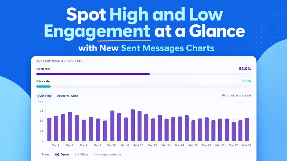
Lansdale, PA – August 6, 2026 – AWeber, a leading email marketing service provider, has launched a significant upgrade to its analytics dashboard, introducing a suite of powerful visualization tools designed to provide marketers with instant, actionable insights into their email campaign performance. This new release, officially live in AWeber dashboards, promises to revolutionize how users understand and optimize their email strategies by making complex data accessible and intuitive. The enhancements include at-a-glance charts for open rates, click rates, and email comparisons, alongside sophisticated features for tracking engagement trends over time and identifying top-performing content.
The core of this update lies in its ability to surface critical patterns and outliers without requiring extensive data manipulation or deep analytical expertise. Marketers can now quickly ascertain which emails resonate with their audience and which fall short, thereby enabling a data-driven approach to refine future communications and maximize engagement.
The Evolving Landscape of Email Marketing and the Demand for Deeper Insights
Email marketing continues to be a cornerstone of digital strategy for businesses of all sizes, boasting an impressive return on investment (ROI) that frequently surpasses other digital channels. Industry reports consistently show that for every dollar spent, email marketing can generate an average of $36-$42 in return, making it an indispensable tool for lead nurturing, customer retention, and sales generation. However, merely sending emails is no longer sufficient; the competitive digital landscape demands strategic optimization based on robust performance data.
For years, marketers have grappled with the challenge of transforming raw email metrics—opens, clicks, unsubscribes—into meaningful, actionable intelligence. Traditional analytics often presented data in tables, requiring manual cross-referencing and trend spotting, a time-consuming process that could delay critical strategic adjustments. This new suite of tools from AWeber directly addresses this pain point, democratizing advanced analytics and placing powerful visualization capabilities directly into the hands of everyday marketers.
AWeber, with its decades-long history as a pioneer in email marketing, has consistently aimed to equip small businesses and entrepreneurs with user-friendly yet powerful tools. This latest release builds upon that legacy, recognizing the growing need for sophisticated analytics that can keep pace with an increasingly complex digital ecosystem. The company’s prior foray into AI-integrated analytics, particularly with its AWeber MCP app for ChatGPT and Claude.ai, signaled a clear direction towards making data more conversational and accessible. This dashboard update can be seen as a natural evolution, bringing similar levels of intuitive insight directly into the primary user interface.
Visualizing Engagement Trends Over Time: The Opens and Clicks Over Time Chart
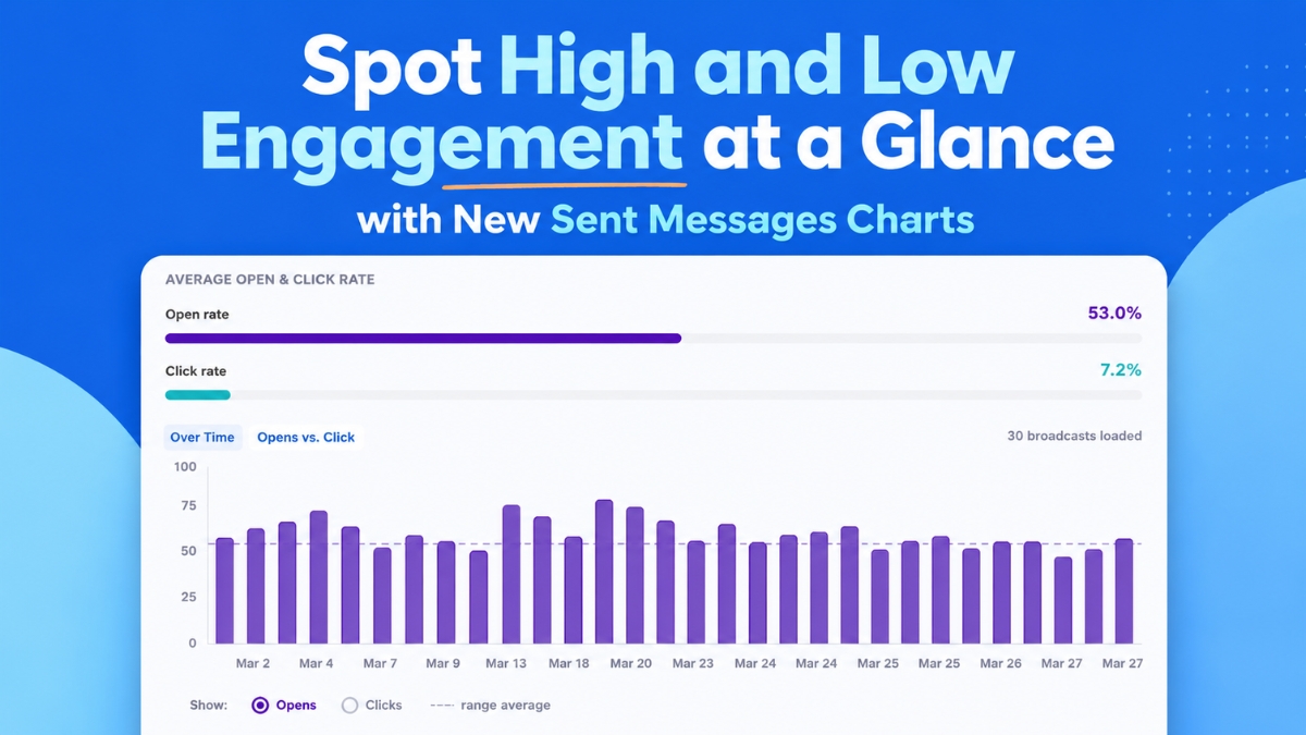
One of the standout features of the new analytics suite is the "Opens and Clicks Over Time" chart. This dynamic visualization plots up to 100 of a user’s most recent broadcast emails on a clear, chronological timeline. The immediate benefit is the ability to instantly discern performance fluctuations and persistent trends. Users can easily toggle between views to compare open rates and click-through rates, providing a comprehensive understanding of how their emails are performing day-to-day or week-to-week.
The chart is designed to highlight critical insights that might otherwise remain buried in spreadsheets. For instance, a consistent spike in open rates on a particular day of the week could indicate an optimal sending time for that audience. Similarly, specific subject line patterns that consistently drive higher engagement become immediately apparent. This visual clarity allows marketers to quickly identify successful tactics and replicate them, or conversely, spot underperforming periods and investigate the underlying causes.
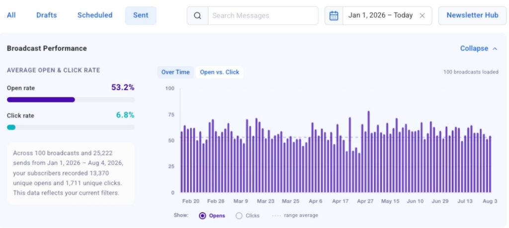
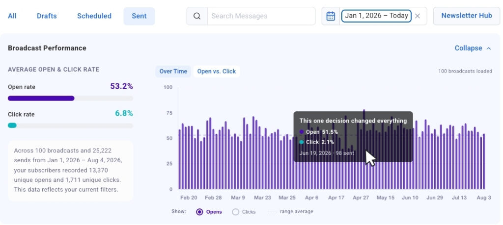
Each bar in the chart represents an individual broadcast, and a convenient "click-to-jump" functionality allows users to instantly navigate from a data point on the chart directly to the corresponding email in the detailed table below. This seamless integration between visual overview and granular detail empowers marketers to move from identifying a trend to analyzing the specific content and context of that email in mere seconds. This efficiency is paramount for agile marketing teams who need to react quickly to performance data. The chart loads automatically and continuously populates as users scroll through their broadcast history, ensuring that the visual context is always current and comprehensive.
Benchmarking Performance: Strongest and Weakest Sends Side by Side
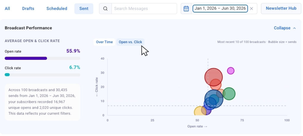
Further enhancing comparative analysis, AWeber has introduced the "Opens vs. Clicks" bubble chart. This innovative visualization plots recent sends together on a two-dimensional graph, where each email is represented by a bubble. Crucially, the size of each bubble is scaled according to the send volume, allowing marketers to compare results across broadcasts sent to different audience sizes without losing vital context. This nuanced approach prevents misleading conclusions that can arise from comparing engagement rates of emails sent to vastly different list segments.
The bubble chart is particularly effective at highlighting "outliers"—those emails that significantly deviate from the average performance. For example, a large bubble positioned high on the "opens" axis but low on the "clicks" axis immediately signals a broadcast with a compelling subject line that captured attention but perhaps lacked engaging content or a clear call-to-action (CTA). Conversely, a bubble showing strong performance in both opens and clicks points to a highly effective email from subject line to conversion. Such insights are invaluable for refining content strategy, A/B testing elements like CTAs, and understanding the complete customer journey from inbox to engagement.
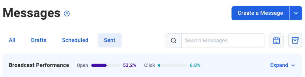
This side-by-side comparison empowers marketers to strategically decide what elements of their campaigns to repeat and what aspects require adjustment. It moves beyond simple metrics to provide a qualitative understanding of email effectiveness, distinguishing between emails that merely get noticed and those that genuinely drive action. To maintain user flexibility, the chart view is collapsible, allowing users to focus solely on the numerical data in the table when preferred, and then expand it again for visual context as needed. This adaptability ensures the analytics interface caters to diverse user preferences and analytical workflows.
Granular Control: Advanced Filtering Capabilities
Understanding that context is king in data analysis, AWeber has integrated robust filtering options into its new analytics dashboard. These features enable marketers to narrow down their data to precisely what they want to measure, facilitating highly targeted analysis.
Date presets are a core component of this functionality, allowing users to instantly pull data for the past 30 days, 90 days, or a full year with a single click. This capability is crucial for identifying seasonal trends, assessing the long-term impact of strategic changes, or simply reviewing performance within specific campaign windows. The chart updates immediately to reflect the chosen date range, providing instant feedback.
Beyond temporal filtering, a dynamic search bar offers even greater precision. Marketers can type in keywords, and the chart will instantly narrow its display to only include broadcasts with that specific word or phrase in the subject line. This is particularly useful for analyzing the performance of specific campaign themes, recurring newsletters, or the effectiveness of different messaging styles. For instance, a marketer could quickly compare all emails containing "webinar" in the subject line to understand audience engagement with their educational content.
Looking ahead, AWeber has announced that segment name filtering is "coming soon." This forthcoming feature will be a game-changer for sophisticated email marketers. It will enable users to isolate chart and table data by specific audience segments, recognizing that engagement naturally varies across different groups within a subscriber list. Understanding how a welcome series performs for new subscribers versus how a promotional email resonates with long-term customers is vital for truly personalized and effective email marketing. This capability will unlock deeper insights into audience behavior and allow for even more refined targeting and content tailoring.
Development Chronology and Broader Implications
The release of these advanced analytics features is not an isolated event but rather the culmination of AWeber’s ongoing commitment to enhancing its platform’s intelligence and usability. The journey began with the foundational analytics available within the platform, providing essential metrics. The subsequent introduction of the AWeber MCP app for ChatGPT and Claude.ai marked a significant step towards leveraging artificial intelligence to interpret data and offer actionable recommendations in a conversational format. This latest dashboard update integrates similar advanced insights directly into the user interface, making them accessible to a broader audience without the need for external AI tools.
This strategic rollout reflects a broader industry trend where marketing technology providers are moving towards more integrated, intuitive, and AI-powered analytics solutions. As data volumes grow, the ability to quickly derive meaning from that data becomes a competitive advantage. AWeber’s new charts reduce the cognitive load on marketers, allowing them to spend less time digging for data and more time acting on it.
The implications for small and medium-sized businesses, AWeber’s primary demographic, are substantial. These businesses often lack the dedicated data analysts or extensive resources of larger enterprises. By providing sophisticated, yet easy-to-understand, visual analytics, AWeber empowers them to make smarter marketing decisions, optimize their budgets, and achieve better results. This can lead to improved customer engagement, higher conversion rates, and ultimately, sustainable business growth.
For AWeber itself, this update strengthens its position in a highly competitive email marketing software market. By offering cutting-edge analytics that rival or even surpass those of larger platforms, AWeber reinforces its value proposition as a comprehensive solution for effective email communication. It signals a forward-thinking approach, anticipating the evolving needs of its user base and continually investing in features that drive real business impact.
Conclusion: A New Era of Data-Driven Email Marketing
The introduction of these enhanced analytics charts marks a pivotal moment for AWeber and its users. By transforming raw data into intuitive visual narratives, the platform empowers marketers to gain unprecedented clarity into their email performance. From understanding long-term engagement trends to identifying the precise elements that drive action in individual campaigns, the new tools are designed to foster a truly data-driven approach to email marketing.
As the digital landscape continues to evolve, the ability to quickly adapt and optimize campaigns based on real-time performance data will be paramount. AWeber’s latest update positions its users at the forefront of this evolution, providing them with the insights needed to craft more effective, engaging, and ultimately, more successful email marketing strategies. The Sent Messages charts are now live, ushering in a new era of intelligent email campaign management for AWeber customers worldwide.