

The architecture of an e-commerce website serves as the digital equivalent of a physical store’s layout, where category pages act as the critical aisles guiding consumers from the entrance to the point of purchase. Often overlooked in favor of high-impact homepages or high-conversion product detail pages (PDPs), the category page—or Listing Page (PLP)—is the primary engine for product discovery and user retention. Industry data suggests that while homepages attract the most direct traffic, category pages are frequently the first point of entry for organic search visitors targeting specific needs. Consequently, optimizing these pages requires a sophisticated blend of psychological insight, data-driven design, and technical precision to ensure that the user’s journey is not merely a path, but a streamlined experience that minimizes friction and maximizes intent.
The Strategic Foundation: Defining Purpose and Intent
Before implementing structural changes or aesthetic upgrades, a brand must establish the primary objective of its category pages. In the current digital landscape, e-commerce category pages generally serve three distinct roles: facilitating browsing, aiding in the decision-making process, or enabling immediate purchase. Each role necessitates a fundamentally different design philosophy.
For "browsing-focused" pages, the visitor is typically in the early stages of the sales funnel, asking, "What are my options?" At this juncture, introducing high-commitment calls-to-action (CTAs) such as "Add to Cart" can paradoxically decrease conversion rates. Behavioral economics suggests that when an interface demands a higher-commitment decision than the user is prepared to make, it triggers "decision conflict." Rather than moving forward, the user may feel pressured, leading to cognitive friction that results in backtracking or site abandonment. In these instances, the page must prioritize visibility, clear labeling, and intuitive navigation over immediate transactional features.
Conversely, for returning visitors or those with high-intent search queries, the category page must act as a shortcut. For these users, an "Add to Cart" button or a "Quick View" option provides significant utility, allowing them to bypass the product detail page entirely. The challenge for modern retailers lies in identifying the intersection between the actions the brand desires—such as newsletter sign-ups or high-margin product sales—and the actions the visitor expects to find.
Analytical Benchmarking and Performance Metrics
The efficacy of a category page is best measured through granular analytics. E-commerce experts generally expect category pages to maintain an exit rate that aligns closely with the site-wide average. A significant discrepancy—specifically a high exit rate on category pages—is a primary indicator of structural failure. It suggests that users are arriving at the "aisle" but finding it so disorganized or irrelevant that they choose to leave the store entirely rather than proceed to a specific product.
Data from major e-commerce platforms indicates that a high bounce rate on category pages often stems from "information overload" or a lack of relevant filtering. To combat this, retailers must employ heatmaps and click-stream analysis to determine which elements are capturing attention and which are being ignored. For example, if a "Shop by Need" filter is placed prominently at the top of the page but receives less than 2% of total clicks, it occupies valuable real estate that could be better utilized for trending products or high-resolution imagery.
Hierarchical Structuring and the "Three-Level Rule"
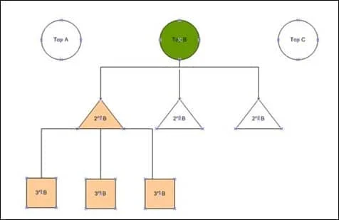
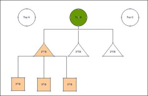
Effective information architecture (IA) is the backbone of a successful category page. While grouping products into top-level categories like "Electronics" or "Apparel" is a standard starting point, data suggests that such broad groupings are insufficient for modern consumer expectations. A category that is too large forces the user to sift through thousands of irrelevant items, leading to "choice paralysis."
Industry best practices recommend a hierarchical breakdown that goes at least one level further, though rarely exceeding three levels of sub-categories. For instance, "Electronics" should lead to "Computers," which further breaks down into "Laptops," "Desktops," and "Tablets." This "child category" approach allows for more specific filtering and helps search engines better index the site for long-tail keywords. As visitors navigate these tiers, the parent category page should dynamically highlight featured items from its child categories to provide a snapshot of the variety available without overwhelming the user.
Aligning Product Features with Consumer Psychology
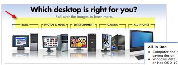
Understanding why a consumer buys a product is as important as understanding what they are buying. This distinction allows retailers to create filters based on both technical features and user needs. In the consumer electronics sector, for example, a visitor may look for a television based on technical specifications like "4K Resolution" or "OLED Panel." However, another visitor may be shopping based on use-case, such as "Gaming," "Home Cinema," or "Outdoor Use."
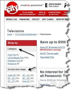
Retailers like Best Buy and the now-defunct Circuit City pioneered the use of need-based filtration. By allowing users to identify their specific situation—such as a student looking for a "Basic" laptop versus a professional looking for "Photo & Music" editing capabilities—the category page transforms from a static list into a consultative tool. This approach significantly reduces the cognitive load on the consumer, as the website performs the initial labor of narrowing down the selection.
The Role of Decision Support and Buying Guides
For complex or high-ticket items, a simple list of products is often inadequate. When the product category involves high technical complexity or significant financial investment, visitors frequently require assistance in determining which subcategory fits their needs.
Integrating buying guides, comparison tools, or interactive "wizards" directly into the category page can serve as a powerful conversion catalyst. These tools provide the "expert advice" that a consumer would typically seek from a sales associate in a physical store. By providing educational content at the point of discovery, brands build trust and authority, reducing the likelihood that a user will leave the site to conduct research elsewhere.
The Chronology of Optimization: An Iterative Approach
The process of refining a category page is not a one-time event but a continuous cycle of testing and iteration. A standard optimization timeline often follows this trajectory:
- Initial Audit (Week 1-2): Analyzing exit rates, bounce rates, and average time on page to identify underperforming categories.
- User Intent Mapping (Week 3): Determining whether the page serves browsers or buyers and adjusting the CTA strategy accordingly.
- Structural Reorganization (Week 4-6): Implementing sub-category hierarchies and refining the internal linking structure to improve SEO and navigation.
- Feature and Filter Implementation (Week 7-8): Adding attribute-based and need-based filters tailored to specific product lines.
- A/B Testing and Heatmap Analysis (Ongoing): Testing variations of layouts, such as grid versus list views, and monitoring user interaction to prune unused features.
A notable case study involves a major retailer that implemented a "need-based" filtration system at the top of their category pages. Despite the internal team’s confidence in the feature, analytics revealed that visitors were almost entirely bypassing the section in favor of traditional sidebar filters. Within two weeks, the team utilized this data to remove the underperforming header and replace it with a "Trending Now" carousel, which saw a 15% increase in click-through rates to product pages.
Broader Implications for the E-Commerce Industry
The evolution of category pages reflects a broader shift in e-commerce toward hyper-personalization and mobile-first design. As more consumers shop via mobile devices, the "infinite scroll" and "load more" buttons have replaced traditional pagination, requiring category pages to be more lightweight and responsive. Furthermore, the integration of Artificial Intelligence (AI) is beginning to allow for dynamic category pages that reorder products in real-time based on a user’s past browsing history and purchase behavior.
Ultimately, the category page is the "moment of truth" in the digital shopping journey. It is where a brand’s inventory meets a consumer’s intent. By focusing on the psychological needs of the visitor, maintaining a clean and logical hierarchy, and relying on rigorous data analysis rather than intuition, e-commerce businesses can transform these middle-of-the-funnel pages into powerful drivers of growth and customer loyalty. In an era where consumer attention is the most scarce resource, the brands that can help users find what they need with the least amount of effort will inevitably lead the market.







