The strategic application of color psychology stands as one of the most potent, yet often underestimated, tools available to contemporary marketers. Far beyond mere aesthetics, color is a fundamental visual cue that instantaneously establishes mood, triggers emotional responses, and provokes profound psychological reactions in consumers. Its influence is so pervasive that, according to comprehensive research, an overwhelming 90 percent of a subscriber’s initial impression of digital content—be it an email message or a website—is formed solely on the basis of color and other visual elements. This immediate impact underscores color’s critical role in conveying value, reinforcing brand identity, and ultimately, influencing consumer behavior.
The Foundational Science of Color Perception
Understanding why color holds such sway begins with its deep-rooted connection to human perception and cognitive processing. Colors are not merely seen; they are felt and interpreted, often at a subconscious level. This phenomenon is supported by extensive psychological studies, which reveal that specific hues can elicit predictable emotional and physiological responses. For instance, certain colors have been shown to stimulate brain activity associated with excitement, while others promote feelings of calm or trustworthiness. This inherent ability to evoke emotion is what makes color an invaluable asset in marketing, allowing brands to communicate their core message and ethos without uttering a single word. Data from a significant consumer survey highlights this further, indicating that 84.7% of consumers consider color to be an important factor when making a purchasing decision. Moreover, consistent use of color can increase brand recognition by a remarkable 80%, transforming abstract visual elements into powerful identifiers that resonate deeply with target audiences. This strong link between color and brand recall firmly establishes color as an indispensable component of a cohesive brand identity and a cornerstone of effective marketing strategy.
A Palette of Influence: Decoding Individual Color Meanings for Marketing
To effectively harness the power of color, marketers must delve into the specific psychological associations of individual hues. Each color carries a unique set of meanings, influenced by cultural context, personal experiences, and universal human responses.
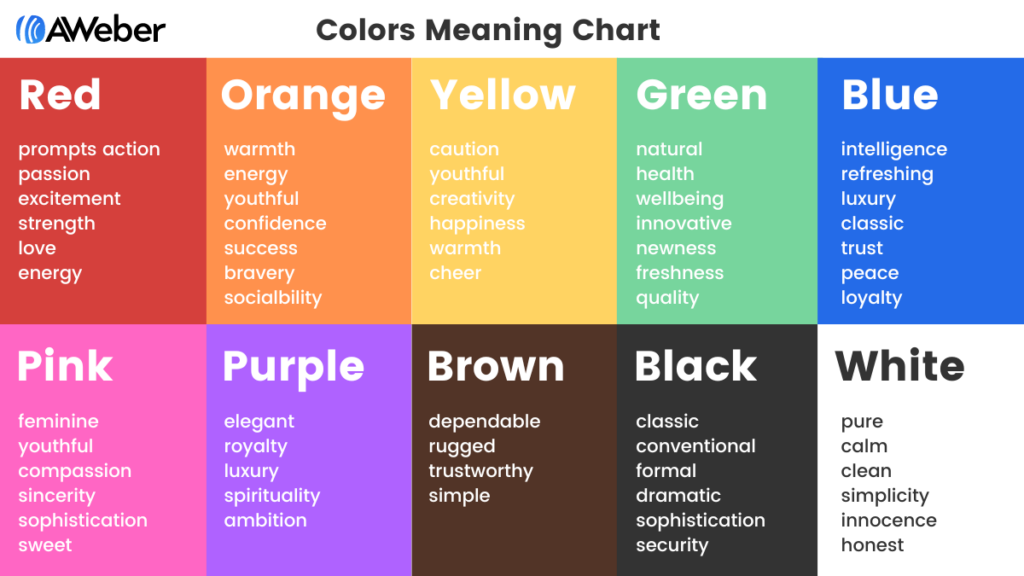
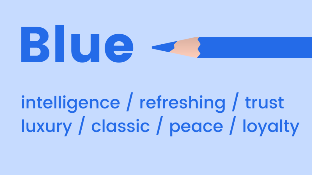
Blue: Often associated with the sky and ocean, blue universally evokes feelings of coolness, calm, and serenity. Its mood-boosting properties are linked to the release of calming chemicals in the brain, fostering positivity and tranquility. Light blues offer a refreshing and airy sensation, ideal for conveying innovation or lightness. Conversely, darker shades of blue project an aura of professionalism, reliability, and luxury, without the starkness often associated with black. This makes dark blue a classic choice for corporate brands, financial institutions, and technology companies aiming to build trust and authority. Its widespread acceptance also makes it a safe and versatile choice for brands seeking to appeal to a broad demographic. In marketing, blue is frequently employed in sectors such as healthcare, finance, and social media platforms to foster trust and stability. Brands like Facebook and IBM famously leverage blue to project dependability.
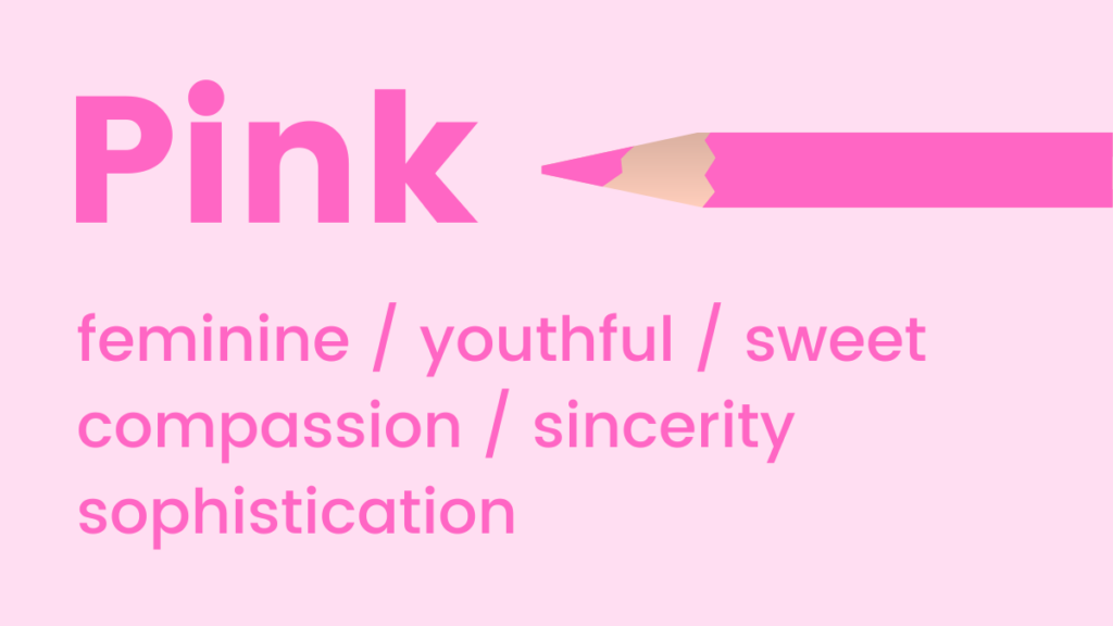
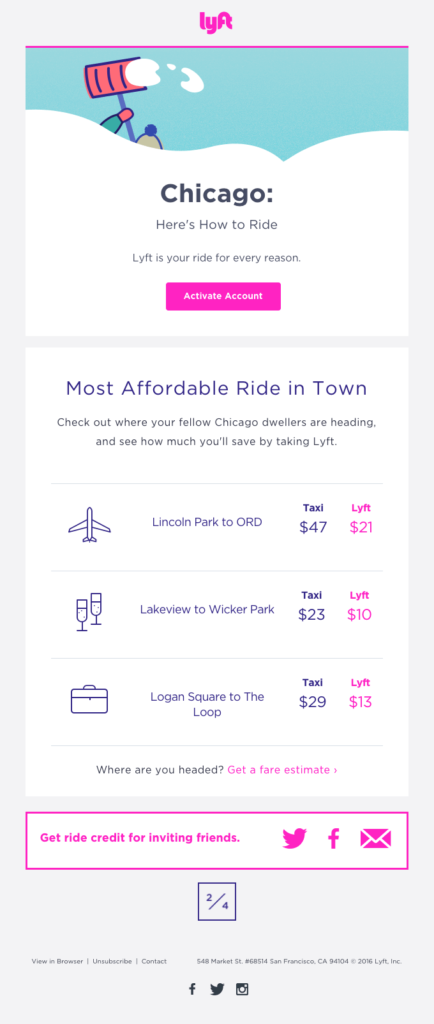
Pink: Vibrant and youthful, pink tones are synonymous with fun, excitement, and femininity. It’s a prime choice for brands targeting a younger demographic or emphasizing sweetness and playfulness. Interestingly, research suggests that pink can even stimulate cravings for sugar, making it a powerful tool for confectionary brands or products positioned as treats. From fashion to beauty, and even in certain tech products designed for a female audience, pink communicates approachability, tenderness, and charm. Its varying shades, from soft pastels to bold fuchsias, allow for diverse expressions, from delicate elegance to audacious self-expression, as seen with brands like Barbie or Lyft.
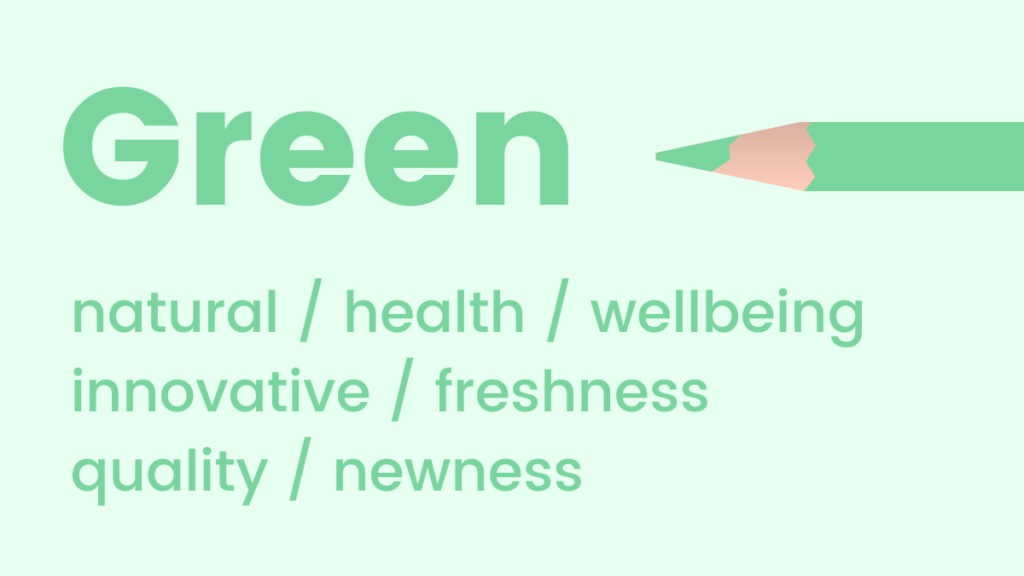
Green: Reflecting nature, health, and well-being, green is a soothing color that promotes relaxation, harmony, and balance. It is unique in that the human eye can discern more shades of green than any other color, contributing to its comforting and expansive feel. Given its fresh and vital associations, green is an excellent choice for promoting new products, sustainable initiatives, or services related to health, environment, and organic living. It conveys growth, renewal, and often, prosperity. Financial institutions sometimes use green to subtly hint at wealth, while eco-conscious brands like Whole Foods Market use it to signify their commitment to sustainability.
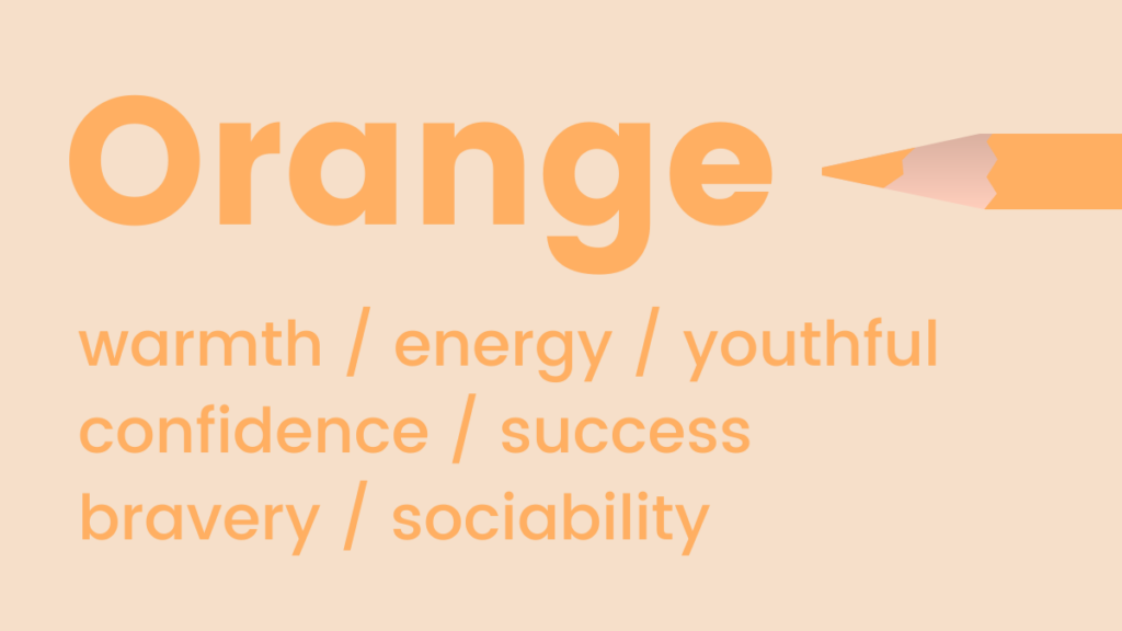
Orange: A vibrant blend of red’s energy and yellow’s happiness, orange radiates warmth, enthusiasm, and optimism. It’s a flamboyant and energetic color often used to symbolize positivity, creativity, and adventure. Notably, orange is also naturally associated with trust and safety in certain contexts, such as high-visibility safety gear. Its inherent boldness makes it a powerful color for calls to action, drawing attention without the aggressive intensity of pure red. It can be particularly effective for brands in the entertainment, sports, or food industries looking to convey excitement and approachability, such as Nickelodeon or Amazon. However, its intensity requires careful application; using it as an accent color or in imagery often yields better results than large blocks of solid orange.
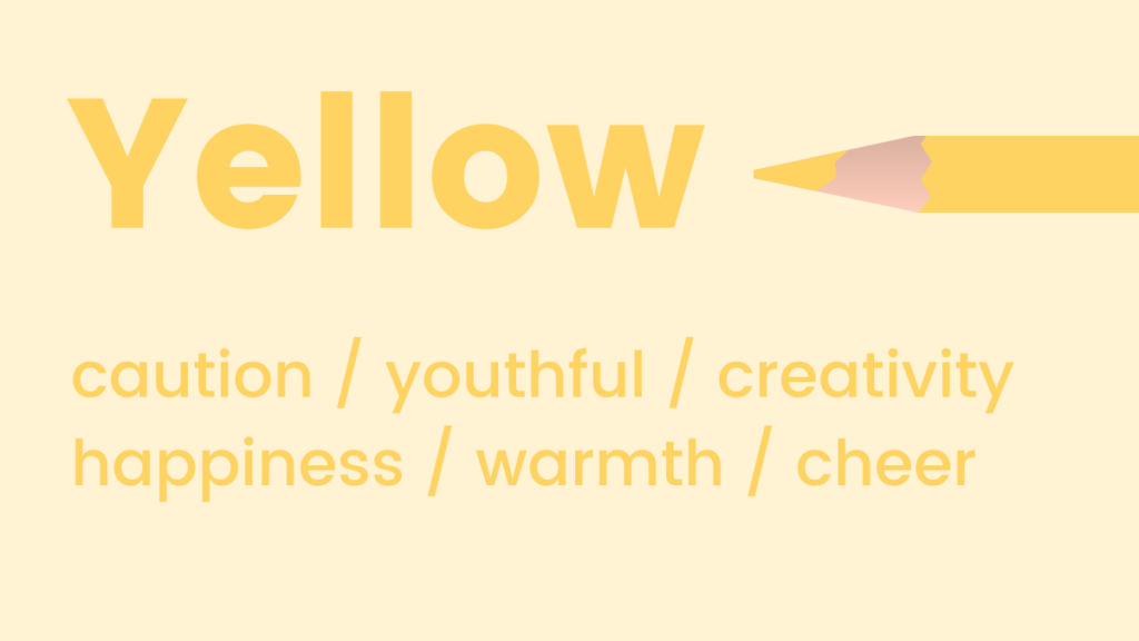
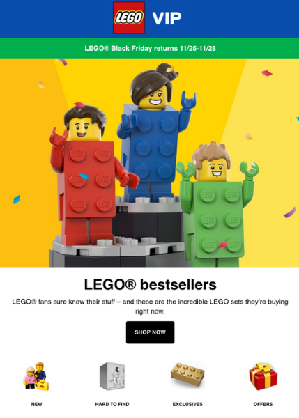
Yellow: Known as the happiest shade in the color spectrum, yellow is intrinsically linked to positivity, joy, and optimism. Like orange, it evokes warmth and energy. Beyond mood, yellow is recognized for its cognitive benefits, including activating memory, stimulating mental processes, and encouraging communication. Its bright and attention-grabbing nature makes it suitable for highlighting important information or signaling cheerfulness. Brands targeting families or children, as well as those in the creative or educational fields, often leverage yellow to project an image of friendliness and accessibility, like McDonald’s or LEGO. However, excessive use can sometimes lead to feelings of anxiety, so balance is key.
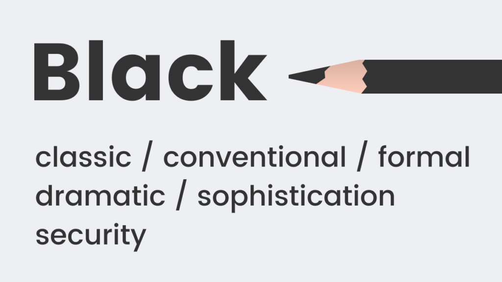
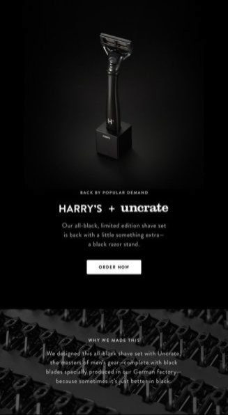
Black: A timeless classic, black exudes sophistication, formality, and power. It’s frequently used to represent luxury, exclusivity, and tradition, as seen in "black tie" events or high-end fashion. Psychologically, black can imply weight and substance; studies have shown that people perceive a black object as heavier than a white one of the same size. In marketing, black is often chosen by premium brands, fashion houses, and technology companies seeking to convey elegance, strength, and authority, such as Chanel or Apple. It provides a strong contrast for other colors, making them pop, and serves as a powerful backdrop for minimalist designs.
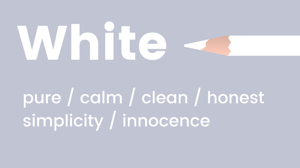
White: Embodying purity, simplicity, and serenity, white is a cool, calm, and modern choice. It suggests cleanliness, freshness, and new beginnings. Brands aiming for a minimalist aesthetic, or those in the health, bridal, or technology sectors, often utilize white to project an image of clarity, efficiency, and innovation. It provides ample negative space, which enhances readability and allows other design elements to breathe, contributing to a sense of openness and spaciousness. White is also a highly versatile background color that makes other colors stand out, as exemplified by brands like Apple’s product designs or The Little White Company.
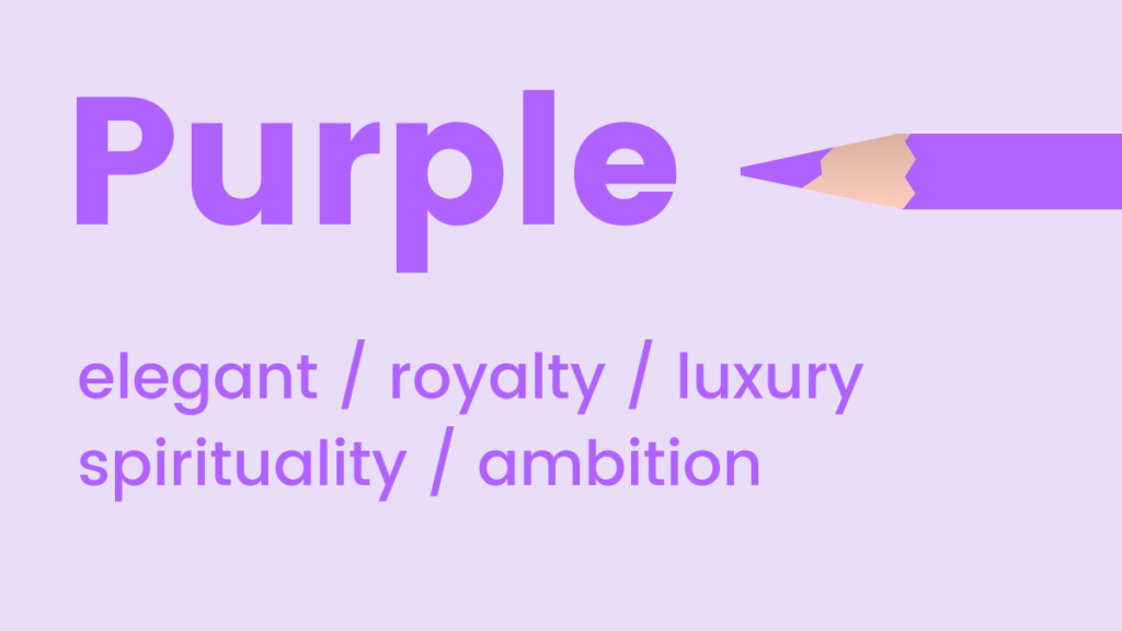
Purple: Historically associated with royalty and luxury due to the rarity and cost of its dyes, purple maintains its connotation of elegance, sophistication, and wisdom. It’s an "in-between" shade that can uplift while maintaining a sense of calm, blending the stability of blue with the energy of red. Purple is also known to encourage creativity, imagination, and spiritual reflection. Brands in the beauty, luxury goods, creative arts, or even spiritual wellness industries often use purple to convey premium quality, artistic flair, and a touch of mystique, such as Hallmark or Cadbury. Lighter lavenders suggest romance and nostalgia, while deeper purples imply opulence.
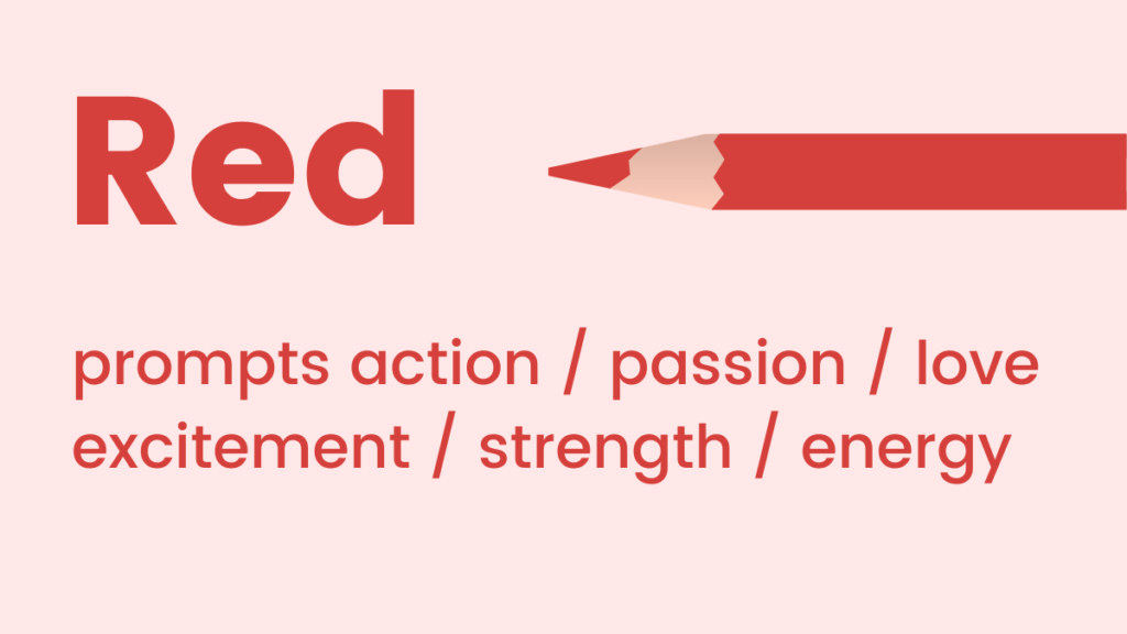
Red: The color of passion, adrenaline, and action, red is a high-energy hue that can significantly boost excitement and urgency. It commands attention and is often used to signal importance, danger, or strong emotions like love and anger. In marketing, red is an excellent choice when the goal is to create a sense of urgency, highlight a limited-time offer, or draw immediate attention to a call to action. Food brands often use red to stimulate appetite (e.g., Coca-Cola, KFC), while retail brands leverage it during sales events. Its intensity means it should be used judiciously, often as an accent color for maximum impact without overwhelming the viewer.
Crafting Cohesive Visual Identities: Strategic Color Schemes in Digital Design

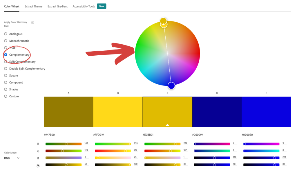
Beyond individual color meanings, the synergy between colors within a design is paramount. Marketers, even those without a design background, can create visually appealing and effective color combinations by understanding basic color theory. There are numerous color theories, but two fundamental schemes are particularly effective for website and landing page design: analogous and complementary.

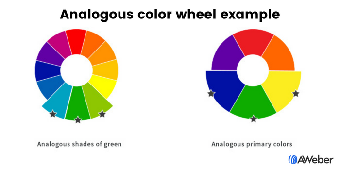
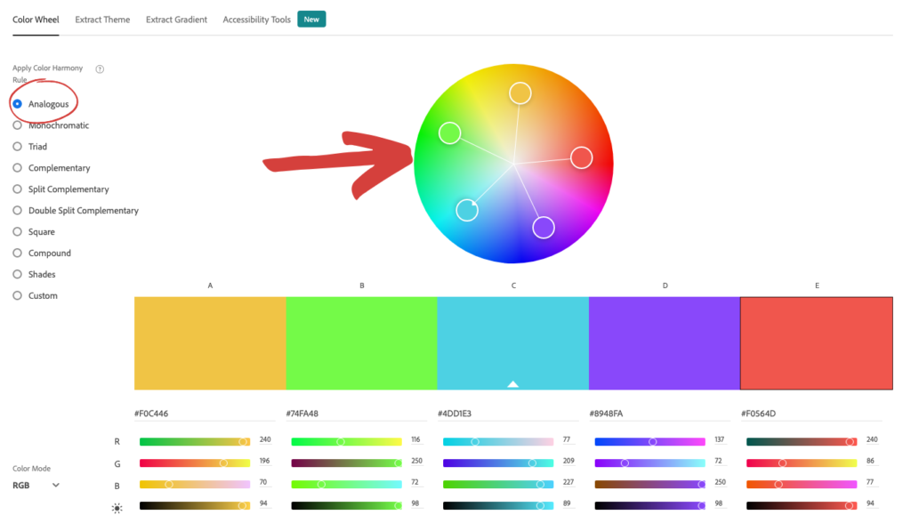
Analogous Colors: These are colors that are adjacent to each other on the color wheel, creating a harmonious and aesthetically pleasing palette. An analogous scheme might involve blue, green, and yellow, or different shades and tints of a single color. The inherent closeness of these colors ensures visual continuity and a soothing effect, making the design feel unified and natural. This approach simplifies the color selection process; once a primary color is chosen, its adjacent hues naturally form a balanced scheme. Tools like Adobe Color CC allow designers and marketers to easily identify analogous combinations, providing a foundation for sophisticated yet user-friendly interfaces. The effective application often follows the "60-30-10 rule," where 60% is a dominant color, 30% a secondary color, and 10% an accent color, typically chosen from the analogous set.

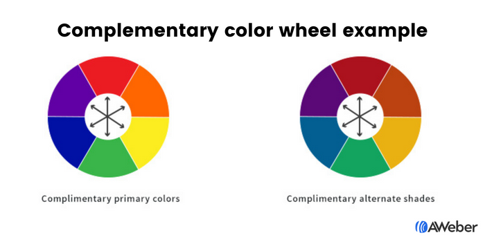
Complementary Colors: For designs that demand more visual interest and impact, complementary color arrangements are highly effective. Complementary colors are located directly opposite each other on the color wheel, such as blue and orange, green and red, or purple and yellow. These pairings create strong contrast, making elements stand out and adding dynamic tension to a design. When used strategically, complementary colors can be visually appealing and draw the eye to specific areas. For instance, an orange call-to-action button against a blue background will pop, immediately capturing user attention. Again, online tools like Adobe Color CC facilitate the discovery of these impactful combinations, helping marketers ensure their designs are both vibrant and balanced.

Optimizing User Journeys: Color Application Across Marketing Touchpoints

The strategic use of color extends across all digital marketing touchpoints, guiding user interaction and reinforcing brand messaging.
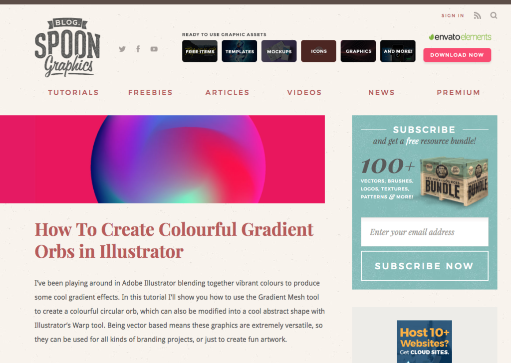
Websites and Landing Pages: The overall color scheme of a website or landing page sets the immediate tone. An analogous scheme can create a sense of calm and professionalism, ideal for informational sites or luxury brands. Complementary colors can be used to highlight key sections, calls to action, or special offers, injecting energy and directing user flow. The background color, typography colors, and interactive elements (buttons, links) must all work in concert to create a coherent and engaging experience. A strong color strategy ensures that visitors instinctively understand the hierarchy of information and are drawn towards desired actions, such as signing up for a newsletter or making a purchase.

Sign-Up Forms: Sign-up forms are critical conversion points, and their visibility and appeal are heavily influenced by color. The primary objective is to make the form noticeable and encourage completion.
- Contrast with the Site: The form’s background should distinctly contrast with the surrounding website content. If the site is predominantly cool-toned, a warm-toned form can effectively draw the eye. This subtle visual "scream" for attention ensures the form isn’t lost in the page’s overall design.
- Internal Contrast: Within the form itself, contrast is vital for guiding the user. Form fields should be clearly delineated, and the call-to-action (CTA) button must stand out prominently. Using a complementary color for the button against the form’s background is an excellent way to emphasize the desired action. For example, a yellow button on a purple form, or an orange button on a blue form, creates an irresistible visual cue to "click here." Thoughtful application of color ensures that the form is not just seen, but actively engaged with, leading to higher conversion rates.
Email Marketing: The colors used in email campaigns should be tailored to the email’s specific purpose, balancing brand consistency with communicative intent.
- Email Newsletters: These often prioritize content readability. A predominantly white background with subtle brand color accents for headers or links is ideal. The goal is to avoid distractions, allowing subscribers to focus on the information. However, if a key objective is to drive traffic (e.g., to a blog post or video), a strategically colored call-to-action button, perhaps in a contrasting color, can significantly boost click-through rates.
- Welcome Emails: As a first impression, welcome emails are perfect for reinforcing brand identity. Consistent use of core brand colors immediately immerses the new subscriber in the brand’s visual world, fostering familiarity and trust.
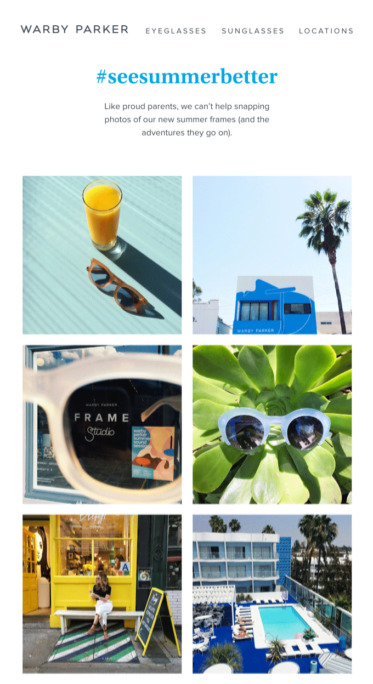
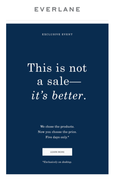
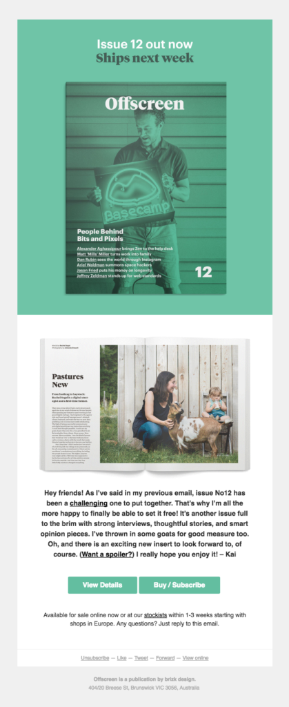
- Sales Emails: The color strategy for sales emails should align with the offer’s psychological intent. A red CTA might convey urgency for a flash sale, while a sophisticated dark blue or purple might be used for a premium product launch. The principles of color psychology, as discussed earlier, directly inform these choices, ensuring the email’s visual language supports its persuasive goal. Brands like Warby Parker effectively use pale blues for a refreshing vibe, while Everlane opts for dark blue to project luxury. Lyft’s pink welcome emails convey friendliness, and Offscreen utilizes green for a fresh, relaxing product launch. Lego’s consistent use of yellow appeals directly to children, aligning with their brand mission. Harry’s leverages an all-black email to position their products as classic and sophisticated, highlighting their white CTA button for clear action. The Little White Company’s minimalist white campaigns perfectly embody their pure and clean brand image. Stuart Weitzman creatively incorporates its signature purple shoebox in abandoned cart emails, subtly reinforcing its luxe brand.
The Evolving Brand: Adapting Color Palettes Strategically
It is a common concern among marketers whether established brand colors limit the application of color psychology principles. The reality is that brand aesthetics, much like personal styles, can and should evolve. A brand is a living entity, and its visual identity must be flexible enough to adapt to market changes, new product offerings, and evolving audience preferences. This might mean strategically incorporating new colors that complement existing brand standards or even subtly shifting the primary palette over time.
The key is not to abandon brand identity but to augment it intelligently. For instance, if a brand primarily uses blue (trust) but is launching an energetic new product, introducing orange (excitement, warmth) as a secondary accent color can be highly effective. Tools like Coolors.co empower marketers to explore new color harmonies by allowing them to input existing brand colors and generate complementary palettes. This approach ensures that while the brand’s core identity remains intact, its visual communication can be dynamic and responsive to specific marketing objectives, leading to a richer and more impactful customer experience.
Innovating Design: The Role of Artificial Intelligence in Color Strategy
The advent of