The landscape of business intelligence and digital analytics underwent a transformative shift throughout 2017 as organizations transitioned from static reporting to dynamic, interactive data storytelling. At the center of this movement was the adoption of Google Data Studio, a tool that democratized data visualization by allowing both enterprises and independent researchers to transform raw numbers into actionable insights. This shift marked a departure from traditional, labor-intensive manual reporting toward automated, real-time dashboards that serve both internal corporate objectives and public-facing data journalism.
The Paradigm Shift in Corporate Reporting
The integration of automated visualization tools has fundamentally altered the workflow of digital marketing and SEO departments. Historically, monthly client reporting was a primary bottleneck for agencies and media houses, often requiring days of manual data extraction from disparate sources such as Google Analytics, Search Console, and proprietary CRM systems.
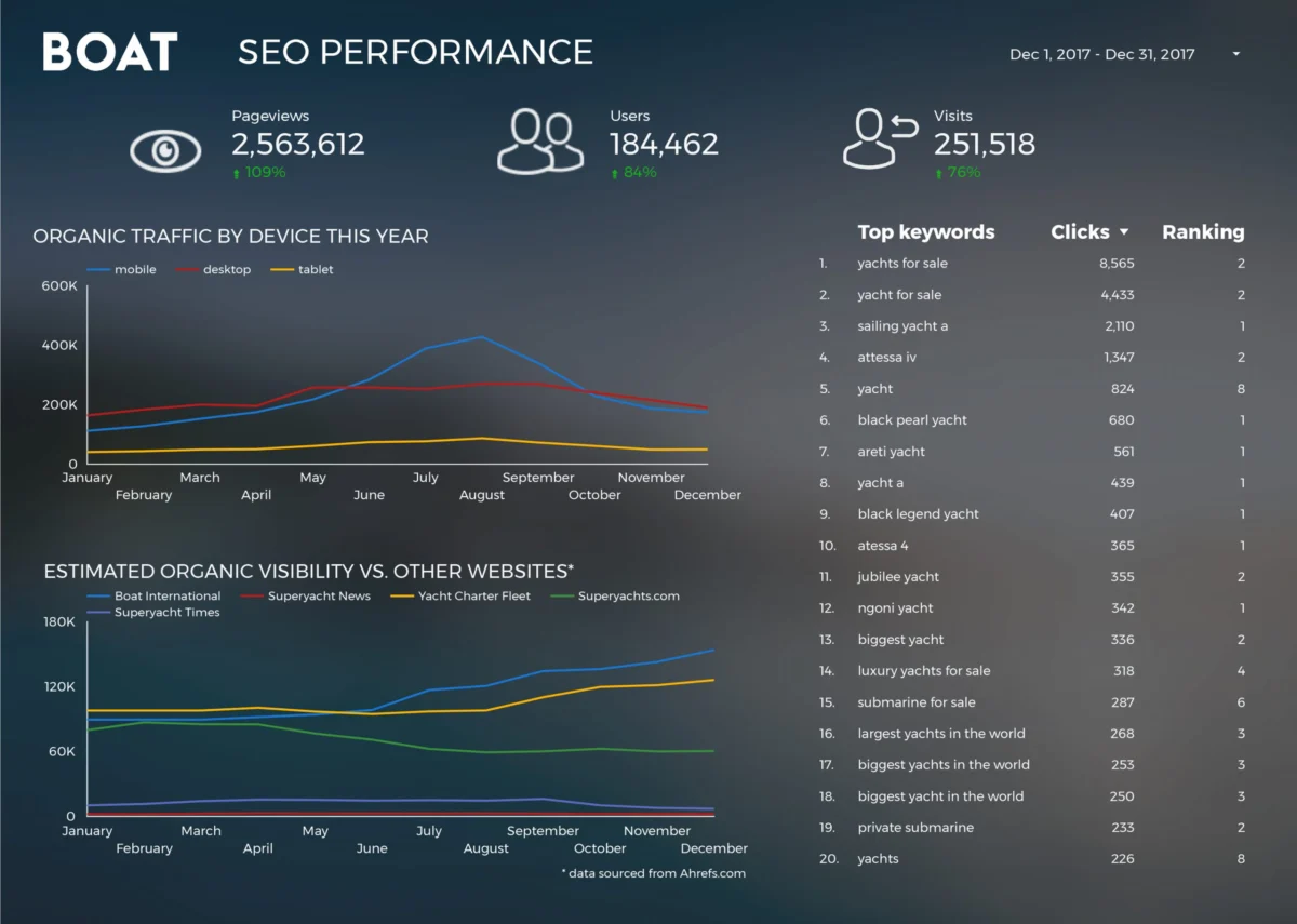
A primary example of this efficiency gain is observed in the operations of Boat International Media. By leveraging the connectivity of Google Data Studio, the organization’s SEO and data teams, led by specialists such as Fanni Takacs and Drew Broomhall, successfully reduced their monthly reporting cycle from five business days to approximately fifteen minutes. This 99% reduction in manual labor was achieved by creating a centralized SEO performance dashboard that focused on high-level key performance indicators (KPIs) while eliminating the "data noise" often found in standard spreadsheet reports. The ability to export these live dashboards into high-fidelity PDF formats allowed for a seamless transition between digital interactivity and traditional executive presentations.
Enhancing Analytical Precision with Advanced Charting
As the adoption of Google Data Studio matured, analysts began moving beyond basic bar and pie charts to more sophisticated visualizations that offer deeper context. One such advancement is the implementation of bullet charts for page-level engagement tracking.

Analytical firms like Analytics Pros demonstrated that bullet charts provide a superior method for benchmarking performance against historical data and predefined targets. Unlike a standard gauge, a bullet chart displays a primary measure, compares it to a target, and situates it within qualitative ranges of performance (e.g., poor, satisfactory, and good). In a business context, this allows stakeholders to see not only how many users are visiting a specific page but also how that engagement compares to the previous year’s performance and the current quarter’s goals. By layering scorecard metrics over these charts, businesses can derive a holistic view of user behavior, including average session duration and bounce rates, within a single, compact view.
The Democratization of Data Connections
A critical factor in the rise of these visualizations was the expansion of the Google Data Studio connector ecosystem. In late 2017 and early 2018, the platform facilitated easier access to Google Analytics, BigQuery, and SQL databases, allowing for the synthesis of massive datasets that were previously inaccessible to non-technical users.
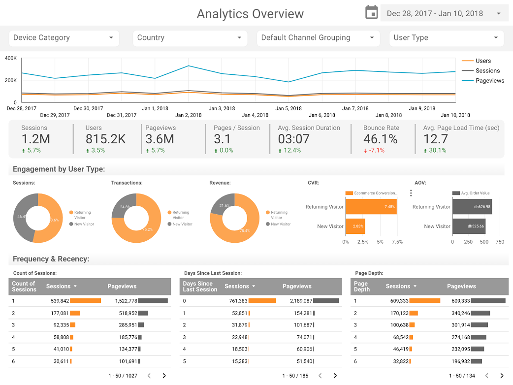
Consultancies such as E-Nor and ClickInsight pioneered the use of these connectors to build standardized templates for Google Analytics. These templates served as a "plug-and-play" solution for companies that lacked the resources to build custom infrastructure from scratch. By utilizing the Google Analytics Web Activity Overview template, businesses could immediately visualize traffic sources, user demographics, and conversion funnels. This standardization played a vital role in elevating the baseline of data literacy across the digital marketing industry.
Data Journalism: Bridging the Gap Between Statistics and Narrative
Beyond the boardroom, 2017 saw a surge in the use of visualization tools for data journalism. This discipline uses data as the primary source for storytelling, making complex global trends or entertainment industry statistics accessible to the general public.
In the realm of entertainment, the "Marvel vs. DC Cinematic Universes" visualization serves as a case study in comparative market analysis. With the global box office for superhero films exceeding $27 billion, the visualization provides a side-by-side comparison of studio success, audience reception, and return on investment. Similarly, the "Data Behind Star Wars" report by ClickInsight utilized interactive tabs to allow fans and analysts to explore starship specifications, character demographics, and the chronological differences between the various films in the franchise. These examples illustrate how data visualization can transform a collection of trivia into a comprehensive industry analysis.

Technical Milestones: BigQuery and Open Source Analysis
The intersection of high-level cloud computing and accessible visualization was perhaps most clearly demonstrated by Google Developer Advocate Felipe Hoffa. Using the BigQuery connector, Hoffa analyzed the "PushEvents" published by GitHub throughout 2017 to identify the top contributors to open-source software.
This analysis required processing millions of rows of data—a task that would be impossible in traditional spreadsheet software. By importing this data into BigQuery and visualizing it in Data Studio, Hoffa was able to pinpoint which companies and individuals were most active in the open-source community. This highlighted a significant trend in the technology sector: the increasing reliance of the modern web on open-source contributions and the transparency provided by public data audits.
Societal Insights: Longitudinal Analysis of Social Trends
Data visualization also proved to be a powerful tool for social scientists and researchers. An in-depth analysis of 150 years of marriage and divorce trends in the United Kingdom, conducted by researchers including Lizzie Silvey, showcased the ability of Data Studio to handle longitudinal data.
The report addressed several critical sociological questions:
- The Impact of Legislation: How specific legal changes, such as the Divorce Reform Act, led to immediate spikes in divorce rates.
- The Influence of Conflict: The correlation between major world wars and marriage surges or declines.
- Gender Dynamics: A breakdown of which demographics were more likely to initiate legal separations over the last century.
By mapping these trends over a 150-year timeline, the researchers were able to move beyond anecdotal evidence to provide a fact-based history of British social structures. This type of analysis demonstrates the platform’s utility in academic and historical contexts, where the goal is to identify long-term patterns rather than short-term business gains.
Chronology of Development and Adoption
To understand the impact of these visualizations, it is necessary to look at the timeline of the platform’s development:
- Mid-2016: Google launches Data Studio in a limited beta, offering a free version for individuals and a professional version for enterprises.
- Early 2017: The platform removes the five-report limit for free users, leading to a massive influx of community-created content and templates.
- Late 2017: The introduction of community connectors allows third-party developers to link data from Facebook Ads, LinkedIn, and other non-Google platforms.
- Early 2018: The platform becomes a primary tool for "Data Stories," with an increasing number of journalists and bloggers using embedded dashboards to support their reporting.
Broader Implications for the Future of Data
The proliferation of these visualizations in 2017 and 2018 has lasting implications for how information is consumed. We have moved into an era where "showing the data" is no longer optional for credible reporting. Whether it is a business justifying its SEO spend or a journalist explaining a cinematic trend, the expectation has shifted toward transparency and interactivity.
The success of the examples highlighted—from Boat International’s SEO dashboards to the GitHub open-source analysis—underscores a fundamental truth in the modern information age: data is most valuable when it is understandable. The transition from complex, siloed databases to clear, visual narratives has empowered decision-makers and the public alike to base their conclusions on evidence rather than intuition.
As tools like Google Data Studio (now rebranded and integrated into Looker Studio) continue to evolve, the barrier to entry for data analysis continues to fall. The lessons learned from the 2017-2018 era of visualization remain relevant today: prioritize clarity, focus on the "why" behind the numbers, and use the power of automation to free up human analysts for what they do best—interpreting the story the data is trying to tell.