The strategic application of color in marketing stands as one of the most potent, yet often underestimated, tools available to contemporary marketers. Color transcends mere aesthetics; it is a primal language that instantly sets a mood, evokes deep-seated emotions, and triggers subconscious psychological reactions. This non-verbal communication can profoundly support or detract from the perceived value of an offering. Indeed, studies underscore its critical role, with a staggering 90 percent of a subscriber’s initial impression of an email message or a website being based on color and other visual cues alone.
This article delves into how various hues exert their influence on marketing performance, providing a comprehensive guide to leveraging color psychology across digital platforms, including websites, landing pages, sign-up forms, and email campaigns.
The Foundational Role of Color in Consumer Perception
Understanding the fundamental importance of color psychology is paramount for any effective marketing strategy. Research consistently highlights its significant impact on consumer purchasing decisions and brand recall. A survey revealed that 84.7% of consumers deem color important when considering a product purchase. Furthermore, the strategic use of color can boost brand recognition by an impressive 80%, solidifying its status as an indispensable component of brand identity.
This phenomenon is deeply rooted in human psychology. Colors are not merely perceived; they are felt. They bypass rational thought, tapping directly into emotional centers and influencing decisions often made in milliseconds. Consider your favorite brands for a moment – what colors immediately come to mind? For many, iconic brands like Coca-Cola (red), Facebook (blue), or Starbucks (green) are intrinsically linked to their primary color palettes. These associations are not accidental; they are the result of meticulous strategic design, aiming to align color perception with brand values.
A Brief History of Color in Commerce and Psychology
The study of color’s impact on human behavior is not new. Early observations of color’s effect on mood date back to ancient civilizations, where colors were associated with healing and spiritual significance. Isaac Newton’s prism experiments in the 17th century, which demonstrated that white light is composed of a spectrum of colors, laid the scientific groundwork for understanding color. Later, Johann Wolfgang von Goethe, in his "Theory of Colours" (1810), challenged Newton’s purely physical approach, exploring the psychological and emotional effects of color, arguing that color perception is influenced by the mind.
The 20th century saw the formalization of color psychology as a field, with researchers beginning to systematically investigate how different colors affect human emotions, cognitions, and behaviors. By the mid-20th century, as advertising and consumer culture boomed, marketers started to consciously integrate these insights. The digital age, however, has amplified the importance of color, making it a cornerstone of user experience (UX) and conversion rate optimization (CRO). In a visually saturated online environment, color becomes a crucial differentiator and a silent persuader, guiding user attention and influencing purchasing pathways.
Decoding the Spectrum: Individual Color Meanings and Marketing Applications
Each color carries a unique psychological blueprint, eliciting distinct feelings and associations. Marketers can harness these innate responses to craft more impactful and resonant campaigns.
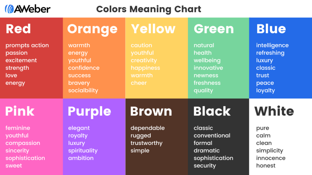
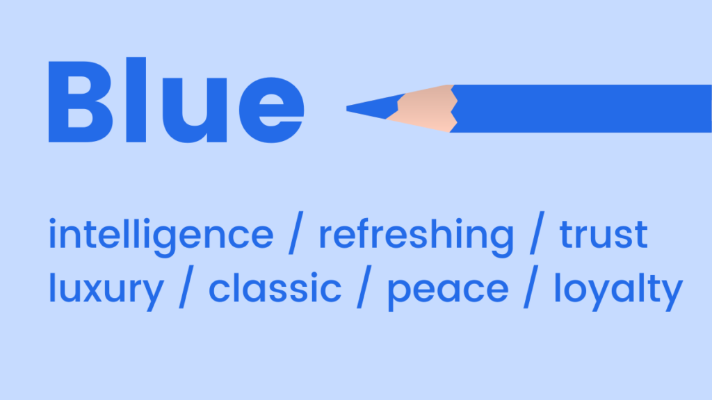
Blue: Trust, Calm, and Professionalism
Blue is universally associated with feelings of coolness, calmness, and serenity. Its mood-boosting properties are linked to the production of calming chemicals in the body, promoting a sense of positivity and stability. Light blue hues offer a refreshing and airy feel, often used to convey cleanliness or innovation. In contrast, dark blue is a classic choice for brands aiming to emphasize luxury, authority, and trustworthiness without the starkness of black. Industries like finance, technology, healthcare, and corporate services frequently adopt blue to project reliability and professionalism.
- When to use blue: Ideal for conveying trust, security, stability, intelligence, and tranquility. Excellent for corporate communications, financial institutions, tech companies, and products emphasizing reliability or calmness.
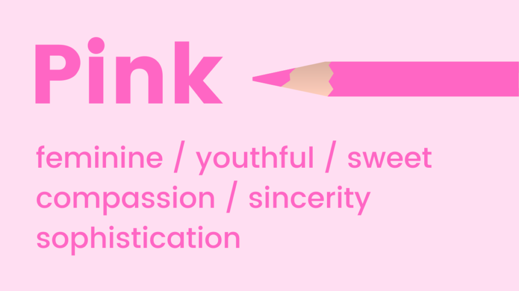
Pink: Youthfulness, Sweetness, and Empathy
Pink tones inherently suggest youthfulness, playfulness, and excitement. It is a go-to color for emphasizing femininity, sweetness, or romance. Intriguingly, research indicates that the color pink can even influence taste perception, making us crave sugar – a phenomenon often exploited in confectionery branding. From vibrant fuchsias to soft pastels, pink can communicate approachability and warmth.
- When to use pink: Perfect for brands targeting younger demographics, fashion, beauty, confectionery, or products that aim to evoke tenderness, compassion, or a lighthearted mood.
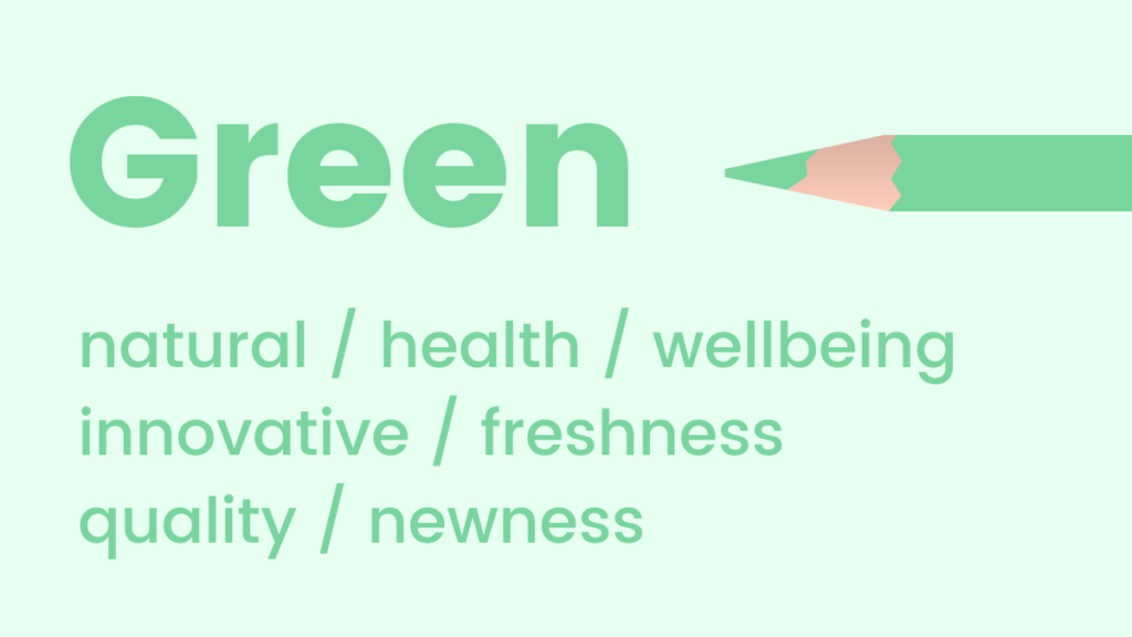
Green: Nature, Growth, and Prosperity
Green evokes natural elements, health, and well-being. It is a soothing choice, promoting feelings of relaxation, harmony, and balance. The human eye is most sensitive to green, allowing it to discern a vast array of shades, making it comfortable and inviting. Its association with growth and renewal also makes it an excellent color for promoting new products, features, or initiatives. Beyond environmental themes, green also signifies wealth and prosperity.
- When to use green: Excellent for eco-friendly brands, health and wellness products, financial services (signifying growth), and any marketing effort aiming to convey freshness, vitality, or sustainability.
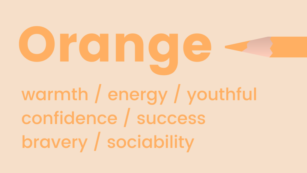
Orange: Energy, Enthusiasm, and Affordability
Orange represents warmth, energy, and enthusiasm. It is a fun, flamboyant color often used to symbolize positivity, optimism, and creativity. A lesser-known psychological association of orange is with trust and safety, particularly in lighter, softer shades, which can communicate a friendly and approachable demeanor. Its vibrancy makes it highly noticeable, often used to draw attention in a non-aggressive way.
- When to use orange: Effective for calls to action, creative industries, food and beverage, children’s products, or brands aiming to convey excitement, warmth, and innovation. Pro Tip: To ease into using this bold color, incorporate images with sunny orange accents before fully integrating it into your palette.
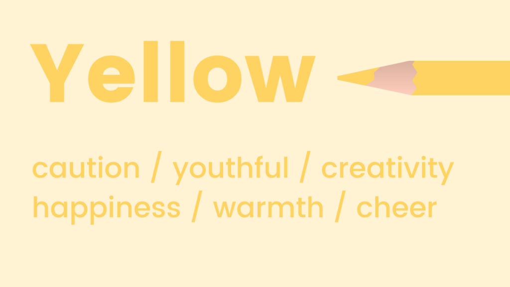
Yellow: Optimism, Clarity, and Attention
Similar to orange, shades of yellow symbolize positivity and optimism, often hailed as the happiest color in the spectrum. Psychologically, yellow is known for activating memory, stimulating mental processes, and encouraging communication. Its high visibility makes it an excellent choice for drawing immediate attention. However, overuse or overly bright yellow can sometimes be perceived as overwhelming or alarming.
- When to use yellow: Ideal for products related to leisure, education, children’s items, or brands wanting to project cheerfulness, innovation, or affordability. Use sparingly for highlights and calls to action to maximize impact.
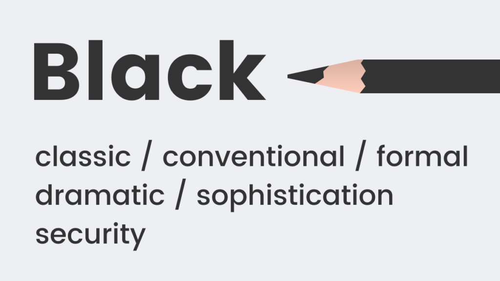
Black: Sophistication, Power, and Formality
Black is a timeless, classic color that never goes out of style. It frequently represents formality, elegance, and sophistication – think "black tie" events. It also subtly implies weight and substance; for example, objects in black are often perceived as heavier or more premium than those in lighter colors. Black can convey authority and power, making it a strong choice for luxury brands.
- When to use black: Suited for luxury brands, high-end fashion, professional services, or products aiming to project power, elegance, and exclusivity. Often used as a background or for minimalist design.
White: Purity, Simplicity, and Modernity
White embodies coolness, calmness, and serenity. It is a quintessential choice for brands that aspire to appear modern, fresh, and clean. White space in design is crucial for readability and creating a sense of openness, allowing other elements to breathe and stand out. It signifies purity, simplicity, and efficiency.
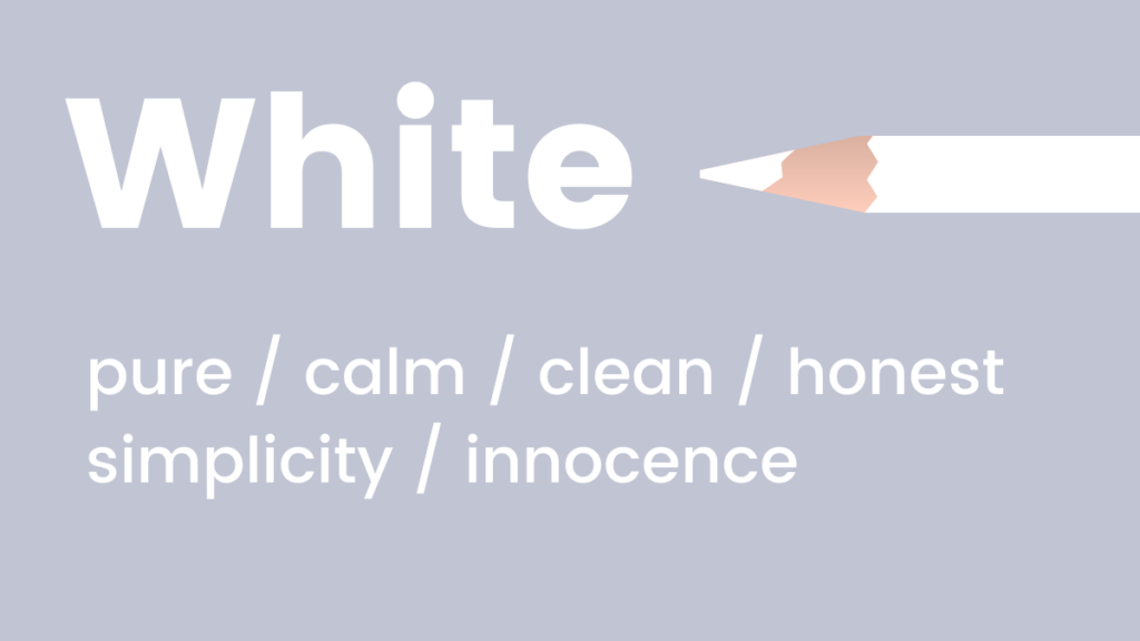
- When to use white: Excellent for minimalist brands, healthcare, bridal, technology, or any context where cleanliness, clarity, and simplicity are paramount. Serves as a fantastic background for vibrant accent colors.
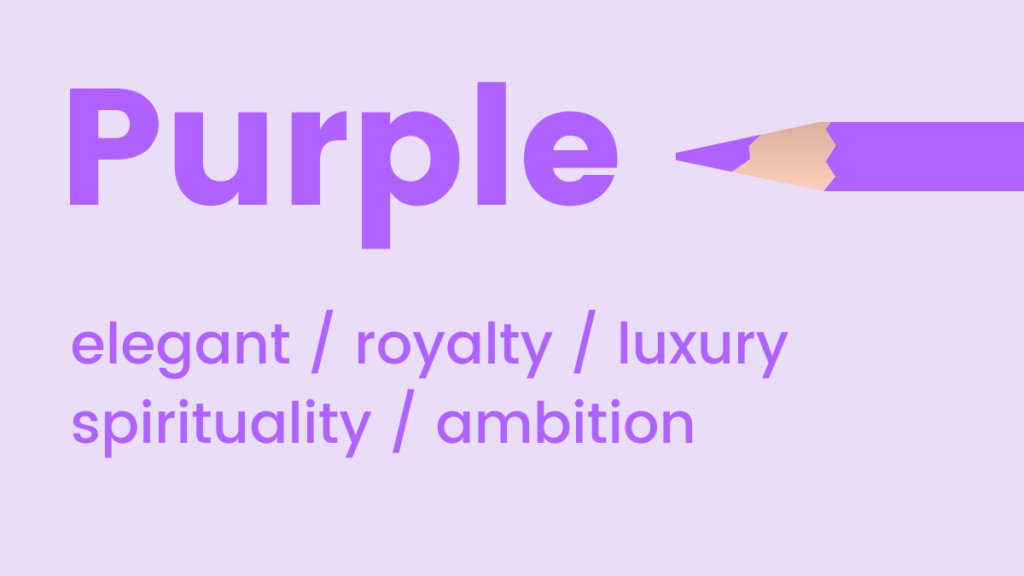
Purple: Luxury, Creativity, and Spirituality
Purple is often associated with royalty, luxury, and elegance. It is an "in-between" shade that can uplift while maintaining a sense of calm. Historically linked to wealth and power due to the rarity of its dyes, purple also encourages creativity, imagination, and spirituality. Lighter shades like lavender can be soothing, while deeper purples exude richness and mystery.
- When to use purple: Ideal for luxury goods, creative industries, wellness and beauty products, or brands seeking to convey sophistication, uniqueness, and imagination.
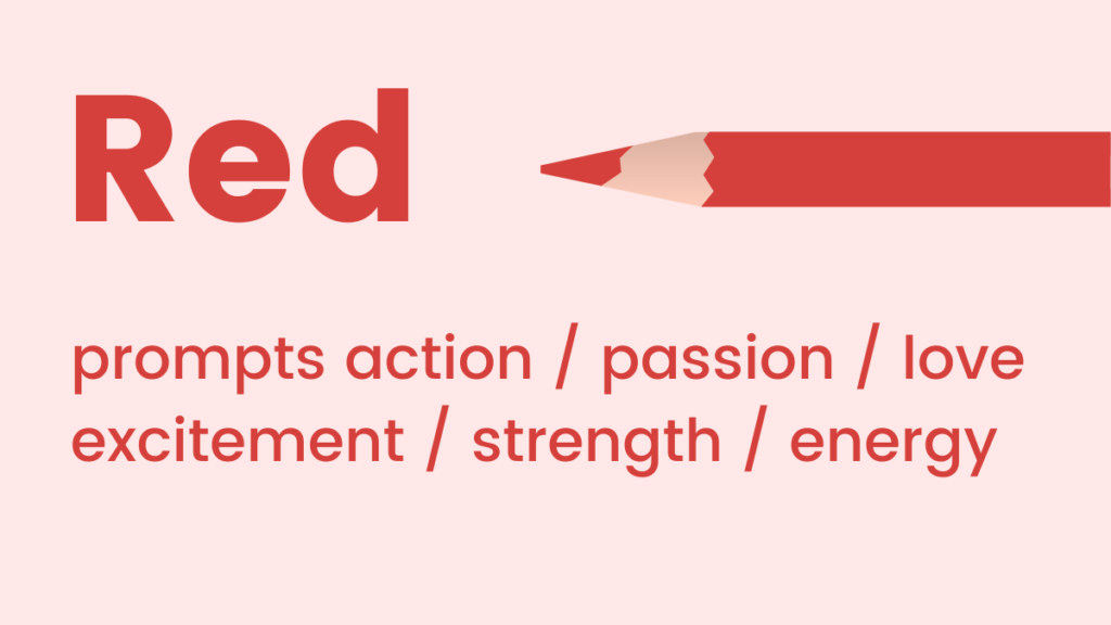
Red: Urgency, Passion, and Action
Red tones represent passion, adrenaline, and action. As a high-energy color, it can boost energy levels, increase heart rate, and stimulate urgency. Its high visibility and intensity make it a powerful attention-grabber. If the goal is to convey the urgency of a message or to prompt immediate action, red is an exceptionally effective color choice.
- When to use red: Highly effective for sales, warnings, calls to action (e.g., "Buy Now," "Sign Up"), food and beverage (stimulates appetite), or brands that want to convey excitement, love, or power.
Crafting Harmonious Color Schemes for Digital Platforms
While understanding individual color meanings is crucial, effective digital marketing requires combining colors harmoniously. Non-designers often find this challenging, leading to confusion and suboptimal color combinations. However, with a basic grasp of color theory, anyone can create visually appealing and effective palettes. Two primary color schemes are particularly effective for website and landing page design:
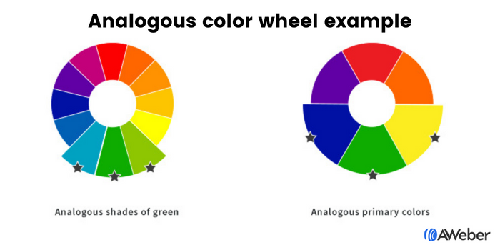
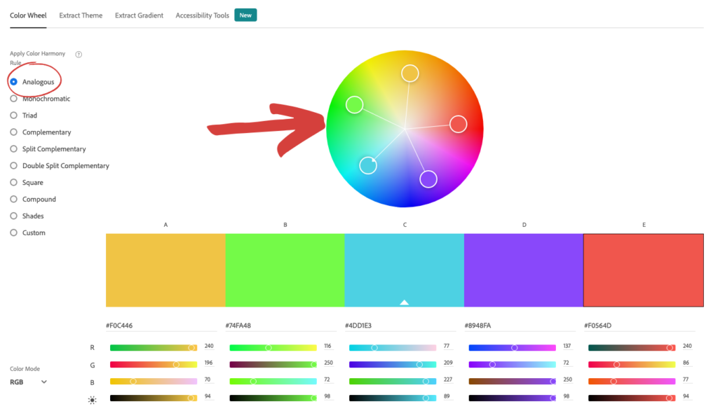
Analogous Colors: Seamless Flow and Unity
Analogous colors are those that are adjacent to each other on the color wheel. This could involve shades of blue, green, and yellow, or even different tonal variations within a single color family. This scheme creates a sense of harmony and visual continuity, as the colors naturally blend into one another. It’s a forgiving approach that yields visually pleasing results without jarring contrasts.
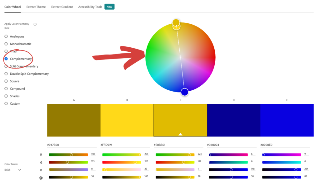
- Implementation: Tools like Adobe Color CC allow users to easily identify analogous combinations. By selecting the "analogous" option and moving a pointer around the color wheel, perfect complementary sets can be discovered effortlessly.
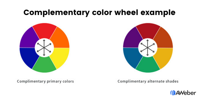
Complementary Colors: Dynamic Contrast and Impact
For those seeking to infuse their website color scheme with more dynamism and visual interest, complementary colors offer an excellent solution. These are colors positioned directly opposite each other on the color wheel, such as blue and orange, green and red, or purple and yellow. These pairings create strong visual contrast, making elements stand out and capturing attention effectively. When used judiciously, complementary colors can make for stunning, impactful arrangements, especially when moving beyond primary color combinations.
- Implementation: Similar to analogous colors, Adobe Color CC provides a "complementary" option. This tool simplifies the process of finding these contrasting yet balanced pairings, ensuring visual appeal and effective differentiation.
Optimizing Sign-Up Forms with Color
Sign-up forms are critical conversion points, and their visibility directly impacts their effectiveness. Color plays a significant role in ensuring visitors notice and engage with these forms. The same principles of analogous and complementary colors can be applied, alongside the powerful concept of contrast.
Analogous and Complementary Forms:
Using analogous shades for a form can create a cohesive and pleasant look, such as a form styled with three shades of green or a combination of yellow and green. Conversely, employing complementary colors, like purple and yellow or blue and orange, can create visually arresting forms that naturally draw the eye.
The Power of Contrasting Colors:
Contrast is perhaps the most vital principle for sign-up forms. Contrasting colors compel attention, silently signaling, "Look at me!" This is crucial for guiding visitors toward desired actions.
- Form vs. Site Contrast: Making the sign-up form’s background a contrasting color to the overall website design ensures it pops off the page, immediately drawing visitor attention.
- Internal Form Contrast: Once the form has captured attention, internal contrast guides the user through the completion process. Contrasting colors for form fields and the call-to-action (CTA) button make them highly noticeable. For instance, a form using black, yellow, and white strategically directs the eye to the form itself, then to the input fields, and finally to the bright, clickable button. Complementary colors can also be used to create impactful button designs, ensuring the "click here" message is unmistakably clear.
Strategic Color Choices for Email Marketing
The choice of colors in marketing emails should be purpose-driven, aligning with the specific objective of each communication.
- Email Newsletters: These typically deliver regular updates, news, or educational content. Prioritize readability by using ample white space with subtle splashes of brand colors. The primary goal is content consumption, so avoid secondary colors that might distract. An exception is a clear, contrasting call-to-action button if the goal is to drive clicks to external content (e.g., blog articles, videos).
- Welcome Emails: As a customer’s first significant interaction with your brand, welcome emails should strongly reinforce your company’s visual identity. Employ brand colors generously to establish recognition and familiarity.
- Sales Emails: Color choices for sales emails depend heavily on the offer and desired emotional response. Refer back to the individual color psychology principles to guide decisions. For an urgent sale, red might be appropriate; for a luxury item, dark blue or purple.
Real-World Email Color Schemes:
- Blue: Warby Parker uses pale blue for a refreshing vibe, while Everlane employs dark blue for a luxurious, sophisticated look.
- Pink: Lyft effectively uses pink in welcome emails to convey friendliness and approachability.
- Green: Offscreen utilizes green palettes in product emails to evoke relaxation and promote a fresh, natural aesthetic.
- Yellow: Lego leverages yellow as a background for product displays, knowing its appeal to children and its association with happiness.
- Black: Harry’s masterfully uses an all-black email to position their product as classic and sophisticated, ensuring the white CTA button stands out.
- White: The Little White Company’s campaigns predominantly feature white to portray a calm, pure, and clean brand image.
- Purple: Stuart Weitzman creatively incorporates its signature purple shoebox in abandoned cart emails, reinforcing its luxe and elegant brand identity.
Evolving Brand Aesthetics: Flexibility and AI Integration

A common concern for established brands is how to integrate these color psychology principles without deviating from existing brand guidelines. It’s crucial to understand that brand aesthetics, like people, can evolve. Adding new colors or adjusting existing palettes is not inherently detrimental; it can signify growth and adaptation. Tools like Coolors allow brands to upload their existing color palette and receive suggestions for complementary colors that align with their established identity, fostering creative expansion while maintaining brand recognition.
The Future is Colorful: AI-Powered Design

The landscape of design is being revolutionized by artificial intelligence, making sophisticated color strategy more accessible than ever before. AI-powered tools, such as AWeber’s AI Signup Form Builder, allow marketers to describe their desired aesthetic—"I want a dark background with an orange button that pops"—and the AI generates the design. This eliminates the need for manual drag-and-drop or starting from a blank canvas. By understanding color intent, the AI can craft forms tailored to specific psychological objectives, whether it’s leveraging orange for trust or blue for credibility.
This innovative approach is rapidly expanding to other marketing assets, with AI-powered email and landing page builders on the horizon. Marketers will soon be able to articulate their vision—"a clean, white newsletter layout with a red CTA" or "a purple, luxury-feel landing page with gold accents"—and the AI will execute the design. This synergy between human psychological insight and AI’s design capabilities promises to democratize expert-level design, enabling businesses of all sizes to harness the full power of color psychology with unprecedented efficiency and personalization. The principles of color psychology, once requiring extensive design expertise, are now becoming actionable inputs for intelligent design systems, marking a new era of data-driven and emotionally resonant marketing.