rifanmuazin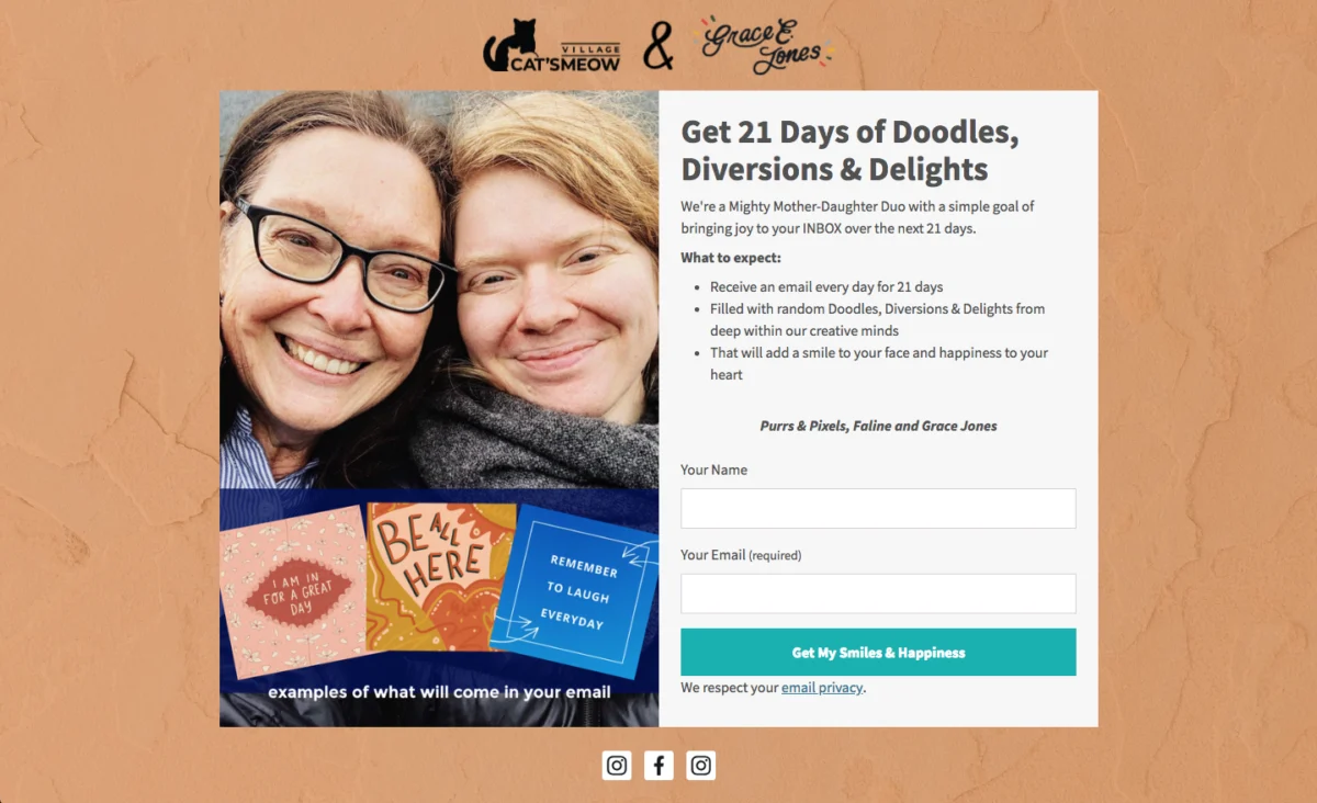
In the fiercely competitive digital landscape, an email list remains one of the most potent assets for businesses aiming for direct engagement and sustained growth. At the very heart of cultivating this invaluable asset lies the email signup form – a seemingly simple digital gateway that, when optimized, can dramatically influence a brand’s reach and revenue. Far from being a mere data collection point, a well-designed and strategically placed signup form is the critical juncture where a curious visitor transforms into a committed subscriber, setting the stage for a lasting relationship. The copy, visual aesthetics, functional type, and strategic placement of these forms collectively dictate whether a visitor embraces the opportunity to connect or simply moves on, underscoring their pivotal role in modern marketing funnels.

The Evolution and Strategic Imperative of Email List Building
The journey of email marketing began with rudimentary newsletters, often a one-way broadcast of information. However, as digital literacy and consumer expectations have matured, so too has the sophistication required for effective email list building. Today, an email list represents a direct communication channel, unmediated by algorithms of social media platforms or search engines. This directness translates into higher deliverability, superior engagement rates, and a more robust return on investment (ROI) compared to many other marketing channels. Studies consistently show email marketing delivering an average ROI of $36 for every $1 spent, making subscriber acquisition a paramount business objective.
The contemporary challenge lies in cutting through the digital noise. Users are bombarded with information, and their attention is a precious commodity. Therefore, the signup form must not only be functional but also compelling, trustworthy, and seamlessly integrated into the user experience. It must articulate immediate value and set clear expectations, addressing potential hesitations regarding spam or irrelevant content.
Understanding the Arsenal: Diverse Types of Email Signup Forms
The digital marketer’s toolkit includes several distinct types of signup forms, each engineered to serve specific strategic objectives and capture attention at different points in the user journey. The judicious selection and deployment of these forms are crucial for maximizing conversion rates while preserving a positive user experience.
-
Inline Forms:
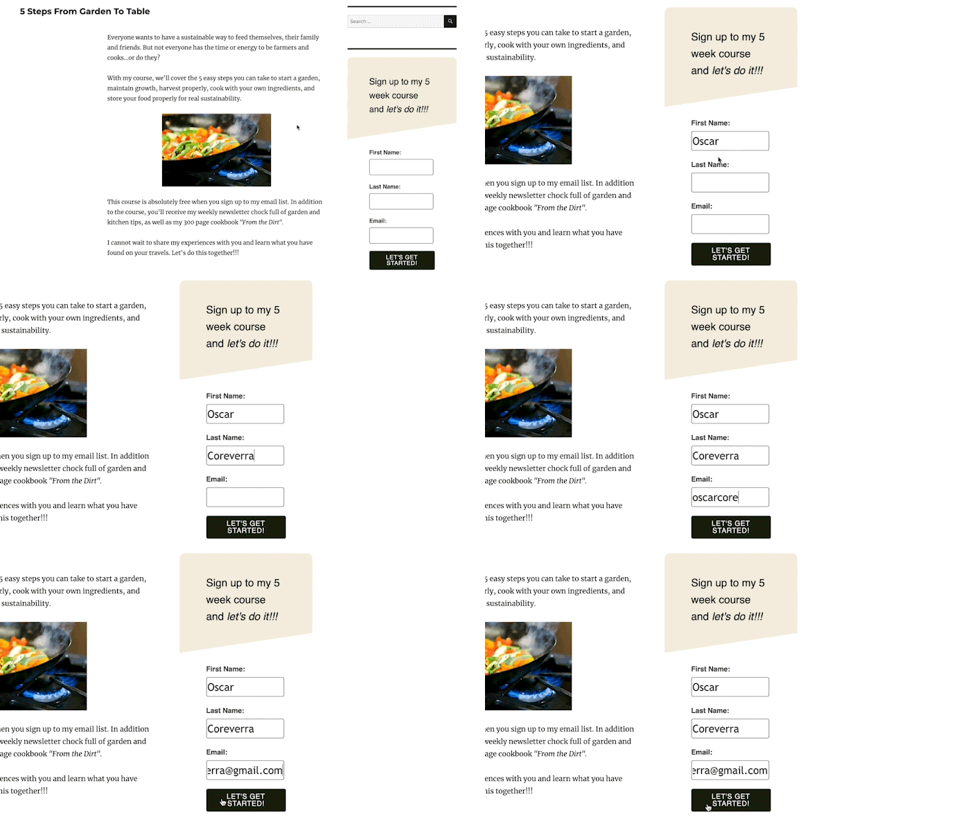
Inline signup forms are intrinsically embedded within the content flow of a webpage. They can reside at the top, bottom, within sidebars, or strategically interspersed throughout an article. Their strength lies in their unobtrusive nature; they don’t interrupt the user’s interaction with the content. This makes them ideal for pages where visitors are already deeply engaged, such as blog posts, resource guides, or ‘about us’ sections. For instance, a reader consuming an article on “digital marketing trends” might find an inline form offering a “free guide to future-proofing your online strategy” highly relevant and less intrusive than a sudden pop-up. Tools like the AWeber for WordPress plugin facilitate easy integration and performance tracking, allowing marketers to place these forms across various pages and monitor their effectiveness contextually. While their conversion rates might be marginally lower than more assertive forms, inline forms often yield higher-quality leads due to the inherent engagement with the surrounding content.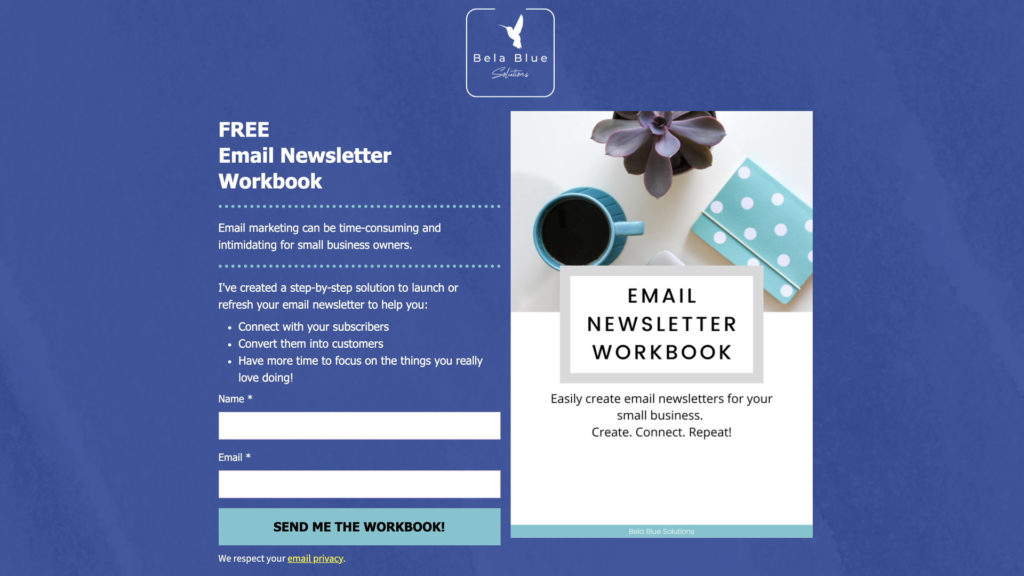
-
Pop-up Forms:
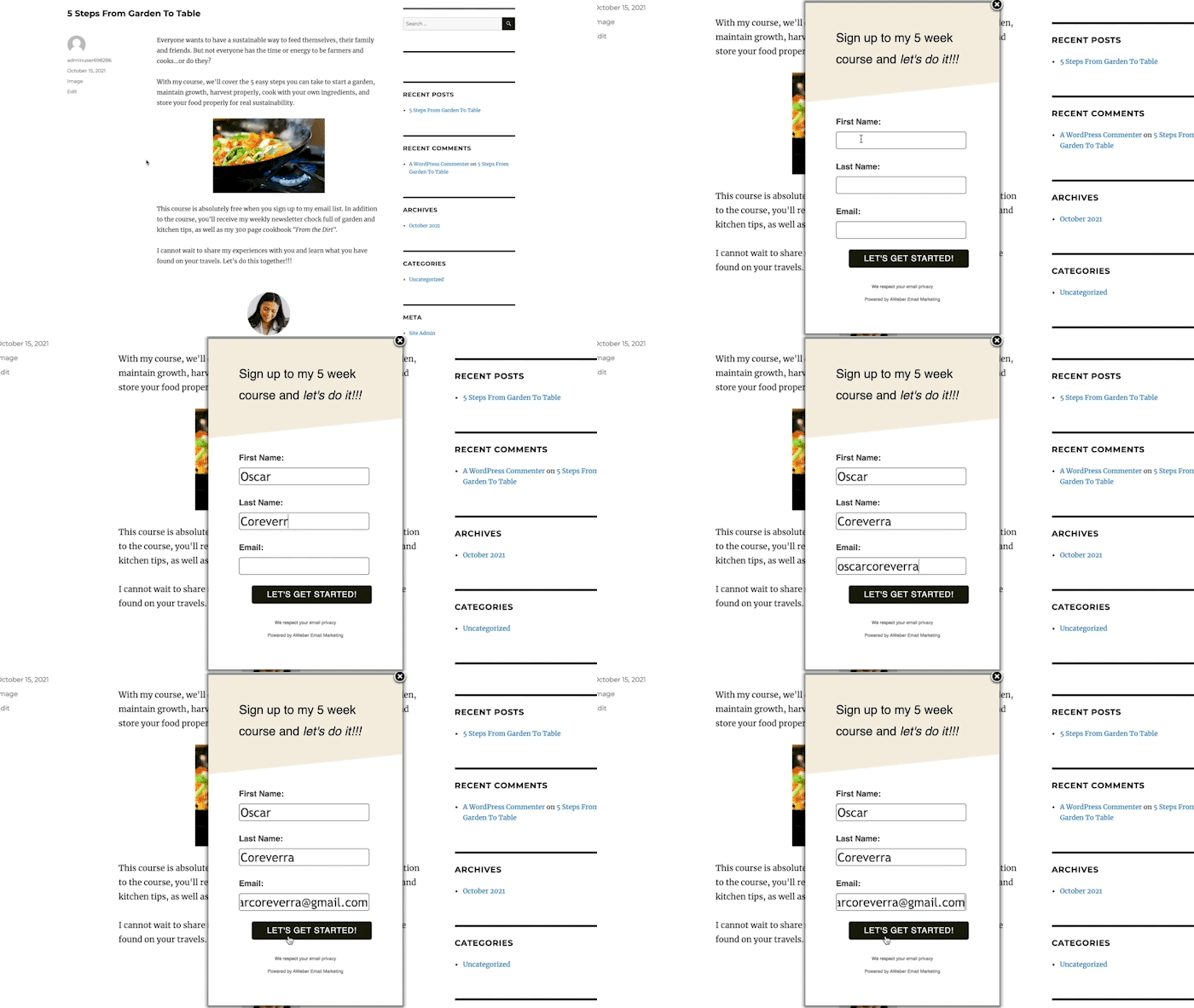
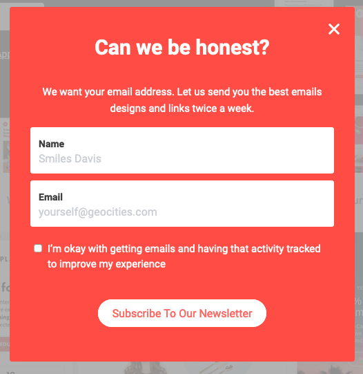
In contrast to inline forms, pop-up forms are designed to command attention by appearing dynamically at specific junctures of a visitor’s website interaction. These can emerge as full-screen overlays, slide in from the edges of the page, or subtly drop down from the top. While highly effective at grabbing immediate attention, their potential to disrupt user experience necessitates careful configuration of their display settings. Industry data suggests that well-timed and relevant pop-ups can significantly boost subscription rates, with some benchmarks showing conversion rates between 3% and 9% for top-performing pop-ups.- Time-Delayed Pop-ups: These forms activate after a pre-defined duration, allowing visitors to engage with content before being prompted. Marketers often leverage web analytics to determine average time-on-page and set the delay just before the typical user exit point, ensuring relevance without immediate intrusion.
- Scroll-Delayed Pop-ups: Triggered when a visitor scrolls to a specific percentage of the page, these forms capitalize on demonstrated content engagement. A visitor who has scrolled 50% or more through an article has invested time, indicating a higher likelihood of interest in supplementary offers.
- Exit-Intent Pop-ups: Perhaps one of the most powerful pop-up variations, exit-intent forms activate when a visitor’s mouse movement suggests an imminent departure from the site. This “last-chance” opportunity is invaluable for presenting a compelling, often exclusive, offer to re-engage a potentially lost lead, such as a discount code or a valuable download. Research indicates exit-intent pop-ups can convert between 2% and 4% of abandoning visitors.
- Two-Step Pop-ups: These forms appear only after a visitor intentionally clicks a link or button, signifying explicit interest in an offer. This pre-qualification leads to exceptionally high conversion rates, as the user has already taken an active step towards subscription.
-
Landing Page Forms:
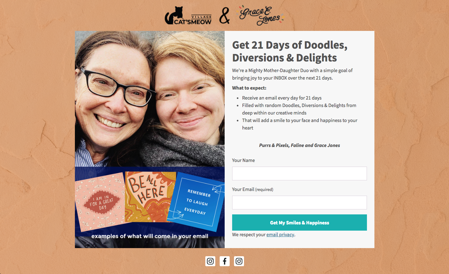
A landing page is a standalone web page meticulously crafted with a singular objective: capturing subscriber signups or specific lead information. Devoid of distracting navigation bars, menus, or extraneous links, landing pages enforce a stark binary choice for the visitor: subscribe or leave. This extreme focus minimizes cognitive load and maximizes conversion potential, making them highly effective for dedicated campaigns such as webinar registrations, ebook downloads, or promotional offers. The ability to integrate rich media—images, videos, and detailed testimonials—on a landing page further enhances its persuasive power, allowing for a comprehensive articulation of value.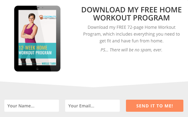
Strategic Placement: Beyond Visibility to Contextual Relevance
The efficacy of an email signup form is inextricably linked to its placement. While visibility is important, contextual relevance is paramount. The goal is to position the form where it feels like a natural extension of the user’s current interaction, aligning with their intent and stage in the customer journey.

For inline forms, a consistent presence in footers or sidebars across all pages ensures that an opportunity to subscribe is always available, regardless of the user’s navigation path. The incentive here should be broadly appealing, such as a general discount or a compilation of best practices. However, inline forms within specific content, like an article about “advanced SEO techniques,” should offer highly targeted lead magnets, such as a “downloadable checklist for SEO audits,” to maximize contextual conversions.
Pop-up forms are often most effective on high-traffic pages, particularly the homepage, where they can capture a broad audience with a compelling primary incentive. Leveraging website analytics to identify other high-performing pages allows for the deployment of specific pop-ups tailored to the content and presumed interests of visitors on those pages. For instance, a pop-up on a product category page might offer a discount on items in that category, while one on a blog post about “healthy recipes” could offer a free recipe book.
Crafting Copy That Converts: The Art of Persuasion
Beyond mere mechanics, the language used on a signup form is the primary driver of conversion. It must effectively communicate value, build trust, and inspire action.
- Clear, Concise Headline: The headline is the form’s first impression. It must instantly convey the core offer and its benefit. For example, “Unlock Your Fitness Potential: Free 8-Week Home Workout Program” immediately informs the visitor what they gain and how it helps them.
- Communicate Value Clearly: Beneath the headline, elaborate on the benefits. This isn’t just about what you’re offering, but how it solves a problem or improves the subscriber’s life. Bullet points are highly effective for breaking down complex benefits into digestible, persuasive snippets.
- Set Clear Expectations: Transparency is crucial for building trust and reducing churn. The form should explicitly state what subscribers will receive, the frequency of emails, and the general content themes. This proactive communication, especially vital for GDPR compliance, minimizes spam complaints and cultivates a respectful relationship. For example, “Receive weekly insights on sustainable living – no spam, just actionable tips.”
- Conversational Copy: Injecting a personal, conversational tone can break down barriers and make the interaction feel less transactional. Phrases like “Hey there!” or “Ready for an upgrade?” can humanize the brand and foster relatability, making the offer more inviting.
- Creative, Witty, or Humorous Language: A distinctive brand voice can significantly enhance memorability and connection. Creative copy, especially in the call-to-action (CTA), can transform a mundane process into an engaging experience. For example, a travel blog might use “Embark on Your Next Adventure” instead of “Sign Up.”
Designing for Impact: Visuals, Usability, and Psychology
The visual design of a signup form profoundly influences perception and conversion. Research in visual psychology highlights that initial impressions are heavily swayed by visual and color cues, often within milliseconds.
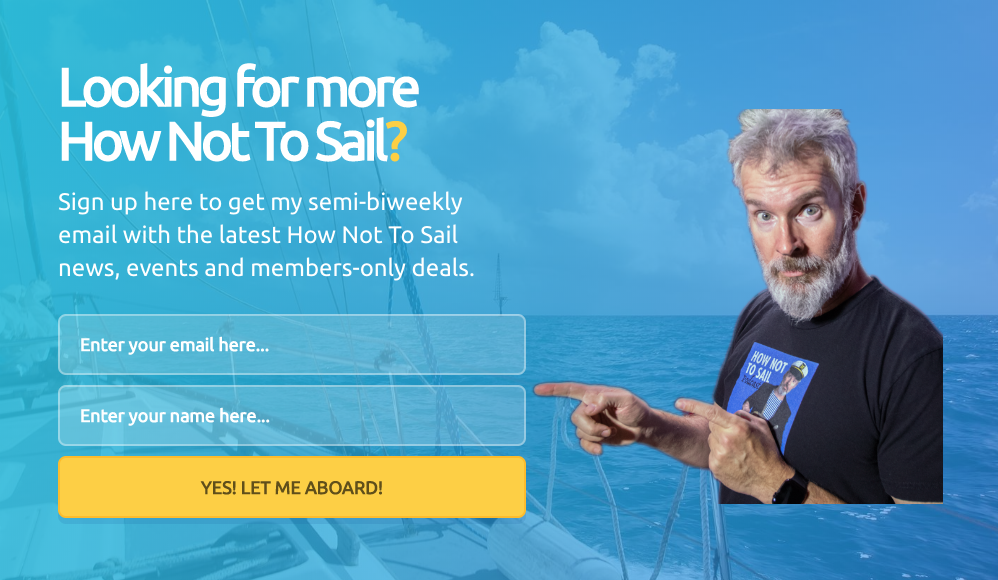
- Minimum Form Fields: Every additional field introduces friction, increasing cognitive load and decreasing conversion rates. For basic subscriber acquisition, “name” and “email address” are typically sufficient. Data consistently shows that reducing form fields can dramatically improve conversion; one study noted that reducing fields from 9 to 4 could increase conversion by 120%. More detailed information can always be gathered through progressive profiling or post-signup surveys.
- Clear Call to Action (CTA): The CTA button is where the conversion happens. Generic terms like “Sign Up” are a missed opportunity. Instead, the CTA should be specific, benefit-oriented, and often incorporate urgency or possessive language (e.g., “Send Me My Free Guide,” “Claim My Discount Now,” “Start My Journey”). A/B testing variations of CTA text, color, and size is critical for optimizing performance.
- Typographic Hierarchy: A clear visual hierarchy guides the eye, with headlines being the largest and most prominent, followed by subheads, and then body text. Limiting font types to one or two maintains visual coherence and professionalism.
- Font Colors: Restricting font colors to one or two ensures readability and avoids visual clutter, maintaining a clean, professional aesthetic.
- Color Contrast: Strategic use of contrasting colors ensures the form stands out from the surrounding webpage, drawing immediate attention to the key action. A vibrant CTA button on a muted background is a classic example of this principle.
- Visual Representation of Incentive: An image or video depicting the lead magnet (e.g., an ebook cover, a screenshot of a course) can significantly boost engagement and convey value more quickly than text alone. Forms with relevant visuals tend to garner more views and higher interaction rates.
- Subscriber Preferences: Offering options for content preferences (e.g., “weekly tips,” “monthly newsletter,” “product updates”) empowers subscribers, leading to higher engagement and lower unsubscribe rates, as they receive content tailored to their interests. This aligns with modern user-centric design principles.
- Unfavorable Alternative: For dismissible forms (like pop-ups), presenting a clear, less desirable alternative to subscribing can subtly nudge visitors towards conversion. For example, a pop-up offering a discount might include a “No thanks, I prefer paying full price” option, making the subscription the obvious choice.
- Social Proof: Displaying the number of existing subscribers or testimonials from satisfied members leverages the psychological principle of social proof. If hundreds of thousands of others have joined, it instills confidence and validates the value proposition.
- Big CTA Button: With over half of all website traffic originating from mobile devices, a large, easily tappable CTA button is not just a preference but a necessity for mobile-first design. It reduces frustration and improves the user experience on smaller screens.
- Plenty of White Space: Adequate white space around text, images, and form fields enhances readability, reduces cognitive strain, and lends a professional, trustworthy appearance to the form.
Leveraging AI for Accelerated Form Creation and Optimization
The multitude of design and copy considerations can be daunting. Modern marketing platforms are now integrating Artificial Intelligence (AI) to streamline the creation of high-converting signup forms. AWeber’s AI signup form builder, for instance, allows users to describe their business in a single sentence, and the AI generates a complete form with brand-aligned colors, a compelling headline, descriptive copy, appropriate input fields, and an optimized layout. This AI-powered initial draft significantly reduces the “blank canvas” syndrome, providing a robust starting point that can then be easily customized. Every element remains editable, empowering marketers to fine-tune the AI’s suggestions to perfectly match their brand voice and campaign objectives. Crucially, these AI-generated forms integrate seamlessly with email lists and automation workflows, ensuring new subscribers are immediately channeled into welcome sequences, thereby automating a critical part of the customer journey. This innovation accelerates the process of implementing best practices, democratizing access to sophisticated design and conversion strategies.

The Imperative of Continuous Testing and Optimization
Publishing a signup form marks the beginning, not the end, of the optimization journey. The digital landscape is dynamic, and user behaviors evolve. Continuous improvement through rigorous A/B testing (split testing) is non-negotiable for sustained performance. Marketers should systematically test various elements:

- Headlines and Value Propositions: Experiment with different angles and benefits.
- Call-to-Action Text: Test urgency, personalization, and benefit-oriented phrasing.
- Number of Form Fields: Validate the optimal balance between data collection and conversion.
- Visuals: Compare forms with and without images, or different types of images.
- Form Type and Placement: Test inline vs. pop-up, or different pop-up triggers.
- Color Schemes and Typography: Assess the impact of visual aesthetics.
- Offer/Incentive: Experiment with different lead magnets (e.g., ebook vs. checklist vs. discount).
Over time, even the most effective forms can experience “banner blindness” if visitors repeatedly encounter them without converting. Periodic updates and fresh designs are essential to maintain novelty and encourage reconsideration. Integrating website analytics tools like Google Analytics with email marketing platform data provides a comprehensive view of user interaction, allowing for data-driven decisions in the optimization process.
Case Study: Personalization Driving Engagement – AWeber’s “What to Write” Course

A compelling demonstration of the power of personalization comes from AWeber’s optimization of its popular “What to Write in Your Emails” course. Facing feedback that some subscribers desired more frequent content while others preferred less, AWeber implemented a crucial change: allowing subscribers to choose their preferred email frequency directly on the signup form. This simple yet profound shift empowered users, aligning the content delivery pace with their individual preferences. The result was a remarkable 47% increase in open rates and an astonishing 150% lift in click-through rates.
This case study underscores a vital insight, particularly relevant for the 94% of small business owners who write their own marketing emails: giving subscribers control over their experience is one of the highest-impact changes achievable in email list building. It transforms a generic interaction into a tailored journey, fostering greater engagement and trust, and ultimately, more valuable customer relationships. This approach not only boosts key performance indicators but also reinforces compliance with data privacy regulations like GDPR by prioritizing user consent and preferences.

Broader Impact and Implications
Optimizing email signup forms transcends mere marketing tactics; it has profound implications for a business’s long-term health. High-converting forms lead to a robust email list, which in turn fuels direct marketing campaigns that boast impressive ROIs. A healthy subscriber list enables targeted communication, fosters brand loyalty, and provides a direct channel for sales and customer service. Furthermore, well-designed forms, by setting clear expectations and offering value, contribute to a positive brand image and mitigate the risks associated with spam complaints and privacy concerns. In an era where customer data is both a valuable asset and a significant responsibility, mastering the art and science of email signup forms is not just a best practice—it is a foundational pillar for sustainable digital growth and customer relationship management.