The global e-commerce landscape in 2025 continues to grapple with a persistent and costly challenge: the “leaky bucket” of the checkout process. According to the latest industry benchmarks, the average cart abandonment rate currently stands at 70.22%, representing trillions of dollars in potential revenue that vanishes at the final hurdle. While roughly 43% of these abandonments are attributed to users who never intended to buy—window shoppers, price comparers, and gift researchers—the remaining majority represents a significant segment of motivated buyers who are driven away by friction, lack of trust, or technical complexity.
![Checkout Page Design: 11 Ways to Reduce Cart Abandonment Rates [+Examples]](https://ceblog.s3.amazonaws.com/wp-content/uploads/2021/09/30141304/Checkout-Page-Design-guest-signin.png)
As digital storefronts become increasingly sophisticated, the checkout page has emerged as the most critical choke point in the customer journey. Recent data from the Baymard Institute and Stripe indicates that minor design adjustments can yield double-digit increases in conversion rates. This report analyzes the primary drivers of abandonment and outlines 11 data-backed strategies currently being deployed by market leaders to streamline the transaction experience and recover lost sales.
The Economic Context of Cart Abandonment
The stakes for e-commerce optimization have never been higher. As acquisition costs rise across major advertising platforms, the ability to convert existing traffic has become the primary differentiator between profitable and struggling enterprises. Industry analysts note that surprise costs remain the single largest deterrent, accounting for 39% of drop-offs. This is followed by slow delivery estimates (21%), security concerns (19%), and mandatory account creation (19%).
![Checkout Page Design: 11 Ways to Reduce Cart Abandonment Rates [+Examples]](https://ceblog.s3.amazonaws.com/wp-content/uploads/2021/09/30141200/Checkout-Page-Design-installment-payment.png)
In response, retailers are shifting away from “one-size-fits-all” checkout designs toward data-driven, modular systems that prioritize transparency and speed. The following strategies represent the current gold standard in high-conversion checkout design.
1. Transparency in Pricing and Logistics
The modern consumer demands total cost clarity before entering the checkout funnel. Historically, retailers waited until the final step to calculate taxes and shipping fees, a tactic that now leads to immediate abandonment for nearly 40% of shoppers.
![Checkout Page Design: 11 Ways to Reduce Cart Abandonment Rates [+Examples]](https://ceblog.s3.amazonaws.com/wp-content/uploads/2021/09/30141517/Checkout-Page-Design-address-autocomplete.png)
Leading retailers like Wayfair have pioneered a “transparency-first” approach by displaying estimated taxes and shipping costs directly on the product page. By providing a “landed cost” early in the process, these companies eliminate the sticker shock that occurs at the final payment step. Furthermore, providing a specific delivery date rather than a vague window (“3-5 business days”) has been shown to increase confidence, addressing the 21% of users who abandon due to delivery speed concerns.
2. The Guest Checkout and SSO Mandate
Forcing a first-time buyer to create an account is one of the most effective ways to kill a sale. In 2025, guest checkout is no longer a feature; it is a requirement. Industry leaders like Etsy have refined this by placing the guest option on equal visual footing with the sign-in button.
![Checkout Page Design: 11 Ways to Reduce Cart Abandonment Rates [+Examples]](https://ceblog.s3.amazonaws.com/wp-content/uploads/2021/09/30141608/Checkout-Page-Design-patagonia-email.png)
To further reduce friction, Single Sign-On (SSO) options—allowing users to log in via Google, Apple, or Facebook—have become standard. Research suggests that SSO can increase conversion rates by 20% to 50% by eliminating the need for password management. For businesses that require account creation for recurring billing or loyalty programs, the prevailing wisdom is now to delay this request until the “Thank You” or confirmation page, after the transaction is secure.
3. Radical Minimization of Form Fields
The correlation between the number of form fields and the abandonment rate is linear and undeniable. While the average checkout contains roughly 12 to 14 fields, top-performing B2C sites like ASOS have successfully reduced this to between 6 and 8.
![Checkout Page Design: 11 Ways to Reduce Cart Abandonment Rates [+Examples]](https://ceblog.s3.amazonaws.com/wp-content/uploads/2021/09/30141709/Checkout-Page-Design-cross-sell.png)
The implementation of address autocomplete technology is a primary driver of this reduction. By allowing users to select their address from a predictive dropdown, retailers can eliminate up to five separate fields (Street, City, State, Zip, Country). Other field-reduction tactics include:
- Using a “Full Name” field instead of separate First and Last name inputs.
- Defaulting the billing address to match the shipping address.
- Hiding the “Address Line 2” field unless specifically requested.
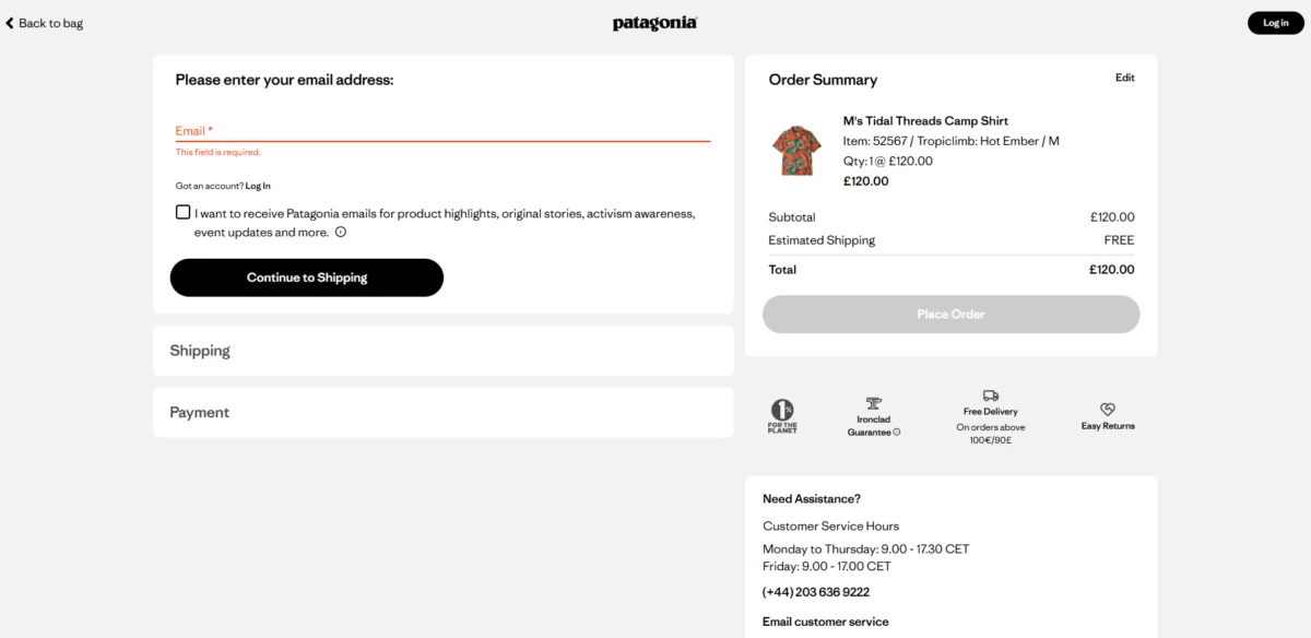
4. Distraction-Free “Enclosed” Checkouts
The checkout page should be a functional cul-de-sac. Once a user enters the payment flow, the primary goal is to keep them there until the order is placed. This has led to the rise of the “enclosed” checkout design, which strips away the main navigation, search bars, and promotional banners.
![Checkout Page Design: 11 Ways to Reduce Cart Abandonment Rates [+Examples]](https://ceblog.s3.amazonaws.com/wp-content/uploads/2021/09/30141752/Checkout-Page-Design-linkedin-post.png)
Outdoor brand Patagonia serves as a prime example of this philosophy. Their checkout header contains only a logo and a “Back to Bag” link. By removing the global navigation, they prevent users from accidentally wandering back into the catalog. However, essential information—such as an order summary with product images and customer service contact details—must remain visible to reassure the buyer.
5. Strategic Selection of Checkout Structure
The debate between single-page and multi-page checkouts has shifted toward a more nuanced, context-dependent approach.
![Checkout Page Design: 11 Ways to Reduce Cart Abandonment Rates [+Examples]](https://ceblog.s3.amazonaws.com/wp-content/uploads/2021/09/30141823/Checkout-Page-Design-multistep-form.png)
- Single-Page Checkouts: These are ideal for low-cost, impulsive, or repeat purchases (e.g., consumer packaged goods like Olipop). They offer the perception of speed and reduce page load interruptions.
- Multi-Page Checkouts: For high-ticket items or complex orders, multi-step flows often perform better. They leverage the “sunk-cost fallacy”—as a user completes each step, they become more committed to finishing the process. Multi-step designs also allow for a cleaner interface on mobile devices.
A 2024 case study by Shopify expert Kurt Elster revealed that in certain A/B tests, a three-page checkout actually outperformed a one-page version by providing logical pauses for the user to review information, thereby increasing trust.
6. The Trust Signal Stack
With 19% of users abandoning carts due to security fears, the visual representation of safety is paramount. However, the types of trust signals required vary by price point. A luxury mattress retailer like Saatva must deploy a robust “trust stack,” including 365-night trial badges, lifetime warranty icons, and “Secure Payment” labels.
![Checkout Page Design: 11 Ways to Reduce Cart Abandonment Rates [+Examples]](https://ceblog.s3.amazonaws.com/wp-content/uploads/2021/09/30141901/Checkout-Page-Design-express-checkout.png)
For lower-cost items, simple indicators like SSL padlocks and recognizable payment logos (Visa, Mastercard, PayPal) are often sufficient. The key is to place these signals near the most sensitive areas of the page, specifically the credit card input fields.
7. Localization of Payment Methods
The diversification of payment options is no longer optional for global brands. A Stripe holdback experiment conducted in April 2025 demonstrated that adding local payment methods drove a 7.4% increase in conversion and a 12% boost in revenue.
![Checkout Page Design: 11 Ways to Reduce Cart Abandonment Rates [+Examples]](https://ceblog.s3.amazonaws.com/wp-content/uploads/2021/09/30141943/Checkout-Page-Design-payment-options.png)
The impact is even more dramatic in specific regions:
- Netherlands: iDEAL increases conversions by 39%.
- China: Alipay delivers a 91% lift.
- Poland: BLIK provides a 46% increase.
Additionally, Buy Now, Pay Later (BNPL) services like Klarna and Affirm have become essential for high-AOV (Average Order Value) retailers, as they allow customers to distribute the cost of large purchases, directly countering the “price too high” objection.
![Checkout Page Design: 11 Ways to Reduce Cart Abandonment Rates [+Examples]](https://ceblog.s3.amazonaws.com/wp-content/uploads/2021/09/30142034/Checkout-Page-Design-mobile-usage-chart.png)
8. Mobile-Native Design Optimization
As of March 2026, mobile devices account for approximately 74% of all e-commerce traffic. Despite this, mobile abandonment rates remain nearly 11 percentage points higher than desktop. This gap is often the result of “desktop-first” designs being shrunk down rather than reimagined for touch.
Mobile-native optimization requires:
![Checkout Page Design: 11 Ways to Reduce Cart Abandonment Rates [+Examples]](https://ceblog.s3.amazonaws.com/wp-content/uploads/2021/09/30142139/Checkout-Page-Design-mobile-checkout.png)
- Large, “thumb-friendly” buttons.
- Numeric keypads that trigger automatically for credit card and zip code fields.
- The prioritization of mobile wallets (Apple Pay, Google Pay) at the top of the page to eliminate manual typing.
9. Call-to-Action (CTA) Clarity
A common but overlooked cause of abandonment is “confirmation confusion.” Research from Baymard indicates that up to 11% of users leave at the final review step because they mistakenly believe they have already completed the order.
To prevent this, the final CTA button must be visually dominant and explicitly labeled (e.g., “Place Order and Pay Now” rather than a vague “Continue”). Many top retailers now use “sticky” CTA buttons that remain anchored to the bottom of the screen as the user scrolls through their order details.
![Checkout Page Design: 11 Ways to Reduce Cart Abandonment Rates [+Examples]](https://ceblog.s3.amazonaws.com/wp-content/uploads/2021/09/30142331/Checkout-Page-Design-amazon-cart.png)
10. Real-Time Inline Validation
Nothing frustrates a user more than hitting “Submit” only to be greeted by a list of errors at the top of the page. Inline validation provides real-time feedback, marking fields with a green checkmark upon correct entry or a red warning message the moment an error is detected.
Retailers like Marks & Spencer utilize this to help users correct typos in their email or card numbers immediately. However, for a truly seamless experience, these error messages must disappear the moment the user begins typing the correction—a detail many developers overlook.
![Checkout Page Design: 11 Ways to Reduce Cart Abandonment Rates [+Examples]](https://ceblog.s3.amazonaws.com/wp-content/uploads/2021/09/30142404/Checkout-Page-Design-amazon-checkout.png)
11. The Accessibility Mandate and Legal Compliance
In 2025, accessible design has transitioned from a moral obligation to a legal requirement. The European Accessibility Act (EAA) now mandates that digital stores selling to EU consumers must meet WCAG (Web Content Accessibility Guidelines) standards.
Microsoft’s online store is frequently cited as a benchmark for accessibility. Their checkout features high-contrast text, keyboard-only navigation support, and screen-reader-compatible form labels. Beyond compliance, accessible design benefits all users by ensuring the interface is logical, clear, and easy to navigate under any conditions.
![Checkout Page Design: 11 Ways to Reduce Cart Abandonment Rates [+Examples]](https://ceblog.s3.amazonaws.com/wp-content/uploads/2021/09/30141410/Checkout-Page-Design-form-errors.png)
Impact and Future Implications
The evolution of the checkout page is far from over. As we move toward the latter half of the decade, industry experts anticipate that AI-driven biometric authentication (FaceID and fingerprint scanning) will eventually replace traditional form-filling entirely.
The data is clear: the retailers who survive and thrive in 2025 are those who treat the checkout not as a static utility, but as a dynamic, high-performance engine that requires constant tuning. By removing friction, honoring user privacy, and ensuring total transparency, businesses can finally begin to close the 70% abandonment gap and reclaim the revenue currently left in digital carts.