The digital marketing industry has long operated under a persistent misconception regarding the native capabilities of Google’s ubiquitous tracking platform, specifically the belief that Google Analytics provides a built-in heatmap feature. Despite its status as the world’s most widely used web analytics service, Google Analytics (GA) has never possessed a native, integrated heatmap tool in the way most marketers understand the term. Instead, the "Google Analytics heatmap" often cited in industry blogs and tutorials refers to a defunct Chrome extension or a specific data visualization method that lacks the depth of modern user experience (UX) intelligence tools. As organizations migrate to Google Analytics 4 (GA4), the distinction between quantitative data and qualitative visual insights has become a critical focal point for conversion rate optimization (CRO) specialists and web developers alike.
The Evolution of Visual Reporting in the Google Ecosystem
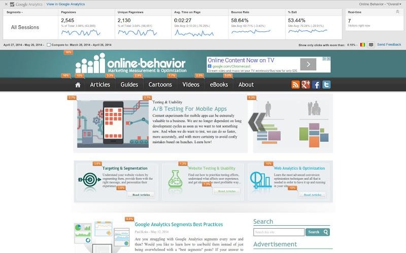
To understand the current landscape, it is necessary to trace the history of Google’s attempts to provide visual click data. In the era of Universal Analytics (UA), Google offered a feature known as "In-Page Analytics." This was a dashboard report that allowed users to view their own websites with an overlay of click percentages. It was a rudimentary solution that provided a "bubble" view of engagement, but it was far from a sophisticated heatmap.
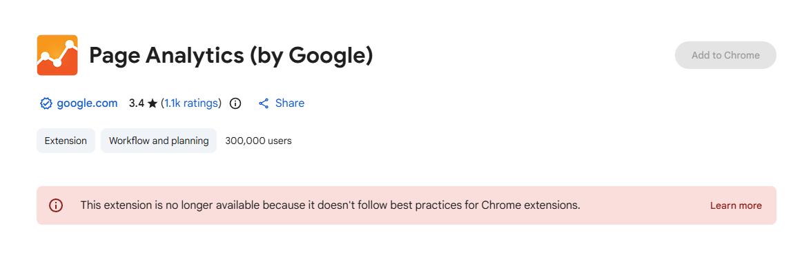
In early 2017, Google officially deprecated the In-Page Analytics report, moving its functionality into a standalone Chrome extension titled "Page Analytics." This extension allowed users to see a reporting bar at the top of their browser while navigating their site, displaying metrics such as page views, bounce rates, and real-time traffic. It also featured an overlay showing where users clicked—but with a significant caveat: it only tracked clicks on links. It could not capture clicks on non-clickable elements, white space, or interactive components that were not tagged as traditional anchors.
The extension saw its last update in 2019. With the transition to GA4, which utilizes an entirely different event-based data model compared to the session-based model of Universal Analytics, the Page Analytics extension became obsolete. As of 2024, the extension is no longer available for download in the Chrome Web Store, leaving a significant gap in the toolkit of marketers who relied on Google’s ecosystem for visual feedback.
The Technical Reality of GA4 Visualizations
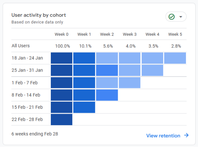
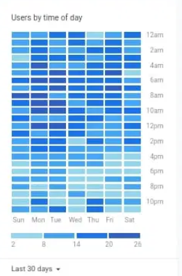
While GA4 does not offer a visual overlay heatmap, it does provide sophisticated data visualization tools that some refer to as heatmaps in a mathematical sense. Within the GA4 "Explorations" module, users can create color-coded tables where the intensity of the color corresponds to the volume of data. For example, a cohort analysis or a pivot table showing user activity by day and time uses a "heatmap" style of conditional formatting to highlight peaks and valleys in traffic.
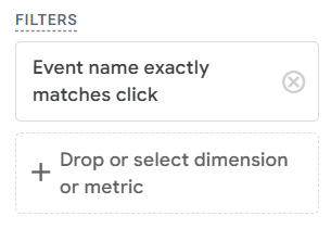
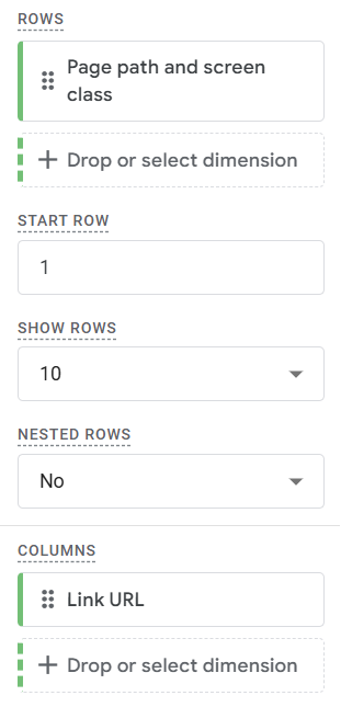
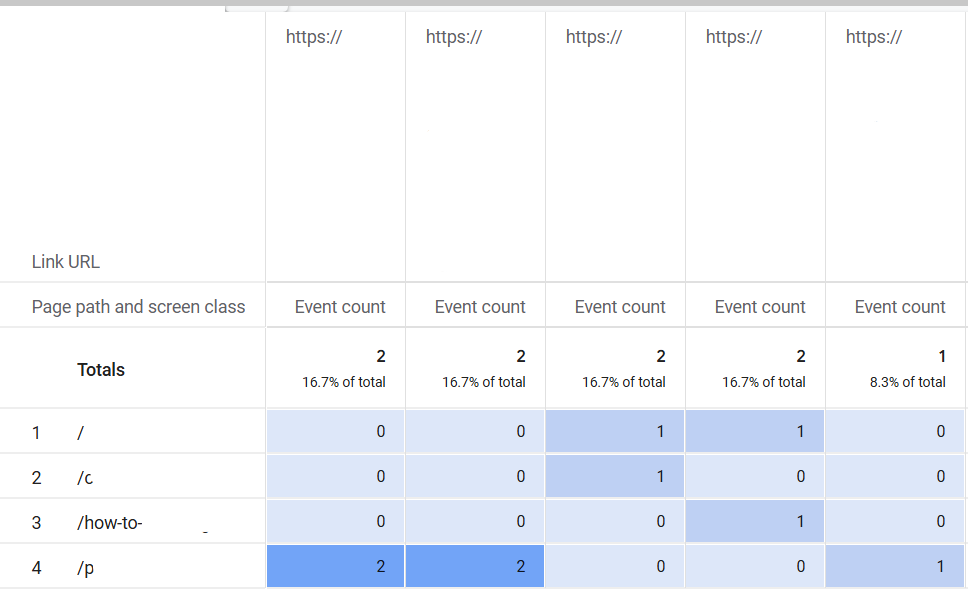
To replicate the link-click data once provided by the Page Analytics extension, advanced users now employ Google Tag Manager (GTM) to trigger custom events on every link click. By capturing the link URL as a parameter, GA4 can generate a "Free-form Exploration." In this setup, "Page path" is set as a row, and "Link URL" is set as a column. By changing the cell type to "Heat map," marketers receive a color-coded table indicating which links are most popular on specific pages.
However, industry experts point out that this is merely quantitative data presented in a colored grid. It fails to address the "why" behind user behavior. It cannot identify "dead clicks"—where users click on an image or text expecting a link that doesn’t exist—nor can it identify "rage clicks," which occur when a frustrated user clicks an element repeatedly because it is slow to respond.
The Rise of Third-Party UX Intelligence
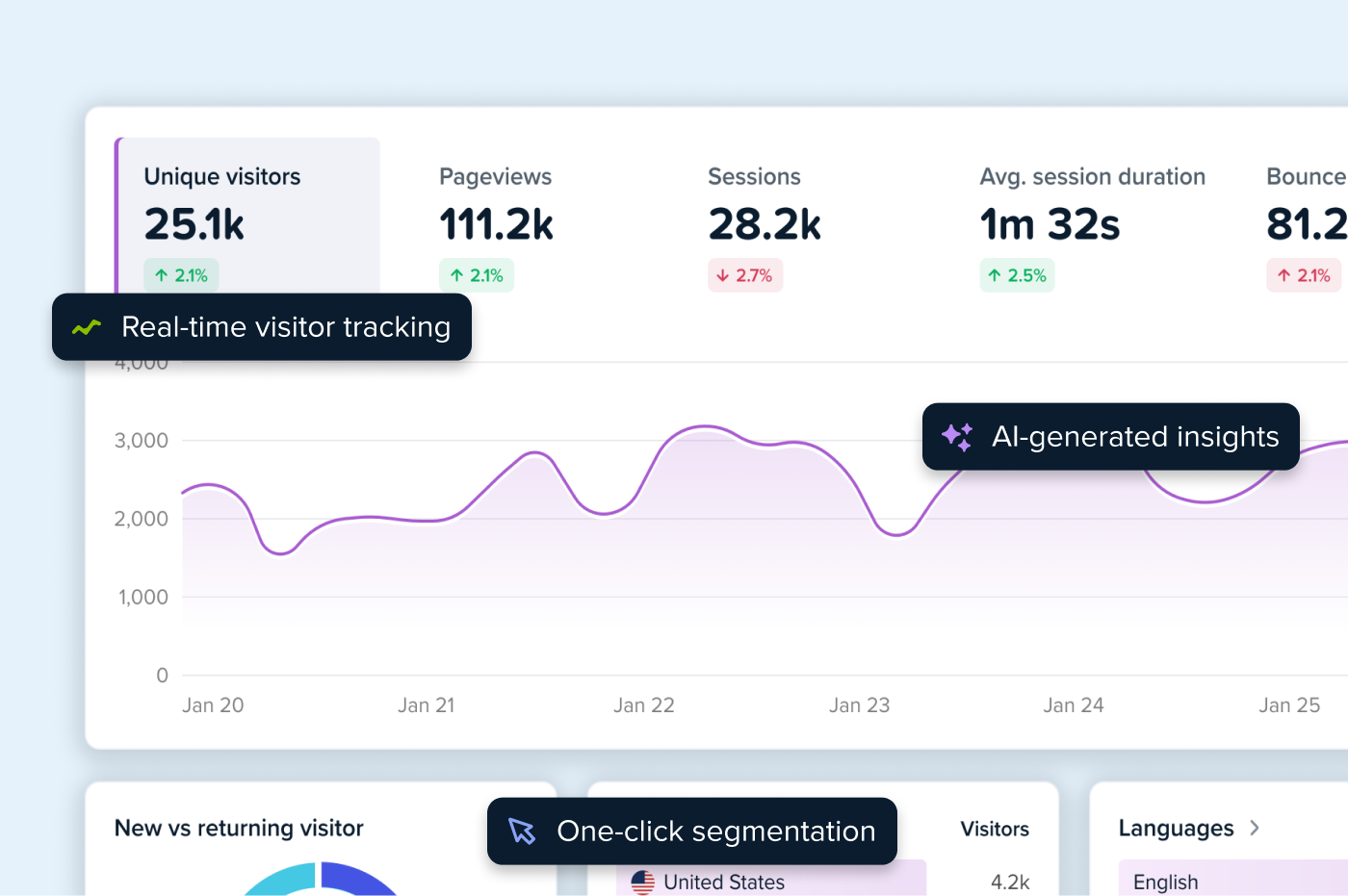
The vacuum left by Google has been filled by dedicated UX analytics platforms like Crazy Egg, which pioneered the visual mapping of user behavior. These tools provide what GA4 cannot: a qualitative look at the user journey. As digital competition intensifies, the market for these tools has seen a compound annual growth rate (CAGR) of over 15% as businesses prioritize user retention over simple acquisition.
The modern "heatmap" is actually a suite of five distinct visual reports:
- Click Maps: These illustrate every single interaction on a page, regardless of whether the element is a link. This is vital for identifying UX flaws, such as users attempting to click on non-interactive icons.
- Scroll Maps: These provide a gradient overlay showing how far down a page visitors travel. Data from these maps often reveals that critical information, such as call-to-action (CTA) buttons or pricing, is located in "cold" zones that less than 20% of users ever reach.
- Confetti Maps: A high-resolution version of a click map where individual clicks are represented by dots. These can be segmented by traffic source, device, or geographic location, allowing marketers to see, for instance, if visitors from a specific Facebook ad are interacting with a page differently than organic search visitors.
- Overlay Maps: Similar to the old Google extension but more robust, these show click percentages on specific clickable elements while allowing for deep segmentation.
- List Maps: A tabular breakdown of page elements ranked by engagement, providing a quick reference for which types of content (e.g., video vs. text) drive the most interaction.
Strategic Implications: The Integrated Optimization Loop
The consensus among data scientists is that the most effective website optimization occurs when quantitative data from GA4 is paired with qualitative data from a heatmap tool. Industry leaders suggest a four-stage "Optimization Loop" that bridges the gap between these two data sources.
The process begins with Identification, using GA4 to find underperforming pages—those with high bounce rates or low conversion values. This is followed by Diagnosis, where a heatmap is deployed on those specific pages to observe user behavior. For example, a high bounce rate on a landing page might be explained by a scroll map showing that the primary "Sign Up" button is located too far below the fold.
The third stage is Hypothesis and Testing, where the insights from the heatmap are used to design an A/B test. If a click map shows users are clicking an unlinked image, the marketer might test a version of the page where that image is linked to a product page. Finally, the loop concludes with Validation, using GA4 to measure the lift in conversion rate and the heatmap to confirm that the new user behavior aligns with the design intent.
Data Privacy and Technical Performance
As global privacy regulations like GDPR (General Data Protection Regulation), CCPA (California Consumer Rights Act), and HIPAA (Health Insurance Portability and Accountability Act) become more stringent, the methods by which heatmaps collect data have come under scrutiny. Unlike the early days of "session replays," modern tools have moved toward "privacy by design."
Leading providers now mask sensitive information at the Document Object Model (DOM) level. This means that when a user types a password, credit card number, or personal address into a form, that data is redacted on the user’s browser before it is ever transmitted to the analytics server. Furthermore, the use of first-party cookies and anonymous IP logging has become the industry standard to ensure compliance while still providing actionable insights.
From a technical performance standpoint, the primary concern for web developers is "script bloat"—the potential for third-party scripts to slow down page load times. Modern heatmap scripts are typically asynchronous and lightweight (often under 30kb), meaning they load in the background without blocking the rendering of the actual website content.
Conclusion: Beyond the Grid
The "Google Analytics heatmap" may be a myth, but the need for visual data has never been more real. As the web moves toward more interactive, JavaScript-heavy experiences, the limitations of traditional, link-based tracking are becoming more apparent. Organizations that rely solely on GA4’s table-based reports risk missing the subtle nuances of user frustration and engagement that lead to long-term growth.
The future of web analytics lies in the integration of these disparate data streams. By connecting the "what" of Google Analytics with the "how" and "why" of visual heatmaps, businesses can move beyond reactive reporting and toward a proactive, user-centric design philosophy. In an era where the cost of customer acquisition is at an all-time high, the ability to see the world through the user’s eyes is no longer a luxury—it is a competitive necessity.