The digital landscape of 2017 and 2018 marked a significant turning point in how organizations and journalists interpreted complex datasets, driven largely by the emergence of accessible, cloud-based visualization tools. At the forefront of this shift was Google Data Studio, a platform that transitioned from a niche beta product to a central pillar of business intelligence (BI) and data journalism. By allowing users to connect disparate data sources—ranging from Google Analytics to BigQuery—into a single, interactive interface, the tool democratized data science, moving it out of the exclusive domain of specialized analysts and into the hands of marketers, journalists, and business leaders.
The Technical Foundation of Modern Data Visualization
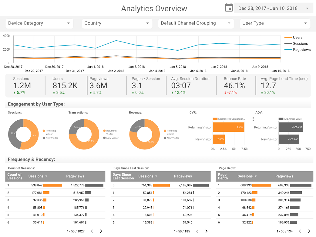
To understand the impact of Google Data Studio during this era, one must look at the state of data reporting prior to its widespread adoption. Traditionally, business reporting was a fragmented process. Data was often siloed in individual platforms, requiring manual extraction into spreadsheets, followed by hours of formatting to create static PDF reports. This "static era" of reporting was characterized by a lack of real-time insight and a high margin for human error.
Google Data Studio addressed these pain points by introducing native connectors. These connectors allowed for a "live link" between the data source and the visualization. For businesses, this meant that a dashboard could update automatically as new sales or web traffic data arrived. For journalists, it meant the ability to build living stories that remained relevant as new figures were released by government agencies or research institutions.
Transforming Business Efficiency: Case Studies in Automation
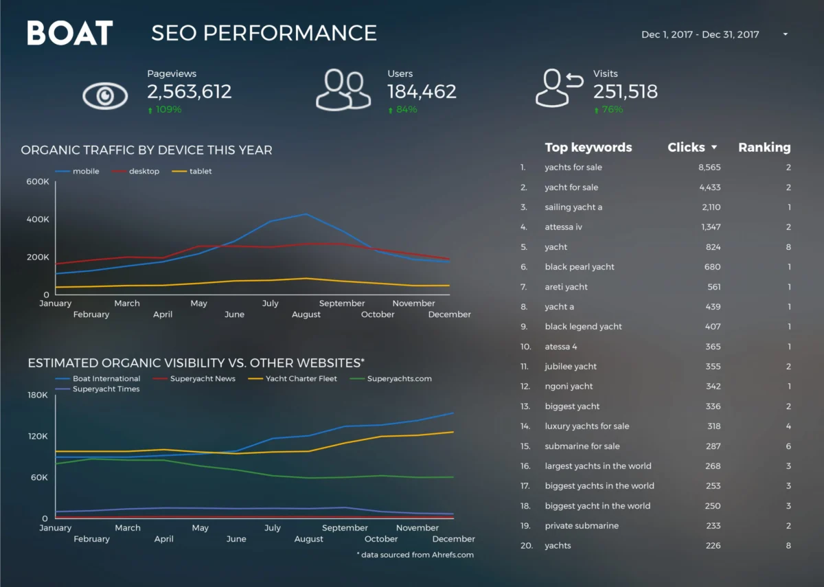
The practical application of these tools is best illustrated through the transformation of agency and corporate workflows. One notable example is Boat International Media, a leading authority in the superyacht industry. Prior to adopting Data Studio, the organization’s SEO performance reporting was an arduous task. Analysts Fanni Takacs and Drew Broomhall reported that the monthly client reporting process originally spanned five full business days. This time was largely spent aggregating data from search consoles, analytics platforms, and social media.
By transitioning to an automated Data Studio environment, Boat International Media reduced this five-day ordeal to just fifteen minutes. This 99% reduction in reporting time allowed the team to pivot from data collection to data strategy. The resulting dashboards were not merely functional; they adhered to high design standards, ensuring that key performance indicators (KPIs) were presented without clutter. This shift emphasized a core tenet of modern BI: the value is not in the data itself, but in the speed and clarity with which insights can be extracted.

Similarly, firms like Analytics Pros utilized advanced visualization techniques, such as bullet charts, to provide deeper context than standard bar graphs. While a standard chart might show that a webpage received 10,000 visits, a bullet chart compares that figure against last year’s performance and the current year’s target simultaneously. This three-dimensional view of data—current status, historical context, and future goals—became the gold standard for high-level executive dashboards.
The Democratization of Analytics Templates
The rise of Data Studio was further accelerated by the community-driven "template economy." Organizations such as ClickInsight and E-Nor began publishing sophisticated dashboard templates that allowed smaller businesses to bypass the steep learning curve of report design. Sunil Attri, a Senior Consultant at E-Nor, was instrumental in developing compact, interactive overviews that utilized Google Analytics data to provide a comprehensive "health check" of a website in a single view.
These templates served as a bridge for companies that lacked the budget for dedicated data scientists. By simply "plugging in" their own data sources to a pre-built architecture, these businesses could achieve the same level of visual sophistication as Fortune 500 companies. This period saw a shift in the role of the analyst from a "builder" to a "curator" of information.
Data Journalism: Narrative-Driven Visualizations
Beyond the boardroom, Google Data Studio emerged as a powerful tool for narrative storytelling, a field often referred to as data journalism. Unlike business dashboards, which focus on efficiency and KPIs, journalistic visualizations aim to uncover trends, debunk myths, and provide social context.
The Cinematic Battle: Marvel vs. DC
The entertainment industry provided a fertile ground for data-driven storytelling. As the "superhero genre" dominated global box offices, analysts used Data Studio to visualize the financial and critical trajectories of the Marvel Cinematic Universe (MCU) and the DC Extended Universe (DCEU). With the MCU surpassing $27 billion in worldwide box office revenue by the late 2010s, visualizations allowed fans and industry analysts to compare movie-by-movie performance, audience ratings, and return on investment. These reports moved beyond simple lists of numbers, using interactive elements to let users explore how specific franchises contributed to a studio’s overall market dominance.
Cultural Phenomena and Scientific Data
The application of data storytelling extended to iconic cultural properties like Star Wars. Teams at ClickInsight developed reports that analyzed the technical specifications of fictional starships and the demographics of the galaxy’s characters. While seemingly lighthearted, these projects demonstrated the platform’s ability to handle complex, multi-tabbed reports that functioned more like interactive encyclopedias than traditional charts.

Open Source Contributions and Big Data
In the realm of technology, Google Developer Advocate Felipe Hoffa utilized the integration between Data Studio and BigQuery to analyze the global open-source ecosystem. By processing millions of "PushEvents" from GitHub, Hoffa was able to identify which companies and individuals were the most active contributors to the web’s infrastructure in 2017. This project was significant because it showcased the platform’s ability to handle "Big Data." While many tools struggle with datasets containing millions of rows, the BigQuery connector allowed for seamless, high-speed visualization of massive datasets, providing a macro-level view of the world’s coding trends.
Societal Insights: 150 Years of UK Social Trends
Perhaps the most profound use of data storytelling was seen in the analysis of long-term social trends. A study conducted by researchers including Lizzie Silvey examined 150 years of marriage and divorce data in the United Kingdom. By pulling historical data from the Office for National Statistics (ONS), the visualization answered complex questions about the impact of world wars, economic depressions, and legislative changes on social structures.
The data revealed that marriage rates often spiked following the conclusion of major conflicts, while divorce rates were heavily influenced by the introduction of new laws, such as the Divorce Reform Act of 1969. This type of visualization serves a dual purpose: it preserves history through data and provides a factual basis for sociological discussion, removing much of the anecdotal bias that often clouds public discourse on social issues.
Chronology of Google Data Studio’s Development (2016–2018)
The rapid adoption of these visualization techniques was supported by a steady cadence of technical updates from Google:
- March 2016: Google announces Data Studio as part of the Google Analytics 360 Suite, initially offered as a limited beta.
- February 2017: Google removes the five-report limit for the free version of Data Studio, leading to an explosion of independent projects and community templates.
- August 2017: The introduction of "Community Connectors" allows users to pull data from over 500 non-Google sources, including Facebook Ads, LinkedIn, and Twitter.
- September 2017: Integration with BigQuery is enhanced, allowing for faster processing of massive datasets.
- Early 2018: The platform introduces advanced features like "Calculated Fields" and "Data Blending," allowing users to join data from different sources (e.g., combining Google Ads spend with Salesforce revenue) within the tool itself.
- September 2018: Google Data Studio officially exits beta, becoming a fully supported enterprise-grade product.
Analysis of Implications and Broader Impact
The rise of Google Data Studio between 2017 and 2018 signaled the end of the "Information Age" and the beginning of the "Insight Age." The primary challenge for modern organizations is no longer the lack of data, but the overwhelming abundance of it. Tools that facilitate clear, concise, and automated visualization have become essential for survival in a data-driven economy.
For the workforce, this evolution necessitated a new set of skills. "Data literacy" became a required competency for roles previously considered non-technical. Marketers were now expected to understand data blending, and journalists were expected to be proficient in SQL or at least understand the logic of data queries.
Furthermore, the shift toward transparency was bolstered. When data is presented in an interactive, public-facing dashboard, it is harder to manipulate or misinterpret than a static quote or a cherry-picked statistic. This has had a positive impact on corporate accountability and journalistic integrity.
Conclusion: The Legacy of a Visualization Revolution
As we look back at the visualizations that defined 2017 and 2018, it is clear that Google Data Studio was more than just a software release; it was a catalyst for a change in mindset. It proved that data does not have to be intimidating or dry. When paired with thoughtful design and narrative intent, data becomes a powerful language capable of explaining the intricacies of global markets, the history of social institutions, and the trends of popular culture.
The examples set by Boat International Media, Felipe Hoffa, and various analytics consultants established a blueprint for the future of business intelligence. Today, as the platform has evolved into Looker Studio, the core principles remain the same: simplify the complex, automate the mundane, and tell a story that drives action. The visualizations of 2017 were not just charts; they were the first steps toward a more transparent and informed digital world.