rifanmuazin
Popup forms, those small overlay windows designed to collect email addresses on websites, represent a dual-edged sword in the realm of digital marketing. When executed with precision and strategic foresight, they are widely recognized as one of the most efficient mechanisms for rapidly expanding an email subscriber list. Conversely, a poorly implemented popup can swiftly alienate visitors, leading to increased bounce rates and a diminished user experience. The fundamental differentiator between these two outcomes lies not in the mere presence of the popup itself, but critically, in the nuanced decisions surrounding when, where, and how often it makes its appearance.
The pervasive frustration associated with popup forms stems primarily from their common misuse. Many websites deploy these overlays prematurely, often within the first few seconds of a visitor landing on a page, or with excessive frequency across every pageview. Such tactics transform a potential engagement opportunity into an immediate interruption, demanding personal information before the visitor has even had a chance to consume any content or assess the site’s value proposition. This approach is counterproductive; it fails as a conversion strategy and instead serves as a significant deterrent, signaling to the user that the website prioritizes data collection over their browsing experience. The contemporary approach advocates for a more respectful, user-centric methodology, demonstrating that it is entirely feasible to design popups that convert effectively while simultaneously honoring the visitor’s journey.

The Evolution and Psychology of Popup Forms
The concept of the popup form has evolved significantly since its inception. Initially, popups were often viewed as intrusive and aggressive marketing tools, frequently deployed without consideration for user context or timing. This led to a widespread negative perception, with many internet users developing “popup blindness” or resorting to ad blockers. However, as digital marketing matured, so did the understanding of user psychology and the importance of a positive user experience (UX). Marketers began to recognize that the inherent value exchange – offering something of worth in exchange for an email address – was paramount.
The psychological underpinnings of an effective popup lie in timing and relevance. When a popup appears at a moment of demonstrated user engagement or intent, it transitions from an interruption to a helpful offer. For instance, a visitor who has spent several minutes reading an article on digital marketing is likely to appreciate an offer for a “free email marketing checklist,” as it directly complements their current interest. This shift in perception, from annoyance to utility, is critical for fostering trust and encouraging opt-ins. Email lists, in particular, remain a cornerstone of digital strategy, offering a direct, owned channel for communication, nurturing leads, and building lasting customer relationships, a fact that underscores the continued relevance of well-executed popup strategies.
Decoding Effective Popup Design for Maximum Conversion
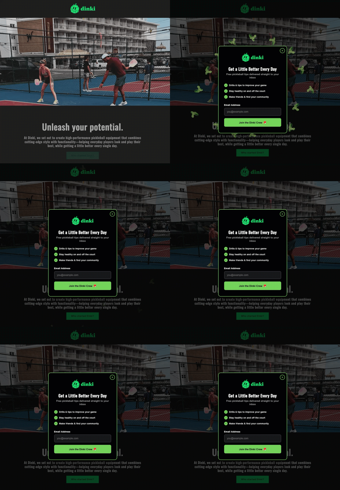
The design and content of a popup form are as crucial as its timing. Best practices, whether utilizing advanced AI-powered builders or manual design, emphasize clarity, conciseness, and a strong value proposition.
- Crafting Compelling Headlines: The headline is the popup’s first impression and must articulate the immediate benefit to the visitor in fewer than ten words. Generic calls to action like “Subscribe to our newsletter” are significantly less effective than specific, benefit-driven statements such as “Get the weekly marketing checklist” or “Unlock your 10% discount now.” The goal is to clearly name the deliverable, ensuring the visitor understands precisely what value they will receive in their inbox. Industry data consistently shows that headlines emphasizing a tangible benefit or solution outperform vague requests for subscription.
- The Power of a Value Statement: While optional, a concise value statement positioned below the headline can significantly enhance the popup’s persuasive power. This single sentence can build urgency or credibility. Examples include “Sent to your inbox in 60 seconds” (urgency) or “Used by 5,000+ small business owners” (social proof/credibility). This statement provides additional context, reinforcing the offer’s appeal. If the headline is sufficiently clear and compelling on its own, this element can be omitted to maintain brevity, adhering to the principle of minimal friction.
- Optimizing Form Fields for Low Friction: The number of fields in a popup form directly correlates with its conversion rate. Marketing analytics consistently demonstrate that every additional field beyond the email address reduces completion rates. For initial list building, the email address is often the only truly essential piece of information needed to initiate a relationship. If personalization is a priority, adding a single “name” field is generally acceptable, but two fields should be considered the absolute maximum for a popup. More extensive data collection, such as company size or specific interests, should be deferred to a later stage, perhaps within a welcome email sequence, a preference center, or through progressive profiling as the relationship deepens. This “less is more” philosophy minimizes user effort and perceived commitment, thereby maximizing opt-ins.
- Action-Oriented Call-to-Actions: The call-to-action (CTA) button serves as the final prompt for conversion and should be crafted with action-oriented language specific to the offer. Phrases like “Send me the checklist” significantly outperform generic terms such as “Submit.” Furthermore, extensive A/B testing across various platforms has shown that first-person phrasing (e.g., “Get my free guide”) often yields higher conversion rates compared to second-person phrasing (“Get your free guide”), as it creates a stronger sense of ownership and immediate benefit for the user.
- User-Centric Close Options: A critical, yet often overlooked, design element is the close button. It should be prominently visible and easily accessible, avoiding tiny ‘X’ icons or “guilt-tripping” dismiss links (e.g., “No, I don’t want more customers”). Providing a clear and straightforward option to close the popup without subscribing demonstrates respect for the visitor’s autonomy and decision. Trapping visitors or making it difficult to dismiss the form can severely damage brand perception and erode trust, ultimately driving users away rather than converting them. User experience specialists universally advocate for clear exit paths as a fundamental aspect of good design.
Tools like AWeber’s AI Signup Form Builder streamline the application of these principles. By simply providing a text description – for example, “I run a marketing blog. Offer a free email checklist. Show the form after 30 seconds.” – the AI generates the appropriate copy, design, layout, and fields. This automation not only accelerates the design process but also ensures that best practices are embedded from the outset, connecting the form directly to the user’s AWeber email list and any pre-built automation sequences without requiring coding or third-party plugins.
Strategic Timing: When to Engage, Not Interrupt
The precise moment a popup appears is arguably the most crucial factor in determining its success. A popup that fires within the first few seconds of a page load often communicates to the visitor that the website owner values their email address more than their immediate experience, creating an immediate sense of intrusion. Conversely, a popup that waits until a visitor has scrolled a significant portion of the page or spent a meaningful amount of time engaging with the content is perceived as helpful because it appears when the user has already demonstrated interest and investment.
The three most effective and widely adopted triggers for popup forms are scroll depth, time on page, and exit intent.
- Scroll-Based Triggers: These triggers activate the popup once a visitor has scrolled a predetermined percentage down the page. For content-rich pages like blog posts, a scroll depth of 40% to 60% is often optimal. At this point, the visitor has actively engaged with a substantial portion of the content, indicating genuine interest and making them more receptive to an offer related to that content. This timing ensures that the offer is made to an already engaged audience.
- Time-Based Triggers: Time-based triggers deploy the popup after a set number of seconds have elapsed since the visitor landed on the page. A duration between fifteen and thirty seconds typically allows most visitors sufficient time to begin engaging with the content. Anything under ten seconds can still feel aggressive and interruptive, particularly for new visitors. This trigger capitalizes on the sustained attention of the user.
- The Efficacy of Exit-Intent Popups: Exit-intent technology represents one of the least intrusive and most effective popup triggering mechanisms. It detects specific user behaviors, such as the cursor moving towards the browser’s close button, back button, or address bar, signaling an imminent departure from the site. The popup then appears as a “last chance” offer, just before the visitor leaves. This method consistently achieves higher conversion rates than time-based popups because it does not interrupt the primary browsing experience. Instead, it offers a final value proposition to individuals who were already on their way out, providing an opportunity to retain engagement that would otherwise be lost. Marketing studies frequently cite exit-intent popups as having conversion rates that can be two to four times higher than other types of triggers.
- Combining Triggers for Layered Strategy: An advanced strategy involves combining these triggers to create a layered approach. For instance, a scroll-based popup could be shown to deeply engaged readers within a specific content segment, offering a highly relevant resource. For visitors who do not meet that scroll depth but are still attempting to leave the site, an exit-intent popup could present a more general, yet still valuable, offer. This dual-trigger strategy ensures that offers are presented at optimal moments, catering to different levels of user engagement and intent.
Frequency and Targeting: Precision for Personalized Engagement
Beyond timing, the frequency and targeting of popups are critical for maintaining a positive user experience and maximizing conversion without causing annoyance.
- The Imperative of Frequency Capping: One of the fastest ways to sour a visitor’s experience is to repeatedly show the same popup. Once a visitor has closed a popup, presenting it again on the very next pageview or during the same browsing session is highly counterproductive. Implementing a robust frequency cap is essential. This could mean showing the popup only once per session or setting a more conservative cap, such as once every seven days. Repeated popups do not convert resistant visitors; they merely reinforce their decision to leave and can actively drive them away. Respecting a user’s decision to dismiss a popup for at least the remainder of their visit is fundamental to building trust.
- Page-Specific Targeting for Relevance: The impact of a popup is significantly amplified when its offer is directly relevant to the content on the page the visitor is viewing. Showing a generic “join our newsletter” popup across an entire website is far less effective than a highly targeted offer. For example, a popup offering a “blog writing checklist” makes perfect sense on a post discussing content marketing strategies, but would be irrelevant and disruptive on a pricing page for a software product. Marketing professionals widely advocate for content upgrades – specific, valuable resources directly related to the page’s topic – as the most effective offers for page-targeted popups. This contextual relevance drastically increases the likelihood of conversion.
- Device-Specific Optimization and Google’s Stance: Popups behave distinctly across different devices, particularly between desktop and mobile. A full-screen popup that might be acceptable on a laptop can entirely obscure content on a smartphone screen, creating a frustrating user experience. Recognizing this, Google introduced an update in January 2017, explicitly stating that “intrusive mobile interstitials” (popups that cover content immediately upon mobile page load) could be treated as a negative ranking signal in mobile search results. This policy was a direct measure to enhance mobile user experience. While popups triggered by time delays, scroll depth, or exit intent are generally not penalized, marketers are strongly advised to use smaller, less intrusive formats on mobile devices, such as slide-ins, banners, or sticky bars that remain visible without blocking the main content. The close button, too, must be easy to find and tap on any screen size. This policy underscores the broader implication of popups on SEO and the critical need for mobile responsiveness.
- Advanced Audience Targeting: Beyond page and device, advanced targeting can involve segmenting visitors based on their behavior or demographics. This could include showing specific popups to users who have visited a certain number of pages, added items to a cart but not completed a purchase, or returned to the site multiple times. Such granular targeting allows for highly personalized and relevant offers, maximizing the chances of conversion.
Beyond the Basic: Innovative Popup Formats
The traditional, static popup form has evolved into a variety of dynamic and engaging formats, each designed to capture attention and facilitate conversions in different contexts. AWeber’s AI Signup Form Builder, for instance, is capable of generating several innovative formats:
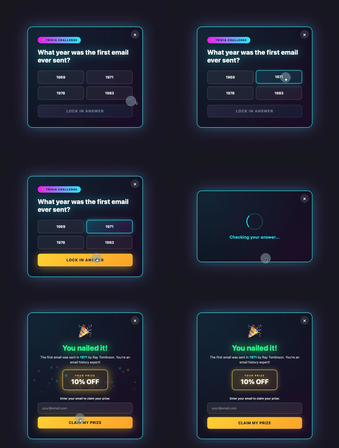
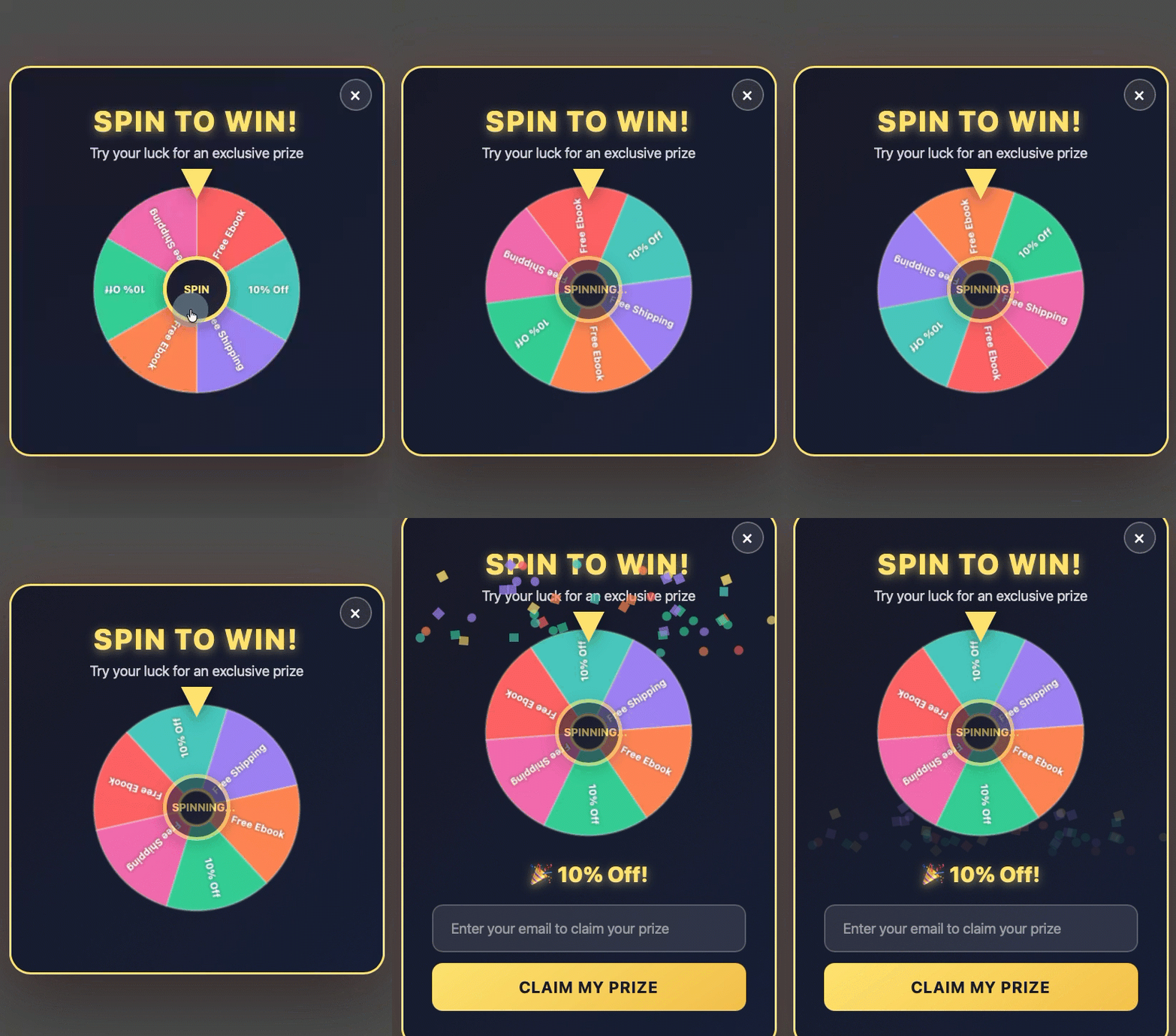
- Gamified Popups: These forms introduce an element of play, turning the opt-in process into an interactive experience. Examples include quizzes, trivia questions, or “spin-to-win” wheels where visitors enter their email address to claim a prize or reveal a discount. The psychological principle here is the allure of reward and immediate gratification, which can significantly boost engagement before the email field is even presented.
- Discount Offer Popups: Particularly effective for e-commerce, these popups offer a discount or special promotion in exchange for an email address. Often combined with exit-intent triggers or gamification (like a spin-to-win wheel), they provide a compelling incentive for visitors on the verge of leaving or those browsing product pages. The urgency created by a limited-time offer can drive immediate conversions.
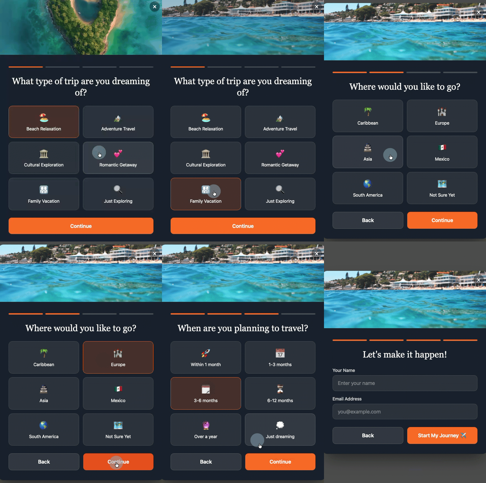
- Multi-Step Forms: These forms break down the opt-in process into smaller, less daunting steps. The visitor first makes a low-commitment decision (e.g., selecting a category of interest, answering a simple question). By the time they reach the email field, they have already invested a small amount of effort and made a micro-commitment, making them more likely to complete the final step. This approach reduces perceived friction and can lead to higher completion rates for more complex data collection needs.
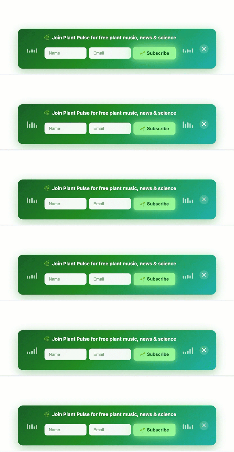
- Sticky Bars: Also known as “hello bars” or “notification bars,” these are thin strips positioned at the top or bottom of the page. They typically contain a concise message, a form field, and a call-to-action button. Sticky bars are non-intrusive as they do not block content, yet they remain consistently visible as the user scrolls. This format is particularly well-suited for mobile devices where full-screen popups are problematic, offering a persistent, gentle prompt for subscription.
- Slide-in Popups: These forms “slide in” from the side or bottom of the screen, typically after a scroll or time delay. They are less disruptive than traditional center-screen popups, offering a softer approach to engagement while still drawing attention to the offer.
The versatility offered by AI-powered builders allows businesses to experiment with these formats, describing the desired style, setting the timing, and letting the technology handle the intricate design and integration details.
Broader Implications: UX, SEO, and Business Growth
The strategic deployment of popup forms carries significant implications for a website’s overall performance, extending beyond mere subscriber acquisition.
- Enhancing User Experience (UX): When popups are designed with the user in mind – offering genuine value, appearing at opportune moments, and providing clear exit paths – they can actually enhance the user experience. They become a helpful guide, presenting relevant information or resources precisely when a user is most likely to appreciate them. Conversely, poorly executed popups are a major detractor, leading to frustration and a negative perception of the brand.
- Navigating Search Engine Optimization (SEO): Google’s stance on intrusive interstitials, particularly on mobile, means that websites must adhere to best practices to avoid potential ranking penalties. Compliance with these guidelines ensures that a website’s SEO efforts are not undermined by aggressive popup implementation, preserving organic search visibility. This makes device-specific targeting and non-intrusive formats crucial for any SEO-conscious business.
- Impact on Brand Perception: The way a website interacts with its visitors through elements like popups directly influences brand perception. A respectful, value-driven approach fosters trust, professionalism, and a positive brand image. An aggressive, interruptive strategy can lead to a perception of desperation or disregard for the customer, damaging brand loyalty and reputation.
- Driving Sustainable Business Growth: Ultimately, strategically implemented popup forms are powerful engines for business growth. By efficiently building a targeted email list, businesses gain a direct channel for lead nurturing, marketing campaigns, and customer retention. This direct access allows for personalized communication, driving conversions further down the sales funnel, increasing customer lifetime value, and generating a measurable return on investment for marketing efforts. Email marketing consistently demonstrates one of the highest ROIs among digital marketing channels, making effective list building paramount.
- Future Trends: The landscape of popup optimization is continuously evolving, with advancements in AI and machine learning playing an increasingly significant role. Future trends point towards even more sophisticated personalization, where popups are dynamically generated and timed based on individual user behavior, demographics, and real-time intent signals. This hyper-personalization promises to make popups even more effective and less intrusive.
Conclusion
Popup forms, when approached with strategic intent and a deep understanding of user behavior, are an invaluable asset for digital engagement and subscriber growth. The era of indiscriminately deploying intrusive popups is unequivocally over, replaced by a sophisticated methodology that prioritizes user experience, contextual relevance, and a clear value exchange. By adhering to best practices in design, timing, frequency, and targeting – leveraging compelling headlines, concise value statements, minimal form fields, action-oriented CTAs, and obvious close buttons – businesses can transform these often-maligned tools into powerful conversion mechanisms. The integration of advanced triggers like scroll depth, time on page, and exit intent, coupled with device-specific and page-specific targeting, ensures that offers are presented precisely when and where they are most likely to be welcomed. Furthermore, the adoption of innovative formats and AI-powered builders simplifies this complex process, allowing businesses to remain competitive while fostering positive user experiences and driving sustainable growth. The essence of effective popup strategy lies in striking a delicate balance: achieving marketing objectives without compromising the user’s journey, thereby building trust and fostering enduring digital relationships.


 Ammar Sabilarrohman
 Asro
Asro