In the fast-paced world of e-commerce, every second a shopper spends deciphering a website’s interface is a moment lost in the journey towards a purchase. Steve Krug, a leading authority on user-interface design, powerfully articulated this principle in his seminal work, "Don’t Make Me Think." His core argument remains acutely relevant today: any question that arises in a shopper’s mind, such as "Where do I click?" or "What does this mean?", introduces friction and hesitation, ultimately hindering the conversion process. This hesitation, Krug explains, erodes a site’s "reservoir of goodwill" with each instance, leading to abandoned carts and lost revenue when that goodwill is depleted. While complex issues like shipping costs are often cited as significant deterrents, subtler, often overlooked visual and textual cues can profoundly impact a shopper’s confidence and willingness to buy. This article explores innovative strategies employed by e-commerce brands to proactively eliminate such doubts, drawing on examples from leading online retailers.

The fundamental challenge in e-commerce user experience (UX) design is to create an intuitive and frictionless path from product discovery to checkout. When users are forced to pause and ponder, their cognitive load increases, detracting from the primary goal of finding and purchasing a desired item. This mental effort can be particularly taxing when dealing with product variations, quantities, and pricing structures. Studies in consumer psychology consistently show a direct correlation between ease of use and purchase intent. A 2023 report by Baymard Institute, a leading UX research firm, indicated that 17% of online shoppers abandon their carts due to a complicated checkout process, a significant portion of which can be attributed to unclear product information and ordering options. This underscores the critical importance of clarity and simplicity in product presentation.
Mastering Product Presentation: Eliminating Quantity and Pricing Ambiguities
One of the most common sources of shopper confusion revolves around product quantities and associated pricing, a point amplified by the persistent concern over shipping costs. However, forward-thinking brands are implementing clever solutions to preempt these questions. By employing clear labeling, intuitive naming conventions, and illustrative visuals, these companies effectively remove the mental hurdles that can derail a sale.

The Power of Contextualizing Quantities: Gush’s Occasion-Based Packaging
The beverage brand Gush exemplifies a highly effective approach to simplifying quantity selection by framing it around user intent and social context. Instead of solely relying on numerical pack sizes, Gush labels its offerings with relatable occasions: "With a Friend," "With the Crew," and "For the Party." These labels, alongside the explicit number of pouches, serve a dual purpose. Firstly, they provide a clear quantity reference. Secondly, and more crucially, they perform the "math" for the shopper. A consumer planning a casual get-together can instantly select "With the Crew" without having to mentally calculate how many pouches are needed for a group of a specific size. This contextual approach leverages behavioral economics, tapping into consumers’ natural inclination to associate purchases with specific scenarios and needs. This reduces the cognitive effort required to make a purchasing decision, allowing shoppers to focus on the product’s appeal rather than its logistical breakdown. The visual representation on their product page, showcasing different pack sizes corresponding to these occasions, further reinforces this intuitive understanding. This strategy not only streamlines the selection process but also adds a layer of emotional resonance to the purchase, connecting the product to positive social experiences.
Clarity in Units: Waju’s Explicit Case and Can Designation
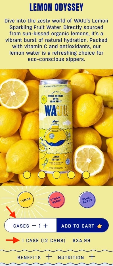
In the beverage industry, where products are often sold in multi-packs, confusion over whether a listed quantity refers to individual units or larger containers is a frequent issue. Waju addresses this directly and effectively on its product pages. The brand clearly designates that the quantity selector refers to "Cases," and immediately below, a concise line explains the exact number of cans within each case. This explicit clarification, coupled with the prominent visual distinction of the quantity field – a white background that draws the eye – ensures that shoppers cannot miss this vital information. By proactively stating the unit of sale and providing a direct conversion to individual units, Waju removes any ambiguity. This level of detail is crucial, especially for online purchases where customers cannot physically inspect the product before buying. The transparency builds trust and prevents potential disappointment or returns stemming from misinterpretation of quantities. This practice aligns with the broader trend in e-commerce towards radical transparency, where brands are expected to provide all necessary information upfront to facilitate informed purchasing decisions.
Beyond Ingredients: Blueland’s Outcome-Oriented Product Naming
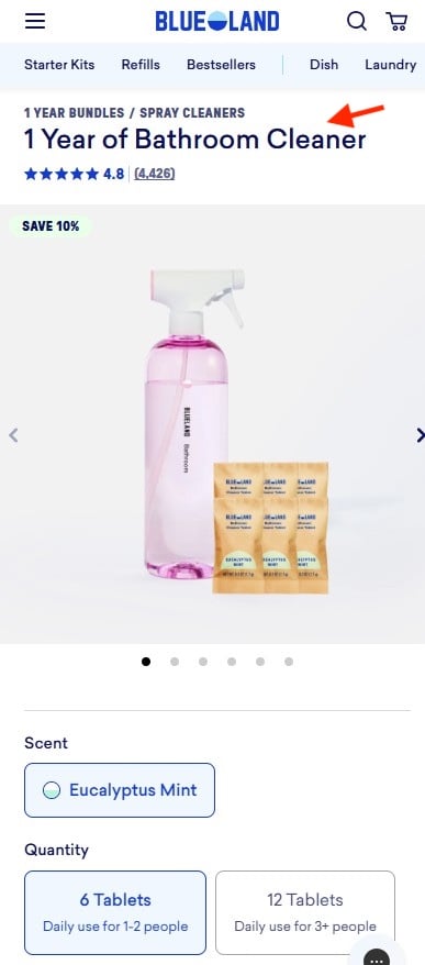
The direct-to-consumer cleaning product brand Blueland takes a sophisticated approach to product naming that prioritizes the end benefit over the literal contents. Their product, "1 Year of Bathroom Cleaner," transcends a simple description of refill tablets and a reusable bottle. Instead, it speaks directly to the long-term value and convenience the product offers. This naming convention is a masterclass in user-centric marketing. It answers the shopper’s implicit question: "How long will this last me, and what problem does it solve?" By focusing on the outcome – a year’s supply of cleaner – Blueland eliminates the need for customers to calculate how many tablets are needed for daily use or how many people are in their household. This approach is particularly effective for subscription-based models or products designed for sustained use. It shifts the consumer’s focus from a potentially complex calculation of usage rates to a clear understanding of the tangible benefits and long-term savings. This strategic naming convention not only simplifies the purchasing decision but also positions Blueland as a provider of solutions rather than just products.
Visualizing Consumption: The Farmer’s Dog’s Portion-Based Pricing
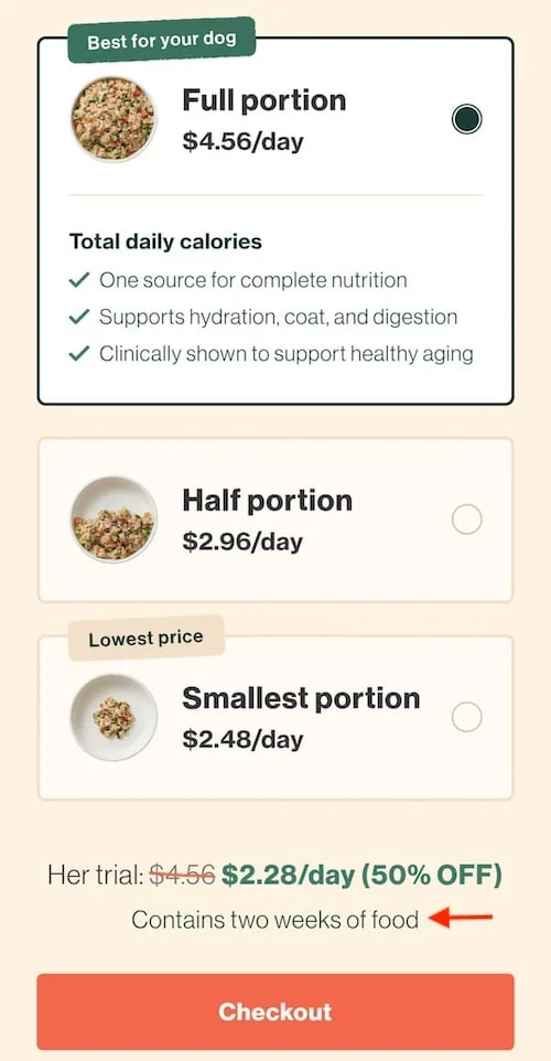
For perishable goods or products with variable consumption rates, like pet food, translating bulk quantities into manageable daily portions can be a significant challenge for consumers. The Farmer’s Dog tackles this head-on with a visually driven approach that simplifies portion selection and pricing. Their system presents three distinct bowl sizes, each illustrating a different portion of dog food. This visual representation allows pet owners to intuitively grasp the quantity of food their dog will receive. Crucially, The Farmer’s Dog prices its offerings "per day" rather than per box or weight. This aligns with how most pet owners budget and manage their pet’s diet. A clear statement below the options, such as "Contains two weeks of food," further clarifies the selection. This multi-faceted approach—visual illustration, per-day pricing, and a summary statement—eliminates the need for customers to perform complex conversions of grams, boxes, or daily feeding recommendations. It transforms a potentially confusing decision into a simple visual selection, mirroring the ease of portioning food for their pet in real-time. This strategy not only enhances user experience but also reinforces the brand’s commitment to providing a tailored and convenient solution for pet nutrition.
Broader Implications for E-commerce Success
The strategies employed by Gush, Waju, Blueland, and The Farmer’s Dog are not merely isolated design choices; they represent a fundamental shift in how e-commerce businesses approach customer engagement. By prioritizing clarity, intuition, and a deep understanding of user needs, these brands are building stronger relationships with their customers. This focus on reducing cognitive friction has several critical implications:
- Increased Conversion Rates: When shoppers can easily understand product offerings and pricing, they are more likely to proceed with a purchase. Studies by Nielsen Norman Group have consistently shown that websites with high usability experience significantly higher conversion rates.
- Reduced Cart Abandonment: Hesitation and confusion are primary drivers of cart abandonment. By preemptively addressing potential questions, businesses can significantly reduce the number of shoppers who leave before completing their transaction.
- Enhanced Customer Loyalty: A positive and frictionless online shopping experience fosters trust and satisfaction, encouraging repeat business and brand advocacy. Customers are more likely to return to sites where they feel understood and catered to.
- Lower Return Rates: Clear product descriptions and quantity information can prevent mispurchases, leading to a decrease in costly returns. This benefits both the business’s bottom line and the customer’s overall satisfaction.
- Competitive Advantage: In a crowded e-commerce landscape, a superior user experience can be a key differentiator. Brands that invest in intuitive design and clear communication are better positioned to capture and retain market share.
The insights from Steve Krug’s foundational work continue to resonate, and the examples provided demonstrate that by embracing a user-centric design philosophy, e-commerce businesses can transform their online stores from sources of potential frustration into engines of seamless commerce. The future of online retail success lies not just in the products offered, but in the clarity and ease with which customers can acquire them. As technology evolves and consumer expectations rise, the imperative to "not make them think" will only grow stronger, driving innovation in how brands present their offerings and guide their customers through the digital marketplace. The ongoing commitment to refining these subtle yet powerful elements of design will undoubtedly shape the trajectory of successful e-commerce ventures in the years to come.