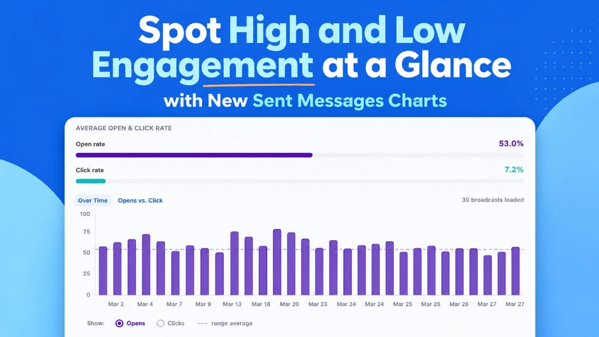
AWeber, a long-standing innovator in email marketing solutions, announced on August 6, 2026, the launch of a significant upgrade to its analytics dashboard, introducing powerful new visualization tools designed to transform how marketers understand and optimize their email campaigns. The new features, including "Opens and Clicks Over Time" and "Opens vs. Clicks" bubble charts, along with sophisticated filtering capabilities, aim to provide marketers with instant, actionable insights, moving beyond raw data to strategic intelligence.
This enhancement comes at a pivotal time when digital marketing, particularly email, continues to be a cornerstone of customer engagement and revenue generation. According to recent industry reports, email marketing consistently delivers one of the highest returns on investment, with estimates often ranging from $36 to $42 for every dollar spent. However, capitalizing on this potential requires more than just sending emails; it demands a deep understanding of audience engagement and campaign performance. AWeber’s latest offering directly addresses this need, promising to simplify complex data analysis for businesses of all sizes.
Revolutionizing Performance Tracking with Visual Timelines
Central to AWeber’s new analytics suite is the "Opens and Clicks Over Time" chart. This intuitive visual timeline plots up to 100 of a user’s most recent broadcast emails, offering an immediate overview of engagement trends. Marketers can easily toggle between views for open rates and click rates, enabling a direct comparison of performance across different sends. The chart is designed to make patterns and outliers "surface at a glance, no digging required," as highlighted by Sean Tinney, the author of the announcement.
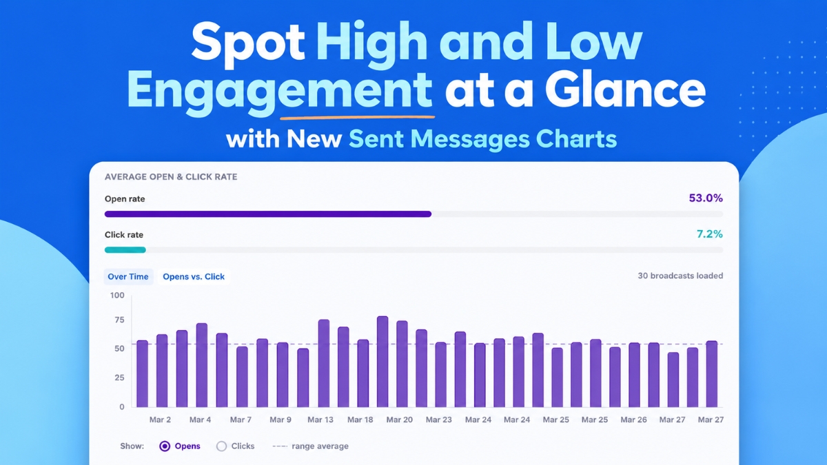
For instance, a consistent spike in open rates on a particular day of the week or for emails containing specific keywords in their subject lines can quickly become apparent. Similarly, a dip in click rates following a certain content theme can signal areas for adjustment. This historical perspective is invaluable for strategic planning, allowing marketers to identify optimal sending times, effective subject line formulas, and compelling call-to-action strategies. The chart automatically loads and populates as users scroll through their broadcast history, ensuring a seamless and comprehensive view of past performance.
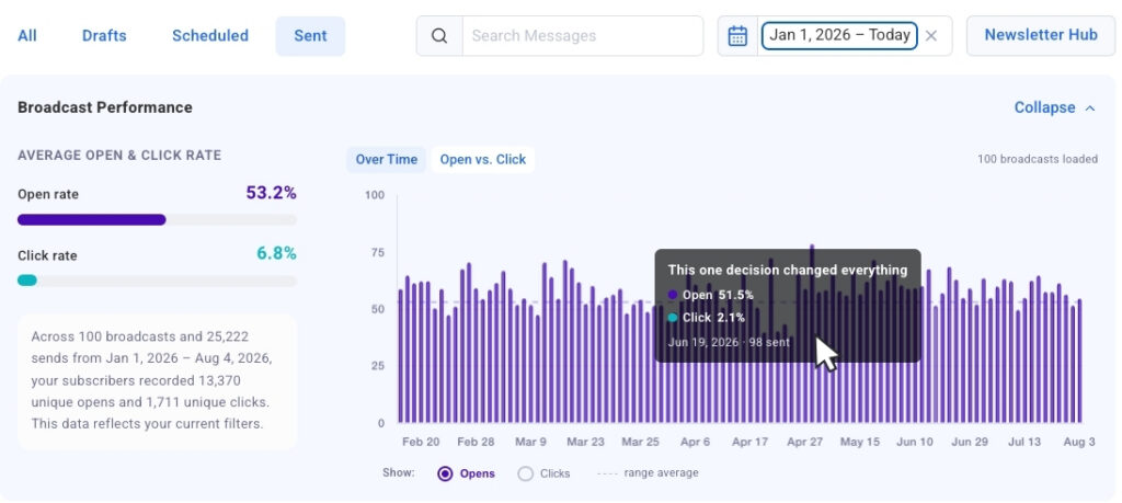
A crucial feature integrated into the "Opens and Clicks Over Time" chart is its interactive nature. Users can directly click on any bar within the chart, which acts as a "click-to-jump" link, instantly navigating them to the corresponding broadcast details in the table below. This functionality drastically reduces the time and effort required to investigate specific performance spikes or drops, enabling marketers to move from high-level observation to granular analysis in mere seconds. Such immediate access to context is vital for understanding the ‘why’ behind the data and facilitating rapid iteration and improvement of campaigns.
Comparative Analysis Through Dynamic Bubble Charts
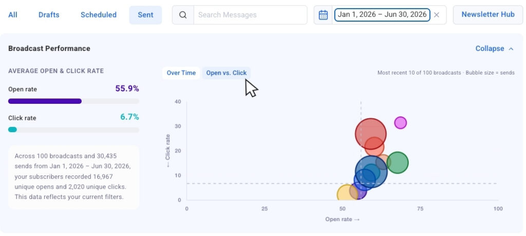
Complementing the temporal view, AWeber has introduced the "Opens vs. Clicks" bubble chart, offering a powerful tool for comparative analysis of recent sends. In this innovative visualization, each email broadcast is represented as a bubble, with its size dynamically adjusted to reflect the send volume or audience size. This crucial design choice allows marketers to compare campaign performance across different audience segments or list sizes without losing critical context.
The bubble chart excels at highlighting "outliers" swiftly. Users can instantly discern which broadcasts achieved strong open rates but struggled with click-throughs, indicating a captivating subject line but perhaps less engaging content or a weak call to action. Conversely, campaigns that drove both high opens and clicks clearly stand out as successful models to replicate. This side-by-side comparison is instrumental in identifying what resonates most effectively with subscribers, guiding future content creation and strategic adjustments. The ability to visually compare and contrast the success metrics of various campaigns empowers marketers to make data-driven decisions on what to repeat, what to refine, and what to discontinue.
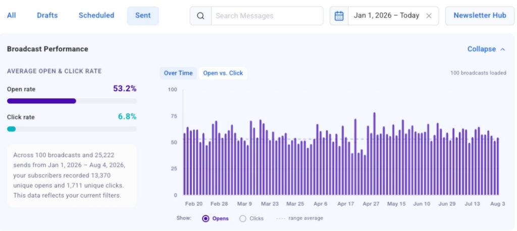
Recognizing the diverse preferences of its users, AWeber has also incorporated a collapsible chart view. This thoughtful design element allows marketers to hide the visual charts when their primary focus is on the raw numerical data presented in the accompanying table. The charts can be easily expanded again whenever the visual context is desired, offering flexibility and an uncluttered workspace tailored to individual analytical workflows. This feature underscores AWeber’s commitment to user experience, ensuring that powerful analytics are accessible and adaptable to various operational needs.
Precision Filtering for Targeted Insights
Beyond sophisticated visualizations, the new analytics suite boasts robust filtering capabilities designed to streamline the data analysis process. Marketers can leverage date presets to quickly pull data for the past 30 days, 90 days, or a full year with a single click. The charts instantly update to reflect only the sends within the selected timeframe, allowing for focused trend analysis over specific periods. This immediate responsiveness empowers users to track progress towards short-term goals or assess long-term performance shifts efficiently.
Further enhancing the analytical precision is the dynamic search filtering option. By typing keywords into the search bar, users can narrow down the chart and table data to include only broadcasts with those specific words in their subject lines. This capability is invaluable for A/B testing variations of subject lines, analyzing the performance of campaigns related to specific themes or promotions, or identifying the most effective messaging strategies. For example, a marketer can quickly compare all emails containing "webinar" in the subject line to understand audience receptivity to virtual events.
Looking ahead, AWeber has announced that segment name filtering will be "coming soon." This forthcoming feature will allow marketers to isolate chart and table data by specific audience segments, a critical capability given that engagement metrics naturally vary across different subscriber groups. The ability to analyze performance per segment will enable highly targeted optimization strategies, ensuring that communication is tailored and maximally effective for each audience cohort. This granular level of analysis is crucial for maximizing engagement and conversion rates in a world of increasingly personalized marketing.
The Broader Context: The Imperative of Email Analytics
The introduction of these advanced analytics tools by AWeber is not merely a product update; it reflects a broader industry trend towards more sophisticated, accessible, and actionable data insights in email marketing. For years, email marketing has been lauded for its effectiveness, but the challenge has always been translating vast amounts of data into tangible improvements. Traditional metrics like open rates and click-through rates, while foundational, often tell only part of the story. Marketers need to understand the context behind these numbers: why some emails perform better than others, what specific elements drive engagement, and how these factors evolve over time.
In today’s competitive digital landscape, where customers are bombarded with information, the ability to quickly discern what resonates and what falls flat is paramount. Businesses, especially small to medium-sized enterprises (SMBs) and solopreneurs, often lack the resources for dedicated data scientists. Therefore, intuitive, visually-driven analytics platforms like AWeber’s new offering democratize data science, putting powerful insights directly into the hands of marketers. This empowers them to iterate faster, optimize their strategies, and ultimately achieve better campaign outcomes without needing specialized analytical training.
The integration of these new charts with AWeber’s existing ecosystem, including the AWeber MCP app for AI platforms like ChatGPT and Claude.ai, signifies a strategic move towards a more interconnected and intelligent marketing toolkit. By combining generative AI capabilities for content creation with robust analytics for performance measurement, AWeber is positioning itself at the forefront of marketing innovation. This synergy allows marketers to not only generate compelling content but also to rigorously test and refine it based on real-world engagement data, creating a continuous feedback loop for improvement.
AWeber’s Commitment to Empowering Marketers
Sean Tinney, writing on behalf of AWeber, emphasized that these charts "extend the broadcast analytics available in the AWeber MCP app for ChatGPT and Claude.ai, bringing that same view directly into your Dashboard." This statement highlights AWeber’s overarching strategy: to provide comprehensive, integrated tools that support marketers through every stage of their campaign lifecycle, from ideation and creation to deployment and analysis.
Industry observers note that this commitment to user empowerment through accessible technology is a hallmark of AWeber’s approach. "Platforms like AWeber are crucial for leveling the playing field," remarked a prominent digital marketing analyst. "By offering sophisticated analytics in an intuitive format, they allow smaller businesses to compete effectively with larger enterprises that have vast data teams. The ability to quickly identify patterns and optimize campaigns without deep technical expertise is a game-changer for growth."
The implications of these updates are far-reaching. For businesses, it means a clearer path to understanding their audience, refining their messaging, and maximizing their return on investment from email marketing. For marketers, it means spending less time sifting through spreadsheets and more time crafting effective strategies based on tangible insights. This shift from reactive reporting to proactive, data-driven optimization is critical for sustained success in the digital age.
Looking Ahead: The Future of Email Optimization
The ongoing development of features like segment name filtering further illustrates AWeber’s dedication to providing increasingly granular and relevant insights. As email marketing continues to evolve, with greater emphasis on personalization and audience segmentation, the ability to analyze performance at a segment level will become indispensable. Understanding how different demographics, interests, or engagement levels respond to specific content or offers is key to hyper-targeted campaigns that drive exceptional results.
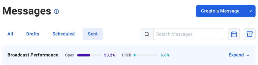
The new Sent Messages charts are live now in AWeber, marking a significant milestone in the platform’s evolution. They serve as a testament to AWeber’s continuous investment in tools that genuinely empower its users to not only track but actively improve their email marketing performance. By providing clear, visual, and actionable data, AWeber is helping marketers navigate the complexities of digital engagement with greater confidence and strategic foresight, ensuring that every email sent contributes meaningfully to their business objectives.