The landscape of digital storytelling has undergone a significant transformation with the integration of dynamic data visualization tools, shifting the focus from static reporting to immersive, interactive experiences. As data volume increases across all industries, the ability to translate complex datasets into digestible, visual narratives has become a prerequisite for effective communication. A primary example of this evolution is the recent update to Google Data Studio—now integrated into the Looker Studio ecosystem—which allows users to embed live reports directly into third-party websites and online environments. This feature addresses a long-standing challenge for data analysts and journalists: the "click-away" problem, where readers are forced to leave an article to interact with data on an external platform. By enabling seamless embedding, creators can ensure that their audience remains engaged within the context of the story, facilitating a more immediate and effective transfer of insights.
The Technical Framework of Report Embedding
The transition from static screenshots to interactive iframes represents a milestone in web-based data reporting. Previously, authors were often restricted to including non-interactive images of their charts, which lacked the depth and granularity required for a comprehensive understanding of the subject matter. With the introduction of embedding capabilities, Google Data Studio empowers users to present live data that updates in real-time or allows for user-driven filtering.
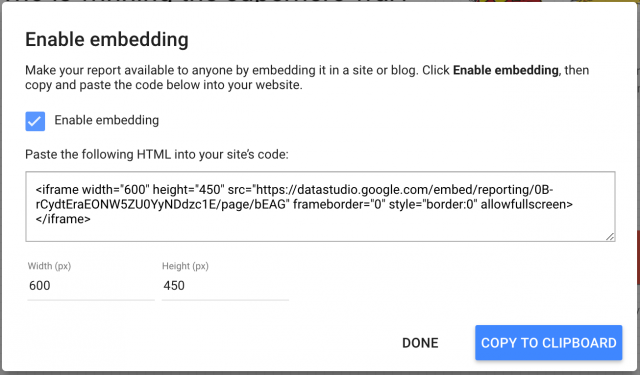
To implement this feature, users must first navigate to the sharing settings of their specific report. The process involves a simple toggle within the Data Studio interface to "Enable embedding," which then generates an HTML snippet or a URL for use in various Content Management Systems (CMS). A critical component of this process is the management of permissions. For a report to be visible to a general audience, the sharing settings must be updated to "Public" or "Anyone with the link can view." Failure to synchronize these settings results in a broken experience where readers are met with a login prompt rather than the intended data.
Furthermore, the technical implementation requires a strategic approach to dimensions. In a modern web environment characterized by a multitude of device categories—from high-resolution desktops to mobile smartphones—responsiveness is paramount. Analysts are encouraged to identify the specific width of their website’s content area. For instance, a standard blog layout often utilizes a content width of approximately 640 to 800 pixels. By setting the Data Studio "Display mode" to "Fit to width" within the page settings, the embedded iframe can dynamically adjust to the user’s screen size, maintaining legibility and aesthetic integrity across platforms.
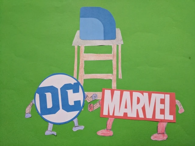
Case Study: The Quantitative Rivalry of Marvel and DC Studios
To demonstrate the efficacy of these tools, a comprehensive analysis of the "Marvel vs. DC" cinematic war serves as a prime case study. This rivalry, which has dominated the global box office for over a decade, provides a rich dataset encompassing box office receipts, critical reception scores, and production budgets. Since the initial visualization of this data a year ago, the landscape has shifted with the release of five significant films: Marvel’s Guardians of the Galaxy Vol. 2, Spider-Man: Homecoming, and Thor: Ragnarok, alongside DC’s Wonder Woman and Justice League.
The data reveals a widening gap in the performance of the two franchises. As of late 2017, the Marvel Cinematic Universe (MCU) had consistently outperformed the DC Extended Universe (DCEU) in both financial returns and critical acclaim. Marvel’s strategy of building a cohesive, multi-phased narrative has resulted in a higher average "Fresh" rating on review aggregators like Rotten Tomatoes, whereas DC’s entries have historically seen more polarized reactions. However, the inclusion of Wonder Woman in the updated dataset provided a significant boost to DC’s metrics, proving that individual successes can challenge the overarching dominance of a rival studio.
By embedding these findings into a live report, readers can hover over specific data points to see the exact box office gross of Thor: Ragnarok or compare the production budget of Justice League against its total return. This level of interactivity transforms a standard news piece into a research tool, allowing fans and industry analysts to draw their own conclusions from the raw numbers provided by the author.
Chronology of Data Visualization Tools in Digital Media
The journey toward interactive embedding has been marked by several key developmental milestones in the technology sector:
- 2016: The Launch of Google Data Studio. Google introduced Data Studio as part of the Google Analytics 360 Suite, providing a cloud-based solution for data visualization and dashboarding.
- Early 2017: Expansion of Connectors. The platform expanded its ability to pull data from diverse sources, including BigQuery, SQL databases, and Google Sheets, making it a versatile tool for non-technical users.
- September 2017: The Introduction of Embedding. The pivotal update allowed reports to be placed directly into websites via iframes. This moved Data Studio from a private reporting tool to a public-facing publishing platform.
- 2020-2022: Integration with Looker. Google’s acquisition of Looker led to the rebranding of Data Studio as Looker Studio, integrating more robust enterprise-level data modeling features while maintaining the user-friendly embedding interface.
This timeline illustrates a clear trajectory toward the "democratization of data," where the tools once reserved for high-level data scientists are now accessible to bloggers, journalists, and small business owners.
Strategic Strategies for Data Storytelling
While the ability to embed a full report is a powerful feature, it often presents a challenge in terms of user experience (UX). A massive, multi-page dashboard can be overwhelming for a reader who is looking for a specific insight. To combat "data fatigue," professional analysts recommend breaking down visualizations into digestible, "bite-sized" chunks.
Instead of embedding a ten-page report, a storyteller might choose to embed a single, focused chart that corresponds to a specific paragraph of text. Currently, while Data Studio does not allow for the embedding of a single chart in isolation from its parent page, authors can circumvent this by creating separate, single-page reports for each key insight. This "modular" approach to data storytelling ensures that the visualization supports the narrative rather than distracting from it.
For example, in the Marvel vs. DC analysis, an author might first embed a bar chart showing total box office revenue to establish the scale of the industry. This could be followed by a scatter plot correlating budget versus profit, and finally, a line graph showing the trend of critical scores over time. By intertwining text with targeted visuals, the author guides the reader through a logical progression of facts, leading to a more persuasive and informative conclusion.
Broader Implications for the Media Industry
The implications of interactive data embedding extend far beyond the realm of comic book movies. In the field of investigative journalism, the ability to present public records, financial disclosures, and census data in an interactive format enhances transparency and trust. Readers are no longer required to take a journalist’s word for it; they can explore the underlying data themselves.
In the corporate sector, this technology streamlines internal reporting. Marketing teams can embed live performance dashboards directly into their internal wikis or project management tools, ensuring that all stakeholders have access to the most current data without needing to navigate complex external software.
Moreover, the rise of "embedded insights" has forced a shift in web design priorities. As more interactive elements are added to web pages, developers must prioritize fast loading times and efficient script execution. The use of iframes, while convenient, requires careful management to ensure that they do not degrade the performance of the host site.
Conclusion: The Future of Data-Driven Narrative
The update to Google Data Studio’s embedding features represents more than just a technical convenience; it is a fundamental shift in how we consume information. By bridging the gap between data analysis and storytelling, these tools allow for a more nuanced and engaging discourse. As demonstrated by the Marvel vs. DC case study, the most effective stories are those that are backed by hard data but presented in a way that is accessible and interactive.
As we move forward, the expectation for transparency and interactivity in digital media will only grow. Journalists and analysts who embrace these tools will be better equipped to capture the attention of an increasingly data-literate audience. Whether the subject is the box office performance of a superhero franchise or the complexities of global economics, the goal remains the same: to allow readers to interact with the story quickly, effectively, and with the full weight of the data behind it. The era of the static report is concluding, making way for a new standard of dynamic, data-driven journalism.