In the dynamic landscape of digital marketing, the email signup form stands as the singular, pivotal interface between a curious website visitor and a burgeoning email list. Its strategic design, compelling copy, and precise placement are not mere aesthetic considerations but critical determinants that can dramatically sway a visitor’s decision to subscribe, ultimately impacting a brand’s ability to foster direct customer relationships and drive conversions. As businesses increasingly rely on personalized communication, the efficacy of these forms has become paramount, demanding a nuanced understanding of user psychology, technological advancements, and evolving best practices.
The Gateway to Engagement: Understanding Email Signup Forms
Email marketing continues to be a cornerstone of digital strategy, boasting an impressive return on investment (ROI) that often surpasses other channels. For instance, recent industry reports suggest that email marketing can yield an average ROI of $42 for every $1 spent, underscoring the intrinsic value of a robust subscriber list. The signup form is the initial touchpoint in this valuable journey, a digital handshake that invites potential customers into a brand’s ecosystem. Its primary function is to capture essential contact information, typically an email address, but its true power lies in its ability to articulate value and build immediate trust. A poorly conceived form can deter interested parties, resulting in missed opportunities and a stagnant growth trajectory. Conversely, a meticulously crafted form can significantly expand a brand’s reach, cultivating a loyal audience eager for direct communication and exclusive content. The journey from casual visitor to engaged subscriber is often initiated and solidified by the effectiveness of this crucial digital gateway.

Diverse Approaches: Types of Signup Forms and Their Strategic Placement
The digital marketing toolkit offers a variety of signup form types, each designed to serve distinct strategic purposes and capture visitor attention at optimal moments. The selection of the appropriate form type hinges on factors such as website context, anticipated user behavior patterns, and the specific conversion goals of a marketing campaign.
-
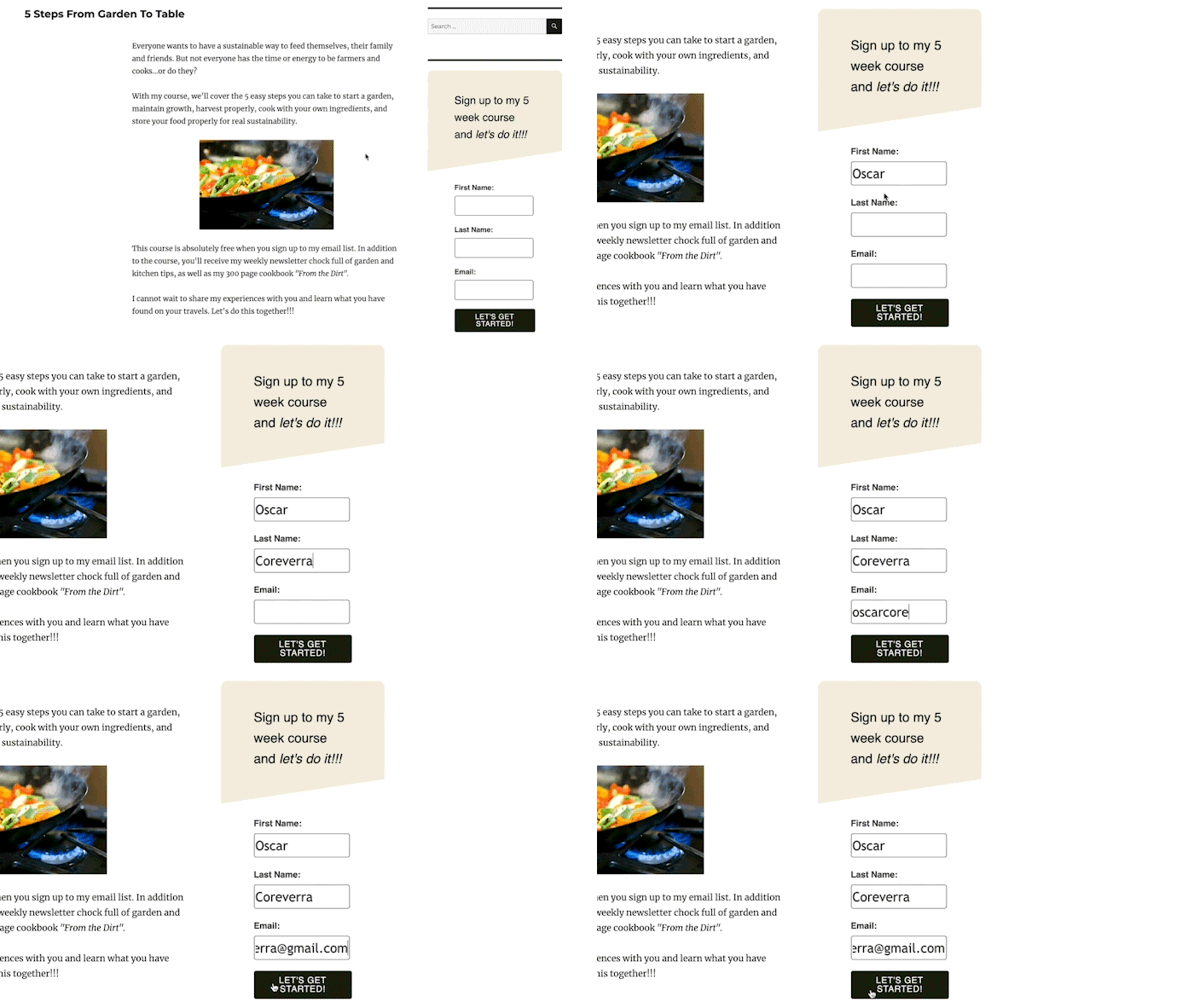
Inline Forms: These forms are seamlessly integrated within the natural flow of a webpage’s content. They can be strategically positioned at the top of an article, nestled within a sidebar, embedded at the conclusion of a blog post, or anywhere else content naturally resides. Their non-intrusive nature makes them ideal for visitors who are already engaged with the content, offering a subtle invitation to deepen their connection with the brand. Inline forms are particularly effective when placed on high-value content pages, where visitors are likely seeking more information or resources. For broader appeal, a general incentive such as a 10% discount or a "latest tips" newsletter can be placed in a footer or sidebar inline form, ensuring a consistent subscription opportunity across the entire site. Tools like the AWeber for WordPress plugin facilitate easy integration and performance tracking, allowing marketers to fine-tune their placement for maximum impact.
-
Pop-up Forms: Unlike their embedded counterparts, pop-up forms dynamically appear or "slide in" during a visitor’s interaction with a website. These attention-grabbing elements can emerge from the sides, top, or bottom of a page, sometimes blurring the background content to emphasize their presence. While highly effective at increasing subscriber signups due to their prominence, pop-up forms require careful management to avoid disrupting the user experience. Modern platforms offer extensive display settings, allowing marketers to tailor their appearance to be less intrusive, such as delaying their appearance or restricting their frequency. Industry data indicates that pop-ups can achieve conversion rates ranging from 3% to 9%, significantly higher than many inline forms, provided they are implemented judiciously and align with user expectations.
Pop-up forms come in several strategic variations:
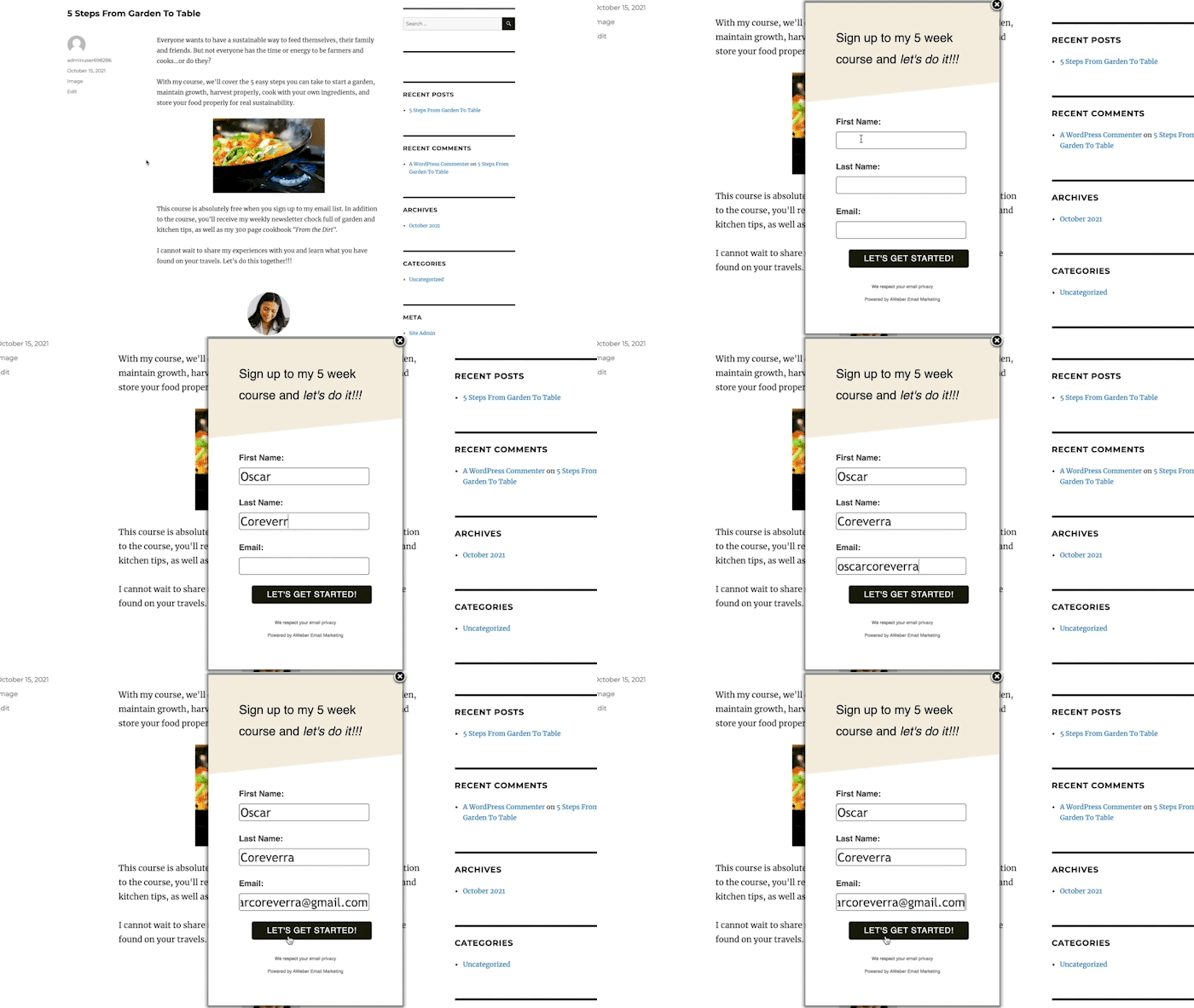
- Time-Delayed Pop-ups: These forms activate after a predetermined duration, allowing visitors to engage with the initial content before the subscription offer is presented. Optimal delay times are often informed by web analytics, aligning with the average time users spend on a page to ensure the offer appears when engagement is high. Marketers can also control their frequency, preventing visitor fatigue by displaying them only once per visit or after a set number of days.
- Scroll-Delayed Pop-ups: Triggered when a visitor scrolls to a specific point on a page, these forms capitalize on demonstrated content engagement. Their appearance signifies that the user has found value in the content, making them more receptive to a subscription offer.
- Exit-Intent Pop-ups: Perhaps one of the most powerful pop-up variations, exit-intent forms activate when a visitor’s mouse movement suggests an imminent departure from the site. This "last-chance" strategy is highly effective for converting otherwise lost opportunities, presenting an enticing offer—such as an exclusive discount or a valuable resource—to encourage subscription before the visitor leaves. Studies show exit-intent pop-ups can recover 10-15% of abandoning visitors.
- Two-Step Pop-ups: These forms appear only after a visitor actively clicks on a link or button, signifying a clear intent to learn more or receive an offer. This voluntary engagement typically results in exceptionally high conversion rates, as the visitor has already taken a proactive step towards subscription. This pre-qualification often leads to a more engaged and higher-quality lead.
-
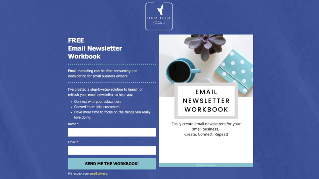
Landing Page Forms: Distinct from traditional website pages, a landing page is a standalone web page meticulously designed with a singular objective: to capture subscriber signups or leads. Devoid of navigation bars, menus, or extraneous links, landing pages eliminate distractions, presenting visitors with a clear binary choice: subscribe or exit. This focused approach is highly effective because it directs the visitor’s attention solely to the value proposition. Marketers leverage rich media, including compelling images, explanatory videos, and persuasive text, to underscore the benefits of subscribing, often leading to significantly higher conversion rates compared to forms embedded on multi-purpose web pages.
Crafting Compelling Narratives: The Art of Signup Form Copy
Beyond its placement and type, the textual content of a signup form is paramount to its success. Persuasive copy serves to articulate value, manage expectations, and forge an immediate connection with the potential subscriber.
-
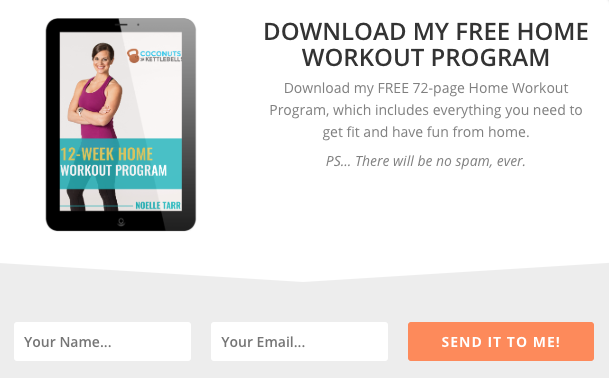
Clear, Concise Headline: The headline is the first impression. It must instantly convey what the subscriber will gain and how it will benefit them, leaving no room for ambiguity. For example, a headline like "Unlock Your Free Home Workout Program" immediately communicates the offer and its utility. Supporting descriptive text can further elaborate, such as mentioning the program’s length or specific benefits, as seen with "Coconuts & Kettlebells" offering a 72-page program.
-
Clearly Communicate Value: Following the headline, the body copy must expand on the tangible value provided. It should articulate how the offer addresses a pain point, solves a problem, or answers a critical question for the subscriber. Whether through a succinct sentence or a bulleted list, demonstrating the post-subscription transformation is key. "Stepmom Magazine," for instance, effectively uses bullet points to detail the specific content subscribers will receive, reinforcing the value proposition. Marketing strategists often refer to this as the "What’s In It For Me?" (WIIFM) principle, emphasizing benefits over features.
-
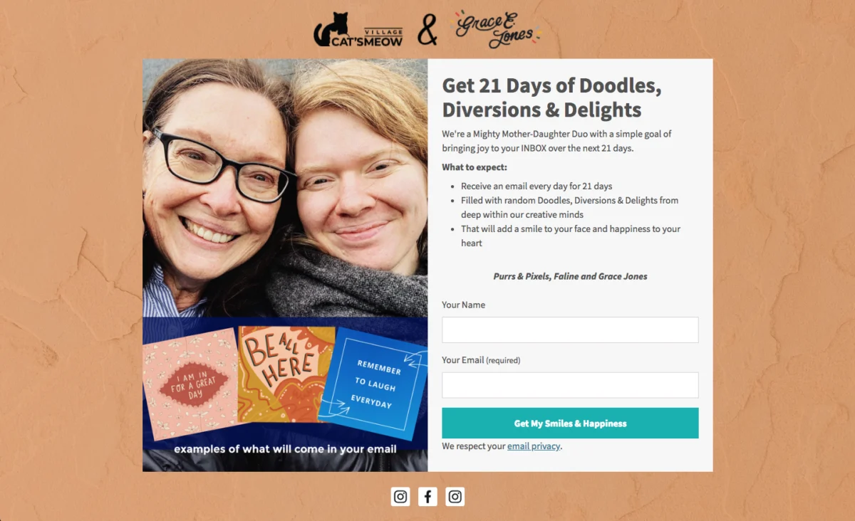
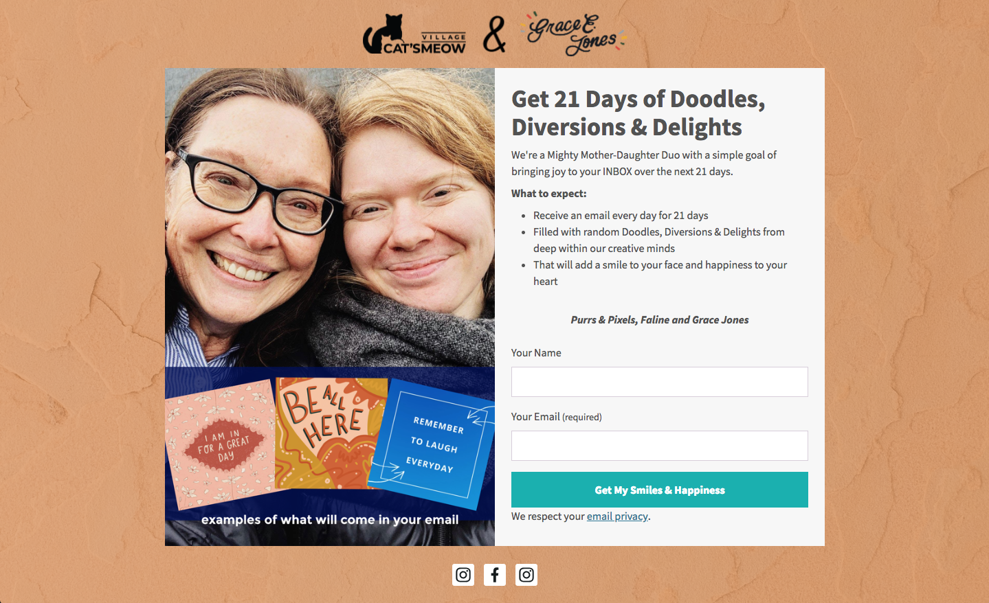
Set Clear Expectations: Transparency builds trust and mitigates future issues like spam complaints or unsubscribes. The form should clearly outline what subscribers will receive, the frequency of communication, and the nature of the content. This practice not only ensures a positive subscriber experience but also contributes to regulatory compliance, such as GDPR, which mandates clear consent and information regarding data usage. "Cat’s Meow Village" exemplifies this by explicitly stating subscribers will receive "fun, light-hearted emails every day for 21 days."
-
Write Conversational Copy: Breaking from formal language, conversational copy can instantly capture attention and foster a sense of personal connection. Phrases like "Oh hey!" or "Hey you!" can disarm visitors and pique their curiosity, making them more receptive to the subsequent value proposition. "Really Good Emails" leverages this approach, creating an immediate, personal rapport with its audience, which can significantly lower barriers to subscription.

-
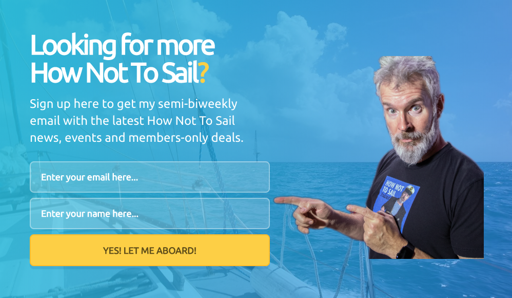
Be Creative, Witty, or Humorous: Infusing creativity or humor into the copy can humanize a brand, making it more relatable and trustworthy. This distinctive voice can set a brand apart and resonate deeply with its target audience. "How Not to Sail" exemplifies this by using sailing-themed terminology for its call-to-action (CTA) button, transforming a generic "Sign Up" into an immersive brand experience. This playful approach encourages visitors to "climb aboard" and "sail away" with the brand.
Visualizing Conversion: Essential Design Principles for Signup Forms
Design is not merely decorative; it’s a powerful psychological tool that shapes perception and influences behavior. Studies on visual perception indicate that up to 90% of a user’s first impression is based on visual and color cues, making thoughtful design integral to a form’s success.
-
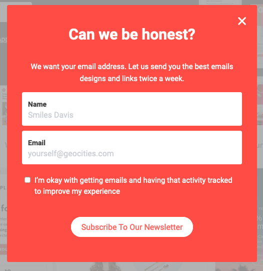
Keep Form Fields to a Minimum: Every additional field in a signup form introduces friction, potentially deterring completion. Simplicity often correlates with higher conversion rates. For basic subscriber acquisition, requesting only a name and email address is generally sufficient. If the objective is lead qualification, more fields might be necessary, but marketers should always weigh the value of additional data against potential subscriber drop-off. Complex data collection can be deferred to post-signup surveys or multi-step forms, as demonstrated by "Ann Handley" using just two fields for a quick subscription process. Research consistently shows that reducing the number of form fields can increase conversion rates by as much as 120%.
-
Use a Clear Call to Action (CTA): The CTA button is the final prompt for conversion. Generic text like "Sign Up" is a missed opportunity. Instead, the CTA should explicitly remind visitors of the value they are about to receive, using action-oriented, benefit-driven language. Examples include "Send me my free guide!" or "Yes, I want in!" Incorporating urgency ("Join now!") or possessive language ("Download my free templates") can significantly boost click-through rates, making the offer feel more personal and immediate, as seen with "Paul Kirtley’s" use of possessive language.
-
Follow a Hierarchy for Font Sizes and Types: A well-defined typographic hierarchy guides the reader’s eye, emphasizing key information. Headlines should be the largest, followed by subheads, and then descriptive text. Limiting font types to one or two maintains visual coherence, with a distinct font for the headline to grab attention. "FroKnowsPhoto" effectively uses varying font sizes and styles (bold, italicized, all caps) to create visual interest and clear hierarchy, facilitating quick information processing.
-
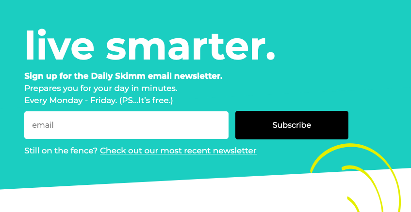
Stick to 1-2 Font Colors: Overuse of colors can lead to visual clutter and hinder readability. A restrained palette, often one or two primary font colors that align with brand guidelines, ensures clarity and professionalism. "The Daily Skimm" demonstrates how a single, well-chosen font color (white) can be highly effective in a clean design, allowing the message to be absorbed without distraction.
-
Create Color Contrast: Strategic use of contrasting colors helps a signup form stand out from the surrounding webpage, drawing immediate attention. A bright, brand-aligned color against a neutral background can significantly increase form visibility and completion rates. "Teach Me To Talk" utilizes a vibrant color scheme that immediately attracts the eye while clearly articulating its incentive, leveraging the psychology of color to influence user action.
-
Visually Represent Your Incentive: A compelling visual can be the decisive factor in a visitor’s decision to subscribe. Forms featuring relevant images or graphics tend to receive significantly more views and higher engagement than those without. The visual acts as a tangible representation of the value being offered, making the incentive more concrete and appealing. "Spoon Graphics" effectively uses a fun, illustrative graphic to represent its incentive, making the offer more appealing.

-
Let Subscribers Choose Their Preferences: Empowering subscribers to tailor their content preferences enhances engagement and satisfaction. When users can customize the type and frequency of emails they receive, they perceive greater value and are more likely to remain subscribed. This personalization reduces the likelihood of unsubscribes and spam complaints, fostering a healthier email list. "The Intrepid Guide’s" form allows subscribers to select topic preferences, creating a more personalized email experience, a strategy increasingly favored by modern consumers.
-
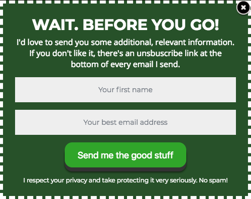
Try Presenting an Unfavorable Alternative: This psychological tactic, typically employed with dismissible forms like pop-ups, subtly nudges visitors towards subscription by framing the alternative as undesirable. By highlighting the negative consequences of not subscribing, it makes the subscription offer the more logical and attractive choice. "Boast" masterfully uses this by offering a discount for signing up, with the alternative being "No thanks, I prefer paying full price"—a choice few would willingly make, demonstrating a clever application of loss aversion.
-
Use Social Proof: The principle of social proof dictates that individuals are more likely to take an action if they see others doing it. Displaying subscriber numbers or testimonials instills confidence and validates the value of the offering, reassuring potential subscribers that they are making a popular and worthwhile decision. "Nerd Fitness" effectively leverages this by proudly announcing "over 300,000 people are subscribed," instantly building trust and implying significant value.
-
Use a Big CTA Button: With over half of all website traffic originating from mobile devices, optimizing for touch-screen interaction is crucial. A large, easily tappable CTA button enhances user experience on mobile, reducing frustration and increasing conversion rates. "Mark Asquith’s" form features a prominent, bold "Download Now" button, ensuring effortless interaction across all devices and aligning with contemporary UX principles.

-
Use Plenty of White Space: Ample white space around text, images, and form fields improves readability and lends a professional, clean aesthetic. This visual breathing room reduces cognitive load, making the form less intimidating and more inviting, thereby increasing trust and completion rates. "1 Chic Retreat" demonstrates effective use of white space, allowing its copy to stand out clearly and project an image of professionalism.
The Dawn of Automation: AI in Form Creation
Recognizing the complexity and numerous design decisions involved in crafting high-converting signup forms, platforms like AWeber have introduced AI-powered form builders. This innovation streamlines the creation process, democratizing sophisticated design and optimization for businesses of all sizes.
The AWeber AI signup form builder exemplifies this trend. By simply describing a business in a single sentence, the AI can generate a comprehensive signup form, complete with brand-aligned colors, a compelling headline, descriptive copy, appropriate input fields, and a professionally designed layout. A bakery seeking emails for a weekly recipe newsletter will receive a distinct form from a fitness coach promoting a free workout plan, demonstrating the AI’s contextual understanding and ability to tailor solutions. While AI provides a robust working draft, every element remains fully editable, allowing marketers to fine-tune copy, adjust colors, add or remove fields, and personalize the button text, ensuring the final product perfectly aligns with their brand identity and objectives. Crucially, these AI-generated forms seamlessly integrate with email lists and automation workflows, enabling new subscribers to