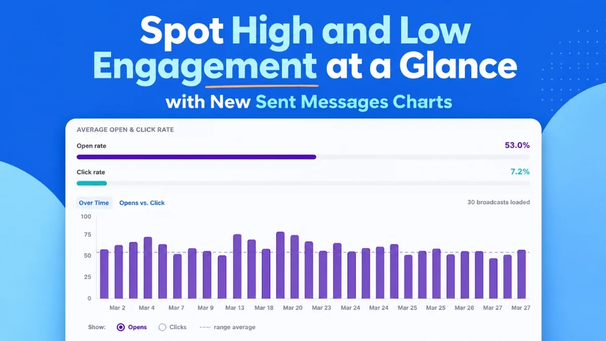
Email marketing powerhouse AWeber announced on August 6, 2026, the launch of a significantly enhanced analytics dashboard, providing marketers with unprecedented clarity into their email campaign performance. This comprehensive update integrates sophisticated visualization tools, including at-a-glance charts for open rates, click rates, and direct email comparisons, designed to empower users to quickly identify successful strategies and optimize future outreach. The new features aim to transform raw data into actionable insights, enabling businesses to send more of what resonates with their audience and refine their messaging with precision.
The Enduring Power and Evolving Landscape of Email Marketing
In an increasingly fragmented digital landscape, email marketing continues to assert its dominance as a critical channel for communication, customer retention, and revenue generation. Reports consistently highlight email’s exceptional return on investment (ROI), often cited as high as $36 for every $1 spent, underscoring its indispensable role in modern marketing strategies. However, capitalizing on this potential requires more than just sending emails; it demands a deep understanding of audience engagement, content effectiveness, and optimal timing.
Historically, marketers have grappled with the challenge of sifting through vast quantities of data to extract meaningful conclusions. Basic metrics like open and click rates have long been available, but the ability to contextualize these numbers, spot trends over time, and compare performance across diverse campaigns has often necessitated manual analysis or reliance on complex, expensive enterprise-level tools. This gap has created a significant hurdle for small to medium-sized businesses (SMBs) and individual content creators, who form a substantial portion of AWeber’s user base, in optimizing their email strategies effectively.
AWeber, with its decades-long legacy in providing accessible email marketing solutions, has consistently focused on democratizing sophisticated tools for a broad audience. This latest analytics overhaul reflects a strategic response to the evolving needs of marketers, moving beyond mere data presentation to offer intuitive, visual storytelling of campaign performance. The company’s commitment to empowering users with actionable intelligence is evident in the design and functionality of these new features.
Unveiling Key Features for Enhanced Performance Insight
The cornerstone of AWeber’s new dashboard lies in its innovative data visualization capabilities, meticulously crafted to bring critical performance metrics to the forefront without requiring extensive data analysis expertise.
1. See Engagement Trends Over Time with "Opens and Clicks Over Time"
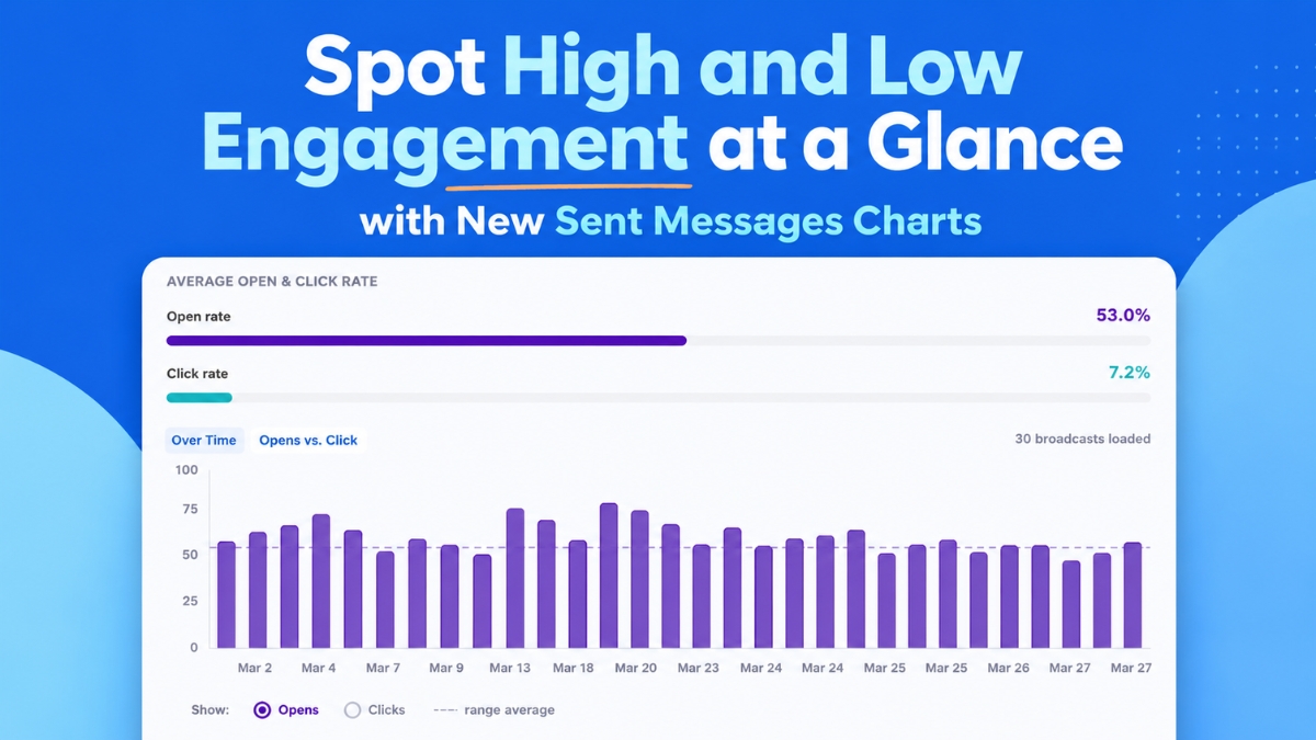
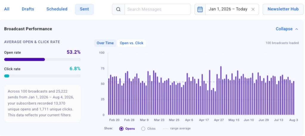
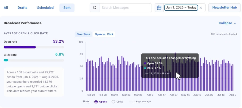
The "Opens and Clicks Over Time" chart is a powerful new addition, plotting up to 100 of a user’s most recent broadcasts on a visual timeline. This bar chart offers a dynamic representation of engagement, allowing marketers to toggle between open rates and click rates to compare performance at a glance. The immediate visualization of trends helps users identify patterns such as specific subject lines that consistently drive higher engagement, particular days of the week that yield superior results, or even shifts in audience responsiveness over time.
For instance, a marketer might observe a recurring spike in open rates for emails sent on Tuesdays, or a consistent dip in clicks for broadcasts featuring a certain type of content. These insights are invaluable for refining content calendars, optimizing send schedules, and iterating on subject line strategies. The chart’s interactive design further enhances usability, with "click-to-jump" links that instantly navigate from a specific bar on the chart to the corresponding broadcast in the detailed table below. This seamless transition from macro trend identification to micro-level message analysis drastically reduces the time and effort required to pinpoint the exact messages driving success or requiring adjustment. The chart loads automatically, continuously populating with more broadcast data as the user scrolls, ensuring an always-up-to-date overview of campaign performance.
2. Identifying Strengths and Weaknesses with the "Opens vs. Clicks Bubble Chart"
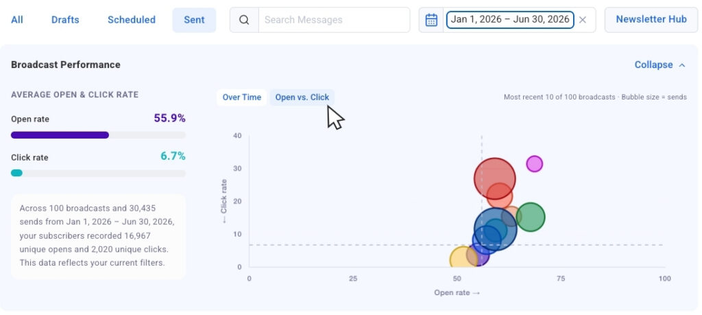
Complementing the timeline view, the "Opens vs. Clicks bubble chart" offers a unique comparative perspective. This chart plots recent sends as individual bubbles, where the position on the x-axis represents open rate and the y-axis represents click rate. Crucially, the size of each bubble is scaled according to the send volume, providing essential context that allows marketers to compare results across broadcasts sent to different audience sizes without losing perspective.
This visualization is particularly adept at surfacing outliers. Marketers can quickly identify broadcasts that achieved high open rates but struggled with clicks, indicating a compelling subject line but perhaps a less engaging call to action or content within the email. Conversely, emails with strong performance in both opens and clicks stand out as successful templates to replicate. The ability to distinguish between these scenarios is critical for targeted optimization – understanding whether to focus on improving initial engagement (via subject lines and preview text) or deeper engagement (via content and CTAs). This side-by-side comparison eliminates guesswork, offering clear guidance on what campaign elements to repeat and what to adjust for future sends.
Empowering Precision with Advanced Filtering Capabilities
Beyond insightful visualizations, AWeber has integrated robust filtering options to give marketers granular control over the data they analyze. These capabilities are designed to help users focus on specific periods or campaign types, making the analytics even more actionable.
1. Intuitive Date Presets: The dashboard now includes convenient date presets, allowing users to instantly pull data from the past 30 days, 90 days, or a full year with a single click. This feature immediately updates the charts and tables to reflect only the sends within the selected timeframe, simplifying historical analysis and trend identification over defined periods.
2. Dynamic Search Filtering: A powerful dynamic search bar allows users to narrow down the displayed data by typing in keywords. The chart and table will then filter to show only broadcasts containing that word in the subject line. This is invaluable for marketers running segmented campaigns or A/B tests based on subject line variations, enabling them to compare the performance of specific themes or approaches directly. For example, a marketer can quickly compare all campaigns related to "product launch" or "webinar invitation" to assess which messaging strategies were most effective.
3. Upcoming Segment Name Filtering: AWeber has also announced that segment name filtering is "coming soon." This highly anticipated feature will allow users to isolate chart and table data by specific audience segments. Recognizing that engagement naturally varies by audience group, this capability will enable marketers to conduct highly targeted analysis, understanding how different demographic or behavioral segments respond to various campaigns. This will be a significant step forward in optimizing personalized marketing efforts and allocating resources more effectively based on segment-specific performance.
Synergy with AI: Extending the AWeber Ecosystem
These new analytics charts are not isolated additions but represent an extension of AWeber’s broader strategy towards integrating intelligent, data-driven tools into its platform. The company highlighted that these features complement and extend the broadcast analytics already available in the AWeber MCP app for ChatGPT and Claude.ai. This integration signifies a holistic approach to email marketing, where AI-powered insights work in tandem with intuitive visual analytics to provide a comprehensive understanding of campaign performance.
By linking advanced analytics with AI capabilities, AWeber is positioning itself at the forefront of marketing technology. Users can leverage AI to generate creative content ideas or optimize subject lines, and then use the new dashboard to rigorously track the performance of these AI-generated elements, creating a feedback loop for continuous improvement. Furthermore, AWeber continues to support its users with educational resources, referencing existing guides such as "how to track and improve your email marketing performance" and "how to improve your email open rates," ensuring that users not only have the tools but also the knowledge to succeed.
Expert Commentary and Broader Implications
The launch of AWeber’s enhanced analytics dashboard underscores a significant trend in the MarTech industry: the shift from mere data collection to actionable, accessible insights. Industry analysts suggest that such innovations are crucial for businesses striving to maintain a competitive edge in a data-saturated environment.
"In today’s fast-paced digital economy, marketers need tools that cut through the noise and deliver clear, actionable intelligence," stated a hypothetical industry analyst, commenting on the general trajectory of marketing platforms. "AWeber’s new dashboard, with its intuitive visualizations and robust filtering, represents a strong move towards empowering everyday marketers with sophisticated analytical capabilities that were once reserved for large enterprises."
From AWeber’s perspective, this update reinforces its commitment to user success. "We are dedicated to providing our users with the clearest possible insights into their email marketing efforts," stated a hypothetical AWeber product manager. "These new charts and filtering options are designed to remove the guesswork, allowing marketers to quickly identify what works, understand why, and replicate that success. Our goal is to make sophisticated analytics accessible and actionable for everyone, from small business owners to seasoned marketing professionals."
The Broader Impact for Marketers and Businesses
The implications of AWeber’s new analytics suite are far-reaching, particularly for the vast ecosystem of small businesses, entrepreneurs, and content creators who rely on email marketing.
1. Democratization of Advanced Analytics: These tools effectively democratize advanced analytical capabilities, making sophisticated performance tracking and optimization accessible to marketers without extensive data science backgrounds or large budgets for premium tools. This levels the playing field, allowing smaller entities to compete more effectively by adopting data-driven strategies.
2. Enhanced Decision-Making and ROI: By providing clear visualizations of engagement trends and comparative performance, the dashboard enables marketers to make more informed decisions about content, timing, and segmentation. This iterative optimization process is expected to lead to higher open rates, increased click-through rates, and ultimately, a stronger return on investment from email campaigns.
3. Time and Resource Efficiency: The "at-a-glance" nature of the charts and the intuitive filtering options significantly reduce the time marketers spend on manual data aggregation and analysis. This efficiency allows them to allocate more resources to creative content development and strategic planning, rather than administrative data processing.
4. Fostering a Culture of Experimentation: With immediate feedback on campaign performance, marketers are encouraged to experiment with different subject lines, calls to action, and content formats. The ability to quickly identify successful variations and discard underperforming ones fosters a continuous cycle of testing and refinement, leading to more resilient and effective email strategies.
Conclusion
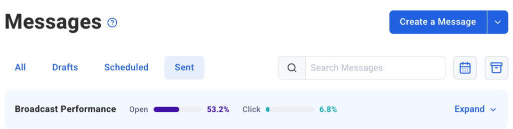
AWeber’s launch of its advanced email analytics dashboard marks a significant milestone in its journey to empower marketers worldwide. By offering intuitive visual trends, side-by-side performance comparisons, and powerful filtering capabilities, the company is providing users with the critical intelligence needed to navigate the complexities of email marketing. These features, now live in AWeber’s Sent Messages, promise to transform how businesses understand and optimize their digital communications, driving greater engagement, stronger connections, and ultimately, more successful campaigns in an increasingly data-centric world. The integration with AI-powered tools further solidifies AWeber’s position as a forward-thinking platform, ready to meet the evolving demands of modern marketing.