The modern digital advertising landscape operates on a brutal economic reality: every click on a paid advertisement represents a direct cost, but not every click represents a return on investment. As global digital ad spend continues to climb toward an estimated $700 billion annually, a critical structural flaw has emerged in the marketing funnel of many organizations. Most marketing teams dedicate the vast majority of their resources to sophisticated targeting and high-quality creative assets, only to direct the resulting traffic to a generic product page. These pages, often cluttered with site navigation and competing calls to action, were never designed to convert high-intent paid traffic. This disconnect creates a "leaky bucket" scenario where hard-earned ad budgets evaporate due to distraction-filled user experiences.
The emergence of the specialized product landing page has become the primary solution to this inefficiency. By closing the gap between a compelling advertisement and the point of purchase, these dedicated pages provide a focused environment designed for a single purpose: persuasion. Unlike standard product detail pages (PDPs) that serve as permanent site assets for organic browsers, product landing pages are campaign-specific tools engineered to maintain a strict 1:1 conversion ratio—one page, one goal, one specific action.
The Structural Divide: Product Landing Pages versus Standard Product Pages
To understand the necessity of a product landing page, one must examine the fundamental difference in user intent. A visitor arriving at a brand’s homepage or a standard product page via organic search is often in a "browsing" or "discovery" mindset. They require navigation bars, footers, and links to related categories to explore the brand’s ecosystem. However, a user who clicks an ad for a specific offer has already demonstrated a narrow intent. Forcing that user into a broad site architecture introduces "choice paralysis," a psychological phenomenon where an abundance of options leads to a decrease in decision-making.

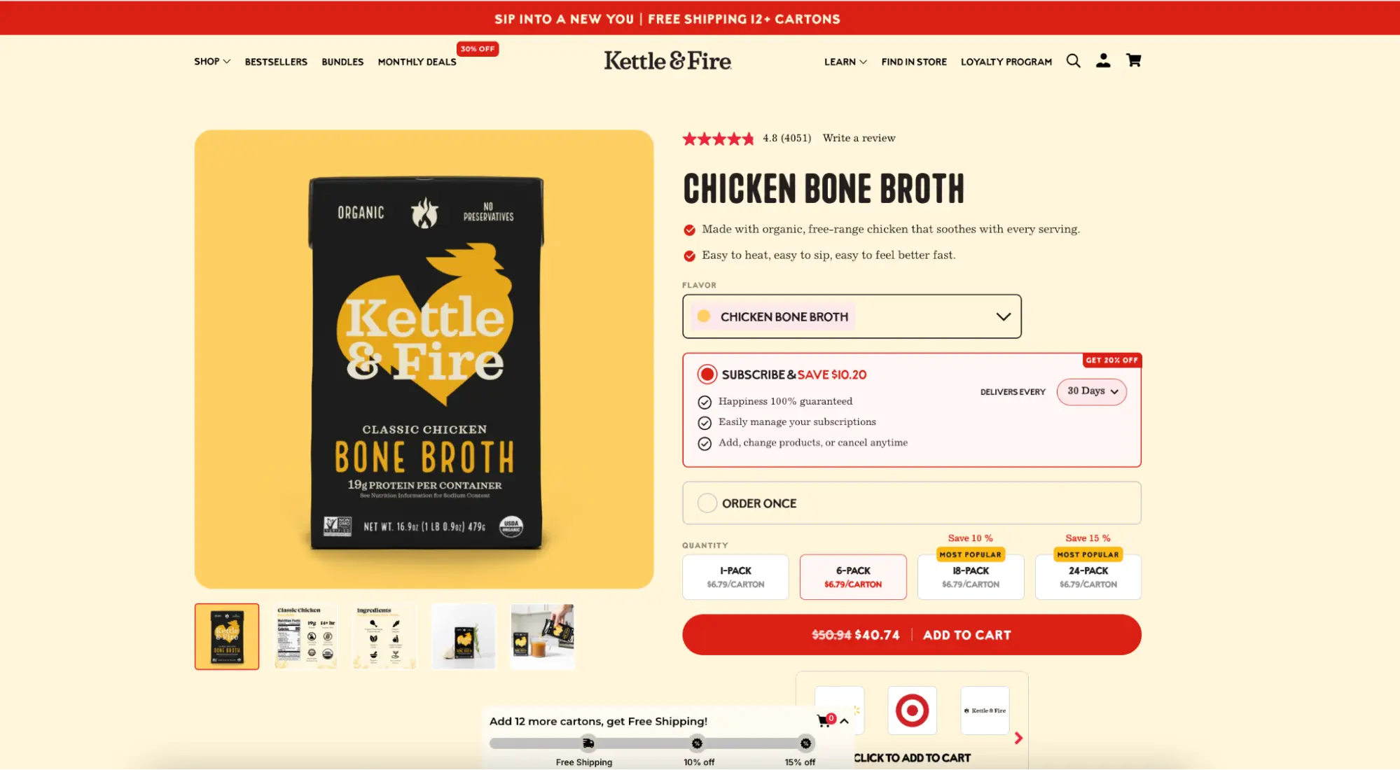
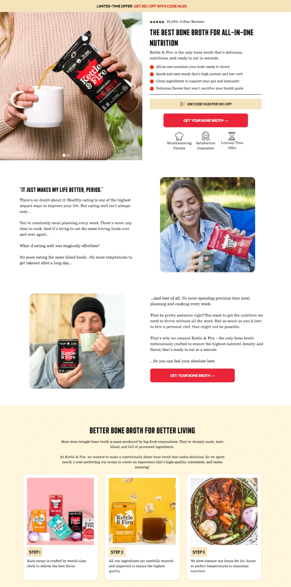
A prominent case study in this field involves the bone broth brand Kettle & Fire. The company maintains two distinct digital experiences for the same product. Their standard product page is a comprehensive resource featuring a full navigation bar, a dropdown menu linking to 12 different product variants, a "More Kettle & Fire" section with bundles, and a footer containing dozens of links. While effective for organic discovery, this page offers over 30 different ways for a visitor to exit the site without making a purchase.

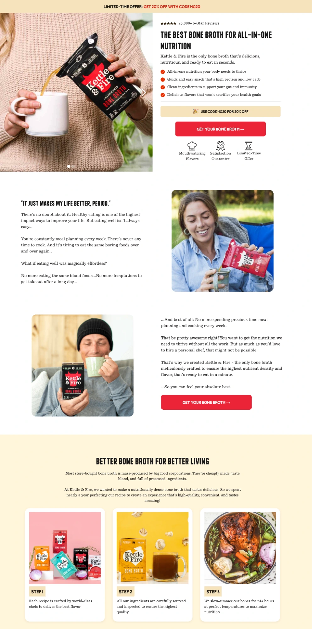
In contrast, the Kettle & Fire dedicated landing page for the same product, hosted on a separate subdomain, strips away every distraction. There is no navigation bar and no social media icons. Every link on the page either scrolls the user to a deeper informational section or directs them straight to the checkout. By utilizing urgency through limited-time discount codes and establishing credibility through expert endorsements, the landing page enforces a focused path. The data suggests that for paid traffic, this distraction-free environment is not merely a preference but a prerequisite for maximizing Return on Ad Spend (ROAS).
The Psychology of Conversion: Core Design Principles
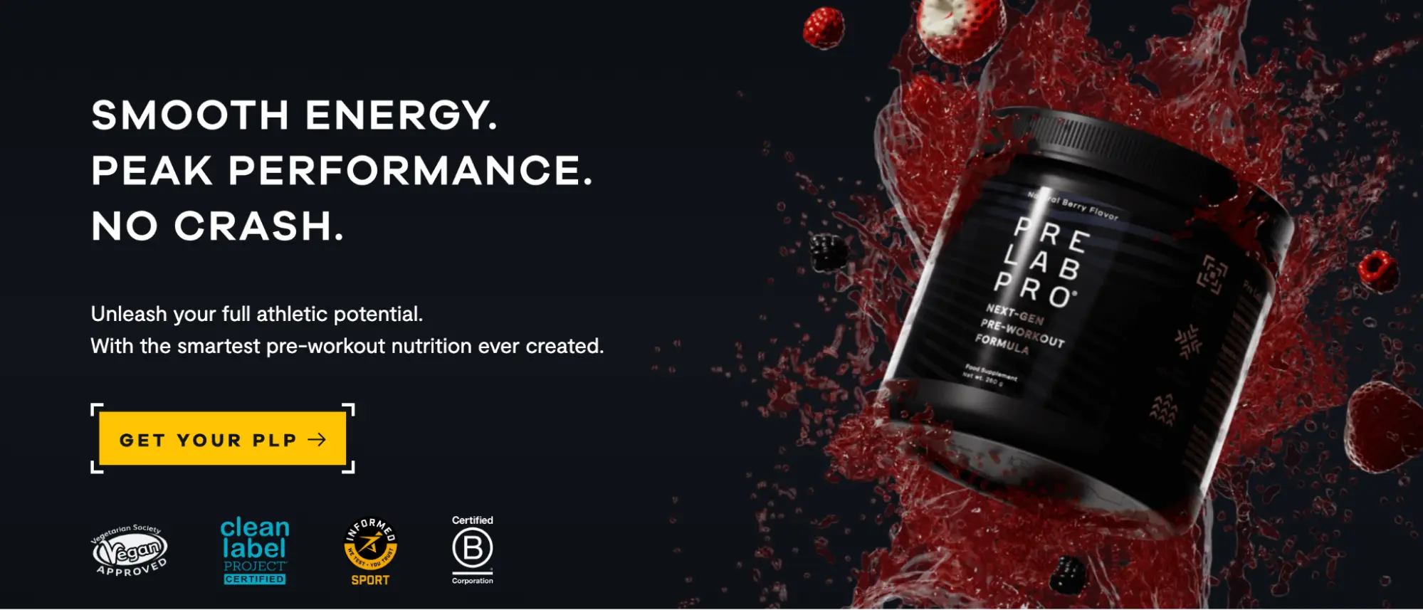
The success of a product landing page is rarely a matter of aesthetic appeal alone; it is a result of applied conversion mechanics. Research from the Nielsen Norman Group indicates that content "above the fold"—the area of a webpage visible without scrolling—receives the vast majority of user attention. Consequently, the most effective pages ensure that the headline, primary benefit, and call to action (CTA) are immediately visible.
Another critical factor is "message match." This refers to the alignment between the language used in the advertisement and the language on the landing page. If an ad promises "the world’s most durable wallet" but the landing page headline reads "Browse our summer collection," the cognitive dissonance causes an immediate drop in conversion rates. Google’s Quality Score algorithm directly measures this alignment, rewarding high-match pages with lower costs-per-click (CPC) and better ad placements.
Technical performance also plays a non-negotiable role in conversion. Industry benchmarks consistently show that for every one-second delay in mobile page load times, conversion rates can drop by as much as 20%. With the implementation of Google’s Core Web Vitals—specifically Largest Contentful Paint (LCP) and Interaction to Next Paint (INP)—page speed has transitioned from a technical metric to a core business KPI. Platforms like Instapage have responded by developing specialized infrastructure, such as the Thor Render Engine, to ensure that landing pages load near-instantaneously, mitigating the risk of "bounce" due to latency.
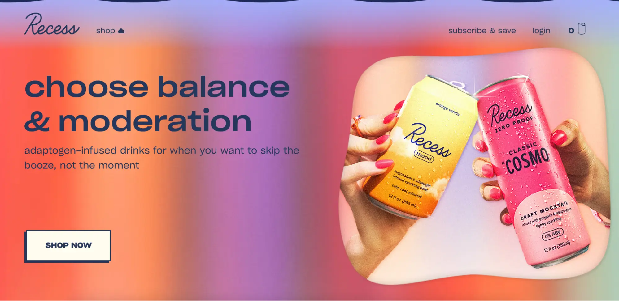
Categorizing the Architecture: Single, Multi, and Launch Pages
Marketing objectives dictate the architectural needs of a landing page. Industry experts generally categorize these pages into three functional types:
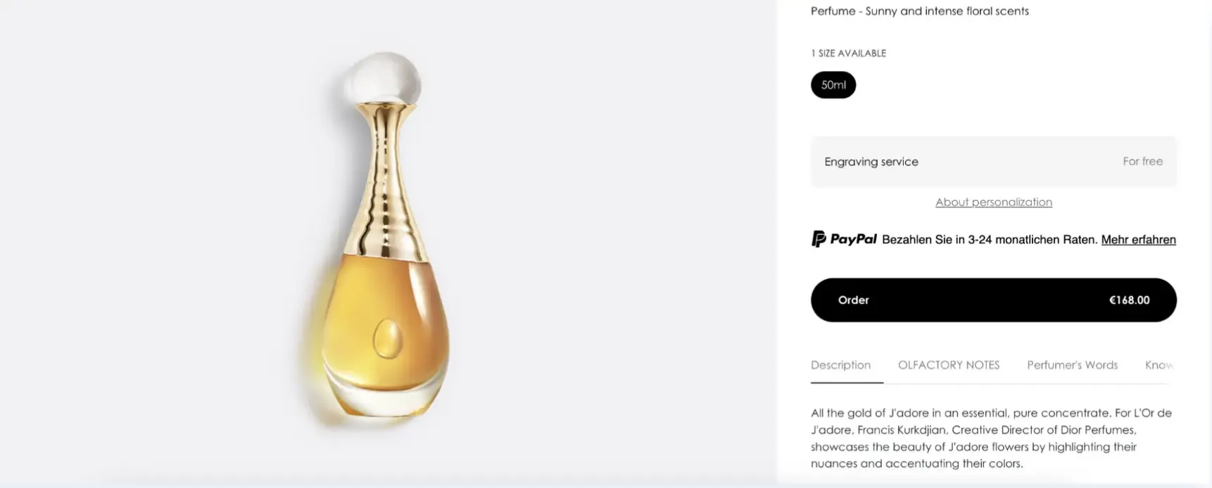
1. Single-Product Landing Pages
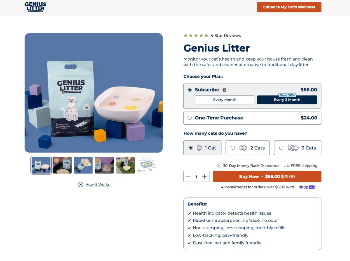
These are built around a specific SKU or variant. They are most effective when an advertisement targets a very specific consumer need. Brands like Oura Ring and Cowboy e-bikes utilize this format to provide a deep dive into a high-consideration product. For these premium items, the page must overcome the "tactile gap"—the fact that the customer cannot touch the product. High-definition 360-degree views and detailed feature breakdowns serve to bridge this gap.

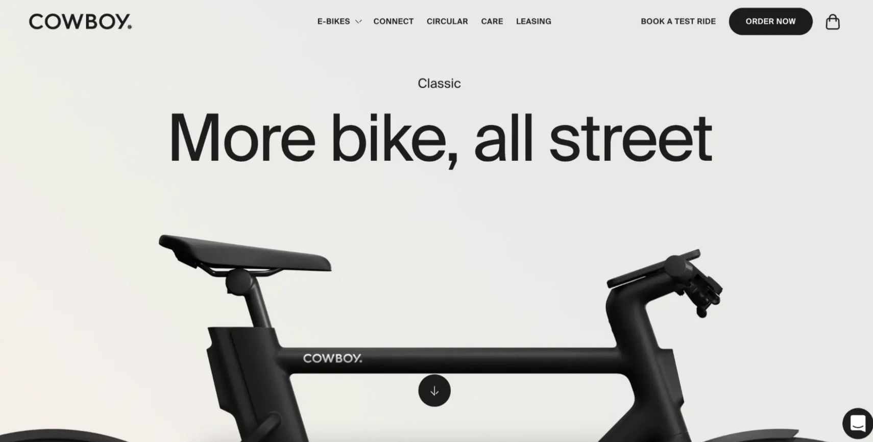
2. Multi-Product Landing Pages
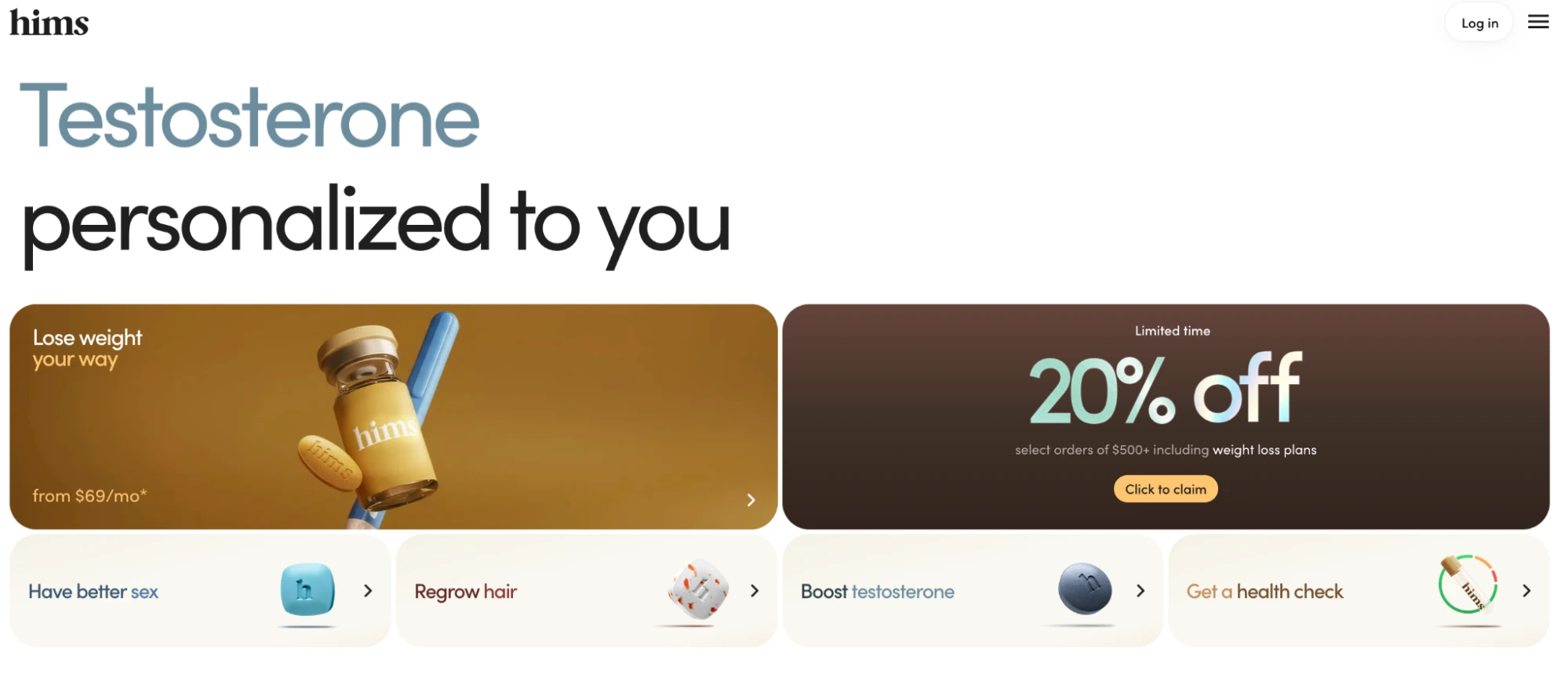
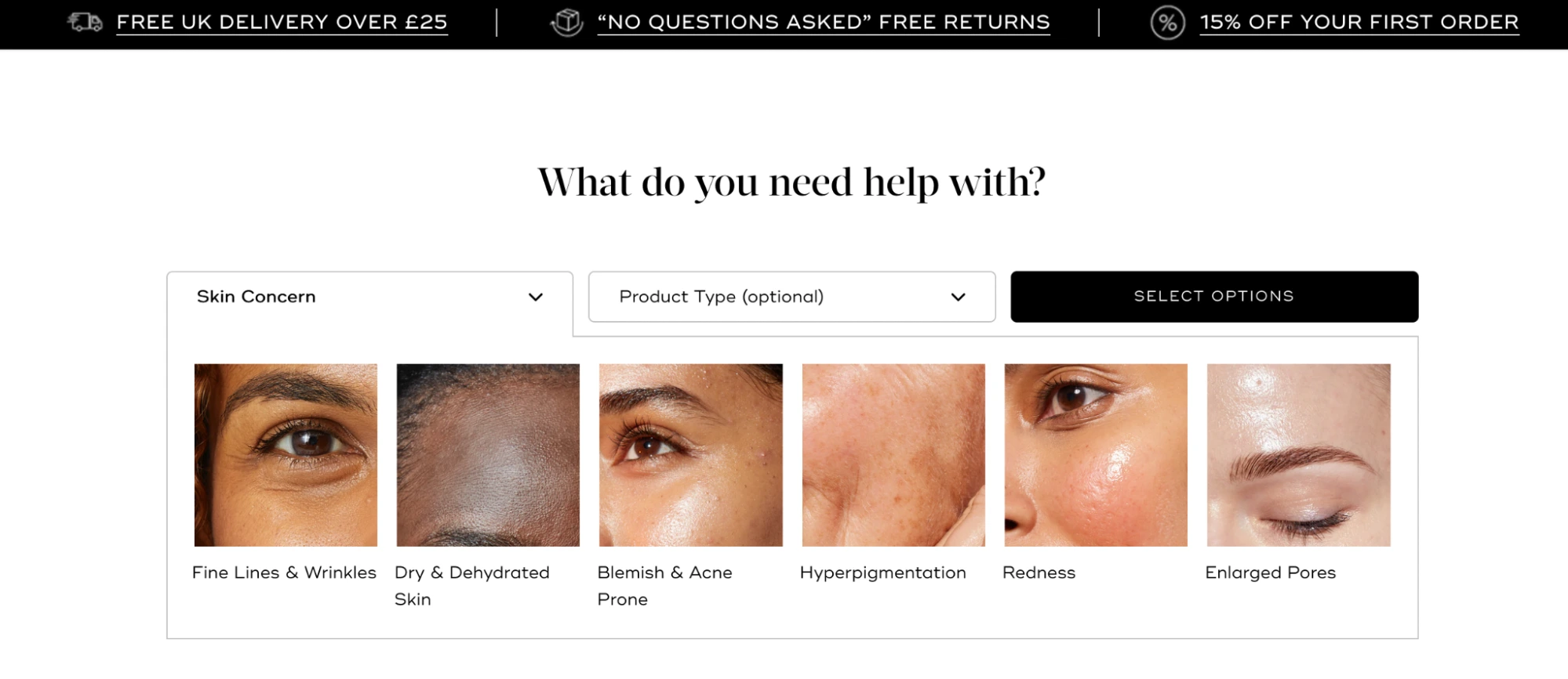
These pages showcase a product family or a specific category. They are essential when a campaign targets a broader keyword, such as "men’s skincare" or "minimalist accessories." The goal here is to provide enough structure for the visitor to self-select into the right product without overwhelming them. Brands like Hims and Medik8 use this approach, employing "selection tiles" or condition-based navigation to guide users toward the appropriate solution.
3. Product Launch and Waitlist Pages
For new releases, the primary objective is often the capture of intent rather than immediate revenue. These pages emphasize availability, exclusivity, and risk reversal. A notable example is the backpack brand Tierra, which uses a launch page to highlight its sustainability credentials while offering a 30% waitlist incentive. This strategy allows brands to build a qualified lead list before the product even enters the shipping phase.

The Role of Social Proof and Trust Indicators
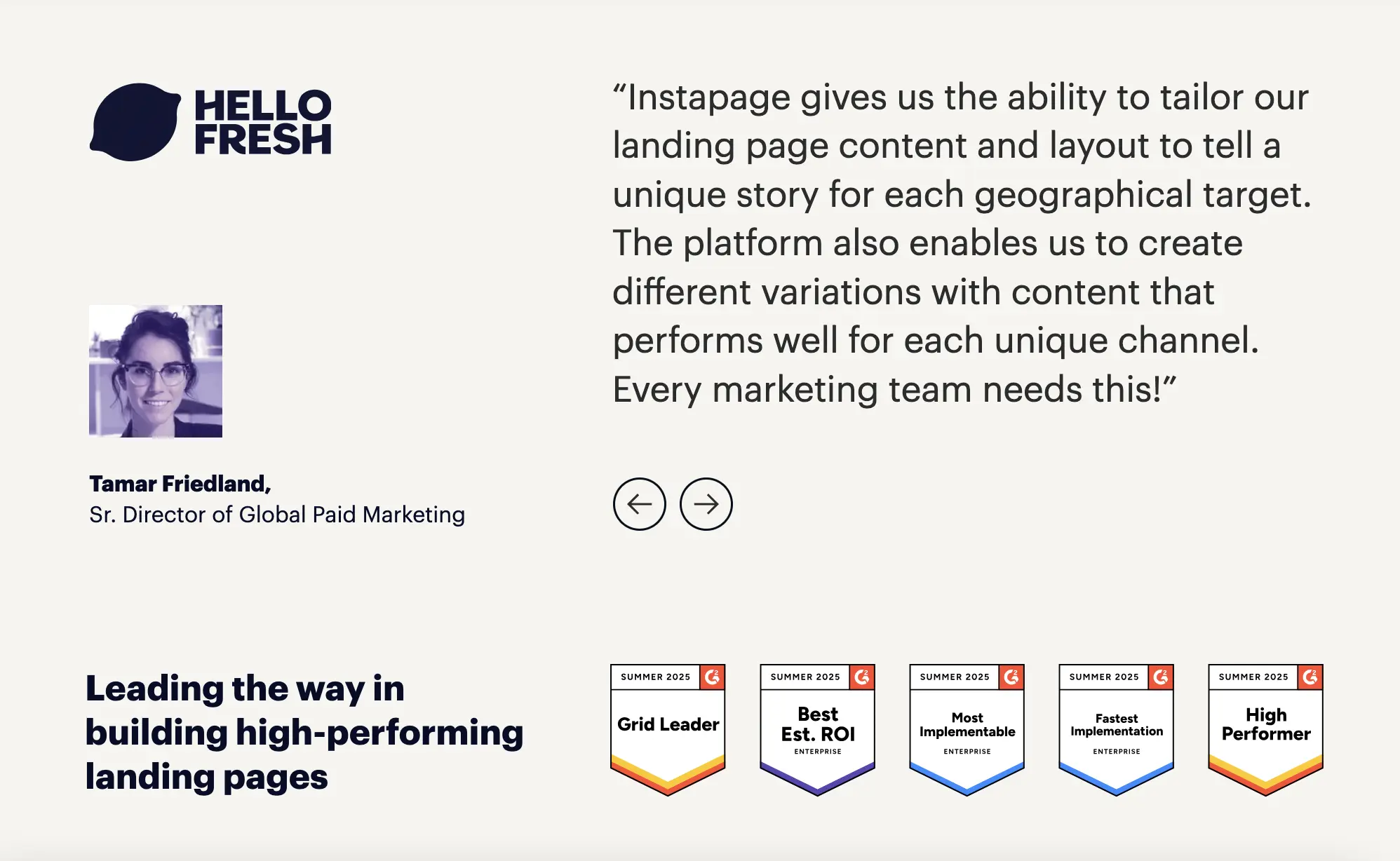
In an era of skepticism, social proof has become the "currency" of the landing page. However, the placement of this proof is as important as the proof itself. Modern conversion optimization dictates that testimonials, review counts, and industry awards should be placed in close proximity to the CTA. This strategy resolves doubt at the exact moment the visitor is asked to make a decision.
Case studies from brands like AG1 (Athletic Greens) demonstrate the power of personalized social proof. When traffic arrives from a specific influencer or podcast, the landing page is often customized to feature that influencer’s face and endorsement. This "borrowed credibility" acts as a powerful psychological trigger, significantly lowering the barrier to conversion for fans of that specific personality.

A Systematic Framework for Measurement and Optimization
Building a product landing page is the first step; the second is a rigorous process of measurement and iterative testing. Professional marketing teams utilize a goal-to-KPI framework to evaluate performance:

- Conversion Rate: The percentage of visitors who complete the primary CTA. This is the ultimate barometer of page effectiveness.
- Cost Per Conversion: This metric justifies the investment in landing page technology. If a specialized page increases the conversion rate from 2% to 4%, the cost per acquisition is effectively halved.
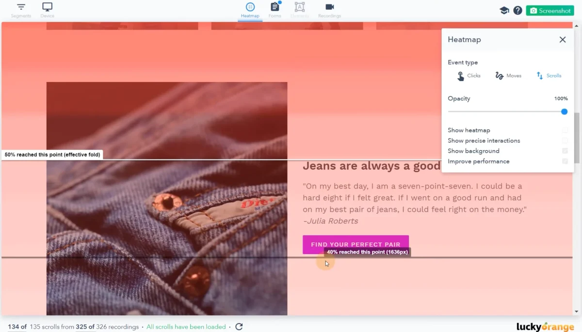
- Heatmap Analysis: Tools that track click and scroll depth reveal where visitors are losing interest. A page with high traffic but low scroll depth suggests a failure in the "above-the-fold" value proposition.
- A/B Testing: Systematic testing of headlines, CTA colors, and image placement allows for incremental improvements that compound over time.
The rise of AI-driven content generation has further accelerated this optimization cycle. Modern builders now allow teams to generate dozens of headline variations and personalized copy segments instantly, enabling a level of scale that was previously impossible without significant developer intervention.

Implications for the Future of E-commerce and SaaS
As the cost of digital advertising continues to rise, the brands that survive will be those that treat their landing pages as dynamic, high-performance sales environments rather than static brochures. The shift toward specialized landing pages represents a broader movement toward personalization and efficiency in the digital economy.
The overarching conclusion for enterprise marketing teams is one of discipline. High-performing pages are not characterized by complex animations or avant-garde design, but by their adherence to the 1:1 conversion ratio. By eliminating navigation, matching the ad’s message, ensuring rapid load times, and strategically placing social proof, organizations can stop the "quiet leak" of their paid budgets and turn more clicks into tangible revenue. In the competitive landscape of the 2020s, the landing page is no longer an optional add-on; it is the most critical asset in the performance marketing toolkit.