In the intricate landscape of digital marketing, the email signup form stands as a pivotal entry point, serving as the direct conduit between a website visitor and a brand’s valuable email list. Its design, copy, placement, and functionality are not merely aesthetic choices but critical determinants that can profoundly influence a visitor’s decision to subscribe, ultimately impacting lead generation, customer engagement, and business growth. This digital gateway, often underestimated, holds the power to make or break nascent customer relationships in an increasingly competitive online environment.
The Evolving Landscape of Email Capture
The journey of email capture has evolved significantly, from rudimentary embedded fields to sophisticated, behavior-triggered mechanisms. Early forms were often static, blending into webpage footers or sidebars. However, as digital marketing matured, so did the understanding of user psychology and conversion optimization, leading to a diverse array of form types each designed to serve a specific strategic purpose. The right choice of form type is paramount, dictated by the context of interaction and the desired user experience.
One of the most fundamental types is the inline signup form. These forms are seamlessly integrated within the body of a webpage, appearing as a natural part of the content flow. They can be strategically placed at the top of an article, nestled within a relevant section, or positioned at the bottom to capture readers who have engaged with the full content. Their strength lies in their non-intrusive nature, allowing visitors to engage with content before presenting the subscription opportunity. Data suggests that while inline forms might have slightly lower immediate conversion rates than more aggressive pop-ups, they often yield higher quality leads due to the visitor’s pre-existing engagement with the content surrounding the form. AWeber, for instance, offers a WordPress plugin to facilitate easy placement and performance tracking, underscoring the importance of integrated solutions.
In contrast, pop-up forms are designed to command attention. They are not embedded but appear dynamically at specific junctures during a visitor’s site interaction. These can manifest as overlays that blur the background, slide-ins from various screen edges, or full-screen takeovers. While their directness can significantly boost subscriber signups – some studies report pop-ups converting at rates up to 5-10% compared to 1-2% for static forms – they also carry the risk of disrupting the user experience. Industry best practices, therefore, advocate for careful adjustment of display settings to mitigate potential friction.
Pop-up forms come in several sophisticated variations:
- Time-delayed pop-ups appear after a set duration, allowing visitors to consume initial content. Marketers often consult web analytics to align the delay with average time-on-page, ensuring the form appears just before a visitor might consider leaving. This approach balances visibility with respect for user browsing.
- Scroll-delayed pop-ups are triggered once a visitor has scrolled to a specific percentage of the page, indicating deeper engagement with the content. This method ensures the offer is presented to genuinely interested users.
- Exit-intent pop-ups represent a crucial last-ditch effort to convert departing visitors. Leveraging tracking technology, these forms activate when a user’s mouse movement suggests an imminent exit. They are particularly effective for presenting enticing offers—such as discounts or exclusive content—to "save" otherwise lost opportunities.
- Two-step pop-ups appear only after a user actively clicks a link or button, signifying a clear intent to engage with the offer. This voluntary interaction often results in remarkably high conversion rates, as the user has explicitly chosen to see the form.
Beyond embedded and dynamic forms, landing page forms offer a singularly focused approach to lead capture. Unlike conventional website pages with navigation menus and multiple links, landing pages are meticulously designed with one objective: securing a subscriber signup. By eliminating distractions, they compel visitors to make a clear choice: subscribe or leave. This singular focus, combined with compelling visuals, videos, and persuasive text emphasizing value, makes landing pages highly effective for specific campaigns or lead magnet promotions.
Strategic Placement: Maximizing Visibility and Relevance
The effectiveness of any signup form is intrinsically linked to its placement. A fundamental principle is to ensure forms are both noticeable and naturally integrated, avoiding disruptions to the user journey. Contextual relevance is key; a form offering a specific guide should appear on pages related to that topic, increasing the likelihood of conversion.
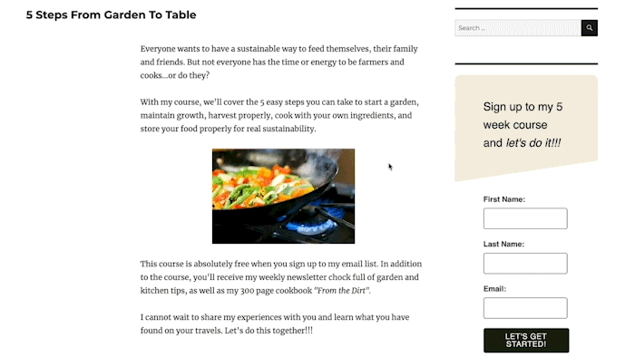
For inline forms, a ubiquitous presence in website footers or sidebars ensures that regardless of the visitor’s location on the site, an opportunity to subscribe is always available. Incentives offered via these persistent forms should be broadly appealing, such as a general discount or a compilation of best practices, to cater to diverse visitor interests. However, marketers also deploy inline forms within specific blog posts or content pieces, tailoring the offer to the immediate context, for example, a form for a "recipe e-book" embedded within a "healthy eating" blog post.
Pop-up forms, due to their intrusive nature, require more strategic placement. The homepage, often the primary entry point for traffic, is a prime location for a general pop-up promoting a brand’s main incentive. Furthermore, identifying high-traffic content pages through web analytics tools like Google Analytics allows marketers to deploy targeted pop-ups with offers specifically relevant to the content being consumed. This data-driven approach ensures pop-ups enhance rather than detract from the user experience, leading to higher engagement.

Crafting Compelling Copy: The Art of Persuasion
Beyond placement and type, the linguistic artistry of signup form copy is paramount. It must articulate value, build trust, and motivate action. Research from the Nielsen Norman Group consistently highlights that clear, concise messaging is crucial for user experience and conversion across digital interfaces.

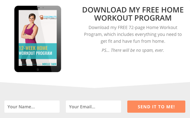
- Clear, Concise Headlines: The headline is the visitor’s first interaction with the offer. It must immediately convey what subscribers will gain and how it addresses a need. For example, "Unlock Your Free Home Workout Program" leaves no ambiguity, clearly stating the benefit and the format of the offer. Adding a brief description, like "72-page guide designed to get you fit from home," further amplifies the value proposition.
- Clearly Communicate the Value: Below the headline, expand on the benefits. This isn’t just about what they get, but what problem it solves or how it improves their situation. Bulleted lists are highly effective for breaking down key benefits, making them digestible and impactful, as seen in examples like "Stepmom Magazine" articulating specific content types subscribers will receive.
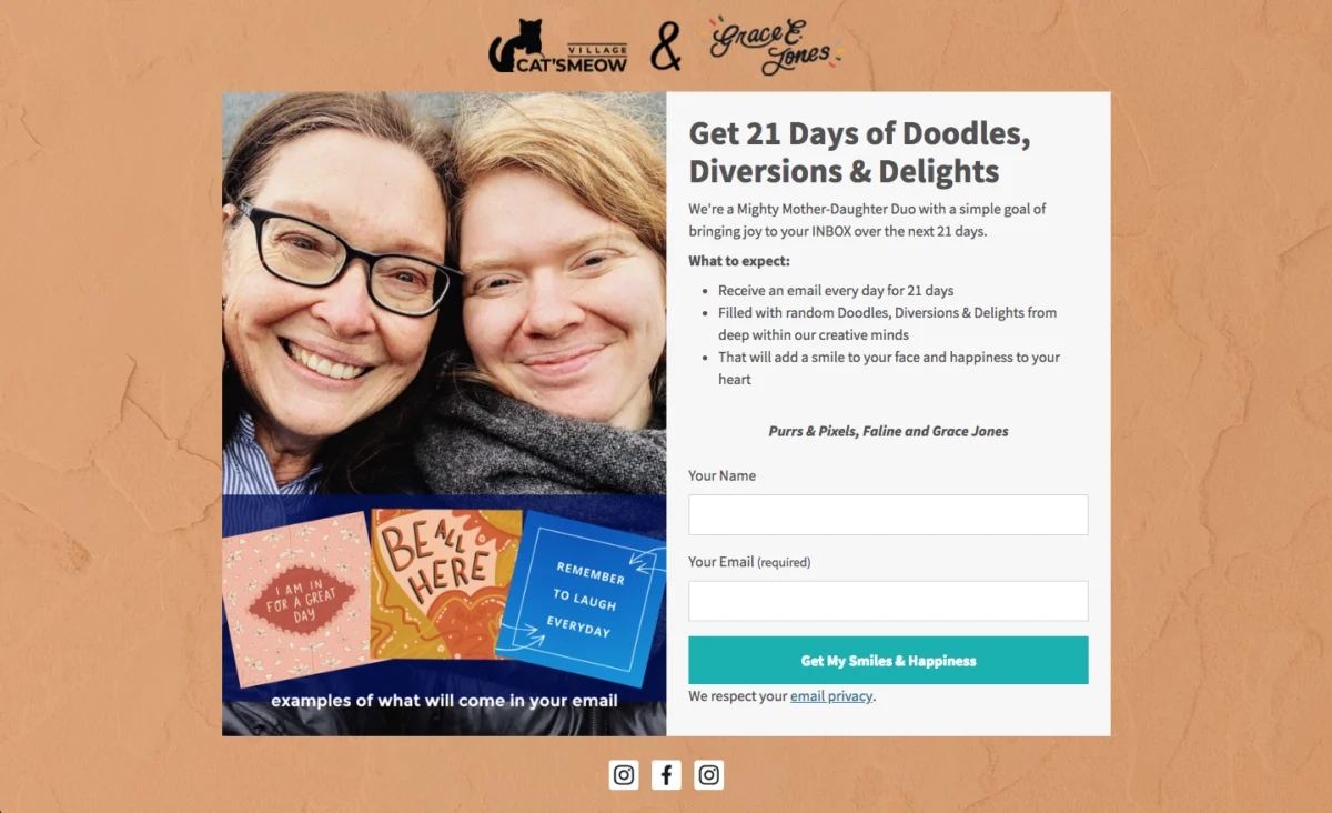
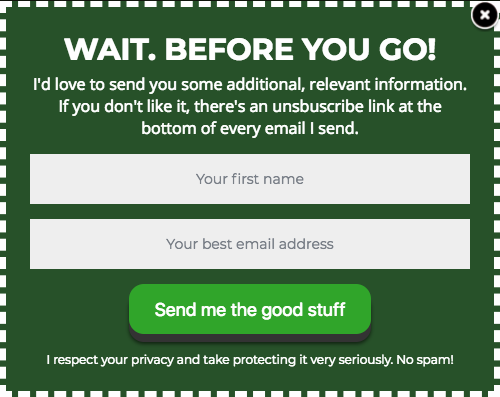
- Set Clear Expectations: Transparency builds trust and reduces unsubscribes. The copy should specify what subscribers will receive, how often, and the nature of the content. This commitment to clarity not only fosters a reliable relationship but also ensures compliance with data privacy regulations like GDPR, which mandates explicit consent and clear communication regarding data usage and communication frequency. An example like "Cat’s Meow Village" stating "fun, light-hearted emails every day for 21 days" provides unambiguous foresight.
- Write Conversational Copy: Breaking from formal language can grab attention and foster a more personal connection. Phrases like "Oh hey!" or "Hey you!" create a sense of direct address, making the interaction feel less transactional and more engaging. This conversational tone can lower psychological barriers and make the brand more approachable.
- Be Creative, Witty, or Humorous: Injecting personality into copy differentiates a brand and makes it memorable. Humor, when appropriate for the brand’s voice, can build rapport and trust. For instance, "How Not to Sail" uses maritime terminology for its call-to-action (CTA), transforming a simple signup into an imaginative "climb aboard and sail away" experience. This creative approach makes the form more engaging and unique.
Designing for Conversion: Visual Psychology and User Experience
The visual presentation of a signup form significantly influences first impressions, with studies suggesting that up to 90% of initial judgments are based on visual elements and color cues alone. Thoughtful design can dramatically enhance perceived professionalism and trustworthiness.
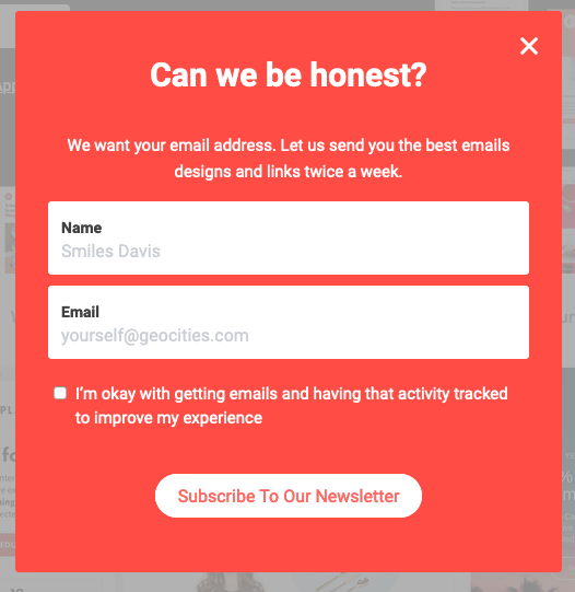
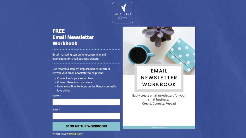
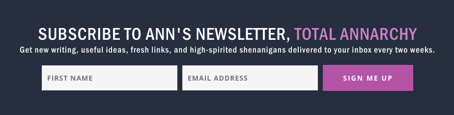
- Keep Form Fields to a Minimum: Every additional field introduces friction, increasing the likelihood of abandonment. For simple subscriber acquisition, requesting only a name and email address is often optimal. Research from HubSpot found that reducing the number of form fields from 11 to 4 can increase conversion rates by over 120%. If more data is required for lead qualification, strategies like multi-step forms or post-signup surveys can be employed to gather information iteratively, minimizing initial friction. Ann Handley’s minimalist form with just two fields exemplifies this principle.
- Use a Clear Call to Action (CTA): The CTA button is the final prompt for conversion. Generic terms like "Sign Up" are often less effective than specific, benefit-oriented language. A CTA like "Send me my free guide!" or "Download my templates now" clearly reminds the visitor of the value offered. Incorporating urgency ("Join now!") or possessive language ("Get my updates!") can further increase click-through rates by creating a sense of ownership and immediate benefit. Paul Kirtley’s use of possessive language on his CTA button directly connects the action to the subscriber’s benefit.
- Follow a Typographic Hierarchy: Visual hierarchy guides the reader’s eye, making the form easier to scan and comprehend. The headline should feature the largest font, followed by subheads, and then descriptive text. Limiting font types to one or two maintains visual consistency, with distinct fonts for headlines adding visual interest without clutter. FroKnowsPhoto’s form demonstrates effective use of varied font styles and sizes to create a clear hierarchy.
- Stick to 1-2 Font Colors: Overuse of colors can be distracting and diminish readability. A restrained palette, often aligning with brand guidelines, creates a professional and clean appearance. The Daily Skimm’s simple use of white font color on a contrasting background is a testament to the power of minimalism.
- Create Color Contrast: A signup form needs to stand out from the rest of the webpage. Strategic use of contrasting colors—a bright form against a neutral background, or vice-versa—draws the eye and increases the likelihood of engagement. Teach Me To Talk effectively uses a distinct color scheme to highlight its incentive.
- Visually Represent Your Incentive: Humans are visual creatures. Including an image or graphic that represents the incentive (e.g., a mock-up of an e-book cover, a vibrant infographic) can significantly increase form views and conversions. Visuals communicate value instantly and can provide the extra push a visitor needs to subscribe, as exemplified by Spoon Graphics’ use of a fun, relevant visual.
- Let Subscribers Choose Their Preferences: Personalization is a cornerstone of modern marketing. Allowing subscribers to select their preferred content topics or email frequency enhances engagement by delivering tailored content. This increases perceived value and reduces the likelihood of unsubscribes. The Intrepid Guide’s form, offering topic preferences, illustrates this approach to a more personalized email experience.
- Try Presenting an Unfavorable Alternative: This psychological tactic, best suited for pop-up forms, frames the act of not subscribing as undesirable. By presenting an explicit negative consequence for dismissing the form, it subtly nudges visitors towards conversion. Boast’s pop-up, offering a discount with the alternative of "No thanks, I prefer paying full price," makes subscribing the economically rational choice.
- Use Social Proof: The principle that people are more likely to do something if others are doing it is powerful. Displaying subscriber counts ("Join 300,000+ others!") or testimonials on a signup form builds trust and validates the value proposition. Nerd Fitness’s prominent display of its large subscriber base instills confidence and encourages new signups.
- Use a Big CTA Button: With over half of global website traffic originating from mobile devices, responsive design is non-negotiable. A large, easily tappable CTA button ensures a smooth user experience on smartphones and tablets, reducing frustration and accidental misclicks. Mark Asquith’s form with a prominent "Download Now" button is an excellent example of mobile-friendly design.
- Use Plenty of White Space: Clutter overwhelms. Ample white space around text, images, and form fields improves readability, reduces cognitive load, and lends a professional, trustworthy appearance to the form. 1 Chic Retreat’s form effectively uses white space to create a clean and inviting layout.
The Rise of AI in Form Creation
Recognizing the complexity of balancing design, copy, and functionality, innovative solutions are emerging to streamline the form creation process. AI-powered signup form builders, such as those offered by AWeber, represent a significant leap forward. By simply describing a business in a single sentence, AI can generate a complete signup form, incorporating brand colors, compelling headlines, descriptive copy, appropriate input fields, and an optimized layout. This capability ensures that a bakery’s recipe newsletter form will differ intelligently from a fitness coach’s free workout plan form. While AI provides a robust working draft, all elements remain editable, allowing marketers to fine-tune the form to their exact specifications. Crucially, these AI-generated forms seamlessly integrate with email marketing platforms, instantly connecting new subscribers to automated welcome sequences.

Continuous Optimization: The Iterative Process
Publishing a signup form is merely the initial step; continuous testing and optimization are vital for sustained effectiveness. A/B testing, or split testing, involves comparing two versions of a form to determine which performs better against a defined metric, such as conversion rate. Elements ripe for A/B testing include:
- Headlines and subheads
- Call-to-action text and button color
- Number of form fields
- Incentive visuals
- Placement and timing of pop-ups
- Overall design and color scheme
Periodically refreshing a form’s appearance and messaging is also crucial, as visitors who have seen it multiple times without converting may become desensitized. A fresh look or a new offer can re-engage these users.
Case Study: AWeber’s 150% Engagement Boost
An exemplary case demonstrating the power of optimization comes from AWeber itself. When updating their popular "What to Write in Your Emails" course, they encountered conflicting feedback: some subscribers desired more frequent emails, others less. Their solution was to empower subscribers to choose their preferred email frequency directly on the signup form, subsequently delivering the course content at their chosen pace via email automation. This seemingly simple change yielded remarkable results: open rates increased by 47%, and click-through rates soared by 150%. This case underscores the profound impact that giving subscribers control over their experience can have on engagement, particularly given that 94% of small business owners reportedly write their own marketing emails, making such high-impact changes invaluable.
Implications and Future Outlook

In conclusion, the email signup form, far from being a mundane necessity, is a strategic asset in the digital marketing toolkit. Its effective deployment hinges on a nuanced understanding of user psychology, meticulous design, persuasive copy, and continuous optimization. From inline forms that offer subtle integration to dynamic pop-ups that seize attention and dedicated landing pages that drive focused conversion, each type serves a unique purpose. As digital consumer behavior continues to evolve and data privacy regulations tighten, the emphasis on transparent, value-driven, and user-centric signup experiences will only grow. The integration of AI tools further promises to democratize effective form design, enabling businesses of all sizes to build high-quality email lists that fuel sustainable growth and foster enduring customer relationships. The ongoing commitment to testing and refinement ensures that this critical digital gateway remains a high-performing asset in any marketing strategy.
Sean Tinney is a content marketer at AWeber with over 15 years of experience collaborating directly with small business owners on email strategy, list building, and automation. His focus is on practical, high-impact strategies that yield measurable results for businesses operating without extensive marketing teams.