Conshohocken, PA – August 6, 2026 – AWeber, a leading provider of email marketing solutions for small businesses and entrepreneurs, today announced the launch of a significantly enhanced analytics dashboard, promising marketers unprecedented clarity into their email campaign performance. The new suite of visualization tools, accessible directly within the AWeber platform, is designed to transform raw data into actionable insights, enabling users to quickly identify successful strategies and refine future campaigns. This development underscores AWeber’s commitment to empowering its users with sophisticated yet intuitive tools to navigate the increasingly complex digital marketing landscape.
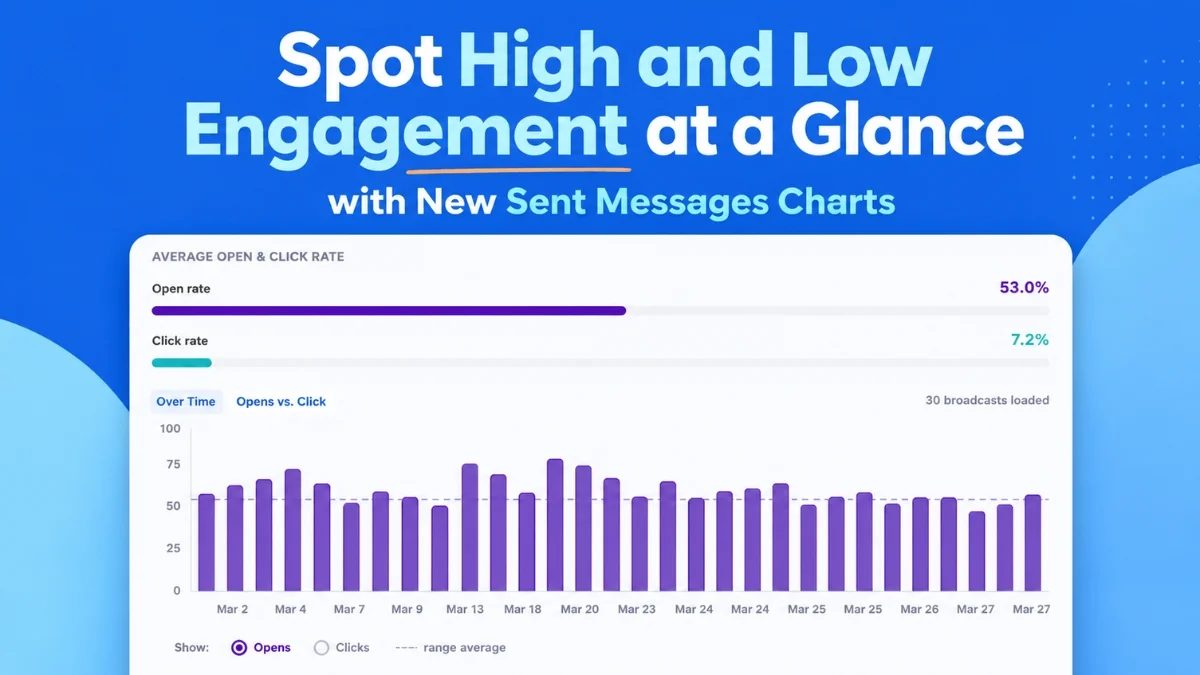
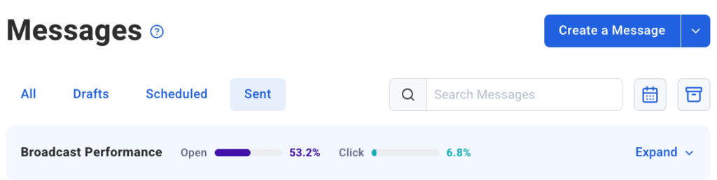
The core of this enhancement lies in its ability to present critical metrics such as open rates, click rates, and email comparisons in an easily digestible, visual format. Marketers can now, at a glance, ascertain which emails resonated with their audience and drove action, and which ones fell short. This immediate feedback loop is crucial for optimizing engagement and maximizing the return on investment for email marketing efforts. The platform aims to eliminate the need for laborious data compilation and analysis, allowing patterns and outliers to surface effortlessly.
Visualizing Engagement Trends Over Time
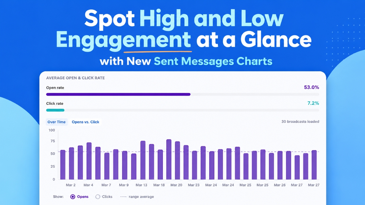
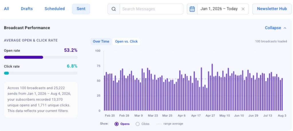
A cornerstone of the new dashboard is the "Opens and Clicks Over Time" chart. This dynamic bar chart plots up to 100 of a user’s most recent broadcast emails on a visual timeline, offering a longitudinal view of campaign performance. A simple toggle allows marketers to switch between open rates and click-through rates, facilitating direct comparisons and trend spotting. For instance, a consistent spike in opens following a particular subject line style, or a recurring pattern of higher engagement on specific send days, becomes immediately apparent. This visual representation is invaluable for identifying what resonates with subscribers across different timeframes.
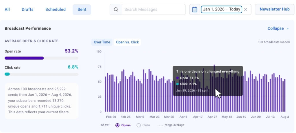
The ability to discern these patterns rapidly is a significant advantage in a fast-paced marketing environment. Marketers can swiftly pinpoint a successful formula – perhaps a unique approach to content, an optimal sending time, or a compelling call-to-action – and replicate it. Conversely, underperforming broadcasts can be identified, prompting a deeper dive into their characteristics to understand what went wrong and how to avoid similar pitfalls in the future. The chart’s click-to-jump functionality further enhances usability, allowing users to select any bar on the chart and instantly navigate to the detailed metrics of that specific broadcast within the accompanying data table. This seamless transition from high-level trend analysis to granular message review streamlines the optimization process. As users scroll and load more broadcasts, the chart dynamically populates, ensuring a continuous and comprehensive historical overview.
Comparative Analysis with Opens vs. Clicks Bubble Chart
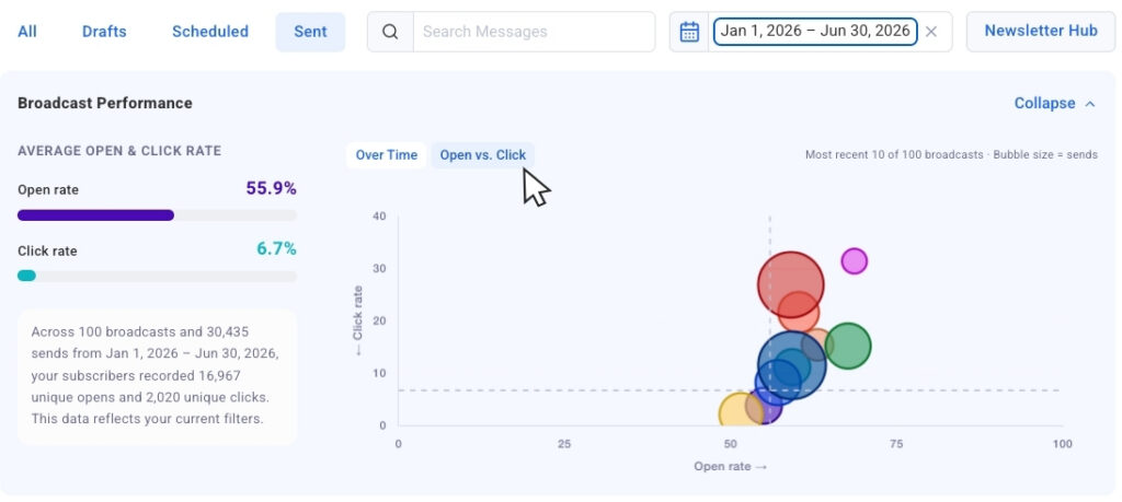
Beyond chronological trends, the new dashboard introduces the "Opens vs. Clicks" bubble chart, a powerful tool for side-by-side performance comparison. This innovative chart plots recent email sends, with each broadcast represented as a bubble. Crucially, the size of each bubble is scaled by the send volume, providing essential context for comparison. This feature addresses a common challenge in email analytics: comparing campaigns sent to vastly different audience sizes without skewing perception. A campaign sent to a smaller, highly engaged segment might show strong rates, while a broader broadcast might have lower rates but higher absolute numbers. The bubble size clarifies this distinction, allowing for more accurate interpretation of performance.
The bubble chart excels at surfacing outliers – emails that either significantly overperformed or underperformed relative to others. Marketers can quickly identify broadcasts that achieved high open rates but struggled with click-throughs, suggesting engaging subject lines but less compelling content or calls-to-action. Conversely, emails with moderate open rates but exceptional click-throughs might indicate highly effective internal content that could benefit from stronger subject line optimization. This visual comparison empowers marketers to understand the strengths and weaknesses of their content strategy, guiding decisions on what elements to repeat, refine, or discard. This comparative insight is fundamental for iterative improvement, allowing marketers to fine-tune their messaging, design, and offers to maximize subscriber engagement and conversion potential.
Streamlined Data Management and Filtering Capabilities
Understanding that ease of access and customization are paramount, AWeber has integrated intuitive controls into the new analytics dashboard. A collapsible chart view allows users to toggle the visual charts on or off, providing flexibility to focus purely on the numerical data in the table when preferred, and instantly re-engage with the visual context when needed. This adaptability ensures the dashboard caters to diverse analytical preferences and workflows.
Furthermore, the new filtering options significantly enhance data navigability. Date presets enable users to quickly segment data by the past 30 days, 90 days, or a full year with a single click, allowing for rapid analysis of performance within specific periods. This immediate update of the chart and table data facilitates timely reviews and strategic adjustments. Going a step further, dynamic search filtering empowers users to type keywords into a search bar, instantly narrowing the displayed data to only include broadcasts with that specific word in the subject line. This capability is invaluable for A/B testing analysis, allowing marketers to compare different subject line approaches or campaign themes directly. AWeber also announced that segment name filtering will be introduced soon, further refining the ability to isolate and analyze performance across specific audience segments, acknowledging that engagement naturally varies by audience demographic or interest. These granular filtering options are critical for deep-dive analysis, allowing marketers to extract highly specific insights from their email data.
The Evolving Landscape of Email Marketing Analytics
The introduction of these advanced analytics tools by AWeber comes at a time when email marketing continues to be a cornerstone of digital strategy for businesses of all sizes. Industry reports consistently highlight email’s superior return on investment (ROI) compared to many other digital channels, with estimates often ranging from $38 to $42 for every dollar spent. However, the sheer volume of emails received by consumers daily means that standing out in the inbox is more challenging than ever. Average open rates typically hover around 20-25%, and click-through rates often fall between 2-5%, emphasizing the constant need for optimization.
This competitive environment necessitates sophisticated analytical tools that move beyond basic metrics. Marketers today require actionable insights that can inform content creation, segmentation strategies, send times, and overall campaign design. The shift from simply reporting numbers to visually representing trends and comparisons empowers marketers to make data-driven decisions more efficiently and effectively. This new dashboard is not merely an incremental update; it represents a strategic evolution in how AWeber equips its users to thrive in this dynamic landscape. It reflects a broader industry trend towards more intelligent, AI-powered analytics that simplify complex data sets and provide clear pathways for improvement.
AWeber’s Commitment to Empowering Marketers
Sean Tinney, identified as the author of the original announcement and likely a key figure in AWeber’s product development, articulated the company’s vision behind these enhancements. "Our goal at AWeber has always been to simplify powerful marketing for our users," Tinney might have stated. "With these new analytics features, we’re taking that commitment a step further. We understand that time is a precious commodity for small business owners and marketers. By providing clear, actionable visual data, we’re enabling them to spend less time digging through spreadsheets and more time crafting compelling messages that truly connect with their audience and drive results. This dashboard is about empowering our users to understand their subscribers better, iterate faster, and ultimately, grow their businesses more effectively."
This sentiment aligns with AWeber’s history of developing user-friendly tools that democratize advanced marketing capabilities. The company has long served a diverse clientele, from solopreneurs to growing enterprises, all of whom benefit from tools that provide clarity without overwhelming complexity. The integration of these charts with the AWeber MCP app for ChatGPT and Claude.ai further solidifies AWeber’s position at the forefront of marketing technology, connecting direct campaign performance with advanced AI-driven content generation and strategic insights. This synergy allows marketers to not only analyze what works but also to rapidly generate new content informed by those insights, creating a virtuous cycle of improvement.
Broader Impact and Strategic Implications
The implications of AWeber’s enhanced analytics dashboard extend beyond mere performance tracking. For small businesses, these tools translate directly into improved efficiency and profitability. By quickly identifying what works, marketers can allocate resources more effectively, reducing wasted effort on underperforming campaigns. This leads to higher engagement rates, increased conversions, and ultimately, stronger customer relationships built on relevant and valuable communication.
For content creators and influencers, the ability to see engagement trends over time and compare different types of content side-by-side is invaluable for audience development. They can pinpoint which topics, formats, or calls-to-action generate the most interest, allowing them to tailor future content strategies to maximize impact and growth. This data-driven approach moves content creation from guesswork to a precisely calibrated art.
Furthermore, the advanced filtering capabilities, particularly the upcoming segment name filtering, will allow marketers to delve into the nuances of their audience. Understanding how different segments respond to various messages is critical for highly personalized marketing, a key driver of modern email success. This level of insight enables hyper-targeted campaigns that resonate deeply with specific subscriber groups, fostering loyalty and driving conversions at a higher rate. In a market where personalization is no longer a luxury but an expectation, these tools provide a competitive edge.
The release of these charts signifies AWeber’s continuous investment in its platform, ensuring its users remain equipped with state-of-the-art tools necessary for navigating the competitive digital landscape. By providing such comprehensive yet accessible analytics, AWeber is not just offering a service; it is offering a strategic advantage, enabling its diverse user base to unlock the full potential of their email marketing efforts. The Sent Messages charts are now live, marking a significant step forward in making sophisticated email performance analysis readily available to all AWeber users.