The psychology of color in marketing stands as one of the most potent, yet often underestimated, tools at a marketer’s disposal. Color possesses an inherent ability to instantly establish mood, evoke profound emotions, and trigger specific psychological reactions in consumers. Its pervasive influence can either significantly bolster or detrimentally undermine the perceived value of a product or service. Research underscores this impact, with a compelling statistic revealing that 90 percent of a subscriber’s initial impression of an email message or a website is predicated solely on color or other visual cues. This immediate, subconscious processing highlights why a strategic understanding and application of color theory are not merely aesthetic considerations but fundamental pillars of effective branding and communication.
The Foundational Influence of Color in Consumer Behavior
The importance of color extends far beyond surface-level appeal, delving into the core of consumer decision-making and brand recognition. Surveys consistently show that a vast majority of consumers, specifically 84.7% in one notable study, consider color to be a crucial factor when contemplating a product purchase. This strong belief translates directly into tangible business benefits, as strategic color usage has been demonstrated to increase brand recognition by an impressive 80%. Such figures position color as an indispensable component of any robust brand identity strategy.
The connection between color and customer perception is deeply ingrained. Consumers often forge strong associations between particular brands and specific colors, a phenomenon rooted in both cultural conditioning and psychological responses. Consider the dominant color associated with a globally recognized brand; its choice is rarely arbitrary. This inherent link influences everything from initial product interest to long-term brand loyalty, shaping how a brand is perceived in the competitive marketplace. Understanding these psychological triggers allows marketers to craft experiences that resonate deeply with their target audience, guiding them through a carefully orchestrated emotional journey.
A Brief History and Scientific Basis of Color Psychology
The systematic study of how colors affect human behavior, mood, and perception has roots stretching back centuries. Ancient civilizations recognized the power of color in healing and ritual, while thinkers like Aristotle explored its philosophical implications. However, it was Sir Isaac Newton’s prism experiments in the 17th century that scientifically demystified color, demonstrating that white light is composed of a spectrum of colors. Later, in the early 19th century, Johann Wolfgang von Goethe’s "Theory of Colours" challenged Newton’s purely physical approach, delving into the subjective and psychological aspects of color perception, laying early groundwork for what we now understand as color psychology.
In the 20th century, particularly with the rise of modern advertising and mass media, the application of color psychology became increasingly sophisticated. Marketers began to systematically study how different hues influenced consumer choices, leading to industry standards and best practices. Contemporary research, drawing on fields such as neuroscience and cognitive psychology, continues to refine our understanding. Studies utilizing fMRI scans, for example, have shown that specific brain regions activate in response to certain colors, correlating with emotional states like calmness or excitement. These physiological responses underscore that color is not just "seen" but "felt," making its strategic deployment a powerful non-verbal communicator capable of influencing subconscious biases and conscious decisions.
Decoding the Emotional Palette: Individual Color Meanings and Marketing Applications
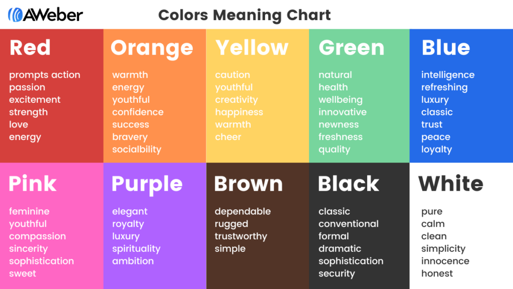
Each color carries a unique set of psychological associations, which, when understood, can be leveraged to craft highly effective marketing messages.
The Calming Credibility of Blue
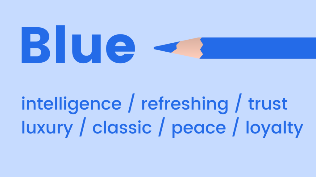
Blue is predominantly associated with feelings of coolness, calmness, and serenity. Its mood-boosting properties are attributed to its ability to signal the body to produce calming chemicals, fostering a sense of positivity and relaxation. Light blue evokes a refreshing and clean aesthetic, often utilized by brands seeking to convey lightness or innovation. Conversely, dark blue is a quintessential choice for brands aiming for an aura of luxury, professionalism, and trustworthiness, without the severe formality sometimes associated with black. Major corporations like IBM and Facebook leverage blue to project stability and reliability.
- When to Use Blue: Ideal for financial institutions, healthcare providers, technology companies, and businesses that want to convey reliability, security, and intelligence. Light blues can be used for refreshing beverages, travel, or wellness brands.
The Youthful Vibrancy of Pink
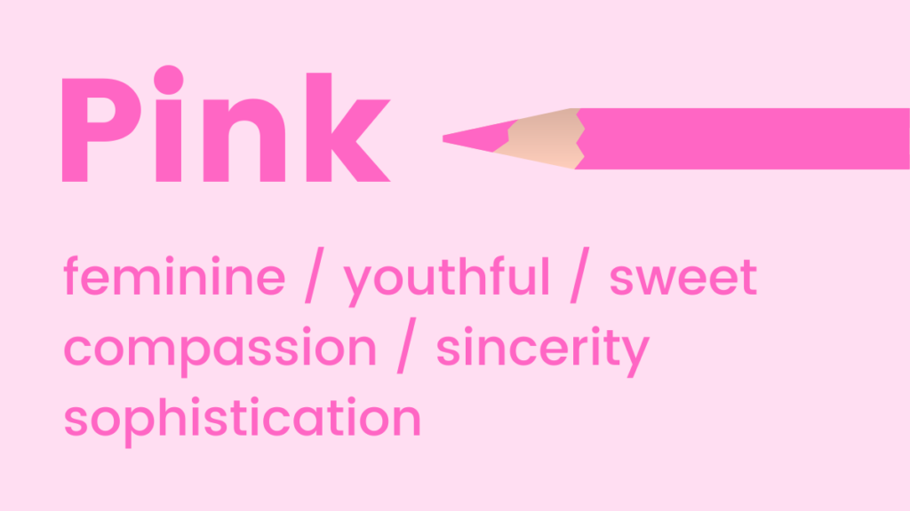
Pink tones exude youthfulness, fun, and excitement. It is a superb choice for emphasizing femininity, sweetness, or charm. Intriguingly, research suggests that the color pink can even influence taste perception, making us crave sugary treats—a phenomenon exploited by confectionery brands. Its versatility allows for a spectrum of expressions, from playful fuchsia to delicate blush. Lyft, for instance, utilizes pink in its branding to project an approachable and friendly image.
- When to Use Pink: Perfect for beauty products, children’s brands, fashion, confectionery, and non-profit organizations (e.g., breast cancer awareness campaigns). Softer pinks can convey tenderness and romance, while brighter shades communicate energy and playfulness.
The Natural Harmony of Green
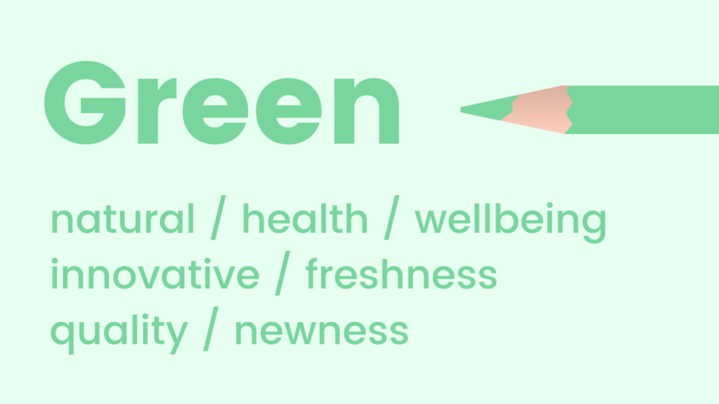
Green hues are intrinsically linked to natural elements, health, and well-being. It is a soothing choice that promotes feelings of relaxation, harmony, and growth. As the color to which the human eye is most sensitive, allowing for the discernment of the greatest number of shades, green offers a broad palette for nuanced communication. Its fresh appeal makes it excellent for promoting new products or features, suggesting novelty and vitality. Brands like Starbucks and Whole Foods effectively use green to underscore their natural or ethical positioning.
- When to Use Green: Highly effective for eco-friendly brands, organic products, health and wellness industries, outdoor and adventure companies, and financial services (representing money and growth).
The Energetic Optimism of Orange
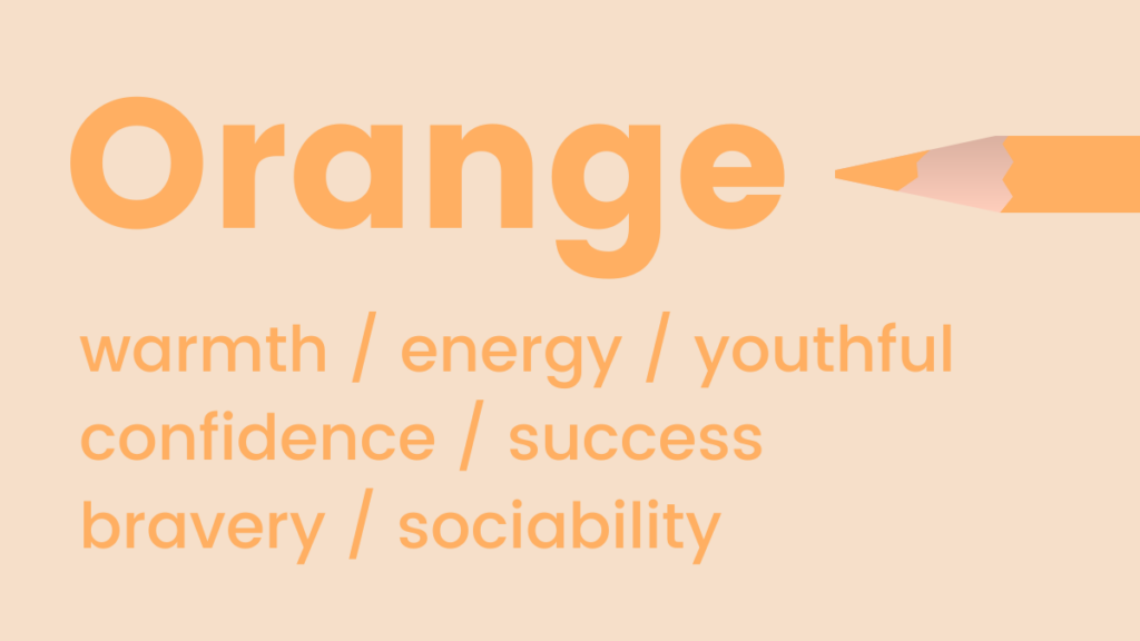
Orange radiates warmth and energy, embodying fun, flamboyance, positivity, and optimism. This vibrant color is also uniquely associated with trust and safety, perhaps due to its common use in safety equipment and warning signs (though often combined with other colors for high visibility). Its inviting glow can draw attention without being as aggressive as red. Amazon frequently uses orange for its "Add to Cart" buttons, combining urgency with an approachable feel.
- When to Use Orange: Excellent for brands targeting younger demographics, creative industries, food and beverage (often stimulating appetite), and call-to-action buttons where a friendly yet urgent prompt is desired. Marketers often use it to signal affordability or approachability.
The Joyful Stimulation of Yellow
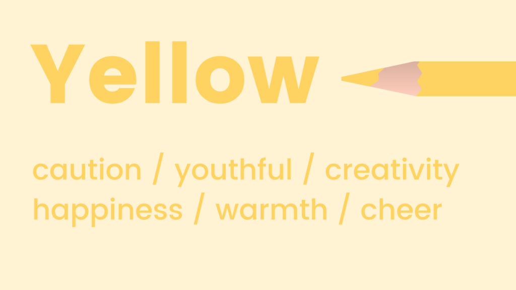
Similar to orange, shades of yellow symbolize positivity and optimism, widely regarded as the happiest color in the spectrum. Psychologically, yellow is known for activating memory, stimulating mental processes, and encouraging communication. Its high visibility also makes it an effective attention-grabber, though overuse can lead to visual fatigue or anxiety. Lego famously employs yellow to appeal to children, associating their brand with joy and creativity.
- When to Use Yellow: Best for brands wanting to convey cheerfulness, warmth, and accessibility. It’s often used in children’s products, travel promotions, and for highlighting important information or calls to action (when used judiciously). Gold tones can evoke luxury and quality.
The Sophisticated Authority of Black
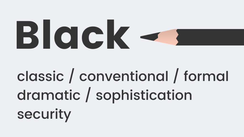
Black is a timeless and classic color choice that inherently conveys formality, sophistication, and power. The phrase "black tie" epitomizes its association with elegance. It also subtly implies weight and substance; studies have shown that people perceive a black box as heavier than an identical white one. This perception of gravitas makes black a powerful tool for high-end brands like Chanel or Rolex, signaling exclusivity and premium quality.
- When to Use Black: Ideal for luxury brands, fashion, high-end technology, and professional services where authority and exclusivity are key. It can also be used effectively for minimalist designs to create contrast and focus.
The Pure Simplicity of White
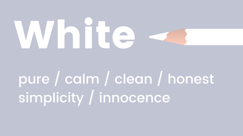
White is the embodiment of coolness, calmness, and serenity. It is an excellent choice for brands aiming for a modern, fresh, and minimalist aesthetic. White often signifies purity, cleanliness, and new beginnings, providing ample negative space that allows other elements to stand out. Tech giants like Apple extensively use white to emphasize simplicity, innovation, and user-friendliness.
- When to Use White: Frequently employed by tech companies, healthcare, the bridal industry, and any brand that seeks to convey simplicity, clarity, efficiency, and a clean user experience. It acts as a perfect backdrop for vibrant accent colors.
The Creative Elegance of Purple
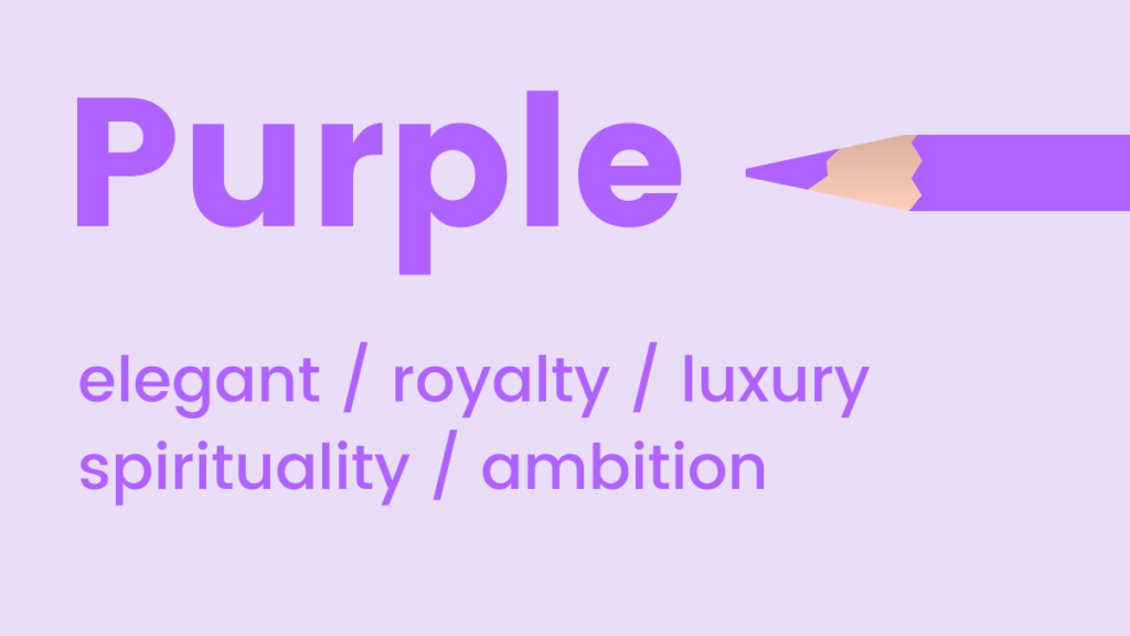
Purple combines the stability of blue with the energy of red, creating a hue that is both luxurious and elegant. It occupies an intriguing psychological space, uplifting while maintaining a sense of calm. Purple is also strongly associated with creativity, wisdom, and imagination, stemming from its historical connection to royalty and scarcity. Stuart Weitzman notably incorporates purple in its branding, especially with its distinctive shoeboxes, to reinforce a sense of luxury and sophistication.
- When to Use Purple: Excellent for luxury goods, creative industries, beauty and anti-aging products, and brands that wish to convey a sense of premium quality, sophistication, and uniqueness. Lighter lavenders can suggest romance or nostalgia.
The Urgent Passion of Red
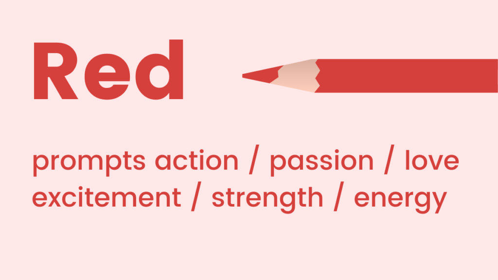
Red tones are synonymous with passion, adrenaline, and action. As a high-energy color, it can effectively boost energy levels and quicken the pulse, making it an ideal choice for conveying urgency or excitement. Its boldness ensures visibility and can be a powerful driver of immediate consumer response, often seen in sales and promotional messaging. McDonald’s uses red to stimulate appetite and create a sense of energy.

- When to Use Red: Highly effective for sales, promotions, call-to-action buttons (e.g., "Buy Now," "Sign Up"), fast food (stimulates appetite), entertainment, and any message requiring immediate attention or evoking strong emotions like love or excitement. It is also commonly used for warnings or alerts.
Strategic Color Combinations for Websites and Landing Pages
Beyond individual color meanings, the harmonious combination of colors is critical for creating a visually appealing and effective digital presence. Many "non-designers" struggle with this, leading to suboptimal aesthetic and psychological impact. However, with a basic understanding of color theory, anyone can craft compelling color schemes. The color wheel serves as the foundational tool for this, guiding designers to create combinations that are either soothing or dynamic.

Analogous Color Schemes: Harmonious Flow
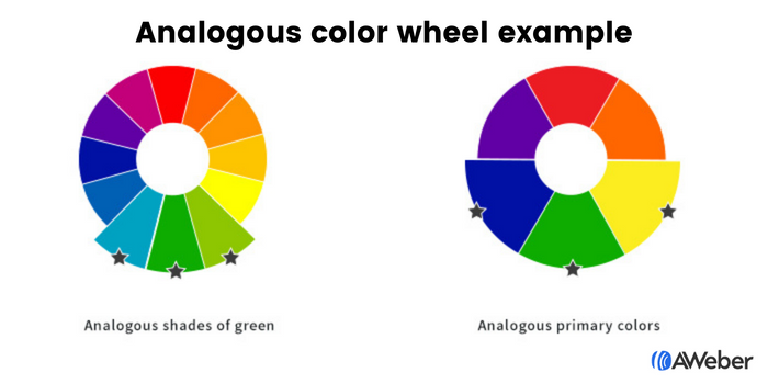
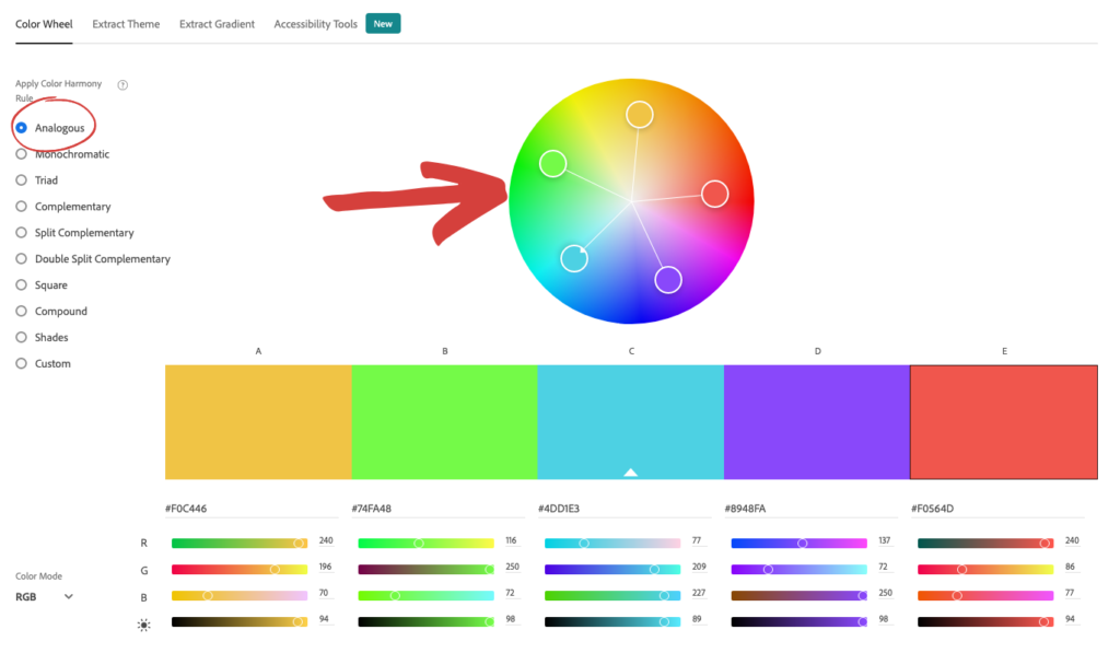
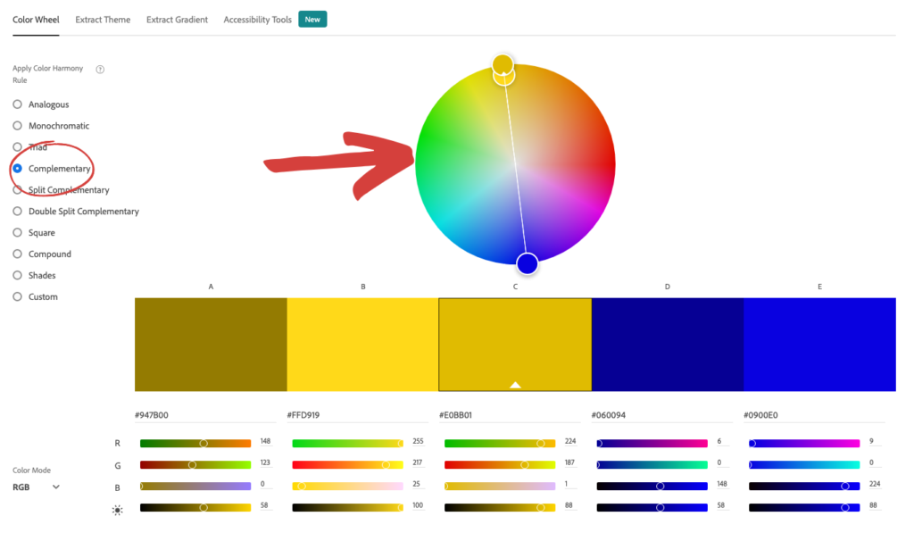
Analogous colors are those that sit adjacent to each other on the color wheel. This proximity creates a sense of harmony and visual continuity, as these colors naturally blend into one another. For example, a palette of blue, blue-green, and green, or various shades within a single color family, would be analogous. Such schemes are inherently pleasing to the eye and provide a cohesive, understated feel. Tools like Adobe Color CC allow users to easily identify analogous combinations by selecting a base color and automatically suggesting its neighbors on the wheel. This approach simplifies the design process, ensuring aesthetic coherence even for those without formal design training.

Complementary Color Schemes: Dynamic Contrast
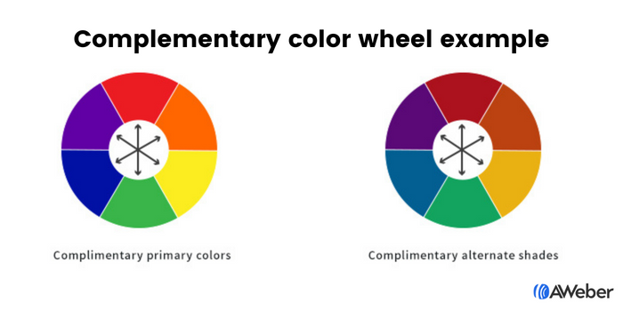
For a more striking and dynamic visual impact, complementary color arrangements are highly effective. Complementary colors are positioned directly opposite each other on the color wheel, such as blue and orange, green and red, or purple and yellow. These pairings create a strong contrast that commands attention and adds visual interest, making elements "pop" against each other. When used strategically, complementary colors can highlight calls to action or key information, guiding the user’s eye without creating visual clutter. Like analogous schemes, Adobe Color CC provides an intuitive way to discover and experiment with complementary palettes, making it accessible for designers of all skill levels. Other color schemes, such as triadic (three colors evenly spaced on the wheel) or monochromatic (variations of a single hue), also offer distinct visual effects for varied design goals.

Optimizing Sign-Up Forms with Intentional Color Choices
Sign-up forms are critical conversion points, and their visibility and appeal are paramount. Color plays a significant role in ensuring these forms capture visitor attention and encourage completion. The principles of analogous, complementary, and especially contrasting colors can be powerfully applied here.

By utilizing analogous or complementary color theories, a sign-up form can be designed to either blend seamlessly with the overall website aesthetic or stand out with deliberate elegance. For instance, a form using three shades of green (analogous) might convey an eco-friendly or organic theme, while a purple and yellow combination (complementary) could suggest creativity and cheerfulness.
However, the most direct way to ensure a form is noticed is through contrasting colors. Contrast silently yet powerfully directs the visitor’s gaze. This can be achieved in two primary ways:
- Contrast Between the Form and the Site: Making the sign-up form’s background a starkly different color from the surrounding website immediately draws the eye to it. If the website is predominantly