Website popup forms, those small overlay windows designed to capture visitor email addresses, stand as one of the most potent, yet equally contentious, tools in a digital marketer’s arsenal. When deployed with precision and respect for the user journey, they represent an unparalleled method for accelerating email list growth. Conversely, a poorly executed popup can swiftly alienate visitors, degrade user experience, and ultimately drive traffic away, undermining meticulously crafted content and brand reputation. The critical distinction between success and failure lies not in the mere presence of the popup itself, but in the sophisticated orchestration of its timing, placement, and frequency.
The digital landscape is replete with examples of popups that fall short of their potential, primarily due to their indiscriminate deployment. A common misstep involves presenting a popup too early in the user’s interaction, often within seconds of arrival, or displaying it relentlessly across every page. This aggressive approach, demanding an email address before a visitor has even had the opportunity to consume initial content, transforms a potential conversion opportunity into an unwelcome interruption. Research by companies like Sumo and OptinMonster consistently demonstrates that while average popup conversion rates hover between 3% and 9%, the top-performing popups, those adhering to best practices, can achieve rates exceeding 15% or even 20%. This stark contrast underscores that effective list building through popups is not about quantity of impressions, but quality of interaction. The objective is to cultivate a respectful dialogue with the user, ensuring the popup enhances, rather than detracts from, their browsing experience.
The Evolution and Current Landscape of Popup Technology
The concept of the website popup emerged in the late 1990s, initially designed to display advertisements in new browser windows. These early iterations were largely intrusive and quickly became synonymous with annoyance, prompting the development of browser-level popup blockers. However, as digital marketing matured, marketers recognized the inherent power of these overlays for direct audience engagement, particularly for email list building. Over time, popup technology evolved from simple, browser-based windows to sophisticated, in-page overlays that can be triggered by a multitude of user behaviors.

Today, the digital marketing ecosystem offers advanced tools designed to address the historical criticisms of popups. One such innovation is AWeber’s AI Signup Form Builder, launched in May 2026. This platform exemplifies the industry’s pivot towards user-centric design and automation. It allows marketers to generate an entire popup form—including copy, design, layout, and fields—from a simple text description. For instance, a user can input: "I run a marketing blog. Offer a free email checklist. Show the form after 30 seconds." The AI then autonomously crafts a relevant and aesthetically pleasing popup. This significant technological leap streamlines the design process, eliminating the need for extensive coding, separate design tools, or third-party plugins, and automatically integrates the form with the user’s AWeber email list and automation sequences. This capability marks a crucial step in making sophisticated, high-converting popup strategies accessible to businesses without dedicated large marketing teams, focusing on delivering value through intelligent automation.
Regardless of whether a popup is generated by AI or designed manually, adherence to fundamental principles remains paramount for maximizing conversion rates while upholding user experience.
Crafting the Anatomy of a High-Converting Popup
The efficacy of a popup hinges on its structural elements and the psychological principles they leverage.
-
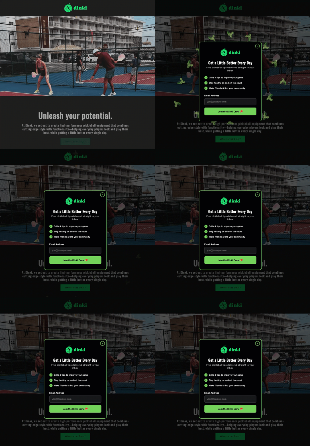
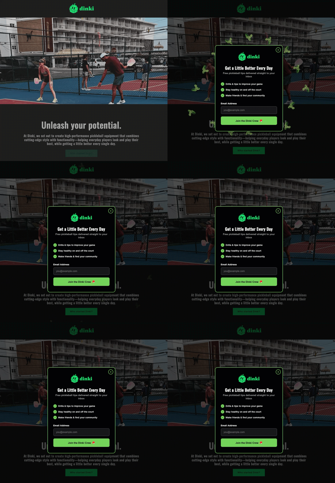
Start with a Specific Headline: The headline is the popup’s most critical component, serving as its primary value proposition. It must be concise, explicit, and immediately convey what the visitor stands to gain, ideally in under ten words. Generic calls to action such as "Subscribe to our newsletter" perform significantly poorer than specific offers like "Get the Weekly Marketing Checklist" or "Unlock Your Free E-commerce Guide." The visitor should comprehend the offer’s tangible benefit before reading any further, directly addressing their immediate needs or interests. Naming the deliverable—e.g., "Free Email Marketing Checklist"—rather than vaguely inviting them to "Join our list" clarifies expectations and enhances perceived value.
-
Add a Value Statement (Optional but Recommended): A brief, one-sentence statement positioned below the headline can powerfully reinforce the offer. This statement should either build urgency ("Sent to your inbox in 60 seconds") or establish credibility and social proof ("Used by 5,000+ small business owners"). Such statements provide crucial context, influencing the visitor’s decision-making process. If the headline alone is sufficiently clear and compelling, this element can be omitted to maintain brevity. However, strategic use can significantly bolster conversion rates by addressing potential hesitations.
-
Keep the Form to One or Two Fields: Simplicity is a cornerstone of high-converting forms. For initial lead capture via a popup, the email address is typically the sole essential field required to initiate a relationship. While a name field can be added for personalization, it should generally be considered the absolute maximum. Industry data consistently shows that every additional field reduces completion rates, sometimes drastically. The principle of progressive profiling suggests that more extensive data can be collected later, perhaps through welcome emails, subsequent surveys, or a preference center, once a foundational relationship has been established. This minimalist approach minimizes friction and maximizes the likelihood of immediate conversion.
-
Use Action Language on the Button: The Call-to-Action (CTA) button is the final prompt for conversion, and its language is crucial. Action-oriented phrases such as "Send me the checklist" or "Get My Free Guide" consistently outperform generic terms like "Submit" or "Sign Up." Furthermore, tests have frequently shown that first-person language ("Get my free guide") tends to convert better than second-person ("Get your free guide"), as it psychologically frames the action as the visitor claiming something for themselves. The CTA should be specific to the offer, reiterating the benefit promised in the headline.
-
Make the Close Button Obvious: Respect for the user’s autonomy is paramount. A clearly visible and easily clickable close option, rather than a tiny ‘X’ or a guilt-tripping "No, I don’t want more customers" link, is non-negotiable. Forcing visitors to engage or making it difficult to dismiss the popup breeds frustration and erodes trust. If a visitor chooses not to subscribe immediately, their decision should be respected, allowing them to continue browsing without impediment. Trapping visitors yields short-term, low-quality leads and long-term brand damage.
Optimizing Popup Triggers for Enhanced User Experience
The timing of a popup’s appearance is perhaps the most critical factor in determining whether it is perceived as helpful or hostile. A popup that appears within the first few seconds of a page visit signals that the website prioritizes email capture over user experience. Conversely, a popup that intelligently waits until a visitor has demonstrated engagement—by scrolling through content or spending a significant amount of time on a page—is far more likely to be received positively. The three most effective triggers, widely adopted in the industry, are scroll depth, time on page, and exit intent.
-
Scroll-Based Triggers: These triggers activate the popup once a visitor has scrolled a predetermined percentage down the page. For content-rich pages like blog posts, a scroll depth of 40% to 60% is often optimal. At this point, the visitor has invested enough time to consume a substantial portion of the content, indicating genuine interest in the site’s offerings. Presenting an offer when their engagement is high dramatically increases the likelihood of conversion.
-
Time-Based Triggers: Time-based triggers deploy the popup after a set number of seconds has elapsed since the visitor arrived on the page. An interval of 15 to 30 seconds typically allows sufficient time for most visitors to engage with the initial content. Any duration under ten seconds can feel aggressive and intrusive, leading to higher abandonment rates. The ideal time varies by content type and audience, necessitating A/B testing for fine-tuning.
-
Exit-Intent Triggers: Widely regarded as the least intrusive and often most effective trigger, exit-intent technology detects when a visitor’s cursor moves towards the browser’s close button, back button, or address bar, signaling an imminent departure. The popup appears precisely at this critical moment, offering a final incentive to stay or connect. Exit-intent popups consistently report higher conversion rates—often 2 to 4 times greater than time-based popups—because they do not interrupt the active reading experience. Instead, they serve as a last-ditch effort to capture a user who was already leaving, converting potential lost traffic into valuable leads.
Sophisticated platforms allow for the combination of these triggers. For instance, a scroll-based popup could be shown to highly engaged readers, while an exit-intent popup is reserved for all other visitors. This layered approach ensures that visitors deep into the content receive a timely offer when their interest is piqued, while those on the verge of leaving are given one last, compelling reason to remain connected.
Frequency and Targeting: Respecting User Boundaries and Context
Beyond timing, the frequency and targeting of popups are crucial for maintaining a positive user experience and maximizing conversion efficacy.
-
Frequency Capping: Repeatedly showing a popup to the same visitor, especially immediately after they have closed it, is a surefire way to induce frustration and train them to abandon the site. Implementing a frequency cap, such as displaying the popup once per session or once every seven days, is essential. This respectful approach acknowledges a visitor’s immediate decision not to subscribe and avoids badgering. Persistent, repetitive popups do not magically convert resistant visitors; they merely confirm their decision to leave and can actively harm brand perception.
-
Page Targeting: Not every page on a website benefits from a popup, nor should the same generic popup appear everywhere. Tailoring the popup to the specific content of the page significantly enhances its relevance and conversion potential. A popup offering a "blog writing checklist" is highly relevant on a blog post about content marketing but would be entirely out of place on a pricing page. Generic "join our newsletter" popups invariably underperform compared to targeted offers that are contextually tied to the content the visitor is currently engaging with. If a user is reading about email automation, an offer for a resource on email automation will resonate far more strongly.
-
Device Targeting and Google’s Stance: Popups behave differently across desktop and mobile devices, a distinction that carries significant implications for user experience and search engine optimization (SEO). A popup that is perfectly legible and non-intrusive on a desktop screen can consume the entire viewport of a smartphone, creating a frustrating experience. Recognizing this, Google introduced penalties for "intrusive mobile interstitials" in January 2017. Full-screen popups that immediately cover content upon mobile page load can negatively impact search rankings. However, popups triggered by time delays, scroll depth, or exit intent are generally not penalized, as they are deemed less intrusive. Best practice dictates deploying smaller banners or slide-in forms on mobile devices, reserving full-screen popups for desktop users, and ensuring the close button is easily discoverable and tappable on all screen sizes. This responsive design approach is critical for maintaining SEO health and providing a seamless mobile experience.
Innovative Popup Formats and Their Psychological Impact
Beyond the standard email capture form, modern popup builders, including AWeber’s AI Signup Form Builder, enable a variety of creative formats that leverage psychological principles to enhance engagement and conversion.
-
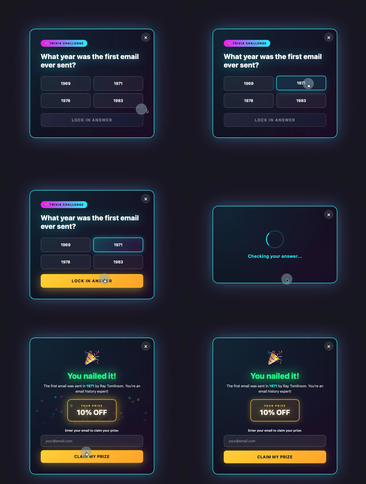
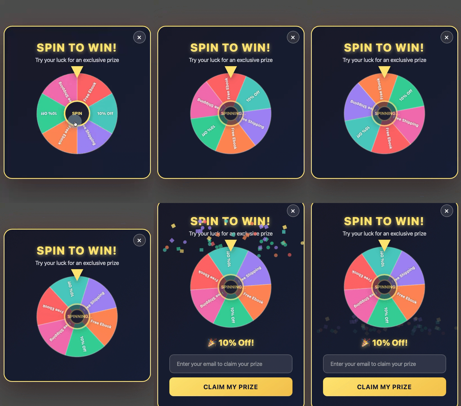
Gamified Popups: Transforming the popup into a quiz, trivia question, or "spin-to-win" wheel introduces an element of playfulness and engagement. The visitor interacts with the popup before being presented with the email field. This initial, low-commitment engagement primes them for the subsequent request, often leading to higher conversion rates as users feel they have "earned" their offer.
-
Discount Offers: Particularly effective for e-commerce, discount offer popups, often in the form of a spin-to-win wheel or a direct coupon code, are powerful when triggered by exit intent. As a visitor prepares to leave, a personalized discount can provide the necessary incentive to complete a purchase or at least capture their email for future marketing efforts. The perceived value of the discount outweighs the slight friction of providing an email address.
-
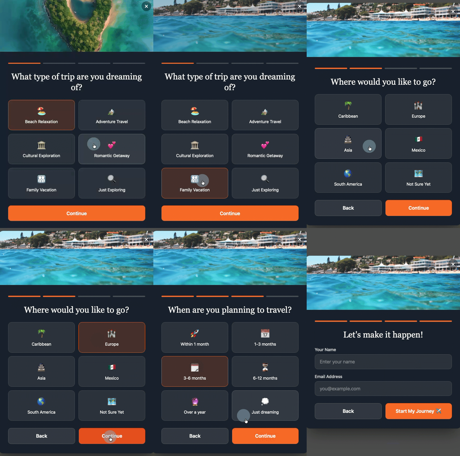
Multi-Step Forms: Multi-step forms break down the conversion process into smaller, less daunting steps. The visitor first makes a low-commitment decision (e.g., selecting a category of interest), and only after this initial engagement are they presented with the email field. This progressive commitment strategy, known as the "foot-in-the-door" technique, increases the likelihood of completion as users feel more invested in the process.
-
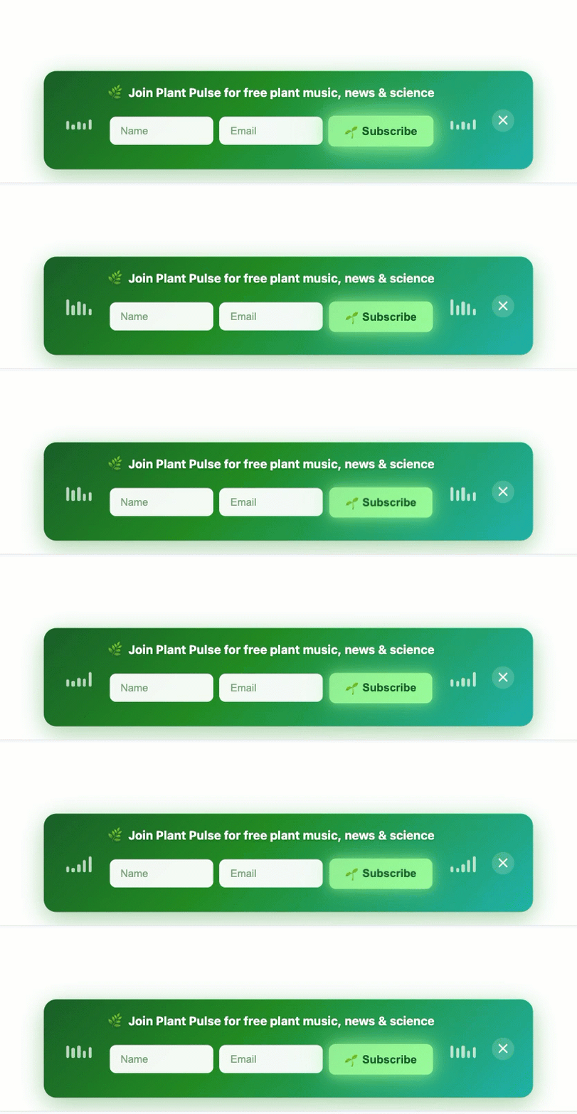
Sticky Bars: A sticky bar is a non-intrusive, thin bar positioned at the top or bottom of the page, featuring a form field and a Call-to-Action button. It remains visible as the user scrolls, offering a persistent, yet unobtrusive, opportunity to subscribe without ever blocking the main content. Sticky bars are excellent for long-form content pages where continuous engagement is desired without interruption.
Each of these formats, readily customizable and deployable through advanced tools, underscores the shift in popup strategy from intrusive annoyance to integrated, value-driven engagement. By carefully considering the content, timing, and user context, businesses can transform what was once a disruptive element into a powerful engine for audience growth and sustained digital relationships. The goal remains consistent: to build a popup that not only converts but also genuinely respects the individual on the other side of the screen, fostering trust and loyalty in the long term.