The psychology of color in marketing stands as one of the most profoundly impactful tools at a marketer’s disposal, shaping consumer perceptions and influencing purchasing decisions long before a single word is read. Color transcends language barriers, instantly setting a mood, evoking powerful emotions, and sparking immediate psychological reactions that can either significantly enhance or detract from the perceived value of a product or service. Research underscores this fundamental truth, with studies indicating that a remarkable 90 percent of a subscriber’s initial impression of an email message, or indeed a website, is predicated solely on color or other visual cues. This profound impact necessitates a deep understanding of how specific hues can be leveraged to optimize marketing performance across various digital touchpoints, including websites, landing pages, sign-up forms, and email campaigns.
The Foundational Role of Color in Brand Identity and Consumer Behavior
The significance of color extends far beyond mere aesthetics, embedding itself deeply into the fabric of brand identity and consumer psychology. A comprehensive survey revealed that 84.7% of consumers deem color an important factor when considering a product purchase, highlighting its critical role in the buying journey. Furthermore, strategic color application has been shown to boost brand recognition by an impressive 80%, transforming abstract concepts into memorable visual experiences. This direct correlation between color use and customer perception is evident in how readily consumers associate specific colors with their favorite brands. The choice of a brand’s primary color is rarely arbitrary; it is a calculated decision aimed at aligning visual identity with core values and desired emotional responses.
The evolution of color psychology as a marketing discipline traces back to the early 20th century, but its scientific underpinning gained significant traction in the latter half, particularly with the advent of mass media and advertising. Marketers began to systematically study consumer responses to different colors, moving from anecdotal evidence to empirical data. This chronological development has culminated in a sophisticated understanding that combines art, science, and cultural anthropology to craft compelling visual narratives. Early theories focused on universal color associations, but modern applications acknowledge the nuanced interplay of cultural context, personal experiences, and market segment.
Decoding the Emotional Spectrum: Individual Color Meanings and Marketing Applications
Each color possesses a unique psychological profile, capable of eliciting distinct emotional responses. Understanding these nuances is paramount for strategic marketing deployment.
-
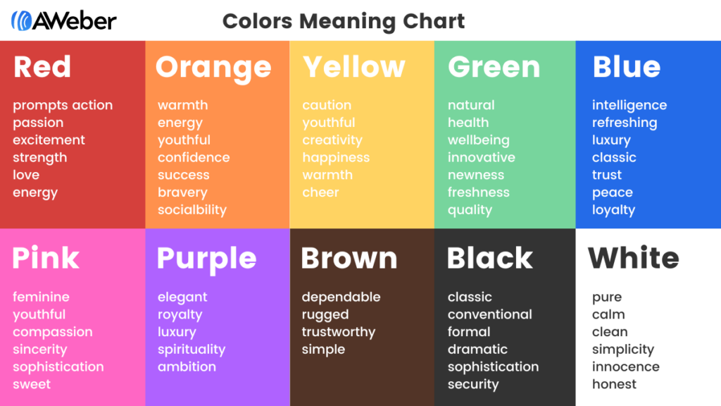
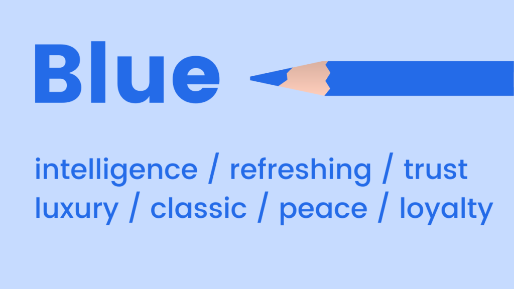
Blue: Frequently associated with feelings of coolness, calmness, and stability. Its mood-boosting properties are believed to signal the body to produce calming chemicals, promoting positivity. Light blue conveys refreshment and openness, making it ideal for brands emphasizing clarity, technology, or freshness (e.g., tech companies, airlines, water brands). Dark blue, by contrast, is a classic choice for brands seeking to convey luxury, trust, and professionalism without the starkness of black (e.g., financial institutions, corporate services, high-end automotive). Its widespread acceptance also makes it a safe and reliable choice for establishing credibility.
- When to use blue: Corporate websites, financial services, healthcare, technology, calm-inducing environments, trust-building communications, luxury branding.
-
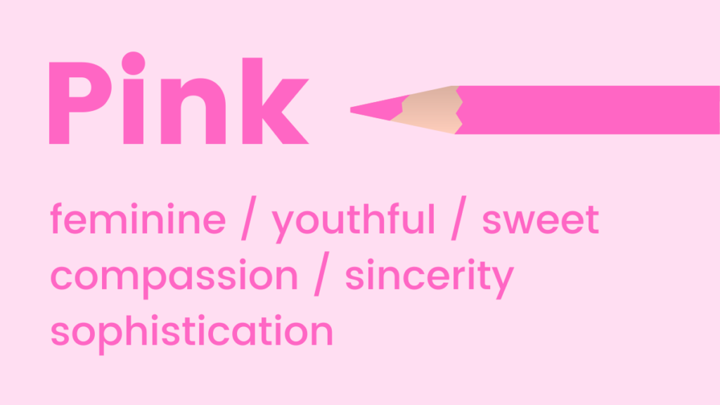
Pink: Evokes youthfulness, fun, and excitement. It is a powerful signifier of femininity, sweetness, and romance, with studies even suggesting it can stimulate cravings for sugar. Various shades offer different appeals: pastel pinks suggest softness and innocence, while vibrant fuchsias convey energy and playfulness.
- When to use pink: Beauty products, children’s brands, confectionery, fashion targeting younger demographics, romance-themed promotions, welcome emails designed for warmth.
-
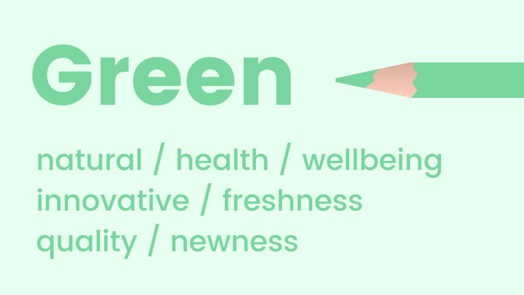
Green: Strongly reminiscent of natural elements, health, and well-being. It is a soothing choice that promotes feelings of relaxation, harmony, and renewal. The human eye is most sensitive to green, allowing it to discern a vast array of shades. Its inherent freshness makes it an excellent color for promoting new products, sustainable initiatives, or growth.
- When to use green: Environmental brands, health and wellness products, organic food, financial growth services, outdoor recreation, "new arrival" announcements, relaxing website interfaces.
-
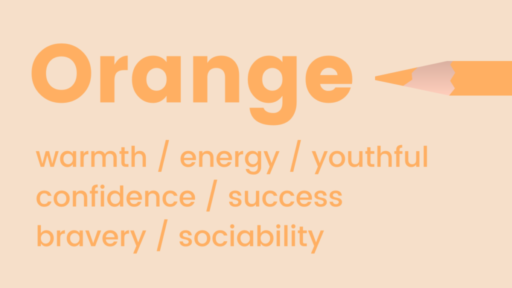
Orange: A vibrant hue representing warmth, energy, and enthusiasm. Its flamboyant nature is often associated with positivity, optimism, and creativity. Intriguingly, orange is also naturally linked with feelings of trust and safety, making it a powerful, albeit bold, choice for calls to action.
- When to use orange: Calls-to-action (especially for younger audiences), creative industries, food and beverage (appetite stimulant), entertainment, sports, urgent promotions that still need to feel friendly.
- Pro Tip: For marketers hesitant about its boldness, gradually integrate orange through images or subtle accents before committing to larger design elements.
-
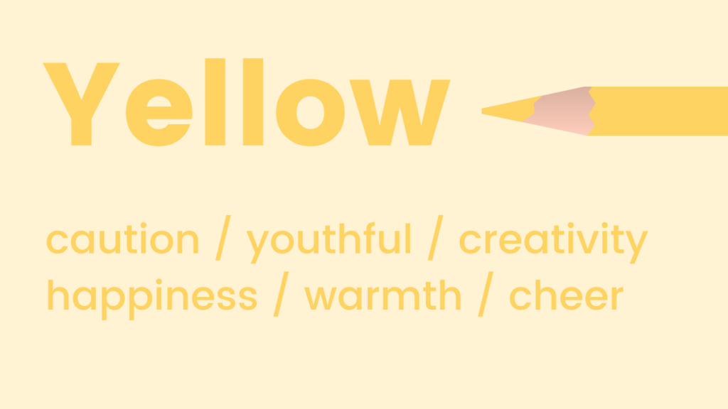
Yellow: Like orange, yellow symbolizes positivity and optimism, widely recognized as the happiest color in the spectrum. It is also known for activating memory, stimulating mental processes, and encouraging communication, making it effective for drawing attention and fostering engagement.
- When to use yellow: Brands targeting children, educational content, calls to attention, warnings, promotions highlighting happiness or optimism, creative services.
-
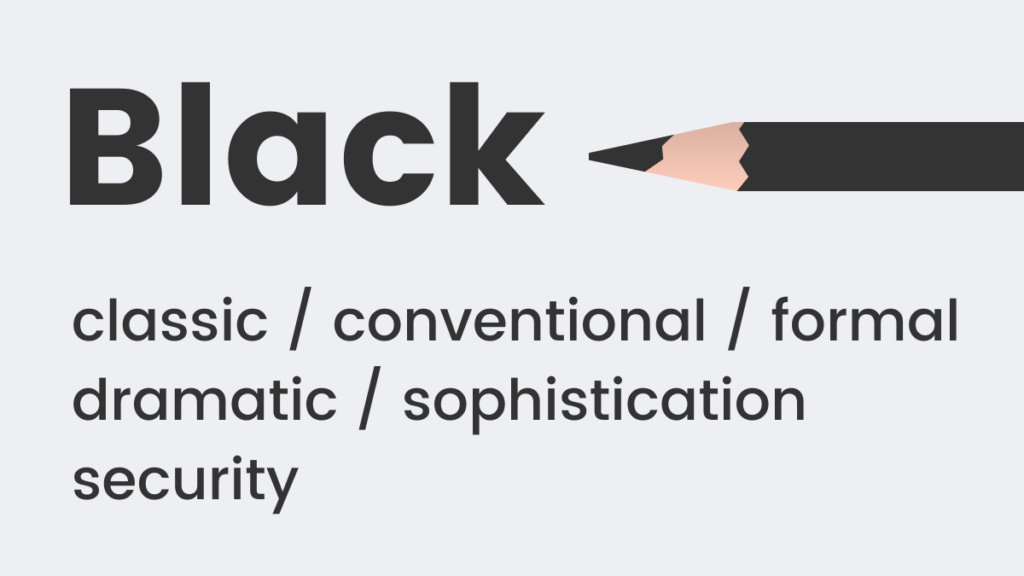
Black: A classic and timeless color choice, black often represents formality, sophistication, and power ("black tie" events). It also implies weight and substance; studies show people perceive a black box as heavier than a white one of the same size. Used strategically, it can convey exclusivity and strength.
- When to use black: Luxury brands, high-end fashion, formal services, tech products (sleek design), to create strong contrast, as a background for vivid elements.
-
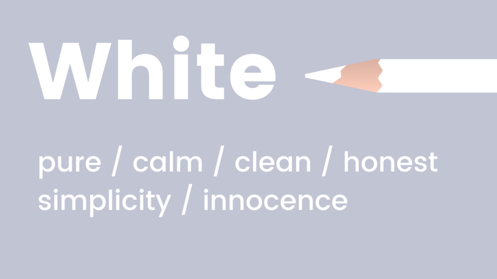
White: Conveys coolness, calmness, and serenity. It is an ideal choice for brands aiming for a modern, fresh, pure, or minimalist aesthetic. White often symbolizes new beginnings, cleanliness, and simplicity, providing ample negative space for other elements to stand out.
- When to use white: Healthcare, bridal, technology (clean interfaces), minimalist design, luxury goods (to convey purity), any context where clarity and simplicity are paramount.
-
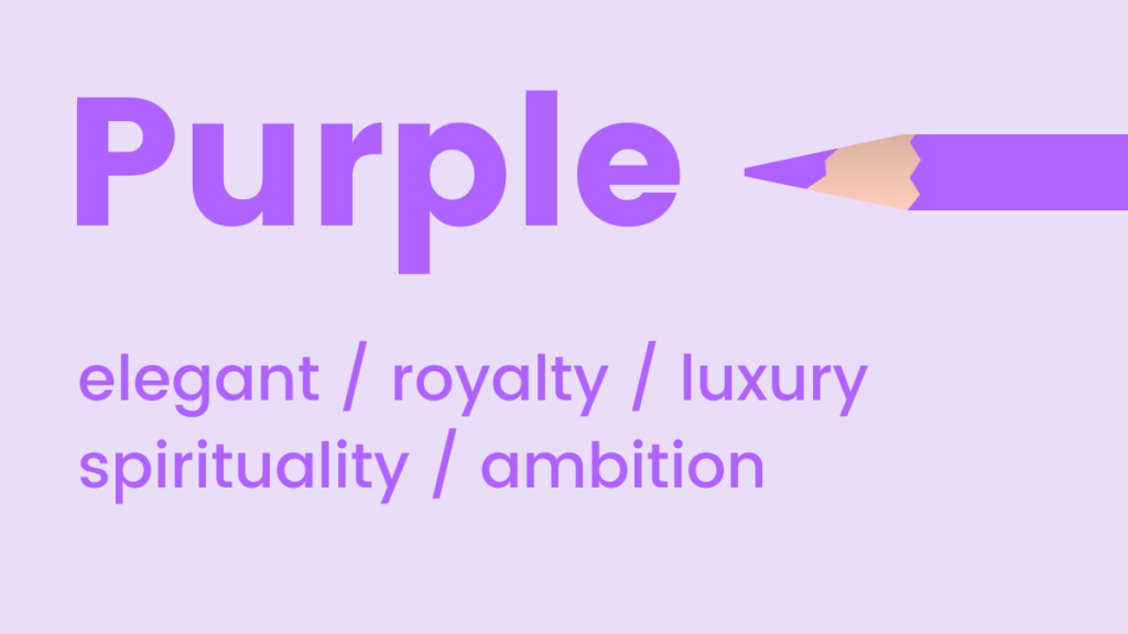
Purple: A regal color associated with luxury, elegance, and sophistication. It occupies a unique position, blending the calm of blue with the energy of red, thus uplifting while maintaining a sense of serenity. Purple is also known to encourage creativity and imagination.
- When to use purple: Luxury products, creative industries, beauty and skincare, spiritual or mystical themes, educational content (to inspire thought).
-
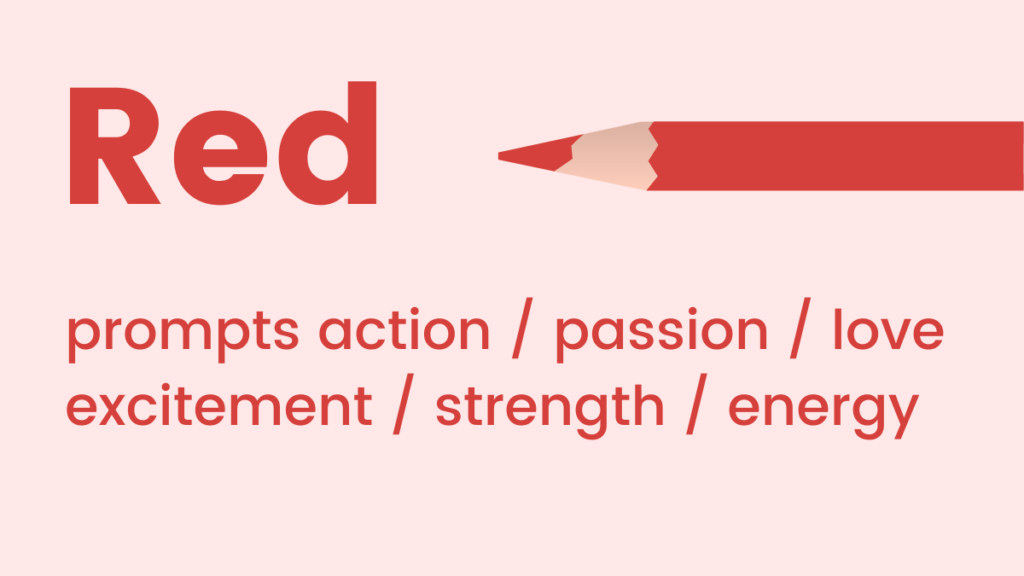
Red: A high-energy color representing passion, adrenaline, and action. It is known to boost energy levels and increase heart rate, making it an excellent choice for conveying urgency, excitement, and strong emotion. Red demands attention and can be highly effective for calls to action, sales, or warnings.

- When to use red: Sales, promotions, calls to action (e.g., "Buy Now"), food (appetite stimulant), emergency services, automotive, brands wanting to project boldness and power.
Strategic Color Scheme Selection for Digital Platforms

For websites and landing pages, selecting an effective color scheme can often be a daunting task for non-designers. However, a basic understanding of color theory simplifies this process, enabling the creation of harmonious and impactful visual experiences. Two primary color schemes are particularly effective for digital design:

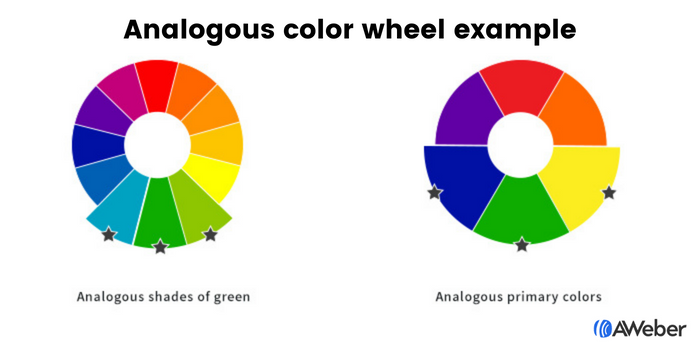
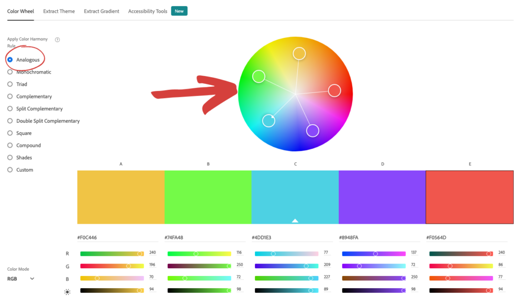
Analogous Colors: These are colors located adjacent to each other on the color wheel. This proximity creates a sense of harmony and visual comfort, as the colors naturally blend and complement one another without harsh contrasts. Analogous schemes are inherently soothing and aesthetically pleasing, making them suitable for brands that want to convey calmness, nature, or a seamless experience. Tools like Adobe Color CC allow users to easily identify analogous combinations by selecting a primary color and seeing its neighbors on the wheel. This approach ensures a cohesive and professional look, guiding the visitor’s eye gently through the content.

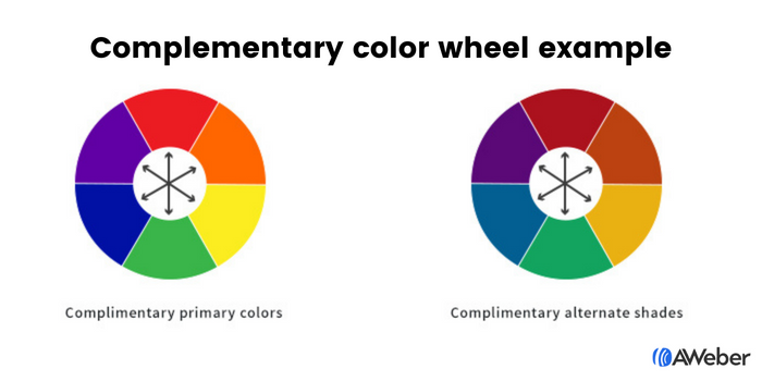
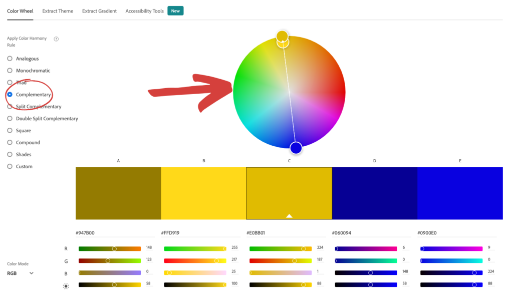
Complementary Colors: Found on opposite sides of the color wheel, complementary colors offer the highest degree of contrast. Pairings like blue and orange, green and red, or purple and yellow create visual vibrancy and draw immediate attention. While analogous schemes offer harmony, complementary schemes provide dynamism and a clear focal point. These pairings are visually appealing and excellent for highlighting specific elements, such as calls to action, without making the design feel chaotic. Adobe Color CC also facilitates finding complementary colors, allowing designers to experiment with various vibrant combinations to achieve desired emphasis. While powerful, complementary schemes should be used judiciously to avoid overwhelming the user; often, one color acts as a dominant hue, and its complement is used for accents.

Optimizing User Interaction: Colors for Sign-Up Forms and Emails
The effectiveness of sign-up forms hinges significantly on their visibility and appeal, where color plays a pivotal role in capturing visitor attention and encouraging action.

Sign-Up Forms:
The principles of analogous, complementary, and especially contrasting colors are vital for form design.
- Analogous and Complementary forms: Using these schemes can ensure your form integrates aesthetically with your overall site design while still being noticeable. An analogous scheme with shades of green, for example, creates a natural, inviting form, while a complementary purple and yellow combination can make the form pop with friendly energy.
- Contrasting Colors: This is arguably the most powerful technique for forms.
- Contrast between form and site: Making the sign-up form’s background a distinctly contrasting color from the surrounding website immediately draws the eye, silently commanding attention. This direct visual separation makes the form unmissable.
- Contrast within the form: Once the visitor’s attention is on the form, internal contrast ensures they understand the next steps. Using contrasting shades for form fields and, crucially, the call-to-action button makes these elements highly noticeable. For instance, a dark form background with bright yellow fields and an orange button creates a clear visual hierarchy, guiding the user to complete the form and click. This application of contrast is directly linked to conversion rates, as a clear and visible CTA drastically increases the likelihood of engagement.
Email Campaigns:
Color choices in marketing emails should be purpose-driven, aligning with the specific goal of each message.
- Email Newsletters: Typically used for delivering regular updates, news, or educational content. These emails benefit from abundant white space, with minimal splashes of brand colors. The primary goal is readability, so secondary colors should not distract from the content. The exception is a call-to-action button, which should use a contrasting color to draw attention and encourage clicks to external content like blog articles or videos.
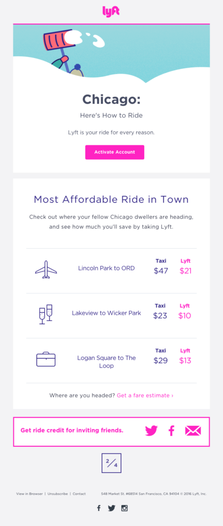
- Welcome Emails: Often the first significant interaction a new customer has with a brand. These emails are critical for reinforcing brand identity, making consistent use of brand colors essential to build recognition and familiarity. A warm, friendly palette (like Lyft’s use of pink) can set a positive tone.
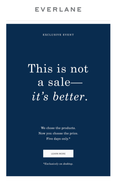
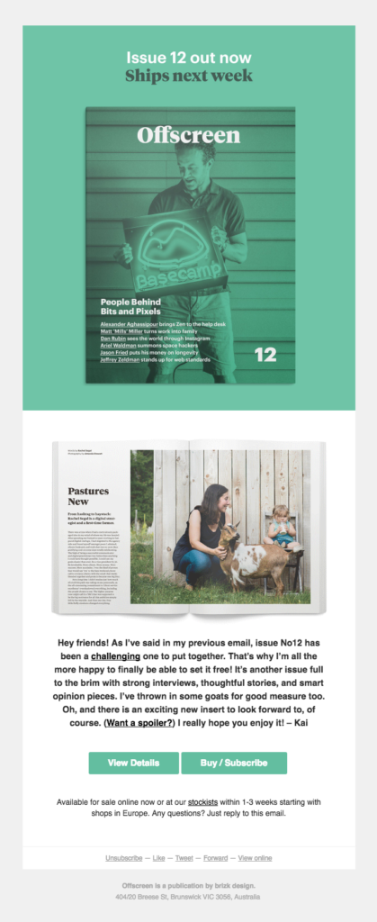
- Sales Emails: Color choices here are highly dependent on the offer and target audience. Applying the psychology of color principles discussed earlier is crucial. For example, red can convey urgency for limited-time offers, while blue might establish trust for a high-value product. Examples show brands like Warby Parker using pale blue for a refreshing feel, Everlane using dark blue for luxury, Offscreen using green for a fresh product launch, Lego leveraging yellow for its child-friendly appeal, Harry’s using black for sophistication with a contrasting white CTA, The Little White Company using white for purity, and Stuart Weitzman incorporating signature purple for elegance in abandoned cart emails.
Brand Color Evolution and AI-Powered Design
For existing brands with established color palettes, applying these psychological principles might seem challenging. However, brand aesthetics are not static; they can and should evolve. A brand, like a person, changes over time, and adapting its visual identity can signify growth and relevance. Integrating new colors that complement existing ones, or even introducing entirely new hues, can mark a "new, better era" for a business. Tools like Coolors enable marketers to input existing brand colors and generate harmonious palettes, making color expansion an accessible process.
The future of color application in marketing is increasingly being shaped by artificial intelligence. AWeber’s innovative AI Signup Form Builder exemplifies this shift, allowing users to describe their desired form – its look, feel, and vibe – using natural language. The AI then generates the form, even capable of replicating designs from screenshots. This capability empowers marketers to translate color psychology knowledge directly into actionable design prompts, such as "a dark background with an orange button that pops" or "a clean, white newsletter layout with a red CTA." The AI understands the intent behind color choices, moving beyond generic templates to create audience-specific designs. This AI-powered approach is expanding to email and landing page builders, promising a future where marketers can effortlessly implement sophisticated color strategies, focusing on the psychological impact while the AI handles the design execution. This development democratizes design, accelerates content creation, and ensures that color choices are not only aesthetically pleasing but also strategically optimized for maximum marketing impact.