The global e-commerce landscape in 2025 faces a persistent and costly challenge as average cart abandonment rates have stabilized at approximately 70.22%, according to the latest industry benchmarks. While data suggests that approximately 43% of these "abandoners" are merely window-shopping or comparing prices with no immediate intent to purchase, the remaining segment represents a massive reservoir of lost revenue for digital retailers. For a multi-billion-dollar industry, the difference between a high-friction checkout and a seamless transaction can determine the long-term viability of a brand. Industry analysts suggest that by refining the final steps of the customer journey, businesses can reclaim a significant portion of the "intent-driven" shoppers who drop off due to technical or psychological barriers.
![Checkout Page Design: 11 Ways to Reduce Cart Abandonment Rates [+Examples]](https://ceblog.s3.amazonaws.com/wp-content/uploads/2021/09/30141304/Checkout-Page-Design-guest-signin.png)
The Economic Context of Cart Abandonment
E-commerce abandonment is rarely the result of a single flaw but rather a cumulative "friction tax" paid by the consumer. Research from the Baymard Institute and other primary sources indicates that the final stages of the funnel are the most volatile. In an era where consumer patience is at an all-time low and mobile-first shopping is the standard, a well-designed checkout page serves as more than just a payment portal; it is a critical trust-building tool.
The financial implications are staggering. With global e-commerce sales projected to continue their upward trajectory through 2026, even a 5% reduction in abandonment can translate to millions of dollars in additional annual recurring revenue (ARR) for enterprise-level retailers. To address this, designers and conversion rate optimization (CRO) specialists are increasingly turning to data-driven design principles that prioritize transparency, speed, and inclusivity.
![Checkout Page Design: 11 Ways to Reduce Cart Abandonment Rates [+Examples]](https://ceblog.s3.amazonaws.com/wp-content/uploads/2021/09/30141200/Checkout-Page-Design-installment-payment.png)
1. Radical Transparency in Pricing and Logistics
The primary catalyst for checkout abandonment remains the "sticker shock" associated with undisclosed costs. Statistics show that surprise shipping fees, taxes, and handling charges account for 39% of all drop-offs. Furthermore, slow delivery estimates contribute to another 21% of lost conversions.
Modern consumers expect a "What You See Is What You Get" (WYSIWYG) experience. Retailers like Wayfair have set the industry standard by integrating total costs—including taxes and estimated delivery dates—directly onto the product page or the very first step of the checkout. By eliminating the "calculated at checkout" ambiguity, brands can filter out price-sensitive browsers early and ensure that those who reach the payment stage are fully committed to the final price.
![Checkout Page Design: 11 Ways to Reduce Cart Abandonment Rates [+Examples]](https://ceblog.s3.amazonaws.com/wp-content/uploads/2021/09/30141517/Checkout-Page-Design-address-autocomplete.png)
2. The Rise of Guest Checkout and Single Sign-On (SSO)
Forcing a customer to create an account before a purchase is a significant point of friction, causing 19% of abandonments. First-time buyers, in particular, view account creation as a barrier to entry and a potential threat to their data privacy.
The solution adopted by leaders like Etsy involves a "Guest Checkout" option that is visually prioritized over traditional login fields. Additionally, the integration of Single Sign-On (SSO) through platforms like Google, Apple, and Facebook has become a non-negotiable feature. SSO not only speeds up the registration process but also provides retailers with more accurate data, often increasing conversion rates by 20% to 50%. Best practices now suggest delaying account creation requests until the "Thank You" or confirmation page, framing it as a way to "track your order" rather than a prerequisite for buying.
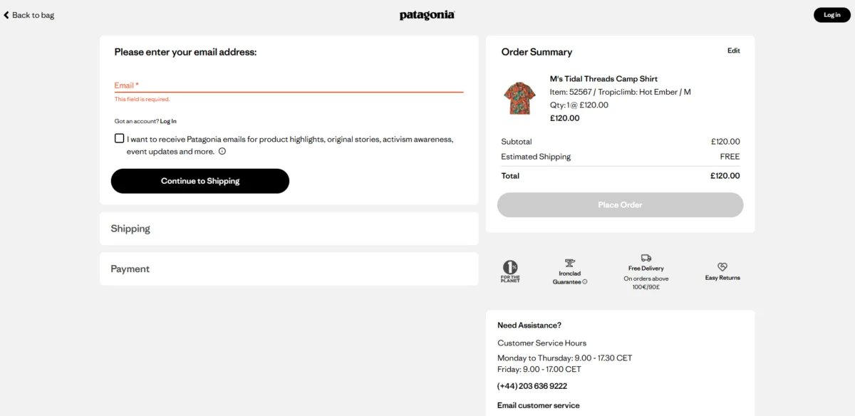
![Checkout Page Design: 11 Ways to Reduce Cart Abandonment Rates [+Examples]](https://ceblog.s3.amazonaws.com/wp-content/uploads/2021/09/30141608/Checkout-Page-Design-patagonia-email.png)
3. Streamlining the Form Field Ecosystem
In 2024 and 2025, research into user effort highlighted that the number of form fields is directly proportional to the likelihood of abandonment. While the average checkout contains 12 to 14 fields, high-converting B2C checkouts have successfully reduced this to between 6 and 8.
Fashion giant ASOS utilizes address autocomplete technology to condense the delivery section into a single predictive field. Other strategies to minimize fields include:
![Checkout Page Design: 11 Ways to Reduce Cart Abandonment Rates [+Examples]](https://ceblog.s3.amazonaws.com/wp-content/uploads/2021/09/30141709/Checkout-Page-Design-cross-sell.png)
- Defaulting the billing address to be the same as the shipping address.
- Using a single "Full Name" field instead of separate "First" and "Last" name boxes.
- Hiding optional fields (like Company Name or Address Line 2) behind a "plus" sign or link.
4. Distraction-Free UI: The "Enclosed Checkout"
The checkout page should have a singular objective: completing the transaction. High-performance designs utilize an "enclosed checkout" strategy, which involves stripping away the global header, main navigation menus, search bars, and promotional banners.
Patagonia serves as a prime example of this "tunnel vision" design. Their checkout header contains only the brand logo and a "Back to Bag" link. This prevents users from wandering back into the catalog or getting distracted by other offers. The only external-facing elements permitted are those that reinforce the purchase, such as customer service contact details and brief FAQs regarding returns and fit.
![Checkout Page Design: 11 Ways to Reduce Cart Abandonment Rates [+Examples]](https://ceblog.s3.amazonaws.com/wp-content/uploads/2021/09/30141752/Checkout-Page-Design-linkedin-post.png)
5. Intentional Structural Design: Single vs. Multi-Page
The debate between single-page and multi-page checkouts has shifted toward a "fitness for purpose" model.
- Single-Page Checkouts: Ideal for low-complexity, impulse-driven purchases (e.g., consumer packaged goods like Olipop). They minimize the number of clicks and feel faster to the user.
- Multi-Step Checkouts: Often superior for high-ticket items or complex orders. They leverage the "sunk-cost fallacy"—as users invest effort into each step (shipping, then delivery method, then payment), they become psychologically more committed to finishing.
Case studies, including those shared by Shopify experts, suggest that multi-page checkouts often result in higher Average Order Value (AOV) because they provide cleaner spaces for upselling warranties or complementary products without cluttering the payment interface.
![Checkout Page Design: 11 Ways to Reduce Cart Abandonment Rates [+Examples]](https://ceblog.s3.amazonaws.com/wp-content/uploads/2021/09/30141823/Checkout-Page-Design-multistep-form.png)
6. Reinforcing Trust through Psychological Signals
With 19% of shoppers citing a lack of trust as a reason for abandonment, the visual language of security is paramount. This goes beyond simple SSL certificates. Retailers must display recognizable trust badges—such as Norton, McAfee, or industry-specific accolades—at the exact moment the user is asked to enter sensitive data.
Luxury mattress brand Saatva utilizes a stack of trust signals, including "365-night trial" and "Lifetime Warranty" badges, to mitigate the "buyer’s remorse" associated with high-AOV purchases. Labeling the payment section as "Secure Payment" further provides the psychological safety required to complete the transaction.
![Checkout Page Design: 11 Ways to Reduce Cart Abandonment Rates [+Examples]](https://ceblog.s3.amazonaws.com/wp-content/uploads/2021/09/30141901/Checkout-Page-Design-express-checkout.png)
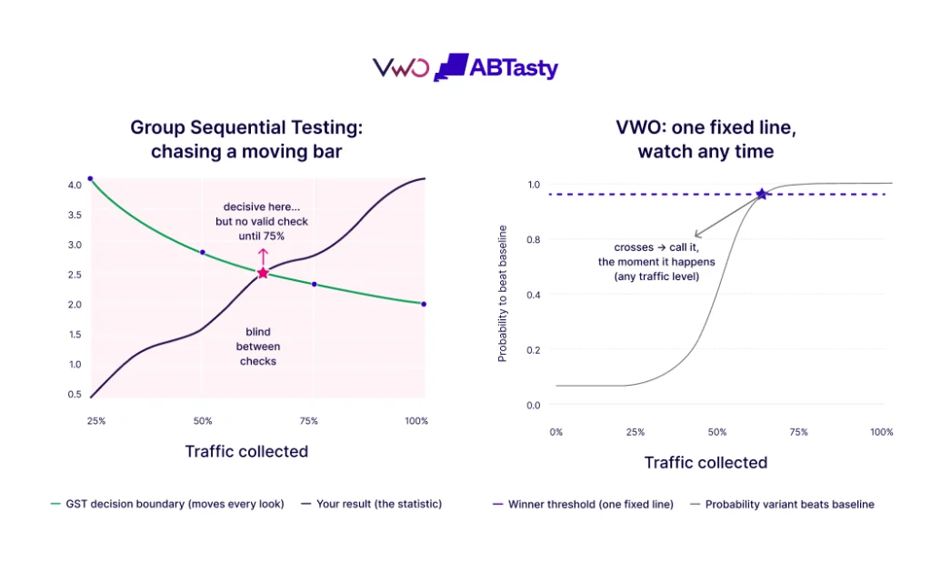
7. Localization of Payment Methods
The diversification of payment options has moved from a "nice-to-have" to a core revenue driver. A 2025 Stripe holdback experiment revealed that adding local payment methods increased conversions by 7.4% and revenue by 12% globally.
In specific regions, the impact is even more dramatic. In the Netherlands, iDEAL integration can lift conversions by 39%, while Alipay in China can see a 91% boost. Furthermore, the inclusion of Buy Now, Pay Later (BNPL) services like Klarna and Afterpay has been shown to increase conversion rates by up to 14% by lowering the immediate financial barrier for the consumer.
![Checkout Page Design: 11 Ways to Reduce Cart Abandonment Rates [+Examples]](https://ceblog.s3.amazonaws.com/wp-content/uploads/2021/09/30141943/Checkout-Page-Design-payment-options.png)
8. Mobile-Native Optimization and Biometrics
As of March 2026, mobile devices account for approximately 74% of all e-commerce traffic, yet mobile abandonment remains significantly higher than desktop (80.94% vs. 70%). This gap is often due to poor mobile UI.
Mobile-first checkout design requires:
![Checkout Page Design: 11 Ways to Reduce Cart Abandonment Rates [+Examples]](https://ceblog.s3.amazonaws.com/wp-content/uploads/2021/09/30142034/Checkout-Page-Design-mobile-usage-chart.png)
- Large, thumb-friendly buttons.
- Triggering the correct digital keypad (e.g., numeric keypad for credit card numbers).
- Deep integration with mobile wallets like Apple Pay and Google Pay, which utilize biometrics (Face ID/Touch ID) to bypass form-filling entirely.
9. Visual Dominance of the Call to Action (CTA)
A common yet overlooked cause of abandonment is the "false completion" error. Users often mistake an "Order Review" page for a final confirmation and leave the site without actually clicking the final "Place Order" button. This can account for up to 11% of drop-offs.
To combat this, the final CTA must be visually distinct—using high-contrast colors—and placed both above the fold and at the bottom of the page. Amazon utilizes a "sticky" side panel that keeps the "Buy Now" button visible regardless of how far the user scrolls through their order details.
![Checkout Page Design: 11 Ways to Reduce Cart Abandonment Rates [+Examples]](https://ceblog.s3.amazonaws.com/wp-content/uploads/2021/09/30142139/Checkout-Page-Design-mobile-checkout.png)
10. Real-Time Inline Validation
Waiting until a user clicks "Submit" to highlight errors is a major friction point. Inline validation provides real-time feedback as the user types. If a credit card number is missing a digit or an email address lacks an "@" symbol, the system should notify the user immediately with a clear, helpful message.
Retailers like Marks & Spencer utilize this to ensure the user never reaches the end of the process only to be met with a "wall of red text." However, the gold standard for this technology also requires that error messages clear as soon as the user begins to correct the mistake, maintaining a sense of forward momentum.
![Checkout Page Design: 11 Ways to Reduce Cart Abandonment Rates [+Examples]](https://ceblog.s3.amazonaws.com/wp-content/uploads/2021/09/30142331/Checkout-Page-Design-amazon-cart.png)
11. Global Compliance and Digital Accessibility
Accessibility is no longer just a moral imperative; it is a legal one. The 2025 European Accessibility Act (EAA) mandates that e-commerce entities selling within the EU must adhere to Web Content Accessibility Guidelines (WCAG).
An audit in early 2026 found that nearly 96% of homepages failed basic accessibility tests, suggesting the checkout pages are likely even worse. High-contrast text, keyboard-navigable fields, and screen-reader compatibility are essential. The Microsoft Store exemplifies this by ensuring that every element of the checkout can be navigated without a mouse, ensuring that the 15% of the global population with some form of disability can complete their purchases without assistance.
![Checkout Page Design: 11 Ways to Reduce Cart Abandonment Rates [+Examples]](https://ceblog.s3.amazonaws.com/wp-content/uploads/2021/09/30142404/Checkout-Page-Design-amazon-checkout.png)
Broader Impact and Industry Implications
The evolution of checkout design reflects a broader shift in e-commerce from "acquisition at all costs" to "retention and efficiency." As the cost of acquiring new customers via social media advertising continues to rise, maximizing the conversion of existing traffic has become the most cost-effective way to grow.
The integration of AI-driven analytics tools, such as heatmaps and session recordings, allows retailers to move away from guesswork. By identifying exactly where users "rage click" or hover indecisively, brands can iterate on their checkout designs in real-time. In the highly competitive landscape of 2025 and beyond, the checkout page is the ultimate battlefield for consumer trust and brand loyalty. Those who fail to adapt to these 11 pillars of design risk being left behind in an increasingly efficient digital marketplace.